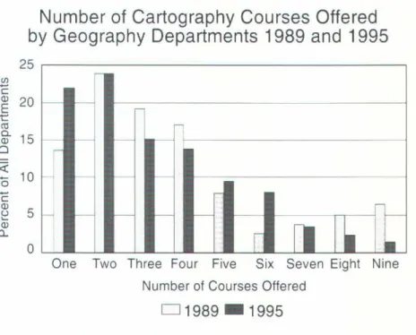
Fryman and Sines (1990) used a questionnaire to survey cartography instructors in the United States and Canada to assess the structure and content of an introductory cartography course. A 1989 survey served as a benchmark for determining changes in the content and structure of an introductory cartography course. The current research was designed to examine four main aspects of an introductory cartography course: (1) characteristics of individual instructors; , their department and institution, (2) course context and structure, (3) introductory cartography course content, and (4) computer use in teaching and laboratory exercises.
Forty-five percent of departments surveyed in both 1989 and 1995 indicated that their introductory cartography course was a requirement. Of the departments surveyed, 38 percent indicate that a laboratory assistant is present during the introductory cartography course. In one third of the introductory cartography courses, field trips were part of the curriculum.
45 percent of respondents indicated that they believe that pen and ink drafts are an essential part of the introductory cartography course. Eight respondents indicated that both pen and ink and computers were essential elements of the introductory cartography course. There seem to have been a number of changes in the content of the cartography course.
Uses, Users, and Use Environments of Television Maps
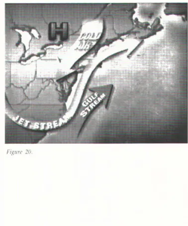
Traditionally, maps and map uses are discussed in terms of images printed on paper and held in the user's hands. The focus is on regional and local weather, but most presentations include an overview of the national pattern. Any discussion of the many types of cards on television requires an example of those cards to be shown.
While Americans can see weather maps of the entire world and individual continents on television, the maps shown here are US weather maps. Almost without exception, management and I or the art department choose the basic map design and colors. Many of the maps and graphics come from firms that provide meteorological data, images and maps for the stations.
Haddad and Cress (1993) reported that The We<1ther Channel is the fourth most watched of the many cable channels in the USA. The collection of uses discussed here may represent only a small part of the many ways in which people use the maps in televised weather presentations in the US, but it is a start to exploring the use of weather maps on television. In Indianapolis, IN, The Weather Channel and Local Weather Service occupy neighboring positions on the dial at the high end of cable service.
Another set of viewers who base decisions on their interpretation of the television weather forecasts are the commodity traders. In contrast, broadcasters on The ·weather Channel, as well as local channels, used a variety of map mo\'ies to educate viewers about the dynamics of the temperature anomalies in the Pacific Ocean as the El. CNN writes in to request that tlrey name the states of the U.S.A.
Many of the products advertised in this way are weather-related and often seasonal. It is interesting to look at the direction of trends in weather forecasting and display. There are many ways to approach reviewing the use of weather maps on television.
The largest map viewing audience is probably that of the television weather map, and the largest number of maps produced daily are the maps for the display of television weather throughout the country and around the world.
About the Quality of Maps
CONTINUED from "beauty" and "ugliness". Both ethics and aesthetics can be seen as determinants in the development of the general meaning of quality in every human being, including cartographers and map users. The mentioned values and ethical beliefs must be seen as arising from the judgment of the actions by other subjects. Quality, in the aesthetic sense, includes both a judgment about the object and a judgment about the perception of the object.
34;The judgment of the quality of 111aps is rarely revealed in11 rational reasoning, but is the result of this very meta-entity, a pre-intellectual awareness of. The development of cognitive ideas in cartography leads to an increasing use of the realistic definition of quality. The assessment of the quality of cards is rarely based on rational reasoning, but is a result of this very meta-entity, a kind of pre-intellectual awareness.
The use of the term quality in business is mostly directed at the needs of the user. The meaning of quality in this context only addresses the ability of the object to satisfy the specific need, compared to other products, and has no meaning for the individual's perception of an object-subject relationship (as in the example of the horse rider). and the horse). To improve the quality of the whole system ("to make maps"), the relationships and the context of all determinant parameters must be monitored.
34; To improve the quality of the whole system ('to make maps'), the relationships and the co11text of the term inen t parameters must be monitored." With this definition, the meaning of quality is not only extended ., but an adequate explanation of the new cartographic products that have resulted from the use of technologies such as interactive maps, multimedia, computer animation or hypermedia can be given. Therefore, the quality of a map should not only be seen in its ability to meet the aestlicticnl a11ti i11for111atio11a/ demands of the user, but also in its ability to meet the tcc/1110/ogical needs of the GIS system.
Therefore, this main aspect of understanding 111ap quality in the context with GIS, qua/if}/ derir.•atio11, can be understood as the application of absolute concepts by defining the highest goal ("formalized and automated derivation") to which we should strive. For the further development of the understanding of quality theory in both philosophy and economics, they offer sophisticated concepts and ideas that can lead to a better understanding of the meaning of quality in cartography as well.
Using Flow Maps to Visualize Time-Series Data: Comparing the
Effectiveness of a Paper Map Series, a Computer Map Series, and Animation
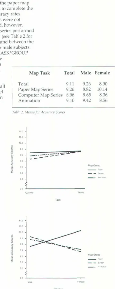
When the purpose of the map is to show quantitative differences, then symbolization becomes more complex. For each of the five flow quantities in the data set, a corresponding line width has been assigned. The subject was asked to indicate which of the values best describes the quantity.
The total viewing time for each of the computer screens was equal to the length of time that subjects in the control group studied the paper maps (approximately 1 minute). Subjects made responses by pressing one of three labeled keys on the computer keyboard. Except for the type of questions asked, the testing and data collection processes were similar to the quantitative evaluation section of the experiment.
As with the quantity evaluation section, the total viewing time for each of the computers is shown. The final part of the study required each subject group to view the other visualization techniques. Furthermore, none of the tested main effects or interaction effects were significant in this model.
111d visualization group for accuracy rates '1.' as a result mainly of the high scores of women using the paper chart sets (Table 5). Subjects also took part in an informal written survey administered at the end of the experiment. The purpose of the research is to gain insight into the preferences of the subjects with regard to the visualizations used in the research.
The result of the study showed that the animation did not improve the learning ability of quantitative values (informational task), but it improved the learning of trend patterns (illustrative task). Interestingly, the study group as a whole preferred a series of paper maps to any other visualization method. Spatiotemporal Display Techniques, Proceedings of the llltematio1rnl Sy111posium on Spatial Data HandliJZg.
An important consideration in the compositing process is the actual size of the images to be m,1- nipulated.
NACIS XVIII PROGRAM
NACISXVIII
WEDNESDAY, OCTOBER 7, 1998
THURSDAY, OCTOBER 8, 1998
From Tozms/Jip Pinto to a Bird's Eye View: The Role of the Federal Government i11 Prcserui11g Wisco11si11 Cartographic Heritage.
SATURDAY, OCTOBER 10, 1998
The editor may also request papers from presenters at the annual meeting and from other sources. Papers should be prepared exclusively for publication in CP, \·Vi th no major part previously published elsewhere. All submissions will be reviewed by the editorial board, whose members will advise the editor on whether a manuscript is suitable for publication.
CARTOGRAPHIC TECHNIQUES Articles relating to all aspects of map design and production are requested from the Cartographic Techniques Editor, James E. Meacham, Director, lnfoGraphics Lab, Department of Geography, University of Oregon, Eugene, OR or jmeacham@ oregon.uoregon.edu . Map Library Bulletin Board Editor, Melissa Lamont, is asking for reports on the current status of map libraries.
Submissions should be sent directly to Melissa Lamont, Data Library, McLean Laboratory, Woods Hole Oceanographic Institution, WHO. Literature cited must conform to the Chicago Manual of Style, 14th edition, University of Chicago Press, Chapter 16, style "B." Examples of the correct citation form appear in the main articles of this issue. Authors of Featured Papers should submit four hard copies of their manuscript for review directly to Michael Peterson, editor of Carto-graphic Perspectives, Department of Geography I Geology, University of Nebraska at Omaha, Omaha, Ne-.
The Editor will contact all authors to notify them if their paper has been accepted for publication and if revisions are required prior to publication. The following technical guidelines should be followed for all accepted manuscripts (these guidelines also apply to book, card, and software reviews). PostScript graphics generated with Adobe lll11strator or Macromedin FreeHn11d for Macintosh/Windows or Corel Draw for Windows computers are preferred, but regular PICT or TIFF format graphics files are usually also compatible.
Images can be submitted to disk, posted to an FTP site, or sent to ftpnt.freac.fsu.edu. Manually produced images should be no larger than 11 by 17 inches and are designed for scanning at 600 dpi resolution (avoid fine-grain tint screens).
Institutional I Miem bros institu cionales
NACIS AGS Collecti on
The North American Cartographic Information Society
N ONPROFIT ORG
S. POSTAGE
TALLAHASSEE, FL PERMIT NO. 55