Universidad de Alcalá
Departamento de
Ciencias de la Computación
T
ESIS
D
OCTORAL
Aportaciones para la mejora de la usabilidad de
las interfaces de los objetos docentes en el
m-learning
Autor:
Dña. Eva García López
U N IV E R S ID A D D E A L C A L Á , P A T R IM O N IO D E L A H U M A N ID A D DEPARTAMENTO DE
CIENCIAS DE LA COMPUTACIÓN
Campus Universitario. Edificio Politécnico
28805 Alcalá de Henares (Madrid) Teléfonos: 91 885 66 51 Fax: 91 885 66 46
Dña. Teresa Díez Folledo, Profesora Titular de Universidad del Área de Lenguajes y Sistemas Informáticos, en calidad de Directora del Departamento de Ciencias de la Computación.
CERTIFICO: Que la Tesis Doctoral titulada “Aportaciones para la mejora de la usabilidad de las interfaces de los objetos docentes en el m-learning” realizada por Dña. Eva García López, dirigida por el Dr. D. José Ramón Hilera González y co-dirigida por el Dr. D. Luis de Marcos Ortega, reúne los requisitos para su presentación y defensa pública.
Y para que así conste, firman la presente en Alcalá de Henares, a 9 de septiembre de 2013.
La Directora del Departamento de Ciencias de la Computación
U N IV E R S ID A D D E A L C A L Á , P A T R IM O N IO D E L A H U M A N ID A D DEPARTAMENTO DE
CIENCIAS DE LA COMPUTACIÓN
Campus Universitario. Edificio Politécnico
28805 Alcalá de Henares (Madrid) Teléfonos: 91 885 66 51 Fax: 91 885 66 46
Dr. D. José Ramón Hilera González, Titular de Universidad del Área de Lenguajes y Sistemas Informáticos del Departamento de Ciencias de la Computación de la Universidad de Alcalá.
Dr. D. Luis de Marcos Ortega, Profesor Ayudante Doctor del Área de Ciencias de la Computación e Inteligencia Artificial del Departamento de Ciencias de la Computación de la Universidad de Alcalá.
HACEN CONSTAR:
Que, una vez concluido el trabajo de tesis doctoral titulado: “Aportaciones para la
mejora de la usabilidad de las interfaces de los objetos docentes en el m-learning” realizado por Dña. Eva García López, dicho trabajo tiene suficientes
méritos teóricos, que se han contrastado adecuadamente mediante validaciones experimentales y que son altamente novedosos. Por todo ello consideran que procede su defensa pública.
Y para que así conste, firman la presente en Alcalá de Henares, a 9 de septiembre de 2013.
El Director de la Tesis El Codirector de la Tesis
Dr. José Ramón Hilera González Dr. Luis de Marcos Ortega
Universidad
de Alcalá
ESCUELA DE POSTGRADO
Programa de Doctorado
Ingeniería de la Información y del Conocimiento
T
ESIS
D
OCTORAL
Aportaciones para la mejora de la usabilidad de las
interfaces de los objetos docentes en el m-learning
Autor:
Dña. Eva García López
Directores:
Agradecimientos
En primer lugar, quiero agradecer a los directores de la tesis, Dr. José Ramón Hilera González y Dr. Luis de Marcos Ortega, su ayuda, consejos y apoyo durante todos los años que he estado realizando este trabajo.
También quiero expresar mi agradecimiento a las instituciones y al personal de las Universidades de Lund (Suecia), Oxford Brookes (Reino Unido) y Metropolia (Finlandia) que tan amablemente me han ofrecido sus instalaciones y ayuda durante mis estancias de investigación en el extranjero. Agradecimiento especial al profesor Fernando Flores (Institutionen för kulturvetenskaper) de la Universidad de Lund, a la profesora Rachel Harrison (Department of Computing and Communication Technologies) de la Universidad de Oxford Brookes, y al profesor Markku Karhu (School of Intermation & Communication Technology) de la Universidad de Metropolia.
Finalmente quiero agradecer a todos los miembros de los grupos de investigación TIFyC (Tecnologías de la Información para la Formación y el Conocimiento) y PMI (Plataformas Móviles Inteligentes) del Departamento de Ciencias de la Computación de la Universidad de Alcalá su ayuda y apoyo durante todos estos años de trabajo.
Acknowledgements
First of all I want to thank my thesis advisors, Dr. José Ramón Hilera González and Dr. Luis de Marcos Ortega, for their help, advice and support during the years I have been performing this work.
I also want to express my gratefulness to the institutions and people from the Lund University (Sweden), Oxford Brookes University (United Kingdom) and Metropolia University (Finland) that have kindly offered their facilities and help during my research stays outside of Spain. I specially appreciate the help provided by Professor Fernando Flores (Institutionen för kulturvetenskaper) from Lund University, Professor Rachel Harrison (Department of Computing and Communication Technologies) from Oxford Brookes University and Professor Markku Karhu (School of Intermation & Communication Technology) from Metropolia University.
Resumen
El incremento del uso de los dispositivos móviles en los últimos años y la revolución que ha supuesto el e-learning en el ámbito de la enseñanza han propiciado la aparición del m-learning. Por otro lado, tradicionalmente los dispositivos con un pequeño tamaño de pantalla han sufrido algunos problemas relacionados con la usabilidad, y los dispositivos móviles no son una excepción. Por ello, es importante tener en cuenta la usabilidad en estos dispositivos, y más aun cuando se trata de enseñanza virtual a través de los mismos, ya que una mala usabilidad podría provocar que los alumnos estuvieran constantemente distraídos con la interfaz (por ejemplo, intentando encontrar una determinada opción) y no centrados en lo realmente importante: el aprendizaje.
El objetivo planteado en la presente tesis es obtener un conjunto de directrices de usabilidad válido para las interfaces de los objetos docentes basados en web para dispositivos móviles. Para conseguir dicho objetivo, se propone una metodología que consiste en partir de un conjunto de directrices fuente diseñadas para páginas web de PC, hacer una evaluación experta y llevar a cabo una experimentación, de manera que al final se consiguen obtener unas directrices válidas para objetos docentes basados en web para dispositivos móviles. Esta metodología se aplica a la ISO 9241-151 y se consigue obtener como resultado un conjunto de directrices válidas para los objetos docentes basados en web para dispositivos móviles.
Abstract
The increased use of mobile devices in recent years and the revolution that e-learning has supposed in the training field have led to the emergence of m-learning. On the other hand, devices with a little screen have traditionally had some problems related to usability, and mobile devices are not an exception. Therefore, it is important to consider usability on these devices, and even more when learning through them, since a poor usability might lead the users to be constantly distracted with the interface (for example, trying to find a concrete option) and not focused on what really matters: learning.
~ 1 ~
Tabla de contenidos / Table of Contents
English Abstract... 11
1. Introduction... 11
2. Background and related work ... 12
2.1. Introduction to Usability ... 12
2.2. Usability for mobile devices ... 13
2.3. Usability in m-learning ... 13
2.4. Usability metrics ... 14
2.4.1. General usability metrics ... 14
2.4.2. Usability metrics for e-learning... 15
2.5. Empirical usability studies ... 16
2.6. Usability guidelines ... 16
2.6.1. Standard ISO 9241-151 ... 17
2.6.2. HHS Guidelines ... 17
2.6.3. W3C Mobile Web Best Practices ... 17
2.6.4. Usability of Mobile Websites and Applications ... 17
2.6.5. Web Content Accessibility Guidelines (WCAG) ... 18
3. Obtaining guidelines ... 18
3.1. Choosing source guidelines ... 19
3.2. Expert evaluation ... 19
3.2.1. Results and analysis ... 20
3.3. Experimentation ... 21
3.3.1. Experiment 1: Guideline 9.3.1 ... 22
3.3.2. Experiment 2: Guideline 9.3.6 ... 23
3.3.3. Experiment 3: Guideline 9.3.7 ... 23
3.3.4. Experiment 4: Guideline 9.3.8 ... 23
~ 2 ~
3.3.6. Experiment 6: Guideline 9.3.16 ... 23
3.3.7. Experiment 7: Guideline 9.4.10 ... 24
3.3.8. Experiment 8: Guideline 9.4.13 ... 24
3.3.9. Experiment 9: Guideline 9.5.1 ... 24
3.3.10. Experiment 10: Guideline 9.6.6 ... 24
4. Results ... 25
5. Conclusions and future work ... 26
5.1. Conclusions of the experiments ... 26
5.2. General conclusions ... 27
5.3. Future work ... 28
References ... 29
1. Introducción ... 33
1.1. Justificación de la investigación ... 33
1.2. Objetivo de la tesis ... 34
1.3. Metodología ... 35
1.4. Estructura del documento ... 36
2. Estado del Arte ... 39
2.1. Definiciones del término usabilidad ... 40
2.1.1. Definiciones del término accesibilidad ... 40
2.2. Ventajas de la usabilidad ... 41
2.3. Usabilidad para dispositivos móviles ... 43
2.4. Usabilidad en m-learning ... 45
2.5. Cómo medir la usabilidad ... 55
2.5.1. Métricas de usabilidad generales ... 56
2.5.2. Métricas de usabilidad para el aprendizaje electrónico ... 57
2.6. Estudios empíricos de usabilidad ... 58
2.6.1. El efecto del tipo de aplicación y el contexto de localización ... 59
~ 3 ~
2.7. Directrices y recomendaciones de usabilidad ... 62
2.7.1. Norma ISO 9241-151 ... 63
2.7.2. HHS Guidelines ... 64
2.7.3. W3C Best Practices ... 68
2.7.4. Usability of Mobile Websites and Applications ... 69
2.7.5. Web Content Accessibility Guidelines (WCAG) 2.0 ... 73
2.7.6. Comparativa de directrices ... 74
3. Obtención de directrices ... 81
3.1. Elección de las directrices fuente ... 84
3.2. Evaluación experta ... 90
3.2.1. Resultados de la evaluación ... 90
3.2.2. Análisis de los resultados ... 92
3.3. Experimentación ... 100
3.3.1. Experimento 1: Directriz 9.3.1. ... 102
3.3.1.1. Hipótesis ... 102
3.3.1.2. Planteamiento del experimento ... 103
3.3.1.3. Realización ... 105
3.3.1.4. Resultados ... 105
3.3.1.5. Conclusiones del experimento ... 113
3.3.2. Experimento 2: Directriz 9.3.6. ... 114
3.3.2.1. Hipótesis ... 114
3.3.2.2. Planteamiento del experimento ... 116
3.3.2.3. Realización ... 119
3.3.2.4. Resultados ... 120
3.3.2.5. Conclusiones del experimento ... 147
3.3.3. Experimento 3: Directriz 9.3.7. ... 149
3.3.3.1. Hipótesis ... 149
~ 4 ~
3.3.3.3. Realización ... 153
3.3.3.4. Resultados ... 153
3.3.3.5. Conclusiones del experimento ... 166
3.3.4. Experimento 4: Directriz 9.3.8. ... 168
3.3.4.1. Hipótesis ... 168
3.3.4.2. Planteamiento del experimento ... 168
3.3.4.3. Realización ... 171
3.3.4.4. Resultados ... 172
3.3.4.5. Conclusiones del experimento ... 188
3.3.5. Experimento 5: Directriz 9.3.10... 189
3.3.5.1. Hipótesis ... 190
3.3.5.2. Planteamiento del experimento ... 191
3.3.5.3. Realización ... 192
3.3.5.4. Resultados ... 192
3.3.5.5. Conclusiones del experimento ... 198
3.3.6. Experimento 6: Directriz 9.3.16... 199
3.3.6.1. Hipótesis ... 199
3.3.6.2. Planteamiento del experimento ... 201
3.3.6.3. Realización ... 202
3.3.6.4. Resultados ... 203
3.3.6.5. Conclusiones del experimento ... 206
3.3.7. Experimento 7: Directriz 9.4.10... 208
3.3.7.1. Hipótesis ... 208
3.3.7.2. Planteamiento del experimento ... 209
3.3.7.3. Realización ... 213
3.3.7.4. Resultados ... 214
3.3.7.5. Conclusiones del experimento ... 240
~ 5 ~
3.3.8.1. Hipótesis ... 243
3.3.8.2. Planteamiento del experimento ... 243
3.3.8.3. Realización ... 246
3.3.8.4. Resultados ... 247
3.3.8.5. Conclusiones del experimento ... 251
3.3.9. Experimento 9: Directriz 9.5.1. ... 252
3.3.9.1. Hipótesis ... 252
3.3.9.2. Planteamiento del experimento ... 253
3.3.9.3. Realización ... 255
3.3.9.4. Resultados ... 256
3.3.9.5. Conclusiones del experimento ... 270
3.3.10. Experimento 10: Directriz 9.6.6. ... 273
3.3.10.1. Hipótesis ... 273
3.3.10.2. Planteamiento del experimento ... 274
3.3.10.3. Realización ... 277
3.3.10.4. Resultados ... 279
3.3.10.5. Conclusiones del experimento ... 290
4. Resultados ... 293
5. Conclusiones y Futuro Trabajo ... 297
5.1. Conclusiones ... 297
5.2. Publicaciones ... 303
5.3. Futuro trabajo ... 304
Referencias ... 307
Anexos ... 315
Anexo 1: Plantilla utilizada para la evaluación experta ... 315
Anexo 2: Encuesta del experimento 9.3.1 ... 318
Anexo 3: Encuesta de satisfacción del experimento 9.3.6 ... 324
~ 6 ~
Anexo 5: Encuesta de satisfacción del experimento 9.3.8 ... 330
Anexo 6: Encuesta de satisfacción del experimento 9.4.10 ... 333
Anexo 7: Encuesta de satisfacción del experimento 9.4.13 ... 340
Anexo 8: Encuesta de satisfacción del experimento 9.5.1 ... 345
~ 7 ~
Tabla de Figuras
Figura 1. Mecanismo utilizado para grabar las interacciones del usuario en los experimentos
llevados a cabo ... 101
Figura 2. Distribución de las respuestas a las preguntas 1 (izquierda) y 2 (derecha) de la
encuesta del experimento 9.3.1 ... 106
Figura 3. Distribución de las respuestas a las preguntas 3 (izquierda) y 4 (derecha) de la
encuesta del experimento 9.3.1 ... 106
Figura 4. Distribución de las respuestas a las preguntas 5 (izquierda) y 6 (derecha) de la
encuesta del experimento 9.3.1 ... 107
Figura 5. Distribución de las respuestas a las preguntas 7 (izquierda) y 8 (derecha) de la
encuesta del experimento 9.3.1 ... 109
Figura 6. Distribución de las respuestas a las preguntas 11 (izquierda) y 12 (derecha) de la
encuesta del experimento 9.3.1 ... 110
Figura 7. Prototipo de páginas web diseñadas para la parte 2 del experimento 9.3.6: todo en
una página (izquierda) y con paginación (derecha) ... 117
Figura 8. Histogramas de errores (eficacia) en función del tipo de distribución de contenidos:
misma página (izquierda) y paginación (derecha) para la búsqueda de palabras en páginas cortas del
experimento 9.3.6 ... 123
Figura 9. Histogramas de errores (eficacia) en función de la localización de la palabra en el
texto: cercana (izquierda) y lejana (derecha), para la búsqueda de palabras en páginas cortas del
experimento 9.3.6 ... 124
Figura 10. Histogramas de errores (eficacia) en función del tipo de distribución de contenidos:
misma página (izquierda) y paginación (derecha), para la respuesta a preguntas en páginas cortas del
experimento 9.3.6 ... 126
Figura 11. Gráfica de caja de tiempo (eficiencia) en función del tipo de distribución de
contenidos para la búsqueda de palabras en páginas cortas del experimento 9.3.6 ... 128
Figura 12. Gráfica de caja de tiempo (eficiencia) en función del tipo de localización de la
palabra en el texto: cercana (izquierda) y lejana (derecha) para la búsqueda de palabras en páginas
cortas del experimento 9.3.6 ... 129
Figura 13. Gráfica de caja de tiempo (eficiencia) en función del tipo de distribución de
contenidos para la respuesta a preguntas en páginas cortas del experimento 9.3.6 ... 131
Figura 14. Histogramas de errores (eficacia) en función del tipo de distribución de contenidos:
paginación (izquierda) y en la misma página (derecha), en páginas largas del experimento 9.3.6 ... 136
Figura 15. Histogramas de errores (eficacia) en función de la localización de la palabra en el
texto: cercana (izquierda) y lejana (derecha), en páginas largas del experimento 9.3.6 ... 137
Figura 16. Histogramas de errores (eficacia) en función del tipo de distribución de contenidos
~ 8 ~
Figura 17. Gráfica de caja de tiempo (eficiencia) en función del tipo de distribución de
contenidos en páginas largas del experimento 9.3.6 ... 141
Figura 18. Gráfica de caja de tiempo (eficiencia) en función de la localización de la palabra en
el texto en páginas largas del experimento 9.3.6 ... 143
Figura 19. Gráfica de caja de tiempo (eficiencia) en función del tipo de distribución de
contenidos y de la localización de la palabra en el texto en páginas largas del experimento 9.3.6 ... 144
Figura 20. Prototipo de páginas web diseñadas para el experimento 9.3.7: paginación,
enlaces internos y scroll vertical, respectivamente ... 151
Figura 21. Histogramas de errores (eficacia) en función del tipo de distribución de contenidos:
Paginación (izquierda), Enlaces internos (centro) y Scroll vertical (derecha), en el experimento 9.3.7 ... 155
Figura 22. Histogramas de errores (eficacia) en función de la localización de la palabra en el
texto: cercana (izquierda) y lejana (derecha) en el experimento 9.3.7 ... 156
Figura 23. Histogramas de errores (eficacia) en función del tipo de distribución de contenidos
y de la localización de la palabra en el texto en el experimento 9.3.7 ... 158
Figura 24. Gráfica de caja de tiempo (eficiencia) en función del tipo de distribución de
contenidos en el experimento 9.3.7 ... 160
Figura 25. Gráfica de caja de tiempo (eficiencia) en función de la localización de la palabra en
el texto en el experimento 9.3.7 ... 161
Figura 26. Gráfica de caja de tiempo (eficiencia) en función del tipo de distribución de
contenidos y de la localización de la palabra en el texto en el experimento 9.3.7 ... 163
Figura 27. Prototipo de páginas web diseñadas para el experimento 9.3.8 ... 169
Figura 28. Histogramas de errores (eficacia) en función del tipo de distribución de contenidos:
sin scroll horizontal (izquierda) y con scroll horizontal (derecha), en el experimento 9.3.8 ... 173
Figura 29. Histogramas de errores en función del tipo de orientación de la pantalla: vertical
(izquierda) u horizontal (derecha), en el experimento 9.3.8 ... 175
Figura 30. Histogramas de errores en función de la localización de la palabra en el texto:
cercana (izquierda) o lejana (derecha), en el experimento 9.3.8 ... 177
Figura 31. Gráfica de caja de tiempo (eficiencia) en función de la existencia (derecha) y
ausencia (izquierda) de scroll horizontal en el experimento 9.3.8... 181
Figura 32. Gráfica de caja de errores en función del tipo de orientación de la pantalla en el
experimento 9.3.8 ... 182
Figura 33. Gráfica de caja de tiempo (eficiencia) en función de la localización de la palabra en
el texto en el experimento 9.3.8 ... 184
Figura 34. Prototipo de páginas web diseñadas para el experimento 9.3.10 (de izquierda a
derecha: W1, W2, W3 y W4) ... 191
Figura 35. Prototipo de página web diseñada para el experimento 9.3.16 ... 201
~ 9 ~
Figura 37. Gráfica de caja de errores en función de la existencia (derecha) o no existencia
(izquierda) de aviso del destino del enlace cuando se abre en la misma ventana un enlace que por
defecto abre en una nueva ventana en el experimento 9.4.10 ... 219
Figura 38. Gráfica de caja de errores en función de la existencia (derecha) o no existencia
(izquierda) de aviso del destino del enlace cuando se abre en una nueva ventana un enlace que por
defecto abre en la misma ventana en el experimento 9.4.10 ... 222
Figura 39. Gráfica de caja de errores en función de la existencia (derecha) o no existencia
(izquierda) de aviso del destino del enlace cuando se abre en una nueva ventana un enlace que por
defecto abre en una nueva ventana en el experimento 9.4.10 ... 224
Figura 40. Gráfica de caja de tiempo (eficiencia) en función de la existencia (derecha) y
ausencia (izquierda) de aviso del destino del enlace al abrir en la misma ventana un enlace que por
defecto abre en la misma ventana en el experimento 9.4.10 ... 226
Figura 41. Gráfica de caja de tiempo (eficiencia) en función de la existencia (derecha) y
ausencia (izquierda) de aviso del destino del enlace al abrir en la misma ventana un enlace que por
defecto abre en una nueva ventana en el experimento 9.4.10 ... 228
Figura 42. Gráfica de caja de tiempo (eficiencia) en función de la existencia (derecha) y
ausencia (izquierda) de aviso del destino del enlace al abrir en una nueva ventana un enlace que por
defecto abre en la misma ventana en el experimento 9.4.10 ... 229
Figura 43. Gráfica de caja de tiempo (eficiencia) en función de la existencia (derecha) y
ausencia (izquierda) de aviso del destino del enlace al abrir en una nueva ventana un enlace que por
defecto abre en una nueva ventana en el experimento 9.4.10 ... 231
Figura 44. Prototipo de páginas web diseñadas para el experimento 9.4.13: enlaces cortos,
medios y largos, respectivamente ... 244
Figura 45. Gráfica de cajas de la eficiencia por tipo de enlace en el experimento 9.4.13 ... 249
Figura 46. Prototipo de páginas web diseñadas para el experimento 9.5.1: campo de texto,
radiobutton y lista desplegable, respectivamente ... 254
Figura 47. Histogramas de errores de interacción en función del tipo de objeto de interacción
(dato “Sexo”) en el experimento 9.5.1 ... 257
Figura 48. Histogramas de errores de interacción en función del tipo de objeto de interacción
(dato “Edad”) en el experimento 9.5.1 ... 258
Figura 49. Histogramas de errores de interacción en función del tipo de objeto de interacción
(dato “País de nacimiento”) en el experimento 9.5.1 ... 259
Figura 50. Histogramas de errores de interacción en función del tipo de objeto de interacción
(dato “Provincia de la vivienda habitual”) en el experimento 9.5.1 ... 261
Figura 51. Gráfica de caja de tiempo (eficiencia) en función del tipo de objetos de interacción
(dato “Sexo”) en el experimento 9.5.1 ... 263
Figura 52. Gráfica de caja de tiempo (eficiencia) en función del tipo de objetos de interacción
~ 10 ~
Figura 53. Gráfica de caja de tiempo (eficiencia) en función del tipo de objetos de interacción
(dato “País de nacimiento”) en el experimento 9.5.1 ... 266
Figura 54. Gráfica de caja de tiempo (eficiencia) en función del tipo de objetos de interacción
(dato “Provincia de la vivienda habitual”) en el experimento 9.5.1 ... 267
Figura 55. Prototipo de páginas web diseñadas para el experimento 9.6.6 ... 276
Figura 56. Gráfica de caja de tiempo (eficiencia) en función del tipo de redimensionamiento
~ 11 ~
English Abstract
Dissertation Title:
Contributions to improve usability of learning objects interfaces in
m-learning
Author:
Eva García López
Advisors:
José Ramón Hilera González Ph.D., Luis de Marcos Ortega, Ph.D.
1. Introduction
The number of users of mobile devices has been increasing over recent years, up to 1.5
billion users worldwide in 2007 [1]. In 2010 the number of mobile connections exceeded 5
billion worldwide [2] and this number is expected to further increase (it is estimated 6.8 billion
in 2013 [3]), because people increasingly have an easier and cheaper access to mobile
technology, and the cost of mobile Internet access is being reduced [4].
On the other hand, usability, which could be defined as “the measure of the quality of
the user experience when interacting with something” [5], is one of the most important
characteristics to be taken into account when addressing systems with a large number of
users, who need to operate in an intuitive way, without prior training or direct support [6]. In
addition, usability is the second most important problem (after security) for system acceptance
by users [7], so it should not be forgotten when developing systems.
By combining the above ideas, usability for mobile devices appears, which can be
considered an emerging specialty within the broader field of usability, which has also been
evolving [8].
The usability advantages are many: increased productivity, enhanced quality of work,
improved user satisfaction and reductions in support and training costs [9]. However, a study
[10] extends these benefits to many more. These advantages are specially important when
dealing with learning systems for mobile devices, i.e., m-learning (mobile learning), because
offering a usable interface to the learners makes learning more pleasant and, therefore, their
motivation will not be reduced due to a poorly designed interface. It is also important to
~ 12 ~
of the interface (for example, searching for some elements or figuring out how to make a task),
but they could only focus on their main task: learning.
On the other hand, although progress has been made in technological innovations, some
obvious limitations still exist on mobile devices interfaces due to their characteristics, i.e.,
small screen size, low resolution screens, non-traditional input methods and navigation
difficulties [11]. In addition, recently a lot of models of mobile devices of different
manufacturers are emerging, which implies that many different input methods (stick,
keyboard, finger) exist, as well as processing power, size and resolution screen, etc. Because of
this, a study [12] argues that some traditional usability guidelines related to navigation,
structure and error prevention should be taken into account for mobile applications, but it also
says that some attributes should be specifically considered: limited user input, ability to display
a very little information on the screen and the use of context. Therefore, traditional usability
guidelines for computer may not be suitable to be applied also to mobile devices [13], so
research in this area could be done to obtain new valid guidelines for mobile devices in
general, and for web-based learning content to these devices, in particular.
For all above, this doctoral thesis proposes the following objective: to obtain a set of
usability guidelines suitable for web-based learning object interfaces for mobile devices.
Section 2 of this abstract shows the background and work related to the research topics
(usability in general, usability for mobile devices, usability in m-learning and usability
guidelines). Section 3 describes the process carried out to obtain the guidelines proposed in
the objective. Section 4 explains the results obtained after finishing the above process and
finally, in Section 5 conclusions and future work are discussed.
2. Background and related work
The related work is divided into six parts: (1) introduction to usability, (2) usability for
mobile devices, (3) usability in m-learning, (4) usability metrics, (5) empirical usability studies
and (6) usability guidelines.
2.1. Introduction to Usability
Usability has been studied in many research studies, which has led to generate several
~ 13 ~
which a product can be used by specified users to achieve specified goals with effectiveness,
efficiency and satisfaction in a specified context of use”.
Usability provides many known benefits, such as increased productivity, enhanced
quality of work, improved user satisfaction and reduction in support and training costs [9].
Nevertheless, there are other studies [10] that describe more usability advantages, such as
reduced development and maintenance costs, improved productivity and efficiency, reduced
training costs, lower support costs, reduced documentation costs, litigation deterrence,
increased e-commerce potential, competitive edge, advertising advantages and better notices
in the media.
2.2. Usability for mobile devices
Mobile devices are different from computers in many characteristics, but maybe the
most important difference is the screen size, which is much smaller in the first ones than in the
last ones. The small screen size that characterizes mobile devices is the most frequently
highlighted feature as a usability problem [6, 11], so it has been studied in several studies since
the 80s [18-22].
In recent years, smartphones and tablets (besides mobile phones) have been spreading,
appearing new models on the market every time. These devices are increasing their graphics
and storing capabilities, and have been adding new technologies and options that they did not
have some years ago, and even the interaction method has been changing (keyboard, stick,
finger). Consequently, functionalities have also been increased to the point of they are now
able to download, install and execute applications, or surfing the Internet, for example.
2.3. Usability in m-learning
There is also an area within the field of mobile devices, which is very important for this
thesis and has been studied by several authors: the mobile learning (which is also called
m-learning). There are several definitions of the term m-learning, proposed by various
researchers [23-26], but maybe the most comprehensive is that proposed by Moses [27]:
“m-learning is a form of e-“m-learning that involves any “m-learning with the use of mobile device to
produce an anywhere and anytime learning experience to cater for the needs of different
learners and augmenting their formal learning experience”.
Since the advent of computer and Internet technologies, the use of technologies for
~ 14 ~
mobile devices and the fast development of wireless communications have made that mobile
learning can be used as a means to transfer knowledge to students [28]. Some notable
examples of the use of technology in the educational context are multimedia learning,
web/Internet-based learning, e-learning and, in recent years, mobile learning [26].
The question before us now is: why should we use mobile devices for learning? The
reason is because it has many advantages. For example, PDAs (and also smartphones and
tablets) can be used without waiting for them to start, so they are ideal in times and places in
which even a laptop would not be useful [29]. This would provide more flexibility to the
learners [30] and it is proven that they foster collaboration and communication between them
[25, 29]. Summarizing: using mobile devices with wireless network technology makes that
mobile learning learners get ubiquity, comfort, convenience, immediacy and customization for
learning [31, 32]. All these advantages are inherited from the technology that supports mobile
learning: the mobile devices.
For designing mobile learning portals, Seong [26] proposed ten golden usability
guidelines that should be followed to try to get a high effectiveness design, user friendly and a
usable interface for supporting the dynamism of mobile devices.
2.4. Usability metrics
In this thesis we will perform some experiments so we need to know how to measure
usability, otherwise it could not be evaluated nor we could conclude whether an interface is
more usable than another one.
Nielsen [5] explains that the usability of a system is composed of five attributes:
learnability, efficiency, memorability, errors and subjective satisfaction. These factors are easy
to understand but difficult to quantify, so it is necessary specifying a way to measure them for
being able to evaluate the usability of a system. Several authors have researched about
different ways to measure usability, so some proposed ideas are shown below, both for
usability in general and e-learning in particular.
2.4.1. General usability metrics
Ryan and Gonsalves [33] performed an empirical study to measure the effect of context
and application type on mobile devices, and they used the following measures to evaluate the
usability:
~ 15 ~
Subjective: user satisfaction, learnability, efficiency, ease of use and context awareness.
In another research [17], 45 empirical studies of mobile usability were analyzed. The
authors observed that the most used usability metrics where the following:
Effectiveness: Degree to which the product is enabling the tasks to be performed in a quick, effective and economical manner or is hindering
performance.
Efficiency: Accuracy and completeness with which specified users achieved specified goals in particular environment.
Satisfaction: The degree to which a product is giving contentment or making the user satisfied.
These metrics are also named in the definition of the term “usability” in ISO 9241-11
[15], so they are probably a good measure of usability.
2.4.2. Usability metrics for e-learning
There are some usability metrics for e-learning that have been defined by different
authors. For example, the usability of a m-learning system could be measured by the metrics
proposed by Gafni [6]: Response time to get information from cache, Device memory cleanup,
Display load, Messages conciseness, Ease of input entering, Ease of output use, Ease of use –
displays per task, Secure messages and information on device, Use of user profile, Installations
success, and Ease of installation.
Other authors [34] proposed some features of m-learning that may help to determine its
acceptance and that may be interpreted as a measure of quality, and that after all is what
usability brings. These features are: simplicity, trialability, observability, relative advantage,
compatibility and support.
Finally, Latham [35] lists some common characteristics that are taken as indicators of
low quality and which, although conversely, may also serve to determine the quality:
practitioners become disenchanted and disillusioned due to unforeseen difficulties, innovation
supporters leave or are not available, people lack training and lose enthusiasm, funding runs
out, there is inadequate supervision and support from management, the program lacks
~ 16 ~
2.5. Empirical usability studies
As already mentioned above, there are a lot of research studies about usability, and
many of them consist of empirical studies, i.e., usability tests performed with users to accept
or reject a hypothesis proposed.
A recurring topic in these usability studies has been field versus laboratory testing. This
question is classical in research methodology, but the advent of mobile devices has revived this
topic, and some empirical studies that compare evaluations in both techniques are starting to
arise, but they provide very different results. For example, Nielsen et al. [36] say that it is
worth to evaluate usability in the field, despite being more complex and taking longer, because
in their study the evaluation in the field was more successful (i.e., users identified more
usability problems) than in the laboratory. On the contrary, in some studies [37, 38] the
researchers got the conclusion that it is not necessary to perform usability testing in the field
unless you want to investigate user behavior in a natural context, so when only evaluating user
interfaces, it is preferable to perform usability testing in the laboratory.
This was an important question to answer because in this thesis some experiments will
be performed, so it is important to know if it is worth testing in the field or not. By taking into
account the studies explained above, we will perform the experiments in the laboratory, as we
only want to evaluate usability of user interfaces, but not the behavior of the user in his/her
context.
2.6. Usability guidelines
Remember that the main objective of this thesis is to obtain a set of usability guidelines
suitable for web-based learning object interfaces for mobile devices. At this point, it is
necessary to make a review of the existing usability guidelines and recommendations. Some of
these guidelines do not have a mobile scope but they were designed for web pages [39, 40],
and on the contrary, some of the recommendations below were already established as
usability guidelines for web pages for mobile devices [41, 42].
Also, there are some recommendations and/or standards of guidelines applied to
accessibility. As accessibility is related to usability, this section will also review some guidelines
for web interfaces, such as those proposed in WCAG 2.0 [43]. This norm has been fully
~ 17 ~
2.6.1. Standard ISO 9241-151
The standard ISO 9241-151 (“Ergonomics of human-system interaction”) covers all
aspects of ergonomics in the interaction between human and systems, and part 151 [39],
entitled “Guidance on World Wide Web user interfaces”, focuses on a set of usability
guidelines for web interfaces. This standard is composed of ten sections: “Scope”, “Normative
references”, “Terms and definitions”, “Application”, “A reference model for human-centred
design of World Wide Web user interfaces”, “High-level design decisions and design strategy”,
“Content design”, “Navigation and search”, “Content presentation” and “General design
aspects”.
2.6.2. HHS Guidelines
The United States Department of Health and Human Services (DHHS) created a set of
usability guidelines for web design [40], which were obtained through an extensive process of
research an review. These guidelines are contained in a book of eighteen chapters: “Design
Process and Evaluation”, “Optimizing the User Experience”, “Accessibility”, “Hardware and
Software”, “The Home Page”, “Page Layout”, “Navigation”, “Scrolling and Paging”, “Headings,
Titles and Labels”, “Links”, “Text Appearance”, “Lists”, “Screen-Based Controls”, “Graphics,
Images and Multimedia”, “Writing Web Content”, “Content Organization”, “Search” and
“Usability Testing”.
2.6.3. W3C Mobile Web Best Practices
W3C proposes a set of usability guidelines directly applicable to websites for mobile
devices [42], which are named “Mobile Web Best Practices 1.0: Basic guidelines”. These
guidelines are divided into five sections: “Overall Behavior”, “Navigation and Links”, “Page
Layout and Content”, “Page Definition” and “User Input”.
2.6.4. Usability of Mobile Websites and Applications
The guidelines contained in the document entitled “Usability of Mobile Websites and
Applications” [41] establish a set of usability recommendations and good practices in websites
and applications for mobile devices. The document is divided into three sections, and these
also group the guidelines in different subsets. The three main sections are: “General Guidelines
for Mobile Websites and Apps”, “General Guidelines for Touch Phones” and “Guidelines for
~ 18 ~
2.6.5. Web Content Accessibility Guidelines (WCAG)
The main objective of WCAG (Web Content Accessibility Guidelines) [43] is to obtain
web pages with an accessible design, thereby reducing barriers to information. The last version
(WCAG 2.0) is divided into four main principles: perceivable, operable, understandable, and
robust. Each of these principles is divided into various guidelines (12 in total); and each of
these guidelines is also atomized into some “Success criteria”, which are 61 in total. In order to
meet the needs of different groups and different situations, three levels of conformance are
defined for each Success criteria: A (lowest), AA, and AAA (highest).
3. Obtaining guidelines
The aim of this section is to show the process followed to obtain the usability guidelines
suitable for web-based learning objects for mobile devices from some usability guidelines
designed for PC websites. Since web-based learning objects are basically web pages (with a
particular teaching content, but web pages after all), the source guidelines should be
guidelines for web pages. The methodology for obtaining usability guidelines for mobile
devices from usability guidelines for PC websites consists of the following phases:
1. Selecting the source guidelines: The first step is to choose the set of guidelines
that will be adapted or validated for web-based learning objects for mobile
devices. The choice of the source guidelines for this thesis is discussed in Section
3.1.
2. Expert evaluation: In the second step, a set of experts have to reasonably
evaluate whether each of the guidelines chosen in the previous step would be
valid (i.e., if it would make sense) in web pages for mobile devices. For this, they
will classify each guideline into one of the following groups:
a. Not applicable. These guidelines are not translatable in any way to
mobile devices, i.e., it makes no sense in web pages for mobile devices.
b. Directly applicable. These are guidelines that would not suffer any
modification when applied to mobile devices, i.e., they would still make
sense in web pages for mobile devices.
c. Applicable with modifications. These guidelines could suffer a
modification before being applied to mobile devices, i.e., they could
make sense in web pages for mobile devices, but being previously
~ 19 ~
The process of expert evaluation followed in this thesis is explained in Section
3.2.
3. Analysis of the results of the expert evaluation: After collecting the responses of
all experts and their justifications, a Chi-square analysis will be performed to
determine which responses were random and what were not. Experimentation
will be carried out for those random responses and for those not random
responses whose general answer was “c)”. The rest will be taken as the general
response, that is, answers “a)” will be directly adopted for mobile devices and
answers “c)” will not exist for mobile devices. The description of this step for this
thesis is explained in Section 3.2.1.
4. Experimentation: After obtaining the guidelines to be experimented, an
experiment should be designed for each, so we can check whether or not the
guideline would be directly applicable to a mobile device, or if it would be
applicable but with previous modifications. The experimentation process carried
out in this thesis is explained in Section 3.3.
5. Proposed guidelines for m-learning: The last step is to obtain the final guidelines
for web-based learning objects. For doing this, guidelines obtained from steps 3
and 4 will be collected. The proposal of these guidelines for this thesis is shown
in Section 4.
3.1. Choosing source guidelines
For this thesis, ISO 9241-151 was chosen, because it is the only international standard,
among all presented in Section 2.6, which is aimed to web pages for PC created by a very
prestigious standardization organization. More specifically, this thesis focuses on Section 9,
because it contains a fairly extensive set of guidelines (41 in total), which is enough for
applying the methodology proposed, and it is the section specifically aimed to web interfaces,
i.e., to the content presentation.
After selecting the source guidelines, the following step is to perform the expert
evaluation in order to classify each of the guidelines as (a) not applicable, (b) directly
applicable or (c) applicable with modifications.
3.2. Expert evaluation
To perform the expert evaluation, 16 usability experts (from the user’s point of view)
~ 20 ~
between 18 and 24 years old; 40% were between 25 and 34 years; and 13.33% were between
35 and 49 years. About their experience using mobile devices, 6.67% was considered novice,
66.67% was considered in an intermediate level and 26.67% was considered expert. Regarding
the highest level of education, 20% had completed High School and were studying a Degree;
26.67% had a Degree; 46.66% had a Master Degree; and 6.67% had a PhD.
All of them filled a template where they had to indicate, for each guideline, whether or
not they thought it was applicable to mobile devices. They did this by selecting one of the
three options mentioned above (a, b or c) and justifying it.
3.2.1. Results and analysis
For analyzing the results obtained, as explained before, a Chi-square analysis was
performed (Table 1).
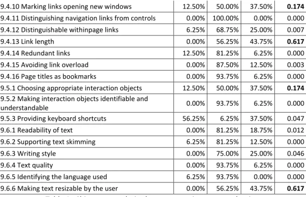
Guideline # a) # b) # c) p-value
9.3.1 General page information 0.00% 62.50% 37.50% 0.317
9.3.2 Consistent page layout 0.00% 81.25% 18.75% 0.012 9.3.3 Placing title information consistently 0.00% 75.00% 25.00% 0.046 9.3.4 Recognising new content 0.00% 87.50% 12.50% 0.003 9.3.5 Visualising temporal status 0.00% 87.50% 12.50% 0.003 9.3.6 Selecting appropriate page lengths 0.00% 50.00% 50.00% 1.000
9.3.7 Minimise vertical scrolling 18.75% 31.25% 50.00% 0.305
9.3.8 Avoiding horizontal scrolling 18.75% 37.50% 43.75% 0.444
9.3.9 Using colour 0.00% 100.00% 0.00% 0.000
9.3.10 Using frames with care 12.50% 37.50% 50.00% 0.174
9.3.11 Providing alternatives to frame-based
presentation 6.25% 75.00% 18.75% 0.002
9.3.12 Providing alternative text-only pages 12.50% 87.50% 0.00% 0.003 9.3.13 Consistency across related Web sites 0.00% 100.00% 0.00% 0.000 9.3.14 Using appropriate techniques for defining the
layout of a page 0.00% 81.25% 18.75% 0.012
9.3.15 Identifying all pages of a Web site 0.00% 75.00% 25.00% 0.046 9.3.16 Providing printable document versions 37.50% 12.50% 50.00% 0.174
~ 21 ~
9.4.10 Marking links opening new windows 12.50% 50.00% 37.50% 0.174
9.4.11 Distinguishing navigation links from controls 0.00% 100.00% 0.00% 0.000 9.4.12 Distinguishable withinpage links 6.25% 68.75% 25.00% 0.007
9.4.13 Link length 0.00% 56.25% 43.75% 0.617
9.4.14 Redundant links 12.50% 81.25% 6.25% 0.000
9.4.15 Avoiding link overload 0.00% 87.50% 12.50% 0.003 9.4.16 Page titles as bookmarks 0.00% 93.75% 6.25% 0.000 9.5.1 Choosing appropriate interaction objects 12.50% 50.00% 37.50% 0.174
9.5.2 Making interaction objects identifiable and
understandable 0.00% 93.75% 6.25% 0.000
9.5.3 Providing keyboard shortcuts 56.25% 6.25% 37.50% 0.047 9.6.1 Readability of text 0.00% 81.25% 18.75% 0.012 9.6.2 Supporting text skimming 6.25% 81.25% 12.50% 0.000
9.6.3 Writing style 0.00% 75.00% 25.00% 0.046
9.6.4 Text quality 0.00% 93.75% 6.25% 0.000
9.6.5 Identifying the language used 6.25% 93.75% 0.00% 0.000 9.6.6 Making text resizable by the user 0.00% 56.25% 43.75% 0.617
Table 1. Chi-square analysis about answers in expert evaluation
When p-value was higher than 0.05, the answers are considered random. As it can be
seen in Table 1, there are 10 guidelines with p-value > 0.05 (cells’ content marked in bold).
Therefore, experimentation will be performed for those guidelines, which is explained in
Section 3.3. The rest of guidelines will be maintained as they are enunciated (most answers
“b”) for mobile devices, except guideline 9.5.3 (“Providing keyboard shortcuts”), which will be
eliminated (most answers “a”) for mobile devices.
After determining the guidelines that would be directly maintained and eliminated after
the expert evaluation, experimentation will be performed for the rest of guidelines, i.e., those
determined by the Chi-square analysis as random.
3.3. Experimentation
Experimentation will be performed in order to check whether or not the guidelines
resulting from the expert evaluation are applicable to web-based learning objects for mobile
devices. This experimentation will not follow the same process in each of the guidelines: in
some of them there will be users, in others there will be real mobile devices, and in others
there will be both of them.
Experiments with users will be performed designing at least two alternatives to be
compared (following the guideline and not following it), depending on the guideline to check,
~ 22 ~
usability, the metrics effectiveness, efficiency and satisfaction will be used, obtained from the
“usability” definition by ISO 9241-11.
In all experiments involving users, a webcam was used to continually record the
smartphone’s screen the user was looking at. The webcam was joined to a metal structure,
and the structure was joined to a soft housing specific for this kind of device (Figure 1). The
webcam was connected to a laptop via the USB cable, so the videos were recorded directly
into the laptop.
Figure 1. Mechanism used to record user interactions
3.3.1. Experiment 1: Guideline 9.3.1
In the first experiment, a survey was designed for learners and teachers (28 participants
in total) about usability in learning objects, specifically about the relevance of displaying some
data of a learning object such as its title, last update and author. After performing the
experiment, guideline 9.3.1 was modified and divided into two guidelines: “General
information about the learning object” (9.3.1a) and “Showing the learning object’s title on the
browser’s window” (9.3.1b). The first one is stated as follows: “Each web-based learning object
of a m-learning course should display a descriptive title and last update, besides the author,
where useful for some reason”. Guideline 9.3.1b is stated as “It is important to display the
learning object‘s title in the browser window when using mobile devices, and recommendable
~ 23 ~
3.3.2. Experiment 2: Guideline 9.3.6
In this case, 19 users participated by performing two tasks: finding words and answering
questions, both using a web-based learning object in a mobile device. The content was
structured in two different ways to compare their usability: all in a single page and with
pagination. After the analysis of the results, guideline 9.3.6 was modified to be valid for
web-based learning objects for mobile devices, and it is stated as follows: “Use pagination when the
content of the web-based learning object for mobile devices is very long; and display all in a
single page when the content is short”.
3.3.3. Experiment 3: Guideline 9.3.7
In this experiment, 23 users participated. They had to find some words in a text of a
learning object with different content structures: pagination, internal links and all content in a
single page. After performing the experiment, the results were analyzed and then guideline
9.3.7 was removed, i.e., it is not valid for web-based learning objects for mobile devices.
3.3.4. Experiment 4: Guideline 9.3.8
22 users participated in this experiment. They had to find some words in a text of a
learning object by using different combinations: with the device in landscape and portrait
orientation; and using and not using horizontal scrolling in each of the orientations. After the
results were obtained and analyzed, guideline 9.3.8 was kept for web-based learning objects
for mobile devices as it is stated in ISO 9241-151, i.e., “Horizontal scrolling should be avoided
in web-based learning objects for mobile devices wherever possible”.
3.3.5. Experiment 5: Guideline 9.3.10
For this experiment, we tested the behavior of four web pages designed containing
“frames” in 20 different mobile devices. After obtaining and analyzing the results, guideline
9.3.10 was modified to be applied in web-based learning objects for mobile devices. It is stated
as follows: “Frames should be avoided in mobile devices to avoid possible problems, such as
the content may not be displayed or having an incorrect behavior”.
3.3.6. Experiment 6: Guideline 9.3.16
In this experiment, 20 different mobile devices were used to check if they were able to
display some specific printable document formats, and if they were able to print them. After
getting and analyzing the results, guideline 9.3.16 was removed, as it is not valid for web-based
~ 24 ~
3.3.7. Experiment 7: Guideline 9.4.10
This experiment consisted of two parts: the first one was performed with 20 different
mobile devices for checking if they were able to open new browser windows; and the second
one was performed with 19 users, each of which used six different mobile devices for opening
the target of some hyperlinks in the same window and in a new window. After the experiment,
the results were analyzed and guideline 9.4.10 is kept for web-based learning objects for
mobile devices as it was originally stated, i.e., “Links that open new browser windows or
pop-up windows in web-based learning objects for mobile devices should be clearly marked”.
3.3.8. Experiment 8: Guideline 9.4.13
In this experiment, 22 users participated. They had to identify the hyperlinks (which
were different sized) contained in a web-based learning object for mobile devices. After the
analysis of the results, guideline 9.4.13 was modified to be applicable to web-based learning
objects for mobile devices. It is stated as follows: “Hyperlink's texts of web-based learning
objects for mobile devices should be as short as possible and, if possible, the text where they
are contained should not be justified”.
3.3.9. Experiment 9: Guideline 9.5.1
The experiment was performed with 20 users. They had to introduce different personal
data (such as gender or age) using three types of HTML form components (radiobutton list,
text field and drop-down list). After the results were analyzed, guideline 9.5.1 was kept for
web-based learning objects for mobile devices as it was originally stated. It is finally stated as
follows: “There are some interaction objects more appropriate than others to interact in
web-based learning objects for mobile devices”.
3.3.10. Experiment 10: Guideline 9.6.6
The last experiment consisted of two parts: the first one was performed with 19
different mobile devices in order to check if they were able to zoom the content of a web
page; and the second one was performed with 19 users. In the second part, users had to use
two different mobile devices (touchscreen and non-touchscreen) and answer some questions
about a learning object displayed on them with different default font size. After analyzing the
results, guideline 9.6.6 was kept for web-based learning objects for mobile devices as it was
originally stated. It is then stated as follows: “The text's font of a web-based learning object
should be able to be resized by the user in a mobile device using functions provided by the
~ 25 ~
4. Results
To summarize, the following guidelines would be modified: 9.3.1 (which will be divided
into two guidelines), 9.3.6, 9.3.10 and 9.4.13. The guidelines that would be kept as they were
stated are 9.3.8, 9.4.10, 9.5.1 and 9.6.6; and the guidelines removed are 9.3.7 and 9.3.16.
Table 2 shows the guidelines that would be set out after the research performed, i.e.,
the guidelines suitable for web-based learning objects for mobile devices.
# Guideline
9.3.1a General information about the learning object
9.3.1b Showing the learning object’s title on the browser’s window 9.3.2 Consistent page layout
9.3.3 Placing title information consistently 9.3.4 Recognizing new content
9.3.5 Visualizing temporal status
9.3.6 Selecting appropriate learning object lengths 9.3.8 Avoiding horizontal scrolling
9.3.9 Using color
9.3.10 Using frames with care
9.3.11 Providing alternatives to frame-based presentation 9.3.12 Providing alternative text-only pages
9.3.13 Consistency across related websites
9.3.14 Using appropriate techniques for defining the layout of a page 9.3.15 Identifying all pages of a website
9.3.17 Use of “white space” 9.4.2 Identification of links
9.4.3 Distinguishing adjacent links from each other 9.4.4 Distinguishing navigation links from transactions 9.4.5 Self-explanatory link cues
9.4.6 Using familiar terminology for navigation links 9.4.7 Using descriptive link labels
9.4.8 Highlighting previously visited links 9.4.9 Marking links to special targets 9.4.10 Marking links opening new windows 9.4.11 Distinguishing navigation links from controls 9.4.12 Distinguishable within-page links
9.4.13 Link length 9.4.14 Redundant links 9.4.15 Avoiding link overload 9.4.16 Page titles as bookmarks
9.5.1 Choosing appropriate interaction objects
9.5.2 Making interaction objects identifiable and understandable 9.6.1 Readability of text
9.6.2 Supporting text skimming 9.6.3 Writing style
9.6.4 Text quality
9.6.5 Identifying the language used 9.6.6 Making text resizable by the user
~ 26 ~
NB: In those guidelines containing the word “page”, it should be understood that it
refers to the web page of the learning object, i.e., the web-based learning object.
5. Conclusions and future work
Conclusions are divided into two parts: conclusions obtained following the experiments
and general conclusions.
5.1. Conclusions of the experiments
From the results of experiment 9.3.1, we can conclude that showing a descriptive title
and last update of a web-based learning object for mobile devices is always necessary, as well
as its title on the mobile browser’s window. If useful, the author should also be shown.
The results of experiment 9.3.6 suggest that when the content of a web-based learning
object for mobile devices is too long, it is preferable to use pagination; but if the content to be
shown is short, then it should be all in the same page.
From the results of experiment 9.3.7 we can conclude that when a learning object has a
lot of content, pagination or internal links are preferable to be used; but if the content is not
too long, it is preferable using vertical scrolling.
As the results of experiment 9.3.8 indicate, users clearly reject horizontal scrolling when
viewing web-based learning objects for mobile devices and, if a learning object mandatorily
needs to have scrolling (because it does not fit on a single screen) users prefer to have only
one type of scroll, preferably vertical instead of horizontal. The only case in which users would
admit horizontal scrolling is when visualizing multimedia content, but those learning objects
mainly composed of text should not have horizontal scrolling.
From experiment 9.3.10 we can conclude that frames should be avoided in mobile
devices, because their content may not be displayed or their behavior may not be that
expected.
The results of experiment 9.3.16 show that now there are some mobile devices that do
not allow (without installing additional software) displaying some popular document formats,
so they neither will be able to print them. The results also suggest that it is difficult to find
nowadays a mobile device that prints without a special printer; and also that there is not any
~ 27 ~
cannot be displayed in all devices, and others do it but in an incorrect way in some of the
devices. Therefore, it makes no sense creating printable versions of web-based learning
objects for mobile devices.
From the results of experiment 9.4.10 we can conclude that users are more comfortable
when opening new windows in a PC than in a mobile device, and in m-learning this is even
more true. Users prefer to be always notified when a link opens a new window in mobile
devices in general, and in m-learning in particular; but this is not as important in PC, where
users prefer to be notified only when the new window is external to the course. Therefore,
preferences about notifying the opening of a link’s target change from one platform to
another.
Regarding the results of experiment 9.4.13, we can conclude that users prefer a
non-justified text in web-based learning objects for mobile devices, in order to clearly identify
where a link of the text starts and ends. Furthermore, links should be as short as possible to be
better identified.
From the results of experiment 9.5.1, we can say that there are some interaction objects
more appropriate than others to interact in web-based learning objects for mobile devices.
Besides this, radiobuttons may cause difficulties to users when they have to select an option in
a list of this type in mobile devices, so it may be preferable to use drop-down lists instead of a
list of radiobuttons.
The results of experiment 9.6.6 suggest that mechanisms should be provided to resize
the font of a web-based learning object in a mobile device. This could be, as used in the
experiment, two buttons or links (one to increase and one to decrease the font size of the
text), which ideally should be always visible for the user realizes their existence and can use
them at any time.
5.2. General conclusions
The results showed that of the 41 guidelines that comprise section 9 of ISO 9241-151,
82.93% were kept as they were initially stated, 7.32% were removed and 9.75% were
modified. Therefore, most of the guidelines used for this research are directly applicable to
mobile devices. However, some guidelines would not make sense or they should be modified
before applying them to web-based learning objects for mobile devices, so we could conclude
~ 28 ~
Furthermore, comparing the experts’ answers in the expert evaluation about the
guidelines experimented, we could see that in 50% of the cases the most repeated answer of
the experts did not match with the results of the experiment, whereas in the other 50% it did.
Therefore, only with the expert evaluation we cannot assure that guidelines that did not pass
the Chi-square analysis are valid for mobile devices; so it is necessary to experiment, as we did,
with those guidelines that did not pass the analysis.
Moreover, many of the guidelines obtained for mobile devices do not exist in other
standards or recommendations, so we could conclude that it is possible to obtain new usability
guidelines from other existent for PC by following the methodology proposed in this thesis.
Therefore, in my opinion, it would be necessary to continue researching for obtaining new
usability guidelines for web-based learning objects for mobile devices. This conclusion is
obtained because some of the current guidelines are designed for web pages for PC and they
may not be valid for mobile devices, and it is possible that there are some guidelines that have
not been discovered yet.
5.3. Future work
The work performed in this thesis leaves open interesting research lines, such as:
1. Analysis of the results by profiles: analyzing the data obtained in the
experiments by the profiles of the users, because they have been analyzed all
together but it may be differences when analyzing by gender, age, etc.
2. Experimenting the guidelines that did not pass the expert evaluation: it could be
interesting to check if the experts were right with their answers in the expert
evaluation. It could be done by the process explained in section 3.
3. Obtaining new guidelines: by following the proposed methodology with a
different set of source guidelines, or by observing the user while using a
m-learning system.
4. Experimentally checking the validity of the guidelines: by applying the guidelines
obtained in the web-based learning objects of a m-learning course and
comparing the users’ level of learning when using them and when using other
learning objects that do not meet the guidelines.
5. Getting the minimum number of users to perform experiments: by means of the