Comparison of clustering methods for multiparametric cytometry data analysis in order to implement an R/Shiny application
81
0
0
Texto completo
(2) Esta obra está sujeta a una licencia de Reconocimiento-NoComercialSinObraDerivada 3.0 España de Creative Commons. ii.
(3) FICHA DEL TRABAJO FINAL Comparison of Clustering Methods for Título del trabajo: Multiparametric Cytometry Data Analysis in order to Implement an R/Shiny Application Nombre del autor: Anna Guadall Roldán Nombre de los codirectores Simon Tournier externos: Sophie Duchez Nombre del consultor/a: Antonio Jesús Adsuar Gómez Nombre del PRA: Javier Luis Cánovas Izquierdo Fecha de entrega (mm/aaaa): 06/2019 Titulación:. Máster universitario en Bioinformática y Bioestadística (UOC, UB). Área del Trabajo Final:. Desarrollo de herramientas de soporte a la ómica. Idioma del trabajo: Inglés Multiparametric Cytometry Palabras clave Unsupervised Clustering Algorithm Performance Resumen del Trabajo (máximo 250 palabras): Con la finalidad, contexto de aplicación, metodología, resultados i conclusiones del trabajo. La citometría de flujo convencional es una tecnología que permite detectar hasta 30 parámetros por célula. Recientemente, la citometría de flujo y la espectrometría de masas se han fusionado dando lugar a la denominada citometría de masas, que potencialmente permite la detección de hasta 100 parámetros por célula. Las poblaciones celulares se caracterizan principalmente mediante el procedimiento de gating, consistente en delimitar manualmente las poblaciones usando histogramas o gráficos de puntos de manera secuencial. Este procedimiento es lento, impreciso y particularmente inadecuado para un elevado número de parámetros. En los últimos años se han estado desarrollando nuevas técnicas computacionales con la finalidad de manejar datos de citometría multidimensional de modo eficiente. Sin embargo, la eficacia de tales desarrollos todavía se está evaluando. Además, el manejo de estas técnicas requiere habilidad en el uso de paquetes R y programación. El objetivo principal de este proyecto es proporcionar a los citometristas algoritmos de aprendizaje no supervisado y técnicas de visualización para explorar datos de citometría multiparamétrica de modo reproducible. Con esta finalidad, se ha realizado una extensa búsqueda bibliográfica sobre algoritmos de agrupamiento aplicados a la citometría y se ha desarrollado una metodología iii.
(4) para la evaluación del rendimiento. Una selección de algoritmos ha sido contrastada aplicando esta metodología a datos de citometría reales y datos ficticios generados expresamente con este fin. Este estudio comparativo ha permitido seleccionar un algoritmo de agrupamiento, RPhenograph, para ser implementado mediante una aplicación Shiny. La metodología desarrollada es aplicable para la evaluación de nuevos algoritmos y nuevos diseños experimentales.. Abstract (in English, 250 words or less): Conventional flow cytometry is an experimental technique enabling to measure up to 30 fluorescence parameters per cell. Recently, flow cytometry has been fused to mass spectrometry giving rise to a new methodology named mass cytometry that can potentially detect up to 100 parameters per cell. Cell populations are mainly characterized by a procedure known as gating, consisting in manually delimitating cell subsets using histograms or two-dimensional dot plots in a sequential manner. This procedure is time-consuming, imprecise and particularly inadequate to be used with a high number of parameters. In the past few years new computational techniques have been developed in order to efficiently handle high-dimensional cytometry data. However, such developments are still under evaluation. Furthermore, dealing with these techniques requires proficiency in using R packages and script writing. The main objective of this project is to provide cytometrists with efficient and easy-to-use unsupervised learning algorithms and visualization tools to explore high-dimensional cytometry data in a reproducible way. To that end, an extensive bibliographic research on unsupervised clustering algorithms applied to cytometry data has been performed and a methodology for performance evaluation has been developed. A selection of algorithms has been benchmarked using this methodology and both real cytometry and synthetic data, the latter being specially generated to that end. This comparative study has allowed the selection of a clustering algorithm, RPhenograph, to implement a Shiny application. The developed methodology is now ready to be applied to benchmark further algorithms and compare performances on other experimental designs.. iv.
(5) Contents 1 Introduction 1.1 Background . . . . . . . . . . 1.2 Objectives . . . . . . . . . . . 1.3 Scope and Methods . . . . . . 1.4 Implementation and timetable 1.5 Obtained products . . . . . . 1.6 Project structure . . . . . . .. . . . . . .. . . . . . .. . . . . . .. . . . . . .. . . . . . .. . . . . . .. . . . . . .. . . . . . .. . . . . . .. . . . . . .. . . . . . .. . . . . . .. . . . . . .. . . . . . .. . . . . . .. . . . . . .. . . . . . .. . . . . . .. . . . . . .. . . . . . .. . . . . . .. . . . . . .. . . . . . .. . . . . . .. . . . . . .. . . . . . .. 4 4 5 6 8 11 12. 2 First selection of unsupervised clustering algorithms based on bibliographic review 13 2.1 Bibliographic research . . . . . . . . . . . . . . . . . . . . . . . . . . . . . . 13 2.2 Selection of algorithms . . . . . . . . . . . . . . . . . . . . . . . . . . . . . . 18 3 Methods for performance evaluation 3.1 F1 score . . . . . . . . . . . . . . . . . . . . . . . . . . . . . . . . . . . . . . 3.2 CPU time . . . . . . . . . . . . . . . . . . . . . . . . . . . . . . . . . . . . .. 20 20 28. 4 Second selection of unsupervised clustering algorithms based on synthetic data 4.1 Clustering algorithms . . . . . . . . . . . . . . . . . . . . . . . . . 4.2 R script to generate synthetic data . . . . . . . . . . . . . . . . . 4.3 Synthetic data generated for algorithm benchmarking . . . . . . . 4.4 Algorithm benchmarking script . . . . . . . . . . . . . . . . . . . 4.5 Evaluation of performance . . . . . . . . . . . . . . . . . . . . . . 4.6 Conclusions . . . . . . . . . . . . . . . . . . . . . . . . . . . . . .. . . . . . .. 29 29 29 33 34 37 42. 5 Comparative study of selected clustering algorithms 5.1 5-parameter design . . . . . . . . . . . . . . . . . . . . . . . . . . . . . . . . 5.2 11-parameter design . . . . . . . . . . . . . . . . . . . . . . . . . . . . . . . 5.3 Conclusions . . . . . . . . . . . . . . . . . . . . . . . . . . . . . . . . . . . .. 44 44 62 68. 6 Discussion. 71. 7 Conclusions. 72. 8 Glossary. 73. 9 References. 74. 1. on testing . . . . . .. . . . . . .. . . . . . .. . . . . . .. . . . . . ..
(6) List of Figures 1 2. 3. 4 5. 6. 7. 8. 9 10 11. 12. 13. Gantt chart with the project schedule. . . . . . . . . . . . . . . . . . . . . . t-SNE mapping of the original five-dimensional data. Data points are colored according reference cell labels (upper left), the RPhenograph clustering (upper right), and the partitions resulting from the two matching procedures (bottom). F1 scores obtained for sample “3 A” for all the cell types using RPhenograph, flowMeans or flowPeaks. Dot sizes and coloring both indicate populations’ frequencies. Missing points on a row indicate undetected populations. . . . . Mean F1 scores for all the samples generated using RPhenograph, flowMeans or flowPeaks. . . . . . . . . . . . . . . . . . . . . . . . . . . . . . . . . . . . Mean F1 scores for all the samples (4 conditions performed in duplicate) related to the number of predicted clusters obtained using RPhenograph, flowMeans or flowPeaks. Dotted lines indicate the number of populations (ground truth). F1 scores obtained for sample “3 A” for all the cell types using flowSOM and the dimensionality reduction algorithms t-SNE and UMAP followed by flowMeans or flowPeaks clustering methods. Coloring indicates the populations’ frequencies. n = 5 random starts for every method. . . . . . . . . . . . . . . Mean F1 scores for all the samples generated using flowSOM and the dimensionality reduction algorithms t-SNE and UMAP followed by flowMeans, flowPeaks or ClusterX clustering methods. n = 5 random starts for every method. . . . . . . . . . . . . . . . . . . . . . . . . . . . . . . . . . . . . . . Mean F1 scores for all the samples (4 conditions performed in duplicate) related to the number of predicted clusters obtained using flowSOM and the dimensionality reduction algorithms t-SNE and UMAP followed by flowMeans, flowPeaks or ClusterX clustering methods. n = 5 random starts for every method. Dotted lines indicate the number of populations (ground truth). . . Manual gating strategy for the 5-parameter experimental design. The five main populations are indicated in orange. . . . . . . . . . . . . . . . . . . . . Representation of the hierarchical gating strategy for the 5-parameter design imported from FlowJo. . . . . . . . . . . . . . . . . . . . . . . . . . . . . . . Cell frequencies for the 3 samples analyzed for the 5-parameter design, obtained by manual gating. Frequencies for the 5 main populations and the potential 20 subpopulations are indicated, as well as the outliers. . . . . . . . . . . . . 5-parameter design. FlowSOM clustering has been performed specifying to find 4, 5, 8, 10 or 20 clusters. Sample 1, n=2 down-samples; samples 2 and 3, n=3 down-samples. . . . . . . . . . . . . . . . . . . . . . . . . . . . . . . . 5-parameter design. Mean F1 scores related to the number of predicted clusters (left panel) and the number of cells (right panel, mean ± standard error). Sample1, n=2; samples 2 and 3, n=3. FlowSOM, RPhenograph and UMAP + flowPeaks, 25,000 and 50,000 cells, n=3; 100,000 cells, n=2. UMAP + ClusterX 25,000 and 50,000 cells, n=2; 100,000 cells, n=1. . . . . . . . . .. 2. 10. 27. 37 38. 39. 40. 41. 43 45 46. 54. 56. 57.
(7) 14. 15. 16. 17 18 19. 20 21. 22 23. 24. 5-parameters design. Number of matched partitions (detected populations) related to the number of clusters. Sample 1, n=2; samples 2 and 3, n=3. FlowSOM, RPhenograph and UMAP + flowPeaks, 25,000 and 50,000 cells, n=3; 100,000 cells, n=2. UMAP + ClusterX 25,000 and 50,000 cells, n=2; 100,000 cells, n=1. . . . . . . . . . . . . . . . . . . . . . . . . . . . . . . . . 5-paramenter design. CPU (user) runtimes related to the number of detected clusters (left panel) and the number of cells (right panel). Sample 1, n=2; samples 2 and 3, n=3. FlowSOM, RPhenograph and UMAP + flowPeaks, 25,000 and 50,000 cells, n=3; 100,000 cells, n=2. UMAP + ClusterX 25,000 and 50,000 cells, n=2; 100,000 cells, n=1. . . . . . . . . . . . . . . . . . . . . 5-parameter design. Anlysis of subpopulations on split main populations. 1st and 2nd panels: 25,000 cell down-samples. 3th and 4th panels: 50,000 cell down-samples. 1st and 3th panels: The F1 scores are indicated for all the matched partitions. 2nd and 4th panels: The F1 scores obtained for the matched partitions corresponding to the main populations are related to the mean F1 scores computed for the populations that have been split in more than one cluster. Dot, square and triangle sizes are drown proportional to the number of clusters found for each population. Notice that NO stands for NO_BTNK cells. . . . . . . . . . . . . . . . . . . . . . . . . . . . . . . . . Manual gating strategy for the 11-parameter experimental design. 19 populations of lymphocytes are delimited (orange). . . . . . . . . . . . . . . . . . . Representation of the hierarchical gating strategy for the 11-parameter design imported from FlowJo. . . . . . . . . . . . . . . . . . . . . . . . . . . . . . . Cell frequencies for the 2 samples analyzed for the 11-parameter design, obtained by manual gating. Frequencies for 19 populations are indicated, as well as the outliers. . . . . . . . . . . . . . . . . . . . . . . . . . . . . . . . . . . 11-parameter design. FlowSOM clustering has been performed specifying to find 5, 10, 15, 20, 30, 40, 50 or 60 clusters. . . . . . . . . . . . . . . . . . . . 11-parameter design. Mean F1 scores related to the number of predicted clusters (left panel) and the number of cells (right panel, mean ± standard error). Samples 1 and 2, n=4 down-samples. . . . . . . . . . . . . . . . . . . 11-parameters design. Number of matched partitions (detected populations) related to the number of clusters. Samples 1 and 2, n=4 down-samples. . . . 11-paramenter design. CPU (user) runtimes related to the number of detected clusters (left panel) and the number of cells (right panel).Samples 1 and 2, n=4 down-samples. . . . . . . . . . . . . . . . . . . . . . . . . . . . . . . . . Summary of the results achieved with the methods and conditions tested. 5_2: 5 parameters, sample 2. 5_3: 5 parameters, sample 3. 11_1: 11 parameters, sample 1. 11_2: 11 parameters, sample 2. . . . . . . . . . . . . . . . . . . .. 3. 58. 59. 61 63 64. 65 66. 67 68. 69. 70.
(8) List of Tables 1 2 3 4 5 6 7 8 9 10. Summary of Accomplishment: Milestones (Milestones scheduled for Phase II are indicated in bold). . . . . . . . . . . . R/Bioconductor packages for cytometry data processing . . . . . . . . . . . Dimensionality reduction, unsupervised clustering and/or visualization methods Unsupervised clustering methods . . . . . . . . . . . . . . . . . . . . . . . . Other approaches and purposes . . . . . . . . . . . . . . . . . . . . . . . . . Recent reviews and benchmarking articles on high-dimensional cytometry data analysis . . . . . . . . . . . . . . . . . . . . . . . . . . . . . . . . . . . . . . First selected clustering algorithms . . . . . . . . . . . . . . . . . . . . . . . Phenotypes . . . . . . . . . . . . . . . . . . . . . . . . . . . . . . . . . . . . Parameters used for synthetic sample generation . . . . . . . . . . . . . . . . Cell populations percentages . . . . . . . . . . . . . . . . . . . . . . . . . . .. 4. 9 13 15 16 17 18 29 33 33 34.
(9) 1 1.1 1.1.1. Introduction Background General description. This project aims to compare new standardized protocols based on emerging computing strategies for multiparametric cytometry data analysis. 1.1.2. Project justification. The Institut de Recherche Saint-Louis (IRSL) in Paris is a reference European research institute focused on hematology, oncology and immunology. The IRSL has developed state-ofthe-art core facilities in order to provide scientists with highly specialized research equipment. The facility, managed by Dr Setterblad, is organized in four main axes: Flow Cytometry, Imaging, Genomics and the BioData Center. The facility’s team offers technical support and scientific advice but, unless for some specific cases, does not perform nor analyze user’s experiments. In order to help users to work more independently, seminars discussing technical aspects in data acquisition and analysis methods are often organized. The use of the Flow Cytometry facility has dramatically increased in the last few years. Flow cytometry is an experimental technique that enables the measurement of multiple parameters at a single cell level with high accuracy and at a high speed (thousands of cells per second). Cells can be fluorescently stained, typically with fluorochromes conjugated to antibodies directed against cell surface or intracellular molecules. Individual cell fluorescence, as well as information about cell size and structural complexity, is collected thanks to a system of lasers and photonic detectors. In hematology, flow cytometry is routinely used to characterize and quantify cell populations. This technology, developed in the late sixties/early seventies, has evolved during the past decades mainly by increasing the number of lasers, enabling to simultaneously measure up to 30 fluorescence parameters per cell. Additionally, flow cytometry has been recently fused to mass spectrometry giving rise to a new technology, named mass cytometry (or cytometry by time-of-flight, CyTOF), that can potentially detect up to 100 parameters per cell using metal-conjugated antibodies. The possibility to acquire such a number of parameters has opened up new research and diagnostic perspectives, particularly in the quest for rare populations [1]. Users of the IRSL Flow Cytometry facility have access to flow cytometers that can detect up to 18 fluorescent signals. The facility also offers informatic equipment to analyze the data generated in the same facility or in other facilities that enable to measure even a higher number of parameters. To date, cell populations are characterized by a procedure known as gating, consisting in manually delimitating cell subsets using histograms or two-dimensional dot plots in a sequential manner. FlowJo is the reference software used to perform these tasks. Even though. 5.
(10) it has a friendly graphical environment, FlowJo offers such a number of functions that even experienced cytometrists are encouraged to attend a specific training to properly use it. Gating can be an appropriate procedure to handle a low number of parameters and/or experimental conditions; however, it is not efficient to handle high-dimensional datasets [2]. This procedure is time-consuming and particularly affected by inter-user variability. Moreover, the choice of the parameters to be used to define a cell population, and the specific sequential order by which these parameters are used in the gating strategy, can alter the final result. This can be particularly troublesome when looking for rare populations. There is therefore a need for new computational techniques that can handle highdimensional cytometry data in a more efficient and reproducible way. In the past few years new promising developments have appeared in the literature. New analysis strategies include different techniques for automatic gating, clustering, dimensionality reduction and data visualization [1]. However, such developments are still under evaluation and there is no standardized protocol approved by the cytometric community. Dr Duchez, responsible of the Flow Cytometry facility, and Dr Tournier, responsible of the BioData Center, are gathering efforts to test these emerging analysis tools and to introduce them to the Flow Cytometry facility’s users. However, dealing with these techniques requires proficiency in using R packages and script writing, a hard task for experimental cytometrists that feel uncomfortable with the command line.. 1.2. Objectives. The main objective of this project is to provide cytometrists with efficient and easyto-use unsupervised learning algorithms and visualization tools to explore highdimensional cytometry data in a reproducible way. Further applications that could also be interesting for multiparametric cytometry analysis such as automated population identification or biomarker discovery are beyond the scope of this project. 1.2.1. Main objectives. 1. Explore and select appropriate algorithms of unsupervised learning and data visualization for multiparametric cytometry data (8-18 parameters). 2. Make the selected computational approaches accessible to the Flow Cytometry facility’s users with little or no knowledge in bioinformatics. 1.2.2. Specific objectives. Objective 1 1.1. Establish a standardized method to import pre-processed FCS (Flow Cytometry Standard) data files. 1.2. Establish some standardized methods to apply unsupervised learning techniques involving 6.
(11) clustering and dimensionality reduction methods. 1.3. Establish some standardized methods for data visualization. 1.4. Establish a standardized method to export the compensated, transformed, dimensionallyreduced and/or clustered data as FCS files. Objective 2 2.1. Construct pipelines implementing the established methods that could be launched on batch and that could be used to build a graphical front-end.. 1.3. Scope and Methods. 1.3.1. Statements. The methods used to achieve the objectives of this project have been considered taking into account the following aspects: 1.3.1.1. Target. The final aim of this project, the graphical front-end, is intended to be used by the cytometrists of the IRSL Flow Cytometry facility (and by any other who may want to). IRSL users mostly include researchers interested in the detection, quantification and discovery of cell populations (including rare populations), with different experience levels in flow cytometry, an increasing interest in multiparametric cytometry, but almost no, if not any, programming skills. 1.3.1.2. Computing resources. The IRSL Cytometry facility offers its users three computers for post-acquisition analysis equipped with proprietary software such as FlowJo available upon reservation. Besides, the IRSL BioData Center has a Dell T620 machine with 32 processor cores and 32GB of RAM, and a cluster with 9 nodes, 40 processor cores per node and 120 GB of RAM per node. 1.3.1.3. Reproducibility and Portability. The pipelines developed on this project must be reproducible over time and portable over different computer environments. Users should be able to reanalyze data at any time with no need to adapt the code to different programming environments or software versions. 1.3.1.4. Collaborative work. This project is codirected by Dr Tournier and Dr Duchez from the IRSL Core Facilities, and supervised by Dr Adsuar from the UOC. There is a need for communicative tools that also enable to trace the development of the project.. 7.
(12) 1.3.1.5. Availability of code. Even though this project is designed to fulfill the needs of the IRSL Flow Cytometry facility users, it is freely available to use and open for feedback. 1.3.1.6. Education. This project aims not only to provide cytometrists an easy-to-use tool, but also to introduce them to programming. 1.3.2. Resolutions. Taken into consideration these circumstances and purposes, the following strategies have been chosen: 1.3.2.1. Choice of software. The software should be open source in order to allow IRLS users to use it in their own computers. In that way, the IRSL analysis computers would be exclusively used for the proprietary software. The language software should also enable to construct pipelines that could be launched on batch on the IRSL machines. Finally, the software should support the majority of algorithms designed for cytometry data analysis. For all these reasons, the R programing language and RStudio software, altogether with Bioconductor and other freely available packages, seem to be the perfect choice. Moreover, RStudio has a simple and efficient package to build interactive front-ends, Shiny, that enables users to easily use RStudio through a graphical interface while displaying the code behind. The latter is an important point, as one of the missions of the IRSL Core Facilities is to introduce researchers to bioinformatics. 1.3.2.2. Programming environment. R scripts have been developed in R Markdown through RStudio. All the work has been performed on a laptop (MacBook Pro with an Intel Core i7 processor and 16 GB of RAM). The final products of this project (R pipelines and, afterwards, a Shiny front-end) are intended to be introduced on Docker images containing all the necessary dependencies to run them (this aspect will not be part of the project). 1.3.2.3. Communication. Meetings are held once a week at the IRSL Core Facilities. Brief summaries of the meetings are shared on a free facility for project management (www.teamgantt.com), altogether with a Gantt chart of the project. In order to share, comment and keep a record of the script development and modifications, the code is saved under the distributed version control system git and served by a public platform at: https://github.com/plateforme-stlouis/RCyto. 8.
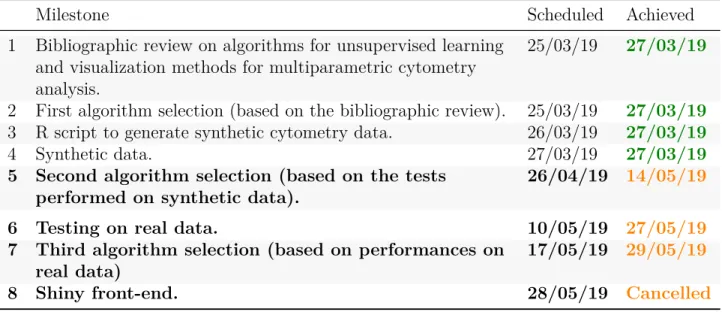
(13) 1.3.2.4. Algorithm benchmarking. The algorithm selection has been performed through three main steps: 1. Algorithm selection based on the literature 2. Testing selected algorithms for biological significance on generated synthetic data 3. Evaluation of computational complexity (CPU time) The use of synthetic data with has enabled testing the algorithms on controlled situations, making special attention to the detection of rare populations (<1%). Synthetic samples are based in real marker expression and simulate being spill-over compensated and pre-processed (i.e., cleaned from debris, dead cells and doublets). 1.3.2.5. Algorithm testing on real data. The selected algorithms have been tested on real multiparametric cytometry data obtained from IRSL experiments and pre-processed using FlowJo.. 1.4 1.4.1. Implementation and timetable Activities. Here below are listed the main activities planned for this project. 1. Bibliographic research on R packages for cytometry data processing. 2. Bibliographic research on algorithms for unsupervised learning and visualization methods for multiparametric cytometry data. 3. Bibliographic research on multiparametric cytometry data. 4. Selection of algorithms based on the literature. 5. Development of an R script that generates synthetic cytometry data. 6. Generation of synthetic cytometry data. 7. R script writing: Testing of selected algorithms and implementation on ‘R pipelines. 8. Selection of algorithms based on their performances on synthetic data. 9. Testing of selected algorithms with real data. 10. Selection of algorithms based on their algorithm performance (CPU time). 11. Final selection, correction and/or validation of the R pipeline(s) 12. Development of a Shiny front-end that implements the validated R pipeline(s). This list has been modified with respect to the initial Project Plan Proposal. In fact, it was first planned to make a third algorithm selection based on the CPU runtimes recorded with the synthetic data sets, just after activity 8. Arrived at that time point, it appeared inadequate to eliminate more algorithms while it was not known how would they perform with real data. Thus, the algorithms have been first tested with real data before performing any other selection. Both performance scores and time complexity have been taken into consideration for the final selection.. 9.
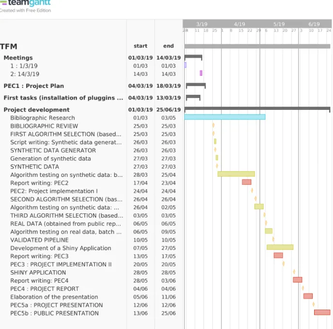
(14) 1.4.2. Timeline. The different activities and milestones had been scheduled ambitiously. Tasks and milestones were first delineated as indicated in Figure 1. This scheduled has been modified during the project development. Indeed, the modification on the planned activities mentioned above impacted on the milestone plan, which was modified in the Phase I Project Implementation Report (see Table 1). Nevertheless, this schedule has not been accomplished. The dates of achievement that have been sensibly delayed or postponed are indicated in orange. Table 1: Summary of Accomplishment: Milestones (Milestones scheduled for Phase II are indicated in bold). Milestone 1. Bibliographic review on algorithms for unsupervised learning and visualization methods for multiparametric cytometry analysis. 2 First algorithm selection (based on the bibliographic review). 3 R script to generate synthetic cytometry data. 4 Synthetic data. 5 Second algorithm selection (based on the tests performed on synthetic data). 6 Testing on real data. 7 Third algorithm selection (based on performances on real data) 8 Shiny front-end.. 1.4.2.1. Scheduled. Achieved. 25/03/19. 27/03/19. 25/03/19 26/03/19 27/03/19 26/04/19. 27/03/19 27/03/19 27/03/19 14/05/19. 10/05/19 27/05/19 17/05/19 29/05/19 28/05/19. Cancelled. Justification of delay. The task that has generated the main delay has been establishing an adequate method to evaluate algorithm performances. A first procedure was used with the algorithms tested on synthetic data and refined when the tests with real data began. In fact, the algorithm selection based on synthetic data (fifth milestone) was finished ahead of time (on 19/04/2019) and was performed again with the improved evaluation method, which is discussed in Chapter 3. Indeed, choosing adequate algorithms is the core of the project and it could not be overlooked. Delaying the establishment of the evaluation method and the test on synthetic data had consequences on the rest of the project, leading to postpone of the Shiny front-end. Although implementing a Shiny front-end would be quite useful for non-expert usability, it represented a less challenging work since the framework allows to easily glue straightforward code. Actually, the main products of this project have been the evaluation and benchmarking methods, the obtained performance measures and the final conclusions. 10.
(15) Figure 1: Gantt chart with the project schedule.. 11.
(16) It appears clear now that the initial objectives were too ambitious with such a constrained schedule for someone who has no experience with clustering algorithms nor script writing before starting this master’s courses. Nevertheless, the final objective, building a graphical front-end, must be kept in mind, as it has determined the choice of software and algorithms. The development of the graphical front-end is thus considered a future perspective instead of a specific objective of the Final Master’s Degree Project.. 1.5. Obtained products. 1.5.1. Bibliographic review. A bibliographic review has been performed in order to select R packages for cytometry data processing, unsupervised clustering algorithms and visualization techniques. 1.5.2. R script to generate synthetic data. A script for synthetic cytometry data generation has been developed in order to benchmark the selected algorithms in controlled conditions. 1.5.3. R scripts for real data pre-processing for algorithm benchmarking. With the finality to use real cytometry data as a reference to evaluate the performance of clustering algorithms, a script has been created. The script allows importing the gating strategies performed on FlowJo and labelling the cell examples accordingly. 1.5.4. R scripts for algorithm benchmarking. R scripts have been developed allowing to benchmark algorithms with different kinds of data: the generated synthetic data and real samples from 5 and 11-parameter experimental designs. A matching procedure has been developed in order to assign the predicted clusters to the reference populations. Algorithm performances are evaluated in terms of F1 score, number of predicted clusters, number of detected populations and computational time and recorded for further analysis. 1.5.5. Comparative study of clustering algorithms. The results obtained from benchmarking a selection of clustering algorithms are compared and discussed in this report.. 12.
(17) 1.6. Project structure. The project is structured through its main milestones and the tasks that have been performed to achieve them: • First selection of unsupervised clustering algorithms based on bibliographic review • Methods for performance evaluation • Second selection of unsupervised clustering algorithms based on testing on synthetic data • Comparative study of selected clustering algorithms • Discussion • Conclusions. 13.
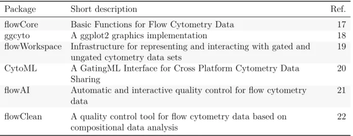
(18) 2. 2.1 2.1.1. First selection of unsupervised clustering algorithms based on bibliographic review Bibliographic research R packages for cytometry data processing. Bioconductor offers several packages performing basic tasks for cytometry data analysis. Table 2 gathers some of the most relevant ones. The package flowcore is the main core library providing tools for flow cytometry data management. Most of the flowCore functionalities have been tested and discussed by reproducing the examples included in its vignette. Code and comments are shared in the GitHub repository dedicated to this project at https: //github.com/plateforme-stlouis/RCyto. Table 2: R/Bioconductor packages for cytometry data processing Package. Short description. flowCore ggcyto flowWorkspace. Basic Functions for Flow Cytometry Data A ggplot2 graphics implementation Infrastructure for representing and interacting with gated and ungated cytometry data sets A GatingML Interface for Cross Platform Cytometry Data Sharing Automatic and interactive quality control for flow cytometry data. 17 18 19. A quality control tool for flow cytometry data based on compositional data analysis. 22. CytoML flowAI flowClean. 2.1.2. Ref.. 20 21. Algorithms for unsupervised learning and visualization methods for multiparametric cytometry data. An extensive bibliographic research on recent high-dimensional cytometry data analysis methods has been performed. The gathered references (that have not all been included in this report) can be consulted in a BibTeX file that is periodically updated and shared at the project’s GitHub repository. The main objective of this project has been selecting unsupervised clustering methods and visualization tools for high-dimensional cytometry data. Recent advances on this field include algorithms, methods and pipelines comprising a broad variety of techniques performing supervised or unsupervised clustering, meta-clustering, automatic partitioning and visualization. Table 3 summarizes the main aspects of a selection of methods performing unsupervised clustering, dimensionality reduction and/or data visualization. The summary is 14.
(19) extended on table 4, essentially with unsupervised clustering methods. Table 5 gathers other interesting methods and packages found in the literature that are beyond the scope of this project.. 15.
(20) Table 3: Dimensionality reduction, unsupervised clustering and/or visualization methods Main goal. Method. Language / Environment. Year. Downsampling Unsupervised learning methods. Number of clusters. Dimensionality t-SNE Reduction. C++, Matlab, Python, R. 2008 no. t-SNE. -. Dimensionality UMAP Reduction. R package. 2018. no. UMAP. -. Dimensionality viSNE Reduction. Matlab GUI (CYT), Cytobank online platform Standalone application. 2013 uniform, random. t-SNE. -. 16. Dim. reduction + clustering. Cytosplore +HSNE. Visualization + clustering. SPADE. R package from GitHub, Matlab, Cytobank online platform. 2011 densitydependent. hierarchical, agglomerative clustering. user-defined. Visualization + clustering. ACCENSE. 2013. t-SNE, k-means. user specifies a threshold p-value. Visualization + clustering. DensVM. Visualization + clustering. FlowSOM. Standalone application with graphical interface R package (cytofkit) from GitHub R package from Bioconductor. Visualization + clustering. X-Shift. Standalone application (Vortex) with graphical interface. 2016. t-SNE. 2015 no. selforganizing map (SOM). t-SNE map (2D scatter plot) UMAP map (2D scatter plot) t-SNE map (2D scatter plot) scatter plots. Comments. Ref.. 6. 8. 23. 24. Very high computational time compared to flowSOM (38, 39). 12. density-based t-SNE map partitioning (2D scatter plot) density-based t-SNE map partitioning + (2D scatter SVM plot) User can consensus nodes Significantly less define the hierarchical represented computational exact number metaclusteras star charts time than SPADE of clusters or ing or pie charts (38, 39) a maximum on a 2D grid, to try out MST or t-SNE graphs weighted Divisive KNN-DE + Marker Tree, detection of Forcelocal maxima directed + cluster layout merging (Mahalanobis distance). 25. multi-level hierarchy of non-linear similarities (k-NN) + (BH)-SNE. 2014. Visualization. Highly suitable for the analysis of massive high-dimensional data sets. 2017 no. densitydependent. Additional methods. MST (dendrogram). 26. 13. 16.
(21) Table 4: Unsupervised clustering methods Main goal. Method. Language / Environment. Year Unsupervised learning methods. Number of clusters. Clustering. flowClust. R package from Bioconductor. Clustering. flowMerge. R package from Bioconductor. user-defined or determined by BIC user-defined or determined by BIC. Clustering. FLAME. GenePattern online platform. 2009 multivariate t mixture models with Box-Cox transformation 2009 multivariate t mixture models with Box-Cox transformation + cluster merging 2009 multivariate skew t mixture model. Clustering. FLOCK. C source code, Java application SamSPECTRALR package from Bioconductor. 2010 Grid-based partitioning 2010 spectral clustering. automatic. Clustering. flowMeans. R package from Bioconductor. 2011. Clustering. flowPeaks. Clustering. SWIFT. R package from Bioconductor MATLAB GUI. Clustering. ImmunoClust. R package from Bioconductor. Clustering. PhenoGraph. Python, MATLAB GUI (CYT), R package (RPhenoGraph) from GitHub, R package (cytofkit) from GitHub. 2012 k-means + finite mixture model 2014 Gaussian mixture model-based clustering 2015 finite mixture model-based iterative clustering 2015. User can also specify a specific or a maximum number of clusters. automatic. Clustering. densityCut. R code available on Bitbucket. 2016. Clustering. ClusterX. R package (cytofkit) from GitHub. 2016. Clustering. k-means + merging of clusters. 17. automatic. automatic. automatic. Additional methods. Visualization. Comments. scatter plots, contour plots, image plots scatter plots, contour plots, image plots. First clustering step is performed on FSC_H/SSC-H Extension of flowClust. Ref. 27. 28. 2-tiered metaclustering (matching populations across samples) density-based partitioning Faithful Sampling data reduction. 3D projections, heatmaps scatter plots. 29. 30. scatter plots. 31. change point detection. scatter plots, contour plots, image plots. 10. density-based peak finding unimodal splitting and merging metaclustering. scatter plots. 11. histograms, scatter plots scatter plots. 32 33. k-NNG + Louvain graph partition algorithm. 14. k-NNG + local-maxima based clustering density-based partitioning. 34. t-SNE map (2D scatter plot). 9.
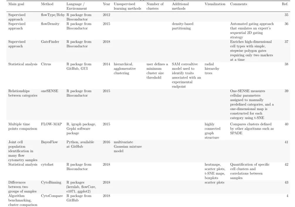
(22) Table 5: Other approaches and purposes. 18. Main goal. Method. Supervised approach Supervised approach. flowType/RchyOptimyx R package from Bioconductor flowDensity R package from Bioconductor. Supervised approach. GateFinder. R package from Bioconductor. 2018. Statistical analysis. Citrus. R package from GitHub, GUI. 2014. Relationships between categories. oneSENSE. R package from Bioconductor. 2015. Multiple time points comparison. FLOW-MAP. R, igraph package, Gephi software package. 2015. Python, available at GitHub. 2016 multivariate Gaussian mixture model. R package from Bioconductor. 2018. Joint cell BayesFlow population identification in many flow cytometry samples Statistical analysis cytofast. Language / Environment. Differences CytoBinning R packages between two (kernlab, flowCore, groups of samples e1071, ggplot2) Algorithm CytoCompare R package from benchmarking, GitHub cluster comparison. Year. Unsupervised learning methods. Number of clusters. Additional methods. Visualization. Comments. 2012. 35. 2015. 2018. 2018. Ref.. Automated gating approach that emulates an expert’s sequential 2D gating strategy Enriches high-dimensional cell types with simple, stepwise polygon gates requiring only two markers at a time. density-based partitioning. hierarchical, agglomerative clustering. user defines a minimum cluster size threshold. SAM correaltive model used to identify traits associated with an experimental endpoint. radial hierarchy trees. highly connected graph structure. 36. 37. 38. One-SENSE measures cellular parameters assigned to manually predefined categories, and a one-dimensional map is constructed for each category using t-SNE. 39. Compares clusters defined by other algoritnms such as SPADE. 40. 41. heatmaps, scatter plots, t-SNE maps, boxplots scatter plots. Quantification of specific cell clusters and correlations between samples. 42. 43. 4.
(23) 2.2. Selection of algorithms. Methods have been selected according the following criteria: 1. Exclude all methods not available on R. 2. Include dimensionality reduction methods. 3. Include unsupervised clustering methods. Informations provided in recent important reviews on the field [1,2] and algorithm benchmarking articles [3,5] have also been considered. Even though the reviews do not perform a proper benchmarking exercise, they give examples of some visualization techniques. Table 6 indicates which methods following our inclusion criteria have been explored in each article. Table 6: Recent reviews and benchmarking articles on high-dimensional cytometry data analysis Mair et al. Saeys, Van Weber and Kimball et al. 2016 [2] Gassen, and Robinson 2016 2018 [5] Lambrecht [3] 2016 [1] Type of article Method SPADE t-SNE PhenoGraph FlowSOM ClusterX flowClust flowMeans flowPeaks immunoClust SamSPECTRAL. Review. Review. Benchmarking article. Benchmarking article. X X X. X X. X. X. X X X X X X X X. X. X. After considering all this information, the methods detailed below have been selected as the most adequate for the IRSL Core Facilities. 2.2.1. Nonlinear dimensionality reduction techniques. Dimensionality reduction techniques aim to represent multidimensional data in a lower dimensional space. While linear dimensionality reduction methods, such as principal component analysis (PCA), aim to transform the data in a way that best preserves its variance, non-linear approaches search to represent the similarity found in the high-dimensional space. 19.
(24) Dimensionality reduction methods are used to visualize high-dimensional data in two or three dimensions. Additionally, they can be used as a pre-processing step before applying methods for supervised or unsupervised learning.. 1. t-SNE (t-Stochastic Neighbor Embedding) Developed by van der Maaten in 2008 [6], t-SNE is a widely used technique to illustrate and compare different gating, clustering and partitioning strategies on cytometry data. It is also used as previous step in some clustering methods such as ClusterX, ACCENSE or DensVM.. 2. UMAP (Uniform Manifold Approximation and Projection) A promising new technique proposed last year by McInnes, claiming better structure preservation and computational performances than t-SNE [7]. Becht and colleagues have tested it with single-cell (mass cytometry and RNA sequencing) data obtaining satisfactory results in terms of data visualization and computational times. Nevertheless, to our knowledge, UMAP has not been tested as a previous dimensionality reduction step for clustering algorithms applied to cytometry data. Furthermore, UMAP and t-SNE embeddings were used to train random forest models to predict Phenograph clusters’ identities leading to similar results [8]. Both t-SNE and UMAP methods have been used in this project as pre-processing clustering steps as well as visualizing methods post-clustering, easing the visualization and the understanding of the clustering results. 2.2.2. Clustering methods. 1. ClusterX: A density-based partitioning method This method is included in the Bioconductor package for mass cytometry data analysis named cytofkit. Its developers have created ClusterX from the Clustering by fast search and find of density peaks (CFSFDP) algorithm introducing modifications to reduce the computational time thanks to a Split-Apply-Combine strategy and automate the density peak detection by using generalized (extreme Studentized deviate) ESD test. ClusterX is able to manage up to 4 dimensions, further off, it can be conducted after a t-SNE dimensionality reduction step [9].. 2. Clustering methods based on the k-means algorithm: flowMeans and flowPeaks These methods are adapted from the k-means algorithm. Following the multidimensional clustering, flowMeans performs a merging step based on the Euclidean or Mahalanobis distances that allows to identify concave cell populations. It also includes a change point detection algorithm to determine the number of subpopulations [10].. 20.
(25) flowPeaks applies the k-means algorithm with a large K in order to find small clusters allowing the generation of a smoothed density function using the finite mixture model. The number of clusters is then determined by density-based peak finding [11] .. 3. Clustering methods with Minimum Spanning Tree visualization SPADE, developed in 2011 by Qiu and colleagues, is one of the main clustering and data visualization methods used nowadays (see table 6) [12]. Briefly, it performs hierarchical, agglomerative clustering after a density-dependent down-sampling step. Results are visualized on an MST dendrogram. In 2015, Van Gassen et al. published flowSOM, a method performing MSTs similar to those obtained with SPADE [13]. The main difference between these methods relies on the clustering algorithm. flowSOM uses self-organizing maps (SOM), which do not require any down-sampling step. This might be the reason for flowSOM achieving remarkably better performance scores and run times than SPADE in all the tests realized by Weber and Robinson [3]. For these reasons, only flowSOM will be tested as MST-producing method.. 4. PhenoGraph PhenoGraph is nowadays one of the most used partitioning methods for cytometry data. It was developed for high-dimensional cytometry data by Levine and colleagues in 2015 [14]. It has the ability to partition high-dimensional single-cell data with no need of previous clustering nor dimensionality reduction steps. Briefly, the high-dimensional space is modelled using a weighted nearest-neighbor graph (NNG) that is then partitioned using the Louvain community detection method. Importantly, the NNG is constructed in two iterations, namely using the Jaccard similarity coefficient in the second iteration. This should help distinguish small cellular subsets from noise. Even though in the tests performed by Weber and Robinson to detect rare populations (0.03% and 0.8%) PhenoGraph does not achieve particularly good F1 scores (0.498 and 0.229, respectively), Kimball et al. point out that PhenoGraph can be an interesting tool to identify novel phenotypic subtypes [3,5].. 3 3.1. Methods for performance evaluation F1 score. In order to give guidance on the newly emerging analysis methods for multidimensional flow cytometry data analysis, the Flow Cytometry: Critical Assessment of Population Identification Methods (FlowCAP) consortium has organized four different challenges from 2010 to 2014. In the first challenge (FlowCAP-I) the ability of unsupervised methods to reproduce expert manual gating was evaluated [15]. Methods were compared using the F1 score, a widely used performance measure that combines precision and recall using the harmonic mean. The F1 21.
(26) score ranges from 0 (worst performance) to 1 (best precision and recall scores). Precision, or positive predictive value, is the proportion of predicted positive examples that are truly positive, whereas recall, which is also known as sensitivity or true positive rate, measures the proportion of truly positive examples that are correctly classified. Thus, the F1 score is built from the confusion matrix. The computation of the F1 score requires comparing the clustering results to a labelled reference. For the synthetic data generated in this study there is no need of gating as the examples have been created according specific phenotypic patterns and are thus already labelled. For the real data, the labels are created by manual gating with FlowJo. Afterwards, for both synthetic and real data approaches, it is necessary a procedure to assign predicted clusters to cell labels: the matching procedure. 3.1.1. Matching procedure. In FlowCAP-I, the F1 score was calculated for all the possible combinations of predicted clusters and reference populations. Each population was then assigned to the cluster giving the highest F1 score, i. e., the F1 scores were maximized individually [15]. This method allowed a cluster to be assigned to multiple reference populations, a problem that was solved by Samusik et al in 2016: by using the Hungarian assignment algorithm, it was the sum of F1 scores that was maximized, limiting the clusters to be assigned to no more than one population [16]. In this work, two different matching procedures have been considered. In order to illustrate them, the clustering result obtained with RPhenograph on one of the synthetic data sets generated for this study will be used as example. The methodology used to generate synthetic data will be explained in detail in Chapter 4.1. In this example, RPhenograph has predicted 18 clusters for a data set containing 50,000 cells divided on 11 populations (labels): (t <- table(clustering, labels)) labels clustering B 1 0 2 0 3 32 4 0 5 1 6 0 7 0 8 0 9 0 10 0 11 0. NK 0 0 0 8 0 0 1 0 0 0 0. T4 T8 NKT_NN NKT_4 NKT_8 30 0 0 0 0 2743 1 0 0 0 0 0 1 0 0 0 0 959 4 3 131 26 10 0 0 11 0 4 217 0 5 8702 0 0 16 3078 0 0 6 0 0 18 8 0 731 3643 0 0 1 0 2985 1 0 1 0 22. U1 9 0 0 0 21 0 1 0 0 0 0. U2 U3 356 0 1 12 0 9 0 13 0 3116 0 0 0 51 0 0 0 1 2 0 5 2. U4 0 0 975 0 9 0 1 0 0 1 0.
(27) 12 0 2953 0 13 0 0 2668 14 7445 0 0 15 0 0 3057 16 22 38 0 17 0 0 1433 18 0 0 2216 3.1.1.1. 0 0 0 0 1 1 0. 15 0 0 1 2 0 0. 0 7 0 14 0 0 0. 0 18 0 1 0 33 0 0 0 2042 0 0 0 0. 0 5 0 0 5 0 1. 0 13 0 5 12 8 8. 0 0 14 0 0 0 0. First matching procedure. In the first matching procedure, a maximum of one cluster is assigned to one reference population. As the generated synthetic data simulates a simplified flow cytometry data set, the method used to assign clusters to partitions has also been simplified. Instead of maximizing the F1 score, only the number of true positives has been maximized. In other words, the procedure finds the most representative cluster for each population: # Finding and sorting column maximums: max_values <- apply(t, 2, max) (sorted_max_values <- sort(max_values)) NKT_4 217 T8 8702. U2 356. NKT_8 NKT_NN 731 959. U4 975. U1 2042. NK 2953. U3 3116. T4 3643. B 7445. The maximums will be assigned sequentially. Sorting them from smaller to higher assures that, in the case that more than one population find its maximum on the same cluster, the population with a higher number of assigned examples will prevail. # Finding the maximum number of each cell type (columns) # on each cluster (rows): (m <- apply(t, 2, which.max)) B 14 U4 3. NK 12. T4 10. T8 NKT_NN 7 4. NKT_4 6. NKT_8 9. U1 16. U2 1. U3 5. For instance, the cluster 10 is assigned to the label T4. On the contrary, the cluster 2 owns 2743 T4 cells that have not been assigned. In this case there are 7 clusters (18 clusters - 11 populations) that have not been assigned. However, all the examples must be assigned to a label in order to compute the confusion matrix. Hence, the label unknowns is introduced.. 23.
(28) # Creating a list with n unknowns matched_preds <- rep("unknown", length(clustering)) # Replacing the numbers of the clusters by the names of the cell types: for(i in 1:length(clustering)){ for(j in 1:length(levels(labels))){ # number of populations # we compare to the sorted maximum values: if(clustering[i] == m[names(sorted_max_values)[j]]){ matched_preds[i] <- names(sorted_max_values)[j] } } } # Factorize matched predictions including the "unknown" level matched_preds_1 <- factor(matched_preds, levels = c(levels(labels), "unknown")) summary(matched_preds_1) B 7492 U3 3314. NK T4 2986 3647 U4 unknown 1017 18273. T8 8777. NKT_NN 987. NKT_4 232. NKT_8 758. U1 2122. U2 395. 18273 unmatched cells have been classed as unknowns. The confusion matrix can now be computed: # Adding the label "unknown" to the labels: all_labels <- labels levels(all_labels) <- c(levels(labels), "unknown") (confusionMatrix(data = matched_preds_1, reference = all_labels))$table Reference Prediction B NK B 7445 0 NK 0 2953 T4 0 0 T8 0 1 NKT_NN 0 8 NKT_4 0 0 NKT_8 0 0 U1 22 38 U2 0 0. T4 0 0 3643 5 0 11 0 0 30. T8 NKT_NN NKT_4 NKT_8 0 0 0 0 0 15 0 0 0 0 1 0 8702 0 0 16 0 959 4 3 0 4 217 0 18 8 0 731 1 2 0 0 0 0 0 0 24. U1 33 18 0 1 0 0 0 2042 9. U2 0 0 2 0 0 0 0 5 356. U3 0 0 0 51 13 0 1 12 0.
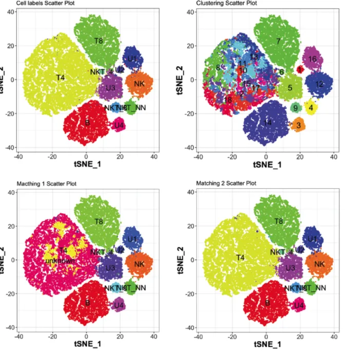
(29) U3 1 0 131 U4 32 0 0 unknown 0 0 18180 Reference Prediction U4 unknown B 14 0 NK 0 0 T4 1 0 T8 1 0 NKT_NN 0 0 NKT_4 0 0 NKT_8 0 0 U1 0 0 U2 0 0 U3 9 0 U4 975 0 unknown 0 0. 26 0 3. 10 1 1. 0 0 28. 0 0 0. 21 0 1. 0 0 12. 3116 9 48. In this case, the B cells have been correctly assigned, but most of the T4 cells have been classed as unknowns. 3.1.1.2. Second matching procedure. In both the FowCAP-I challenge and the work of Samusik using the Hungarian assignment algorithm, the objective was to evaluate methods for automatic gating. It made sense performing one-to-one assignments, i. e., assigning one population to only one cluster [15,16]. However, the present study aims to evaluate exploratory procedures making special attention to rare populations. This is no without cost: algorithms finding small populations will tend to split the largest ones. It is therefore assumed that populations can be predicted by more than one cluster and that results will require validation. Therefore, instead of choosing the cluster giving a better F1 score or a greater number of true positives, all the clusters matching for the same population will be merged and the F1 score will be calculated for the merged clusters. The matching procedure has thus been modified as follows. 1. Each cluster will be assigned to the population for which it contains a higher number of cells. Several clusters can be assigned to the same label. There will be no unknowns. # Finding the cell population (columns) # with a higher number of cells for each cluster (rows): (m <- apply(t, 1, which.max)) 1 9. 2 3 3 11. 4 5 5 10. 6 6. 7 4. 8 3. 9 10 11 12 13 14 15 16 17 18 7 3 3 2 3 1 3 8 3 3 25.
(30) Here, the first row indicates the cluster numbering, and the second row is the population label. For example, the label B (1) is assigned to the cluster 14. In this case, the population 3 (T4) has been split in 8 clusters, as it can be appreciated in the following table. table(m) m 1 1. 2 1. 3 8. 4 1. 5 1. 6 1. 7 1. 8 1. 9 10 11 1 1 1. In this case, population 3 (T4) has been split in 8 clusters. 2. Matching cell labels and clusters: # Empty list matched_preds <- rep("NA", length(clustering)) # Replacing the numbers of the clusters by the names of the cell types: for(i in 1:length(clustering)){ for(j in 1:length(m)){ # Number of predicted clusters if(clustering[i] == names(m)[j]){ matched_preds[i] <- levels(labels)[m[[j]]] } } } # Factorize matched predictions matched_preds_2 <- factor(matched_preds, levels = levels(labels)). 3. Computing the confusion matrix: (confusionMatrix(data = matched_preds_2, reference = labels))$table Reference Prediction B NK T4 B 7445 0 0 NK 0 2953 0 T4 0 0 21823 T8 0 1 5 NKT_NN 0 8 0 NKT_4 0 0 11 NKT_8 0 0 0. T8 NKT_NN NKT_4 NKT_8 0 0 0 0 0 15 0 0 3 1 29 0 8702 0 0 16 0 959 4 3 0 4 217 0 18 8 0 731. 26. U1 33 18 1 1 0 0 0. U2 0 0 14 0 0 0 0. U3 0 0 48 51 13 0 1.
(31) U1 U2 U3 U4. 22 38 0 0 1 0 32 0 Reference Prediction U4 B 14 NK 0 T4 1 T8 1 NKT_NN 0 NKT_4 0 NKT_8 0 U1 0 U2 0 U3 9 U4 975. 0 30 131 0. 1 0 26 0. 2 0 10 1. 0 0 0 0. 0 0 0 0. 2042 9 21 0. 5 356 0 0. 12 0 3116 9. The 18180 T4 cells previously classed as unknowns by the first matching procedure are now included in the partition matched to the T4 cells label (3643 + 18180 = 21823). 3.1.1.3. Visualization. In order to visualize labels, predictions and matching results with single cell resolution, data (which is five-dimensional) is reduced to two dimensions using the t-SNE algorithm and mapped onto scatter plots (Figure 2). Original cell labels (ground truth), predicted clusters and partitions resulting from the two matching procedures are indicated. It can be observed that the first matching procedure (bottom left) classes most of the T4 cells (upper left, yellow) as unknowns (pink). 3.1.2. Mean F1. The F1 score for each population has been calculated using the partitions matched with the second procedure. Afterwards, the F1 scores will be averaged in order to obtain a global performance score. In the FlowCAP-I study, the F1 scores are normalized by the size of the population. The sum of the normalized scores produces an F1 measure. As the size of the populations is referred to all the reference populations, whether they have been detected by the clustering algorithm or not, the final F1 measure computation penalizes the fact of missing populations [15]. In the benchmarking article from Weber and Robinson, the F1 scores are averaged without weights, considering equally important small and large populations [3]. As the present study aims to. 27.
(32) Figure 2: t-SNE mapping of the original five-dimensional data. Data points are colored according reference cell labels (upper left), the RPhenograph clustering (upper right), and the partitions resulting from the two matching procedures (bottom).. 28.
(33) select algorithms particularly able to detect rare populations, the mean F1 scores have also been computed unweighted. 3.1.2.1. Fewer clusters than populations. In the first algorithm benchmarking approach using synthetic data, the fact of missing populations has been penalized as in the FlowCAP-I study by according the undetected reference populations with an F1 score of zero. On the contrary, for the subsequent benchmarking on real cytometry data, only the detected populations have been taken into consideration to compute the mean F1 score. This change of criterium is due to the fact that with the synthetic data, the algorithms that accept specifying number of clusters as a parameter have been run asked to find the exact number of reference populations, whereas with the real data it has been analyzed the fact of performing a clustering asking to find fewer clusters than reference populations. Besides, the tests performed with real data have been analyzed more in detail, paying attention to the number of clusters detected. The mean F1 score computed for the real data tests, thus, does not indicate the global algorithms’ ability to identify the different populations, but the overall degree of accuracy for the detected populations. 3.1.2.2. Outliers. The synthetic samples produced in this project do not contain any outlier or unknown cell: all the examples are assigned to a cell label. However, manually gating real data can produce outliers, including extremely different examples: cells with atypical marker expressions, intermediate forms or experience artefacts. Thus, algorithms are not expected to detect a common pattern in this group of examples. Nevertheless, outliers should not be excluded from the data sets in order to test algorithm performances in real conditions. Therefore, the outliers have been maintained to feed the clustering algorithms but excluded before building the confusion matrix.. 3.2. CPU time. Running user times have been recorded as a measure of computational complexity. All the tests have been performed in the same machine, a MacBook Pro with an Intel Core i7 processor and 16 GB of RAM.. 29.
(34) 4. 4.1. Second selection of unsupervised clustering algorithms based on testing on synthetic data Clustering algorithms. The algorithms selected based on the bibliographic review are listed in Table 7, indicating whether they have been used with high-dimensional and/or dimensionality-reduced data, and whether there is a possibility to indicate the number of desired clusters. ClusterX cannot be applied to data with more than four dimensions, thus, a dimensionality reduction step is required. FlowSOM and RPhenograph algorithms are designed to cluster highdimensional data, the former by building self-organizing maps and the latter by measuring distances in a k-Nearest Neighbor graph. It does not seem useful to reduce the data before applying these algorithms. The methods based on the k-means algorithm, flowMeans and flowPeaks, do not need any previous dimensionality reduction step neither, but have been used to test whether non-linear dimensionality reduction is useful to improve their clustering performances. Two different techniques for dimensionality reduction have been tested: t-SNE and UMAP.. Method. Table 7: First selected clustering algorithms HighDimensionality- Number of clusters dimensional reduced data data. 1 2 3. FlowSOM RPhenograph flowMeans. X X X. 4 5. flowPeaks ClusterX. X. 4.2. X. X X. User-defined Cannot be specified User can indicate a maximum number of clusters Cannot be specified Cannot be specified. R script to generate synthetic data. An R Markdown script has been developed in order to generate controlled synthetic data. Each run produces a sample with 11 populations defined by 5 markers according to real data. Marker expression values follow normal distributions. The following chapters summarize the main aspects of the script, that is available on the GitHub repository dedicated to this project.. 30.
(35) 4.2.1. Parameters. The script takes as parameters: • The name of the synthetic sample • The number of cells • A random seed Additional information can be modified in the first chunk: • • • •. Mean and SD for the negative (“low”) markers Mean and SD for the positive (“high”) markers Table of phenotypes Percentage of cells per population. This information is exported to be used to evaluate algorithm performances.. A phenotype table is built indicating the expression level pattern for each cell type, as in this example: B <- c("CD3" = "low", "CD4" = "low", "CD8" = "low", "CD56" = "low", "CD19" = "high"). 4.2.2. Sample generation. The procedure is based in three steps: • Values are generated according the phenotype table using the rnorm() function in order to follow a normal distribution. • Synthetic cell values are randomly rearranged in order to simulate a real sample. • Cells labels are exported in order to be used to evaluate algorithm performances. Below is shown the core of the script: # creating the dataframe set.seed(params$seed) for(i in (1:length(cells))){ # i takes values [1, number of CELL TYPES] # For cell type i, repeat its name as many times as the number of cells c <- rep(cells[i], ns[i]) # One column will be created for every marker with intensity values for(j in (1:length(markers))){ if(pheno[i,j] == "low"){ p <- rnorm(ns[[i]], mean = neg_mean, sd = neg_sd) }else{ p <- rnorm(ns[[i]], mean = pos_mean, sd = pos_sd) } # all the columns (one per marker) are joined: # convert the "c" list as data frame # to preserve numeric "p" values after cbind-ing 31.
(36) c <- cbind(as.data.frame(c), p) } if(i==1){ # Values for the first cell type start to fill the dataframe "pop" pop <- c }else{ # Values for the other cell types are joined to "pop" pop <- rbind(pop, c) } } # Name the variables: names(pop) <- c("cells", markers). #### REARRANGING # Randomly sampling set.seed(42) x <- sample(1:n, n, replace = F) pop <- pop[x,] # Rearranging the dataframe rownames(pop) <- 1:n # Renaming the rows (in order). # Save the column with the cell labels to a file saveRDS(pop$cells, paste("labels", params$pop_number, Sys.Date(), sep = "_")) head(pop). 1 2 3 4 5 6. cells U2 U3 T4 NKT_NN T4 T4. 4.2.3. CD3 CD4 CD8 CD56 508.589 4962.590 928.24123 -208.6189 3452.062 -2542.275 -729.86929 -181.6612 4152.289 5555.634 714.79808 -227.0640 5818.124 -1460.082 1104.66106 6156.4867 4398.932 4267.739 -639.52833 522.0184 3223.760 4304.875 -86.19721 -747.4541. CD19 -579.0167 -181.8577 -734.4824 330.6812 204.6559 2552.5026. Conversion to FlowFrame class objects. The data frame is stored as an object of class flowFrame. This is the format used by flowCore to manage FCS (Flow Cytometry Standard) files.. 32.
(37) library(flowCore) ff <- new("flowFrame", exprs = as.matrix(pop[,-1])) Marker expression can be visualized using the tools provided by the package ggcyto for cytometry data: library(ggcyto) autoplot(ff, markers[1], markers[5]). CD19 CD19. anonymous. 5000. 0. 0. 5000. CD3 CD3. autoplot(ff, markers[1]) anonymous. density. 2e−04. 1e−04. 0e+00 0. 5000. CD3 CD3. 4.2.4. Export to .fcs. Finally, a synthetic FCS data file is exported.. 33.
(38) write.FCS(ff, paste("ff_", params$pop_number, "_", Sys.Date(), ".fcs", sep = "")). 4.3. Synthetic data generated for algorithm benchmarking. Eight synthetic samples have been generated according to the following parameters: • • • •. 11 populations 5 markers Mean for negative (low) markers: 50 Mean for positive (high) markers: 5000. The 11 phenotypes are created according the expression patterns indicated in Table 8. Table 8: Phenotypes CD3 CD4 CD8 CD56. CD19. B low NK low T4 high T8 high NKT_NN high. low low high low low. low low low high low. low high low low high. high low low low low. NKT_4 NKT_8 U1 U2 U3. high high low low high. high low low high low. low high low low low. high high low low low. low low low low low. U4. high. low. low. low. high. Cell number, standard deviations and cell type proportions have taken different values in function of the conditions indicated in Table 9. Table 9: Parameters used for synthetic sample generation SD percenteages n Condition Condition Condition Condition. 1 2 3 4. 500 1000 1000 1000. equal equal different different. 10000 10000 10000 50000. In conditions 3 and 4, the generated samples are composed of populations in different percentages according a real sample, as indicated in Table 10.. 34.
(39) B 15. %. NK 6. T4 44. Table 10: Cell populations percentages T8 NKT_NN NKT_4 NKT_8 U1 17.5 2 0.5 1.5 4.25. U2 0.75. U3 6.5. U4 2. Each condition has been used to generate two different samples by using two different random seeds, resulting in 8 final samples. Samples are identified with the number of the condition and the letters “A” or “B” for the different random seeds. For example, sample “2 B” has been generated with condition 2 and second seed (B).. 4.4. Algorithm benchmarking script. An Rmd script has been written and used to test the selected methods with the generated samples. The same script includes all the methods and is run one at a time for every sample. The script is available at the project repository. The main aspects of the procedure are indicated below. 4.4.1. Random seeds. Algorithms requiring a random start (FlowSOM, t-SNE and UMAP) have been tested five times with different random seeds in order to test their reproducibility. 4.4.2. Number of clusters. All the synthetic samples produced to benchmark the clustering algorithms contain 11 populations. FlowSOM does not determine automatically the number of clusters; it must be specified by user. There is also the option of choosing a maximum number of clusters to be tested, but it is not recommended [3]. The flowMeans method determines the number of clusters automatically, but the user has the option to indicate a maximum number of clusters. These algorithms have been run asked to find exactly or a maximum of 11 clusters, respectively. flowMeans has always produced the maximum number of clusters indicated with the tested synthetic samples (Figures 5 and 8). 4.4.3. Functions. The matching procedure and the computation of the mean F1 score are performed through functions according the methodology discussed in Chapter 3. 4.4.3.1. Matching procedure. This procedure allows merging the clusters that match to the same reference population into the same partition. 35.
(40) matching <- function(prediction, labels){ # cross table t <- table(prediction, labels) # Finding the cell population (columns) # with a higher number of cells for each cluster (rows): m <- apply(t, 1, which.max) # Empty list matched_preds <- rep("NA", length(prediction)) # Replacing the numbers of the clusters by the names of the cell types: for(i in 1:length(prediction)){ for(j in 1:length(m)){ # Number of predicted clusters if(prediction[i] == names(m)[j]){ matched_preds[i] <- levels(labels)[m[[j]]] } } } # Factorize matched predictions matched_preds <- factor(matched_preds, levels = levels(labels)) matched <- list("preds" = matched_preds, "m" = m, "t" = t) return(matched) }. 4.4.3.2. Computing the mean F1. In this case, the F1 scores for the undetected populations are fixed at zero and taken into account for the F1 average. mean_f1 <- function(cm, c){ # Extracting the F1 values f1_list <- cm$byClass[,"F1"] # replacing NAs by zero f1_list[is.na(f1_list)] <- 0 return(mean(f1_list[1:c])) }. 4.4.4. Clustering. Each method is performed using the matching() and mean_f1() functions as in this example: 36.
(41) pred <- flowMeans(ff@exprs, MaxN = c ) # Macth labels and predictions (cell level) matched <- matching(pred@Labels[[1]], labels) # Storing the results flowmeans_pred <- matched$preds # COMPUTING THE CONFUSION MATRIX AND OTHER PERFORMANCE MEASUREMENTS # store and print print(matched$t) (flowmeans_cm <confusionMatrix(data = matched$preds, reference = labels))$table # COMPUTE THE MEAN F1 flowmeans_F1 <- mean_f1(flowmeans_cm, c) The intermediate cross tables and the confusion matrices are printed for the html documents generated with the Knit package. The confusion matrix elements produced by the confusionMatrix() function from the package caret (that include the F1 scores for all the populations) and the computed mean F1 scores are recorded for further analyses.. 37.
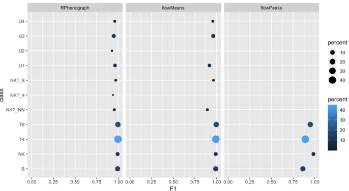
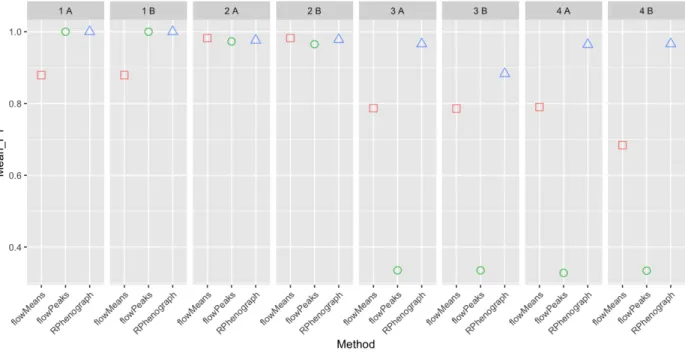
(42) Figure 3: F1 scores obtained for sample “3 A” for all the cell types using RPhenograph, flowMeans or flowPeaks. Dot sizes and coloring both indicate populations’ frequencies. Missing points on a row indicate undetected populations.. 4.5. Evaluation of performance. 4.5.1. Methods without random start. The clustering algorithms RPhenograph, flowMeans and flowPeaks do not need any random start. Thus, each method has been tested for each sample only once. Figure 3 shows the F1 scores computed for a sample generated with the condition 3 (sample “3 A”) using these methods. RPhenograph makes good predictions for all the populations. flowMeans fails to detect the smallest populations (U2 and NKT_4). Finally, flowPeaks fails to detect all populations below 6%. This analysis has been performed for the four synthetic sample types in duplicate. The mean F1 has been computed for every method and sample. This enables performing a global comparison but lacks the detail for the specific populations. On Figure 4.5.1, mean F1 values obtained with the methods without random start are compared. It can be appreciated that changing the cell type proportions (conditions 3 and 4) reduces dramatically the global performances. RPhenograph is the only method that keeps producing good scores in these circumstances. Thus, flowMeans and flowPeaks methods (without previous dimensionality reduction) will be discarded.. 38.
(43) Figure 4: Mean F1 scores for all the samples generated using RPhenograph, flowMeans or flowPeaks. Figure 5 gives important additional information about RPhenograph performances. In this graph, mean F1 scores are related to the number of detected clusters. For flowMeans it has been specified to limit the number of clusters to 11. As it happened with sample “3 A” (Figure 3), flowPeaks only predicts 4 clusters for the samples generated according conditions 3 and 4, drastically decreasing the F1 score (Figure . RPhenograph achieves good F1 scores, but it can be seen here that it is not without cost: increasing the samples complexity (conditions 3 and 4) also increases the number of detected clusters (15-19). 4.5.2. Methods with random start. FlowSOM clustering method and dimensionality reduction techniques t-SNE and UMAP use a random start. The F1 scores obtained with these methods are plotted as box plots in order to see their reproducibility. Five different random starts have been used. Figure 6 shows the results obtained with the sample “3 A”. A huge dispersion is observed with the methods using flowMeans, meaning that this partitioning method (that does not use any random start) would be extremely sensitive to changes on the t-SNE and UMAP maps. On the contrary, flowPeaks partitioning is highly reproducible after UMAP dimensionality reduction. Nevertheless, this algorithm fails to detect the rarest populations (U2 and NKT_4), whether it is performed following t-SNE or UMAP dimensionality reduction. ClusterX algorithm is also very reproducible. It fails to detect the NKT_4 population when it is applied following 39.
(44) Figure 5: Mean F1 scores for all the samples (4 conditions performed in duplicate) related to the number of predicted clusters obtained using RPhenograph, flowMeans or flowPeaks. Dotted lines indicate the number of populations (ground truth). t-SNE but finds all the populations after UMAP dimensionality reduction. FlowSOM also manages to detect all the cell populations, but with some more variability on the small populations (<6%). Figure 7 shows the mean F1 values obtained for the random start methods with five different seeds. Again, increasing the sample complexity by including populations with extremely different frequencies decreases the overall performances. flowMeans is definitely giving poor results for these samples and will thus be discarded. On the other hand, flowPeaks is potentially interesting, particularly after UMAP dimensionality reduction, as it gets improved when the total number of cells increases (condition 4 vs condition 3). In fact, condition 4 samples contain 50,000 cell examples; it is possible that this algorithm performs better with samples having a higher number of cells, which is often the case. On the other hand, ClusterX does not seem to be affected by the sample size and tends to give better performances when it is conducted after UMAP dimensionality reduction. In fact, UMAP + ClusterX method achieves equivalent or even better performances than FlowSOM, an algorithm that generates good mean F1 values in all conditions. Finally, graphs on Figure 8 give information about the number of predicted clusters, which has been fixed to 11 in FlowSOM and to a maximum of 11 in flowMeans. It can be observed that with flowPeaks, both F1 scores and the number of predicted clusters get improved as the sample size increases. Following UMAP, flowPeaks produces better and more reproductible predictions. ClusterX performs clearly better following UMAP. As it can be seen, following tSNE, ClusterX produces similar mean F1 scores for conditions 3 and 4 samples. Nevertheless, 40.
(45) Figure 6: F1 scores obtained for sample “3 A” for all the cell types using flowSOM and the dimensionality reduction algorithms t-SNE and UMAP followed by flowMeans or flowPeaks clustering methods. Coloring indicates the populations’ frequencies. n = 5 random starts for every method.. 41.
(46) Figure 7: Mean F1 scores for all the samples generated using flowSOM and the dimensionality reduction algorithms t-SNE and UMAP followed by flowMeans, flowPeaks or ClusterX clustering methods. n = 5 random starts for every method.. 42.
(47) increasing the sample size (condition 4) dramatically increases the number of predicted clusters. On the contrary, when ClusterX is conducted following UMAP dimensionality reduction, the number of predicted clusters is closer to the ground truth and is not affected by the sample size. Moreover, better mean F1 scores are achieved with the largest samples.. 4.6. Conclusions. Synthetic samples have been evaluated using a matching procedure that does not penalize the splitting of populations and taking into consideration the number of predicted clusters. The following methods have been selected to be tested with real data: • • • •. flowSOM RPhenograph UMAP + flowPeaks UMAP + ClusterX. 43.
(48) Figure 8: Mean F1 scores for all the samples (4 conditions performed in duplicate) related to the number of predicted clusters obtained using flowSOM and the dimensionality reduction algorithms t-SNE and UMAP followed by flowMeans, flowPeaks or ClusterX clustering methods. n = 5 random starts for every method. Dotted lines indicate the number of populations (ground truth).. 44.
Figure
+7

Documento similar