A Taxonomy-Based
Usability Study
of an Intelligent
Speed Adaptation Device
David Alonso-Ríos,
Eduardo Mosqueira-Rey
Vicente Moret-Bonillo
University of A Coruña, A Coruña, Spain
Usability studies are often based on ad hoc definitions of usability. These studies can be difficult to generalize, they might have a steep learning curve, and there is always the danger of being inconsistent with the concept of usability as defined in standards and the literature. This alternative approach involves comprehen-sive, general-purpose, and hierarchically structured taxonomies that follow closely the main usability literature. These taxonomies are then instantiated for a specific product. To illustrate this approach, a usability study for a prototype of an Intelligent Speed Adaptation device is described. The usability study consists of usability requirements analysis, heuristic evaluation, and subjec-tive analysis, which helped identify problems of clarity, operability, robustness, safety, and aesthetics. As a context-specific usability taxonomy for this particular field of application happened to exist, the way that real-world usability results can be mapped to that taxonomy compared to the taxonomy in this article is examined, with the argument that this study’s taxonomy is more complete and generalizable.
1. INTRODUCTION
Usability studies are often based on ad hoc definitions of usability. By “ad hoc” we mean “created for a specific purpose at a particular time.” These usability studies can be difficult to generalize, might have a steep learning curve, and there is always the danger of being inconsistent with the concept of usability as defined in standards and the literature. This article, on the other hand, describes how usability studies can start from comprehensive, general-purpose, and hierarchically structured taxonomies that can be later applied to a specific product.
We illustrate our approach with a particular case study: a pro-totype of an Intelligent Speed Adaptation (ISA) device called CARAT (Continuous Assessment of Road ATtributes) counter. Both the CARAT counter and our usability study are part of a broader research project called Galileo Speed Warning (GSW), which proposes a reward-based alternative to traditional speed enforcement systems that are typically punitive (“CARATs for Safe Drivers,”2009).
The usability activities carried out for the project were as follows: usability requirements analysis, heuristic evaluation, and subjective analysis. All these activities were supported by the taxonomies just mentioned, which facilitated the identifica-tion and classificaidentifica-tion of usability problems and requirements related to aspects such as clarity, consistency, universality, efficiency, robustness, security, and subjective satisfaction.
This article also discusses the validity of our approach as such. To do this, we compare our general-purpose approach with the opposite—that is, one based on context-specific usability taxonomies. As our taxonomies are applicable to any kind of product, it is not necessarily guaranteed that an ad hoc taxonomy will exist for the particular area under study. However, a context-specific usability taxonomy hap-pened to exist for this area (i.e., in-vehicle information sys-tems). We mapped real-world usability results to both kinds of taxonomies (i.e., ours and the context-specific one) and argue that ours is more complete and generalizable.
The article is structured as follows. We begin by providing some background on the role of usability definitions in the study of usability. This is followed by a summary of the attributes of our usability taxonomy. We then describe our particular field of application, namely, the concept of speed adaptation, and the purpose of the CARAT counter. Next, we explain the activities in our usability study of the CARAT counter and the results obtained. We finish with a discussion, some conclusions, and plans for future work.
2. BACKGROUND
2.1. The Role of Usability Definitions in the Study of Usability
applications; and Raza, Capretz, and Ahmed (2012) on open source software.
Regardless of the field of application, all usability studies and methodologies are, consciously or not, based on a particu-lar interpretation of the concept of usability. Currently, the most popular usability definition is the one given by ISO 9241-11 (1998), which defines usability as “the extent to which a prod-uct can be used by specified users to achieve specified goals with effectiveness, efficiency and satisfaction in a specified con-text of use” (p. 2). Effectiveness, in turn, is defined as “the accuracy and completeness with which users achieve specified goals,” efficiency as the “resources expended in relation to the accuracy and completeness with which users achieve specified goals,” and satisfaction as the “freedom from discomfort and positive attitudes towards the use of the product.” ISO 9241-11 was recently replaced by ISO FDIS 9241-210 (2010), part of a comprehensive standard that includes 28 substandards relating to every area of human interaction. However,
all of the standards are generic, non-specific, and oriented toward a process for involving users in the development of interfaces. This approach, while useful, ignores the characteristics of usability and, as a result, is too abstract to guarantee any usability outcomes. (Conger,2011, p. 16)
This vagueness motivates researchers and practitioners to pro-duce their own definitions of usability. For example, after examining the ISO 9241-11 classification, Hu and Chang (2009) argued that if only
effectiveness, efficiency, and satisfaction are measured, the dif-ferent specific aspects of usability problems related to a goal-task’s human-tool interaction process cannot be reflected in the final usability evaluation so that the final usability evaluation appears to be too abstract and empty. (p. 135)
These deficiencies tend to be compensated for by borrowing concepts from other usability definitions, metrics, and so on, and grafting them into the main usability definition. However, this can easily lead to oversights, redundancy, or contradictions. On the other hand, we argue that starting from a compre-hensive and clearly defined conceptualization of usability would facilitate usability activities in several ways:
• Meaningful (as opposed to vague) concepts can be understood by all the participants in the usability activ-ities. This helps to bridge the gap between general usability requirements and specific solutions.
• Hierarchically structured concepts facilitate scalability and the estimation of the complexity and the number of usability aspects that need to be studied.
• Definitions make it possible to reach a common under-standing of the meaning of the factors whose usability needs to be analyzed, which is indispensable not only among the participants in the usability activities but also among the rest of the members of the project or future stakeholders.
2.2. Proposed Usability and Context-of-Use Taxonomies Our previous work in the field of usability includes the defi-nition of a usability taxonomy that aims to synthesize the most prominent classifications in the literature. This was motivated by researching the usability literature and finding a lack of con-sensus on the meaning of the term and a certain vagueness in how its constituent attributes were defined. The taxonomy was published in Alonso-Ríos, Vázquez-García, Mosqueira-Rey, and Moret-Bonillo (2010b) and aims to classify, structure, and describe in detail all the attributes that need to be taken into account in the usability study of any kind of product. Our goals for the taxonomy were as follows:
• To make it comprehensive, covering all the usability aspects from the literature but avoiding contradictions and redundancy. We tried, however, to follow the clas-sifications in the literature as closely as possible, as we believe that the best strategy is to try and find a way to synthesize and refine them from within.
• To structure it hierarchically into several levels of detail, from the general to the particular. Typically, the usability classifications in the literature only have one level.
• To make it applicable to any type of product. This con-trasts strongly with traditional usability classifications, which are intentionally restricted to IT systems. • To provide definitions for all the attributes and
subattributes, which is sometimes neglected or even nonexistent in the literature.
To build our own taxonomy, we researched the relevant literature and tried to limit ourselves to a small subset of nonredundant definitions of usability. We focused on those pub-lications that were particularly well known (e.g., standards) or proposed new attributes that became widely accepted there-after. The selected literature was ISO 9241-11 (1998), ISO/IEC 9126-1 (2001), Nielsen (1993), Preece et al. (1994), Quesenbery (2001), Abran, Khelifi, and Suryn (2003), and Seffah, Donyaee, Kline, and Padda (2006).
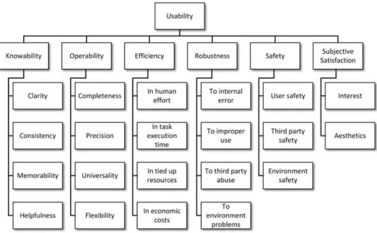
Next we give a brief overview of the taxonomy. The first-level attributes are (seeFigure 1) :
• Knowability: the property by means of which the user can understand, learn, and remember how to use the system. This attribute is subdivided intoclarity, con-sistency, memorability, andhelpfulness. The first three apply toformal(e.g., visual, acoustic, etc.) and concep-tualaspects, and to thefunctioningofuserandsystem tasks(seeFigure 2).
FIG. 1. First-level attributes of our usability taxonomy.
FIG. 2. Subattributes of knowability in our taxonomy.
• Efficiency: the capacity of the system to produce
appropriate results in return for the resources that are invested. The taxonomy draws a distinction between efficiency in human effort, in task execution time, in tied up resources, and in economic costs, with each category further decomposed into more subattributes.
• Robustness: the capacity of the system to resist
error and adverse situations. The taxonomy draws a
distinction between robustness to internal error, to improper use, to third party abuse, andto environment problems.
• Subjective satisfaction: the capacity of the system to produce feelings of pleasure and interest in users. The former are related to aesthetics for each of the five senses.
Rather than proposing radical alterations of the concept of usability—which can be problematic and unjustified—our main contributions were in the way the attributes in the literature are merged, split, renamed, structured, and given depth as a result of the synthesis. Our taxonomy includes every usability aspect covered by the existing classifications except for the ISO/IEC 9126-1 (2001)usability compliance attribute, whose inclusion was considered redundant with other attributes. Similarly, all the first-level attributes in our taxonomy are, at least to some degree, included in two or more of the aforementioned usability classifications, and all the second-level attributes are included in at least one classification, except forrobustness to environment problemsandenvironment safety.
Typically, all the usability aspects are not equally important. The level of detail in our usability taxonomy would allow to, for example, assign weights to the relative importance of each subattribute with a great deal of granularity (although assigning weights is a topic unto itself).
As mentioned previously, usability depends on the specific context of use. That is, the particular characteristics of theusers, tasks, and environments. Our approach is to conceptualize the context of use as a separate taxonomy and to establish connec-tions between it and the usability taxonomy. This context-of-use taxonomy was published in (Alonso-Ríos, Vázquez-García, Mosqueira-Rey, & Moret-Bonillo,2010a) and follows the same approach and principles as our usability taxonomy: It was moti-vated by the lack of consensus on the meaning of the term and was intended as a detailed synthesis of the literature.
3. FIELD OF APPLICATION 3.1. ISA for In-Vehicle Systems
The specific field of application for our usability study is ISA, a technology for intelligent in-vehicle transportation sys-tems that warns the driver when speeding, discourages the driver from speeding, or prevents the driver from exceeding the speed limit (Regan, Young, Healy, Tierney, & Connelly,2002). Because vehicle speed has a direct impact on road safety and studies have long suggested that reduced speed results in fewer accidents (Anderson, McLean, Farmer, Lee, & Brooks, 1995; Finch, Kompfner, Lockwood, & Maycock, 1994), there is a growing interest in the potential of ISA systems.
ISA systems can be classified according to three attributes:
• Intervention: The degree of intervention classifies ISA systems intopassive, intermediate, andactive1(Paine, Paine, Griffiths, & Germanos,2007). A passive system
1Other common names for these three attributes areinformative,
supportive, andmandatory, respectively (ETSC,2005).
simply warns the drivers that they are exceeding the speed limit, typically by means of a simple acoustic or visual warning. On the opposite end of the spectrum, active systems intervene and automatically correct the vehicle’s speed to comply with the speed limit. It is also possible to have an intermediate level of interven-tion, which uses haptic feedback to prevent the user from exceeding the speed limit.
• Freedom: According to the degree of freedom the user has when following and using the ISA recommenda-tions, ISA systems can be classified into voluntary and mandatory (Carsten & Comte, 1997). In volun-tary systems the user has the freedom of following or not following the ISA warnings. On the other hand, in mandatory systems the ISA Device (ISAD) can-not be disconnected and usually limits the vehicle’s maximum speed to the ISA recommendations. • Adaptability: The adaptability to legal speed limits is
also taken into account (R. Liu & Tate,2004). In this regard an ISA device can befixedorvariable. In fixed systems the ISAD compares the vehicle’s speed with the fixed legal speed limits of the road on which it is traveling. On the other hand, in a variable system other driving characteristics are taken into account in order to establish the speed limit, for example, weather conditions, driving near a school, or cornering speed.
In spite of the obvious advantages of ISA systems (Martin, 2002), there is no widespread use of such products. This is related to two factors: technological reasons and consumer acceptance reasons. From the technological point of view, ISA systems need accurate maps and accurate positioning systems in order to work properly. There has been a great deal of research in this area lately, but not enough to ensure good performance. As for acceptance, it should be borne in mind that successful implementation of ISA would ultimately rely upon the attitude of the general public (Carsten et al.,2008). There are many pri-vacy, freedom, and usability concerns that prevent users from adopting ISA technology. According to OECD/ECMT (2006), speed management is a government task, and the European governments will realize important economic benefits for their citizens if they decide to encourage and eventually require them to install ISADs in their cars. As a first step, governments can promote the industry’s efforts by supporting additional research and standardization and encourage its private use by introduc-ing tax cuts as incentives to installintroduc-ing ISA and becomintroduc-ing first customers of ISA technology (e.g., in public transport systems).
3.2. The ISAD Under Study
review how many CARATs they have collected and how many they could have collected through better compliance with the limits.
The CARAT counter follows a “carrots rather than sticks” approach to avoid speeding while driving. A counterexample that uses the “stick” approach is the paper that describes an ISA project in Denmark calledSpar på Farten. The project is based on Pay As You Drive principles, which means that besides giv-ing a warngiv-ing when the driver is speedgiv-ing, the ISA equipment also gives penalty points, which reduce a promised bonus of 30% on the insurance rate (Lahrmann, Agerholm, Tradisauskas, Juhl, & Harms,2007).
Regarding the usability of ISADs we can mention the Swedish large-scale trial involving ISA in urban areas per-formed between 1999 and 2002 (Biding,2002). Several thou-sand vehicles were equipped with voluntary, supportive, and informative systems to keep drivers from exceeding the speed limit. One of the main conclusions of the study was that the “systems must be improved to become more attractive” (Biding, 2002, p. 2). So usability is a very important feature to consider in ISA systems in order to make them more appealing, easier to use, and safer.
4. USABILITY STUDY OF THE INTELLIGENT SPEED ADAPTATION DEVICE
Our contribution to the project took place during the earli-est stages of the development of the CARAT counter. Our tasks include studying the usability requirements of theconcept pro-totype(i.e., the initial design), and assessing the usability of the field prototype(i.e., the first working prototype). The first task, which we callusability requirements analysis, consists in iden-tifying the usability needs and possible usability limitations of the concept prototype. The goal is to provide a set of recom-mendations that can be used as an input to the field design of the product. The next task, usability assessment, can be conducted through many different and complementary activities. In our study we performed two of the most widely used activities: heuristic evaluation and subjective analysis. Heuristic evalu-ation is based on the judgment of usability specialists who analyze the product in order to find strengths and weaknesses. Subjective analysis, on the other hand, interprets the opinions of the users on the usability of the prototype after they have tested it.
The process was guided by our taxonomies. As the taxonomies are general purpose, it is required to instantiate cer-tain attributes with the characteristics of the product under study and its specific context of use. Our taxonomies try to help to achieve this goal by going from the general to the particular at several levels of detail, in contrast with the more abstract and vague nature of traditional usability definitions.
The specific usability techniques employed in this study are very widespread and have been proved to yield useful results, so we considered them appropriate and comprehensive enough
at this stage of the development life cycle. As many usability techniques exist, different techniques might have been used and, certainly, different techniques could be used at later stages, some of which could also be supported by the taxonomies. For example, the taxonomies could be used to structure user interviews or field observations in the same way they were used to structure the user questionnaires or the heuristic eval-uation. However, the fact that the taxonomies are essentially conceptual means that they might not be particularly helpful for lower level usability techniques such as objective performance measurements, for example.
4.1. Description of the ISAD
The CARAT counter is an ISAD designed to be placed in the vehicle where it can be seen by the driver without caus-ing distraction. The device lights up green when the vehicle is within the speed limit, which also increases the CARAT count. The device turns yellow, and no CARATs are accumulated when the limit is slightly exceeded. Otherwise, it turns red, making it more difficult to earn CARATs.
At the end of the trip, the driver can see the earned CARATs and the “ideal” number of CARATs that could have been accumulated for “perfect” driving. The earned CARATs can then be exchanged for real-world benefits such as reduced insurance premiums, loyalty points, and other similar bene-fits. Furthermore, if users decide to make such information available, they can participate in good-driving competitions, statistical information gathering, and various other activities.
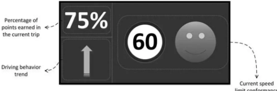
As mentioned, two prototypes of the CARAT counter were developed during our participation in the project: the concept prototype and the field prototype. The concept prototype (see Figure 3) was done on paper and consisted in a small USB device with a display. This prototype served as an input to the usability requirements analysis. Later, a field prototype (see Figure 4) was made in order to test an actual working prototype of the CARAT counter. This was a more complex in-vehicle information system with a display, a USB stick for storing CARATs, and a cigarette lighter plug. The most noteworthy modifications to the interface were the addition of a speed limit sign, a smiley that represents compliance with the speed limit (a green happy face, a yellow neutral face, or a red sad face), and a text that describes the progress of the driving behavior of the user in a more general sense (with the values “neutral,” “improving,” “good,” and “bad”). For this second design we performed heuristic evaluation and subjective analysis.
4.2. Instantiating the Taxonomies
FIG. 3. Concept prototype of the CARAT counter, including the USB connec-tor, the earned CARATs (shown as an absolute value, a numerical percentage, and a percentage bar), and the general HMI button.
FIG. 4. Field prototype of the CARAT counter, including the external shell with two buttons and a speaker, the display, the USB stick, the USB connector, and the cigarette lighter plug.Note.The left side of the display shows the earned CARATs, the “ideal” CARATs, the driving behavior, and the end-of-journey button. The right side of the display shows the speed limit sign and the smiley.
The first step is to remove the branches of the usability taxonomy that are not relevant to the CARAT counter. For example, of all theformalaspects, which appear inknowability, operability, safety, andaesthetics, only thevisualand, in some cases, acousticor tactileaspects are relevant. Some attributes related to structure (from knowability) were also removed because the structure of the physical product is such that their analysis is not necessary.
The next step is to instantiate specific attributes of the usability taxonomy with the components whose usability must
be examined, always from the point of view of the user. Some examples, applied to the field prototype of the CARAT counter, are as follows:
• Thevisualelements of the CARAT counter that appear in theknowability, operability, andsubjective satisfac-tion attributes can be divided into physical elements (e.g., physical buttons, speaker, USB stick, USB con-nector, and cigarette lighter plug) and displayed ele-ments(e.g., text and graphics shown on the display of the device).
• The functioning of the CARAT counter, which is a subattribute ofknowability, is further subdivided into two attributes in the taxonomy: user tasks (i.e., the actions that the user must perform in order to operate the CARAT counter) andsystem tasks(i.e., those func-tions that do not need the input of the user). User tasks can be instantiated with activities like pushing the end-of-journey button and removing the USB stick. System tasks include, for example, recording and displaying information.
• Cultural universality, which is a subattribute of
operability, is subdivided in the taxonomy into univer-sality of languageandcultural conventions. Language is instantiated as displayed text, and cultural conven-tions include themeasurement unitsand the direction-alityof the interface (i.e., whether it is read from left to right or the other way around).
• The environment, which appears in the operability, robustness, andsafetyattributes, can be subdivided into physical environment andtechnological environment, both widely-accepted context-of-use attributes. • Thethird parties(from thesafetyattribute) are
instan-tiated in this case with the passengerswho go along with the driver.
• Confidentiality(from thesafetyattribute) includes con-fidentiality of the personal details of the user and of the use of the product, such as the roads traveled.
TABLE 1
Examples of Usability-Relevant Attributes for the Components of the CARAT Counter
Component Attributes Subattributes
Displayed text (visual) Font Font family, weight, style, decoration, capitalization Size
Orientation
Color Hue, saturation, lightness Content
Displayed graphics (visual) Shape
Size Width, height
Color Hue, saturation, lightness Displayed graphics (conceptual) Shape Literal meaning, symbolism
Color Symbolism
Display structure (visual) Ordering
Positioning Alignment, spacing Color contrast Hue, saturation, lightness
this topic needs further research, particularly for more complex devices.
Another important part of a usability study is to specify the context of use, as the usability of a system is always relative to it. For example, the context of use determines the user’s perception of the usability of the system and makes certain usability attributes more desirable. A brief summary of the rele-vant context-of-use attributes for this usability study, including how they are instantiated and their predicted impact on usability, would be as follows:
• User knowledge of system domainand, similarly but to a lesser extent, user experience with similar systems. In our case, system means ISADs. Previous knowl-edge and experience on the part of the user, or the lack thereof, have a significant impact on knowability. • User knowledge of system language.In our case, the
system’s language is English. If the intended audi-ence lacks proficiency in that language, knowability and universality become particularly critical.
• User attitude to the system. This attribute has an impact on the user’s perception of the usability of the sys-tem, especially regarding user safety and subjective satisfaction.
• Sensorial disabilities and aptitudes of the user(sight, hearing). This affects usability attributes like clarity and safety.
• Task demands on the user.The most sensitive task here is the system task of displaying information while the user is driving, which puts significantsensorial(sight, hearing) and cognitive (memory, attention) demands on the user. Excessive demands on human effort would have a negative impact on perceived efficiency, user safety, and subjective satisfaction.
• Task safety. Two tasks are particularly sensitive here. Firstly, displaying information while the user is driv-ing can affect the physical safety of the user and the passengers. Second, recording driving information is directly related to user confidentiality. Obviously, the inherent safety of the tasks has an impact on the usability of the whole system, as safety is a subattribute of usability.
• Sensorial conditions of the physical environment
(visual, auditory), which are subdivided into the qual-ityand thestabilityof said conditions. In our case, this is instantiated with specific real-world problems such as luminosity, glare, noise, and so on. This is related to usability attributes such as knowability, efficiency, and safety.
• Spatial conditions of the physical environment (ability of the location of the system, postural suit-ability). This is instantiated as the placement of the CARAT counter and the posture of the user while look-ing at the CARAT counter. This has an impact on knowability, efficiency, subjective satisfaction, and, in the worst-case scenario, safety.
• Social environment (human support, interruptions). This is instantiated into several aspects: the presence of passengers who notify the driver of important infor-mation displayed on the CARAT counter, distractions caused by the passengers, the traffic, and so on. This affects efficiency, safety, and subjective satisfaction.
4.3. Usability Requirements Analysis
carrying out a detailed design of the product. The input to this activity was the concept prototype of the CARAT counter previously shown inFigure 3.
The usability taxonomy guides the process in a straightfor-ward manner, as the usability attributes are instantiated with the particular characteristics of the product. For example, visual clarity of the elements is instantiated as visual clarity of the physical elements, the displayed text, andthe displayed graph-ics, each one with its relevant characteristics likesize, font, and so on.
Incidentally, this systematic and structured approach fits well with the technique of formulating requirements as “boil-erplates,” which contributes to standardizing the language and making requirements more reusable (Hull, Jackson, & Dick, 2005). In this technique, requirements are constructed by com-pleting placeholders in ready-made sentences. For example the boilerplate “the <component> shall have a <usability attribute> <component attribute>” could be instantiated as “the displayed text shall have a legible font.”
For more technical considerations, the requirements can be refined by consulting documents such as usability guidelines. The guidelines can be generic or domain specific. Generic guidelines include the ones by Smith and Mosier (1986), Microsoft Corporation (2010), and Apple Inc. (2011). As for guidelines specific to driver information systems, some were proposed by Dingus et al. (1996); Green, Levison, Paelke, and Serafin (1994); Stevens, Quimby, Board, Kersloot, and Burns (2002); and Japan Automobile Manufacturers Association (2004). We also consulted the list of common usability prob-lems in automotive navigation systems that was compiled by Nowakowski, Green, and Tsimhoni (2003).
The usability requirements serve as an input to the design of the field prototype of the CARAT counter (shown inFigure 4). Once the field prototype has been designed, the next step is to perform a heuristic evaluation in order to analyze its strong and weak points in terms of usability.
4.4. Heuristic Evaluation
Heuristic evaluation, first introduced by Nielsen and Molich (1990), is currently one of the most actively used and researched usability methods (Hollingsed & Novick, 2007). In heuristic evaluation, usability specialists examine a product and assess its usability guided by a set of heuristics such as guidelines or good practices. Many different heuristics have been pro-posed over time, but there is still little scientific evidence on the preferability of one over the other in terms of effective-ness, efficiency, or interevaluator reliability (Hvannberg, Law, & Lárusdóttir,2007). Heuristic evaluation remains mostly infor-mal (and, on the upside, quick and inexpensive), and works best when the results of several evaluators are aggregated, as these only find some of the actual usability problems (Nielsen,1992). In a way, our taxonomies aim to make this informal task a bit more systematic and more connected to accepted definitions
usability, as they provide a checklist of common usability aspects to be analyzed and facilitate a shared understanding of usability aspects among the participants. For example, the instantiated taxonomy (shown inTable 1) points the specialist to thecolor contrastbetween adjacent elements of the display in terms of hue, saturation, and lightness (incidentally, these three attributes can be measured and subsequently evaluated according to established color guidelines).
Based on the usability taxonomy applied to the field pro-totype of the CARAT counter (see Figure 4), we assessed the usability of each instantiated attribute. Our assessments were focused on detecting usability problems, not on obtain-ing numerical usability ratobtain-ings. Keevil (1998) and Lynch, Schwerha, and Johanson (2013), for instance, have conducted some research on the latter, but this was not our goal.
Table 2shows some examples of the analysis of the visual clarity of the physical and displayed elements. We subse-quently wrote a full report summarizing our conclusions and suggestions for improvement.
According to our heuristic evaluation, some strong points of the CARAT counter are as follows:
• The two most important elements on the display while the user is driving, namely, the speed limit sign and the smiley, are clearly visible.
• Color contrast on the right side of the display (i.e., light colors on a dark background) is appropriate and follows the widely-accepted guideline of negative contrast.2
• The general purpose of the CARAT counter is intu-itive and the way the display is structured is simple and readable.
• Even though the color of the smiley has an asso-ciated meaning, the different faces make it easily understandable to users with color blindness (see Figure 5).
• The CARAT counter does not risk the legal safety of the user or the passengers, as it does not record infor-mation about the position or the speed of the car at a given moment, something that can be used as evidence in a legal process. Great care has also been taken in order to avoid compromising the confidentiality of its use.
The main usability problems detected in the heuristic evalu-ation were as follows:
• Some elements on the left side of the display tend to be small and have low contrast (e.g., gray or red on blue). • The purpose of some elements is not intuitive, such as (a) the two buttons on the left side of the CARAT
2“In cars, the guiding principle is to minimize glare. Since there
TABLE 2
Examples of the Heuristic Evaluation of the CARAT Counter
Usability Attributes Heuristic Evaluation
Knowability Clarity
Visual clarity of the physical elements
Visual clarity of the physical buttons +Visibility is good
Visual clarity of the speaker +Visibility is good
Visual clarity of the USB stick +Visibility is good
Visual clarity of the USB connector +Visibility is good
Visual clarity of the cigarette lighter plug +Visibility is good Visual clarity of the displayed text
Visual clarity of the “CARAT” text −Size is small
Visual clarity of the earned CARATs −Size is small
Visual clarity of the “out of” text −Size is very small
Visual clarity of the “ideal” CARATs −Size is small
Visual clarity of the driving behavior text −Size is small
Visual clarity of the “no CARAT stick” error message −Size is small Visual clarity of the “no CARAT functionality” error message −Size is small
Visual clarity of the “OFF MAP” error message +Text size is appropriate Visual clarity of the displayed graphics
Visual clarity of the end-of-journey button −Size is too small
Visual clarity of the speed limit sign +Size is appropriate
Visual clarity of the smiley +Size is appropriate
Visual clarity of the “no GPS” icon +Size is appropriate
Visual clarity of the “no speed limit” icon +Size is appropriate
Note. The plus sign indicates a positive assessment and the minus sign a negative one.
FIG. 5. Color is not essential in order to understand the meaning of the smiley.
counter; (b) “ideal” CARATs, which by themselves say little to the user and would be better replaced by a per-centage or some kind of graph; (c) the “no CARAT functionality” error message, which should be replaced by a more descriptive sentence; (d) the end-of-journey button, whose purpose is difficult to infer (the user needs to push it before stopping the engine), and which does not really look like a standard button due to its color palette.
• There is an inconsistency in how the driving behavior text and the smiley seem to represent the same concept, namely, success, but actually do it in different senses of the word. The smiley is associated only with the speed limit, whereas the behavior text is associated with
driving performance in general.3This distinction is not intuitive and can even lead to visual messages that may seem contradictory at first (as shown inFigure 6). • Another problem with the behavior text is the
vague-ness with which it describes the progress of the driving behavior of the user. It should be replaced with more meaningful text messages or with self-explanatory graphics, such as arrows. The latter option would also contribute to solving the general universality problem of having English-language messages whose mean-ing may be unnecessarily unintelligible to non-English speakers.
3At present, it only considers speed but in the future it might be
FIG. 6. Seemingly contradictory messages: Neutral driving behavior and a happy smiley.
• The use of purely textual error messages like “OFF MAP” is not consistent with other alerts that have a graphical representation, such as the smileys or the “no GPS” error icon (seeFigure 7). Graphical representa-tion is also generally preferable over text.
• The speed limit sign does not indicate the speed measurement units (i.e., mph or km/h). Moreover, it supports only km/h.
• The prototype has no audio, which is a recommended feature for similar devices.4
FIG. 7. “OFF MAP” error text (upper part) compared with the “No GPS” error icon (bottom part) showing the lack of consistency in the use of text and icons in error messages.
4Fang, Xu, Brzezinski, and Chang (2006), for example,
demon-strated the benefits of duplicating visual information through sound to remedy some of the difficulties in reading textual information on systems with small-screen displays that are used when in motion.
• The CARAT counter is too dependent on the availabil-ity of a GPS signal that is not precise enough. The use of more accurate signals such as EGNOS might solve some of these problems.
As a result of the heuristic analysis a new interface structure was suggested.Figure 8 shows the wireframe of the display, which was divided in three parts: percentage of points earned in the current trip, driving behavior trend, and current speed limit conformance.
The driving behavior trend is represented inFigure 9. There are four icons that represent four possible trends in your driving behavior:good (you drive in compliance with the speed lim-its),bad(you do not drive in compliance with the speed limit), improving(although your current behavior is good your past behavior wasbadand that is penalizing you for earning all the possible points for a period of time), andneutral(you are not earning points, mainly because of an error in the GPS or in the maps).
4.5. Subjective Usability Analysis
FIG. 8. Wireframe of the suggested display after the heuristic analysis.
FIG. 9. Icons representing the driving behavior and their corresponding meaning.
The subjective analysis was conducted in 2010 with four actual users (as a rule of thumb, Nielsen, 2012, recommended a maximum of five users for nonquantitative studies like this). All the participants were male and from the United Kingdom but were reasonably diverse in all other respects. Their year of birth varied between 1963 and 1983 (the average age at the time was 35). The level of computer expertise varied from low to high. Their annual mileage was between 1,000 and 6,000, except for one user who had 60,000. Only one driver had been given speeding fines or penalty points (3 points at the time).
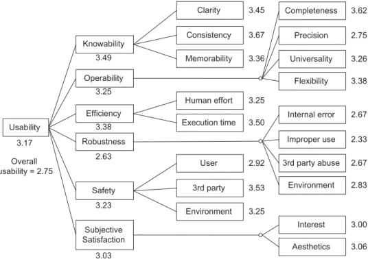
A summary of the ratings given by the users, and grouped for each second-level usability attribute, is shown inFigure 10 (it should be kept in mind again that not every criterion of the usability taxonomy was applicable).
The aggregated ratings shown in Figure 10 were obtained through the technique known as Multi-Attribute Utility Theory (MAUT; Adelman & Riedel,1997). MAUT analysis is a formal subjective multicriterion analysis technique, used in usability environments to assess the utility of systems or alternatives that have more than one evaluable attribute. The procedure for a MAUT analysis is as follows: (a) specification of the evalua-tion criteria and attributes, (b) weighting of these criteria and attributes according to their relative importance, (c) testing of how the system complies with each of the defined attributes, (d) creation of utility functions that will convert the above
mentioned scores into utility measures, (e) integration of the utility values obtained for each attribute into a single measure, and (f) sensitivity analysis.
Due to the lack of information on the context of use at this point, we decided to use linear utility functions and give equal weight to each criterion in order to avoid bias. If reaching a consensus on the relative weights of the taxonomy criteria is deemed necessary, techniques exist for this purpose, such as Analytic Hierarchy Process (Saaty,1980). But this was out of the scope of this usability study, as our ultimate goal was not to come up with an overall usability score but to detect strong and weak points in the usability of the CARAT counter.
Based on the ratings and the observations made in the com-ments boxes, the strong points of the CARAT counter would be as follows:
• Clarity. The displayed elements are legible, the func-tioning is intuitive, and the external components are big, tactile, and easy to identify.
• Consistency of design, which contributes to making the CARAT counter easy to understand.
• Completeness. The CARAT counter includes all the functionalities that the users need.
• Efficiency, particularly in task execution time. • Confidentiality in the use of the product. • Legal safety.
The main criticisms expressed by the users were as fol-lows:
• Lack of precision in the reception of the GPS signal. • Lack of robustness to internal error. A user specifically
remarked that the counting of CARATs sometimes seems to stop working.
• Lack of robustness of the USB connector.
• The CARAT counter can be distracting to the point of being a safety issue, at least for some users.
• The CARAT counter made some users feel emotionally uncomfortable.
TABLE 3
Excerpts from the Subjective Questionnaire of the CARAT Counter
Usability Attributes Questionnaire Items
Knowability Clarity
Visual clarity of the displayed text The displayed text is easy to read. Visual clarity of the displayed graphics The displayed graphics are easy to see.
Clarity of the meaning of the physical components The purpose of the physical components is clear. Clarity of the meaning of the displayed text The meaning of the displayed text is clear. Clarity of the meaning of the displayed graphics The meaning of the displayed graphics is clear. Clarity of the meaning of the structure of the displayed
elements
The purpose of the division of the display into zones is clear.
. . .
Consistency
Visual consistency of the displayed text The appearance of the displayed text remains consistent throughout.
Visual consistency of the displayed graphics The appearance of the displayed graphics remains consistent throughout.
Consistency in functioning of user tasks Similar user actions consistently follow similar steps. . . .
Memorability
Memorability of the meaning of the displayed text The meaning of the displayed text is easy to remember. Memorability of the meaning of the displayed graphics The meaning of the displayed graphics is easy to
remember.
Memorability of the functioning of the user tasks The actions that the user must perform are easy to remember.
Memorability of the functioning of the system tasks The actions performed automatically by the CARAT counter are easy to remember.
. . .
4.6. Summary of the Results of the Usability Study
The overall results of the usability study suggest that the usability of the current prototype of the CARAT counter is ade-quate in general, but with some significant flaws that need to be improved upon in the next stage of development of the prod-uct. Taking into account the heuristic and subjective analyses, the most significant usability conclusions are summarized in Table 4.
Most of these usability problems, however, are due to the fact that the device was just a prototype used to test interest and adoption for stakeholders. Nevertheless, these usability prob-lems must be taken into account in the following design and implementation phases.
The most significant suggestions for improvement would be as follows:
• The size of the text on the left side of the display should be maximized and good contrast should be sought in all the displayed elements.
• The end-of-journey button must be more visible and its purpose must be made clearer.
• More consistency in the visual representation of errors should be sought.
• The speed limit sign needs to specify the speed mea-surement units (mph, km/h).
• The CARAT counter should support other languages besides English. Graphical representations should also be prioritized.
• The precision problems need to be solved, particularly the GPS issues. In this regard, using the EGNOS tech-nology can improve the reliability and accuracy of the signal.
• Robustness to abuse of the USB connection needs to be improved.
• It is very important to avoid distracting the users. This is not due to the complexity of the display, as the CARAT counter is simple.5Rather, the problem seems
5For example, it follows the recommendation that “five or fewer
Usability
Knowability
Operability
Efficiency
Robustness
Safety
Subjective Satisfaction
Clarity
Consistency
Memorability
Completeness
Precision
Universality
Flexibility
Human effort
Execution time Internal error
Improper use
3rd party abuse
Environment User
3rd party
Environment
Interest
Aesthetics
3.62
2.75
3.26
3.38
2.67
2.33
2.67
2.83
3.00
3.06 3.45
3.67
3.36
3.25
3.50
2.92
3.53
3.25 3.49
3.25
3.38
2.63
3.23
3.03 3.17
Overall usability = 2.75
FIG. 10. Average ratings given by the users in the subjective questionnaires, on a scale from 1 (lowest) to 5 (highest).Note.The “overall usability” rating is an independent item in the questionnaire and is rated separately by the users.
to lie in the demands the information places on the attention of the users.
• The external shell should be redesigned to make it more appealing, and the two buttons on the external shell ought to be removed.
It may also be advisable to include audio in the device. Because sound effects can easily go unheard, voice messages might be generally preferable. Moreover, synthesized speech may sound artificial, whereas digitized prerecorded voice messages usually sound natural and acceptable to the driver (Burnett,2000).
4.7. Validity of the Approach
One of our main arguments in this article is that usability needs to be represented with a greater level of detail than the one found in typical usability classifications. Vaguely defined usability taxonomies and heuristics tend to deal with problem types, not specific problems. But, as Gray and Salzman (1998) reminded us,
knowing what problem types an interface has is not really useful for developers. Developers need to know the specific problem (e.g., a problem with an item in a particular menu) and not the general one (e.g., “there are menu problems” or “speak the users’ language”). (p. 242)
In practice, usability studies are often conducted in an ad hoc manner. This can make them very laborious, as the “developer must read a significant body of work to develop even an inkling of the global thought on usability” (Conger,2011, pp. 15–16).
The ad hoc nature of the process can lead to problems of incon-sistency and redundancy, and it is also not practical to create from scratch a detailed conceptualization of usability for each domain of application.
To investigate the validity of our approach, we wanted to explore the difficulties of using traditional context-specific approaches to arrive at concrete usability results. Obviously, not every field of application has a readily available ad hoc usability taxonomy—so, in many cases this would not even be an option—but we happened to find one that suited our purposes: Harvey et al. (2010, 2011) recently developed a taxonomy of usability criteria aimed specifically at in-vehicle information systems (IVIS). Their work is a good example of traditional usability studies in that it is based on an tailor-made definition of usability that was obtained by conducting an exten-sive research of both the literature on usability (e.g., history, definitions) and the specific field of application (e.g., guidelines for in-vehicle information systems).
The classification by Harvey et al. consists of 13 usability criteria that “collectively define usability for IVISs and were developed to meet the overall needs of drivers: safety, efficiency, and enjoyment” (Harvey et al.,2011, p. 514). It is based on the following premise:
TABLE 4
Results of the Usability Study of the CARAT Counter (CC), classified according to the Usability Taxonomy by Alonso-Ríos et al. (2010)
Usability Results for the CC Usability Subattributes
Knowability
1. Text on left side of display is small Visual clarity of elements (size) 2. Graphics on right side of display are big Visual clarity of elements (size)
3. Text on left side of display has bad contrast Visual clarity of structure (color contrast) 4. Graphics on right side of display have good contrast Visual clarity of structure (color contrast) 5. End-of-journey button has bad contrast Visual clarity of structure (color contrast) 6. Display is structurally simple Visual clarity of structure (positioning) 7. External buttons have unclear purpose Conceptual clarity of elements 8. End-of-journey button does not look like a button Conceptual clarity of elements 9. Speed limit sign does not indicate units Conceptual clarity of elements 10. Error messages have unclear meaning Conceptual clarity of elements 11. Pushing end-of-journey button before stopping engine is not intuitive Clarity in functioning of user tasks 12. Errors are arbitrarily represented as text messages or graphics Visual consistency of elements 13. Messages of behavior text and smiley sometimes seem contradictory Conceptual consistency of elements
Operability
14. CC includes necessary functionalities Completeness
15. GPS signal is not precise enough Precision
16. Smiley has alternatives to color for users with color blindness Visual accessibility (color)
17. Text is English only Cultural universality of language
18. Speed limit sign is km/h only Cultural universality of conventions
Efficiency
19. CC does not demand much physical effort Efficiency in human physical effort 20. CC does not demand much time Efficiency in task execution time
Robustness
21. Counting seems to stop working Robustness to internal error
22. USB is vulnerable to abuse Robustness to improper use
Safety
23. CC may be distracting to the point of being dangerous User bodily safety 24. CC may cause emotional discomfort User mental safety 25. CC does not compromise legal safety Legal safeguarding of user 26. CC does not compromise confidentiality User confidentiality
Subjective satisfaction
27. External shell is unattractive Visual aesthetics
Note. Where relevant, instantiated elements are shown in parentheses.
They described their procedure as follows: “Defining the context of use for a particular product enables designers/evaluators to specify the usability factors which are important. This was done for in-vehicle devices to identify six contextual factors” (Harvey et al., 2010, p. 15). “Next, criteria from the general definitions of usability . . . were used as guidance to examine each context factor in more detail” (Harvey et al., 2010, pp. 15–16). Table 5 shows the correspondences between their IVIS usability criteria, their
contextual factors, and the general criteria from the usability literature.
TABLE 5
Harvey et al.’s Usability Criteria for IVIS and the Contextual Factors and General Usability Criteria From Which They Are Derived
Harvey et al.’s Usability Criteria for
IVIS Harvey et al.’s Contextual Factors
General Usability Criteria From the Literature
1. Effectiveness of interaction with device under varying driving conditions
1. Varying environmental conditions Effectiveness
2. Sustained effectiveness of interaction with device whilst driving
1. Dual task environment Effectiveness, Efficiency, Errors
3. Sustained efficiency of
interaction with device whilst driving
4. Interference between interaction with device and primary task performance
5. Learnability of device interactions
2. Training provision Effectiveness, Efficiency, Learnability
6. Efficiency on first use of the device whilst driving
7. Effectiveness on first use of the device whilst driving
8. Adaptability of device to individual users
3. Range of users Task match, Task characteristics, User criteria, Flexibility 9. Compatibility of device with full
range of users
10. Satisfaction on first use of device whilst driving
4. Uptake Perceived usefulness, Satisfaction
11. Perceived usefulness of device in real driving situation
12. Satisfaction based on short- and long-term use of device whilst driving
5. Varying frequency of use Attitude, Satisfaction, Memorability
13. Memorability of device interaction
Note. I V I S =in-vehicleinformationsystems.
approach not very amenable to analysis, in the sense of sepa-rating a complex object into smaller parts in order to study it closely.
As an exercise, we tried to map the main results of the usability study of the CARAT counter (previously shown in Table 4) to the usability attributes proposed by Harvey et al (see Table 6).
If we compare the mappings, we can draw the following conclusions:
TABLE 6
Results of the Usability Study of the CC, Classified According to the Usability Criteria for IVIS by Harvey et al. (2010) Usability Results for the CC Harvey et al.’s Usability Criteria for IVIS
1. Text on left side of display is small Effectiveness of interaction with device under varying driving 2. Graphics on right side of display are big conditions, Sustained effectiveness of interaction,
3. Text on left side of display has bad contrast Compatibility of device with full range of users 4. Graphics on right side of display have good contrast
5. End-of-journey button has bad contrast
6. Display is structurally simple Sustained effectiveness of interaction, Learnability of device 7. External buttons have unclear purpose interactions, Effectiveness on first use
8. End-of-journey button does not look like a button 9. Speed limit sign does not indicate units
10. Error messages have unclear meaning
11. Pushing end-of-journey button before stopping engine is not intuitive
12. Errors are arbitrarily represented as text messages or graphics
13. Messages of behavior text and smiley sometimes seem contradictory
14. CC includes necessary functionalities Sustained effectiveness of interaction
15. GPS signal is not precise enough Effectiveness of interaction with device under varying driving conditions, Sustained effectiveness of interaction
16. Smiley has alternatives to color for users with color blindness
Compatibility of device with full range of users
17. Text is English only
18. Speed limit sign is km/h only
19. CC does not demand much physical effort Sustained efficiency of interaction, Efficiency on first use 20. CC does not demand much time
21. Counting seems to stop working —
22. USB is vulnerable to abuse Compatibility of device with full range of users, Sustained efficiency of interaction
23. CC may be distracting to the point of being dangerous
Interference between interaction with device and primary task performance
24. CC may cause emotional discomfort —
25. CC does not compromise legal safety —
26. CC does not compromise confidentiality —
27. External shell is unattractive Satisfaction on first use, Satisfaction based on short- and long-term use
• The classification by Harvey et al. is missing some commonly accepted usability attributes from the liter-ature, such as certain aspects of robustness and safety. The latter is particularly significant, as Harvey et al. explicitly regard it as very important but did not actu-ally include it as a usability criterion. But the fact is that adding the missing attributes would not be an easy task anyway, as the entangled relationship between their usability criteria and the usability criteria in the liter-ature (as seen inTable 5) makes it difficult to add new attributes without adding more redundancy.
• The intentionally context-specific nature of the clas-sification by Harvey et al. makes it impossible to generalize it to other areas in order to reuse knowledge.
The mapping problems outlined in this list are in fact instances of well-known representational problems that can be classified into four categories (Barcelos, Guizzardi, Garcia, & Monteiro, 2011; Shanks, Tansley, Nuredini, Tobin, & Weber, 2008; Wand & Weber, 1993): construct overload, construct excess, construct redundancy, and construct incompleteness. This is discussed at greater length in Alonso-Ríos (2014).
5. DISCUSSION
All usability studies depend on an understanding of the con-cept of usability, but this is a term with a complex history, and the definitions provided so far in the literature tend to be vague. There is also a noticeable lack of consensus between authors and sometimes there is little overlap between definitions, or the overlap is not immediately obvious. All this motivated us to construct our own usability taxonomy, which was intended as a comprehensive, structured, and general-purpose synthesis of the literature. General-purpose taxonomies are, however, inher-ently abstract, and to address specific usability problems it is always necessary to negotiate the gap between the abstraction of a taxonomy and the specific context of use and the char-acteristics of the product being analyzed. We addressed the concept of context of use in a previous publication (Alonso-Ríos et al.,2010a) and, as shown in this article, some of the particular characteristics of a product can also be generalized to some extent into taxonomies, although some characteristics are too domain specific to be easily generalized. Nevertheless, detailed taxonomies help to reduce this gap and make the instantiation of the usability attributes to the product easier. The taxonomies also allow the process to be more flexible and dynamic. For example, the relative importance of each attribute can be assigned by means of weights, and the dependencies between taxonomies can be mapped as relations.
The taxonomies guided the entire usability study of the CARAT counter in a systematic and relatively straightforward fashion. Granted, familiarity with the taxonomies is neces-sary in order to conduct the usability study efficiently, but the taxonomies try to make the most of the participants’ knowl-edge in two ways. First, the taxonomies are closely based on
the best-known definitions in the usability literature. Second, the taxonomies are general purpose, which means that the knowledge can be reused in other usability studies.
If one follows the opposite approach, that is, to rely on context-specific usability taxonomies, it should be kept in mind that usability is something that could be analyzed for any kind of product. Therefore, it would be unrealistic to expect a fully developed ad hoc taxonomy to be available for any field of application. Even when such a taxonomy exists, its ad hoc nature makes its validity very dependent on the skills of the usability specialists who develops it—always on a case-by-case basis. In this research we were fortunate to find a very well thought-out context-specific usability taxonomy for in-vehicle information systems, without which comparisons would have been impossible. Nevertheless, when we did the comparison we found in the context-specific taxonomy many instances of problems such as vagueness, incompleteness, redundancy, and lack of generalizability. The first three categories of problems are not necessarily inevitable, but, as previously mentioned, this would depend on the skills of the usability specialists. However, the lack of generalizability—and, therefore, lack of repeatability—is inherent to the ad hoc approach.
6. CONCLUSIONS
This article proposes an approach to usability studies that starts from comprehensive, general-purpose, and hierarchically structured taxonomies that are later applied to specific prod-ucts. This contrasts sharply with a fairly common approach to usability studies in which a context-specific definition of usability is created anew in an ad hoc way for each project. In this article, the usefulness of our approach is described from a practical standpoint, in the context of a real-world usability study for an ISA device. The device, which is called CARAT counter, monitors good driving and accumulates points if the driver keeps within specified speed limit thresholds. These points can be then traded for real-world rewards.
The activities of the usability study were as follows: usability requirements analysis, heuristic evaluation, and subjective anal-ysis. These activities take place at different points of the development life cycle and offer complementary views of the usability of the product. Usability requirements analysis and heuristic evaluation are carried out by usability specialists and intend to predict the needs and reactions of the users. Subjective analysis, on the other hand, can be less detail oriented but involves actual users and obtains information about their opin-ions. In general, there has been a great deal of agreement between our analysis of the CARAT counter and the opinions of the users.
error messages and user tasks, universality of speed measure-ment units and interface language, GPS precision problems, user safety, robustness to abuse and internal error, and aesthetic appeal.
We then proceeded to explore the difficulties of arriving at specific results like these through traditional context-specific methodologies. To do this, we used the Harvey et al. (2010) usability classification for in-vehicle information system as an example. Their work is consciously based on the premise that a “general definition of usability [is] virtually impossible” (Harvey et al.,2010, p. 7) and that every definition of usability must be tailored to a specific context from the start. We argued that this methodology poses some problems: (a) It can rely too heavily on context-specific usability guidelines and specialist expertise; (b) it might not be very amenable to analysis; (c) it is not generalizable to other fields; and (d) it could lead to vagueness, incompleteness, and redundancy. Moreover, these problems can be solved only by ad hoc fixes, which may lead to more redundancy. To illustrate our arguments, we investigated the difficulty of mapping specific real-world usability results to their usability criteria.
As mentioned, several topics that have been incidentally raised in this article require further research, and are in fact an object of study for many other researchers besides our-selves. The following topics are particularly relevant to our future work: generalizing the characteristics of a product into taxonomies, assigning weights to usability attributes, connect-ing usability attributes to existconnect-ing usability guidelines, and formalizing the connections between the respective attributes of the usability and context-of-use taxonomies.
ACKNOWLEDGEMENTS
We thank Jonathan Guard, Dave Marples, James Shields, and Nick Williams.
FUNDING
This research has been partly funded by the European GNSS Supervisory Authority under Grant Agreement No. 228357 and by the Xunta of Galicia Regional Government of Spain under Projects 08SIN010CT, CN2011/007, and CN2012/211, the last two also partially supported by the European Union ERDF.
REFERENCES
Abran, A., Khelifi, A., & Suryn, W. (2003). Usability meanings and interpreta-tions in ISO standards.Software Quality Journal,11, 325–338.
Adelman, L., & Riedel, S. L. (1997).Handbook for evaluating knowledge-based systems. Norwell, MA: Kluwer Academic.
Alonso-Ríos, D. (2014). Development of usability and context-of-use taxonomies, integration with techniques for the study of usability and application to real-world cases(Unpublished doctoral thesis).
Alonso-Ríos, D., Vázquez-García, A., Mosqueira-Rey, E., & Moret-Bonillo, V. (2010a). A context-of-use taxonomy for usability studies.International Journal of Human-Computer Interaction,26, 941–970.
Alonso-Ríos, D., Vázquez-García, A., Mosqueira-Rey, E., & Moret-Bonillo, V. (2010b). Usability: A critical analysis and a taxonomy.International Journal of Human–Computer Interaction,26, 53–74.
Anderson, R. W. G., McLean, A. J., Farmer, M. J. B., Lee, B. H., & Brooks, C. G. (1995). Vehicle travel speeds and the incidence of fatal pedestrian crashes.International Research Conference on the Biomechanics of Impact, pp. 13–15.
Apple Inc. (2011). Apple human interface guidelines. Cupertino, CA: Author.
Barcelos, P. P. F., Guizzardi, G., Garcia, A. S., & Monteiro, M. E. (2011). Ontological evaluation of the ITU-T recommendation G.805.
Proceedings of the 18th International Conference of Telecommunications, 232–237.
Biding, T. (2002).Intelligent Speed Adaptation. Borlange, Sweden: Swedish National Road Administration.
Burnett, G. E. (2000). Usable vehicle navigation systems: Are we there yet?
Vehicle Electronic Systems, 2000 - European conference and exhibition, ERA Technology, 3.1.1–3.1.11.
CARATs for safe drivers. (2009, Summer).Pinpoint: The Newsletter of the Location and Timing Knowledge Transfer Network, pp. 4–5.
Carsten, O., & Comte, S. L. (1997). UK work on automatic speed control.
Proceedings of ICTCT 97 Conference.
Carsten, O., Fowkes, M., Lai, F., Chorlton, K., Jamson, S., Tate, F., & Simpkin, B. (2008).ISA-UK intelligent speed adaptation. Final report. June, 2008. University of Leeds, UK.
Conger, S. (2011). Software development life cycles and methodologies: Fixing the old and adopting the new.International Journal of Information Technologies and Systems Approach,4, 1–22.
Dingus, T., Hulse, M., Jahns, S., Alves-Foss, J., Confer, S., Rice, A., Roberts, I., Hanowski, R., & Sorenson, D. (1996).Development of Human Factors guidelines for advanced traveler information systems and commercial vehicle operations: Literature review. McLean, VA: U.S. Department of Transportation.
ETSC. (2005).In-car Enforcement Technologies Today. Brussels, Belgium: Author.
Fang, X., Xu, S., Brzezinski, J., & Chan, S.S. (2006). A study of the feasibil-ity and effectiveness of dual-modal information presentations.International Journal of Human-Computer Interaction,20, 3–17.
Fernandez-Saavedra, B., Alonso-Moreno, R., Uriarte-Antonio, J., & Sanchez-Reillo, R. (2010). Evaluation methodology for analyzing usability factors in biometrics.IEEE Aerospace and Electronic Systems Magazine,25(8), 20–31.
Finch, D. J., Kompfner, P., Lockwood, C. R., & Maycock, G. (1994).Speed, speed limits and accidents(Project report). Berks, UK: Transport Research Laboratory.
Gray, W. D., & Salzman, M. C. (1998). Damaged merchandise? A review of experiments that compare usability evaluation methods.Human–Computer Interaction,13, 203–261.
Green, P., Levison, W., Paelke, G., & Serafin, C. (1994, August).Suggested human factors design guidelines for driver information systems(Tech. rep. UMTRI-93-21). Ann Arbor, MI: Transportation Research Institute. Han, S. H., Yun, M. H., Kim, K.-J., & Kwahk, J. (2000). Evaluation of product
usability: Development and validation of usability dimensions and design elements based on empirical models.International Journal of Industrial Ergonomics,26, 477–488.
Harvey, C., Stanton, N. A., Pickering, C. A., McDonald, M., & Zheng, P. (2010, June 15). Context of use as a factor in determining the usability of in-vehicle devices.Theoretical Issues in Ergonomics Science, 1–21.
Harvey, C., Stanton, N. A., Pickering, C. A., McDonald, M., & Zheng, P. (2011). In-vehicle information systems to meet the needs of drivers.International Journal of Human–Computer Interaction,27, 505–522.
Hollingsed, T., & Novick, D. G. (2007). Usability inspection methods after 15 years of research and practice.Proceedings of the 25th annual ACM International Conference on Design of Communication, 249–255. Hu, G., & Chang, K. H. (2009). A methodology for structured use-centered