Chapter II
Graphs and Summary Statistics
...
…...
Objetive
Chapter
Introduction
Descriptive Statistics are statistical procedures to describe, organize, synthesize, analyze and interpret, generally through frequency distribution tables, appropriate graphs depending on the type of variable that you analyze and summarizing in a convenient way to describe a set of data with a number or index.
Illustration example
Demographic statistics in Rwanda
Rwanda's population density, even after the 1994 genocide, is among the highest in Sub-Saharan Africa at 230 inhabitants per square kilometer. This country has few villages, and nearly every family lives in a self-contained compound on a hillside. The urban concentrations are grouped around administrative centers.
Population: 12.2million (2017) World Bank
Population growth rate: 2.4% annual change (2016) World Bank Life expectancy: 68 years (2017) World Bank
GNI per capita: 718 (2018) World Bank
Fertility rate: 3.88 births per woman (2016) World Bank
GNI per capita -Gross national income (GNI) is the sum of value added by all resident producers plus any product taxes (less subsidies) not included in the valuation of output plus net receipts of primary income (compensation of employees and property income) from abroad.
1. Frequency table for numerical and categorical variable
A Frequency distribution is a grouping of data into mutually exclusive categories showing the number of observations in each class. (See table 1).
• The left column (called classes or groups) includes all possible responses on a variable being studied. The right column is a list of the frequencies, or number of observations, for each class. • The raw data are more easily interpreted if organized into a frequency distribution.
• The resulting frequency distribution helps a person to quickly see the “shape” of the data.
• Although the frequency distribution will result in the loss of some detail, seeing patterns in the data can help a person to make better decisions.
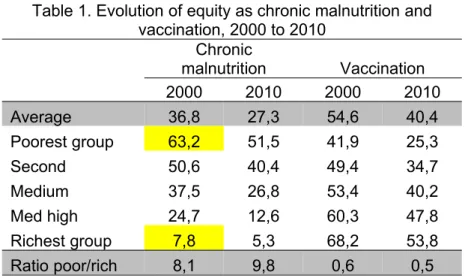
Table 1. Evolution of equity as chronic malnutrition and vaccination, 2000 to 2010
Chronic
malnutrition Vaccination
2000 2010 2000 2010
Average 36,8 27,3 54,6 40,4
Poorest group 63,2 51,5 41,9 25,3
Second 50,6 40,4 49,4 34,7
Medium 37,5 26,8 53,4 40,2
Med high 24,7 12,6 60,3 47,8
Richest group 7,8 5,3 68,2 53,8
Ratio poor/rich 8,1 9,8 0,6 0,5
Interpretation: table 1 shows that, although chronic malnutrition levels has improved in both the average level and by income group between 2000 and 2010, inequalities between the poorest and the richest were accentuated (the ratio of poor-rich rose from 8.1 to 9.8). This would imply that public health programs are favoring more to the people with more resources and, consequently, increasing the gap between these groups. On the side of access to public services, the situation is even worse, as evidenced by the decline in the percentage of children who received full immunization in all income groups, this being most pronounced in the poorest population, which again has meant a greater evil by socioeconomic level.
Another example: The table below shows the results of a survey that asked adults how they pay their monthly bills, it can be presented using a summary table:
Table 2. Payment (monthly bills) by adults
Form of Payment Frequency Percentage (%)
Cash 75 15
Check 270 54
Electronic/online 140 28
Other/don't know 15 3
500 100
Source: Data extracted from USA Today Snapshots, October 4, 2014
Interpretation: You can conclude that more than half the people pay by check and the majority (82%) either pay by check or electronic/online forms of payment.
Transform a continuous quantitative variable into intervals to make a statistical table
There are some methods in SPSS to transform the variable; one of these is "Visual Binning"
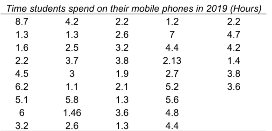
Binning is a method of grouping scaled data into intervals. In the following example, the scaled variable Example: "Time students spend on their mobile phones in 2019" will be binned into four equal-sized intervals to allow statistical comparisons.
The data taken from the students is shown below:
Time students spend on their mobile phones in 2019 (Hours)
8.7 4.2 2.2 1.2 2.2
1.3 1.3 2.6 7 4.7
1.6 2.5 3.2 4.4 4.2
2.2 3.7 3.8 2.13 1.4
4.5 3 1.9 2.7 3.8
6.2 1.1 2.1 5.2 3.6
5.1 5.8 1.3 5.6
6 1.46 3.6 4.8
3.2 2.6 1.3 4.4
Steps to bin a variable (to create intervals and then build a statistical table):
Transform (on the toolbar at the top of the SPSS window <click on "Visual Binning" and follow the steps below according to the figure below:
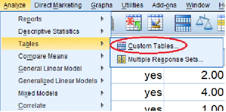
Make statistics tables through 'Custom Table' (categorical variable)
For Creating the custom table, we choose from the Menu: Analyze < Tables < Custom Table:
Next select the variable and to drag and drop them to the position "Rows".
Next, we click on the "Summary Statistics" button to select the percentages that we want to show in our table. In this example, we have chosen to select "Table N%". If you want the totals to appear, choose "Categories and totals"
Table 3. Time students spend on their mobile phones in 2019
Count Table N %
Time students spend on their mobile phones in 2019 (Binned)
<= 2.50 16 38.1%
2.51 - 5.60 21 50.0%
5.61+ 5 11.9%
Total 42 100.0%
Interpretation. 50% of the students use the mobile phone between 2.51 and 5.60 hours, and only 11.9% use the long time (more than 5.61)
Note that you can rearrange the order in which the selected statistics will be displayed. If you are satisfied with your selection you click on "Apply to Selection" and “OK”
Table 4. General information of the students
Count Table N %
Gender FemaleMale 1725 40.5%59.5%
Use
Texting 5 11.9%
Phone call 9 21.4%
Email 1 2.4%
Social media 21 50.0%
Listen music 3 7.1%
Watch video 3 7.1%
Playing games 0 0.0%
Time do students spend on their Mobile Phones in 2019 (Binned)
<= 2.50 16 38.1%
2.51 - 5.60 21 50.0%
5.61+ 5 11.9%
Total 42 100.0%
Descriptive Statistics with SPSS Vs 25 (The data for this exercise is also on the course website, named ‘chapter 2, 2019’)
For the above example, follow the procedure for entering data into SPSS SPSS procedure: Create data file
Creating a new SPSS data file consist of two stages: Defining the variables (variable view)
Entering the data (data view) Defining Variable
1. Click the Variable View in the lower-left corner of the data editor window (see the following figure)
2. Type the name of the each variable under the ‘Name’ column. Assign variable name based on your research questionnaire or the exercise that you want to analyze.
Note. In the "Name" column, we write the names of the variables that you must enter (click on row 1). Name of the variable. It’s your own choice, but that is understandable and does not use numbers or symbols as the first letter since SPSS will not accept it. Also, you cannot use spaces in the name. If you want to write the name of the compound variable with two words or more, you must join the words with underlining. For example: "education_level".
3. Under the ‘Type’ column, click the Ellipses button; by default Numeric appears, click the ok button. 4. Under the ‘Label’ column, type the full name of the variable you are analyzing (example, Time students
spend on their mobile phones in 2019).
5. In the "Values" column, click on the Ellipses button. The Value Labels dialog box opens (see the figure below) Type 1 in the Value box, type each category in the Label box, and click the Add button. Repeat step 5 until end the alternatives that has the variable.
6. When you have finished creating all the variables, go to the next step to write the data. 7. For Enter data. Go to ‘Data view’ and type the data
Graphic method
A statistical chart is the presentation of information by means of geometric figures. The primary objective of a graph is to give an overall visual impression for quick and easy to understand. It is important to consider the title of the figure, specify the scale, legend and determine the appropriate figure to information.
Chart Types
For categorical variables (Gender, Smartphone, etc.).
When you want to know the frequency and percentage of the total cases that are included in each category
Bar chart:
Simple ® a variable, even when the variable is quantitative but is discreet
Clustered bar (Grouped) ® two variables
Stacked ® two variables Pie circular Chart ® one variable
Lines
Stem and leaf
Boxes (combination of quantitative and qualitative)
Note: The first question is: Which Graph to select? The answer is according the type of the variable you will analyze.
Graphs Menu.
Legacy Dialogs (accessed from the main Graph menu) leads to a series of different graph/chart types from which to select. In all cases, you will then be asked to Define the graph by specifying the variables to be displayed and how they are to be plotted.
The precise information required and the format of the dialogue boxes will vary according to the type of graph you select.
If you are not sure what each chart type looks like, select Graphboard Template Chooser (from the main graph menu). You have to ensure that the variable has the correct Measure (nominal, ordinal or scale) defined in Variable View in ‘Measure’ column.
Graph – Chart Builder
The Chart Builder dialog box is an interactive window that allows you to preview how a chart will look while you build it.
1. Click the Gallery tab if it is not selected.
The Gallery includes many different predefined charts, which are organized by chart type. The Basic Elements tab also provides basic elements (such as axes and graphic elements) for creating charts from scratch, but it's easier to use the Gallery.
2. Click Bar if it is not selected.
3. Drag the icon for the simple bar chart onto the "canvas" which is the large area above the Gallery. The Chart Builder displays a preview of the chart on the canvas. Note that the data used to draw the chart are not your actual data.
4. You add variables by dragging them from the Variables list, which is located to the left of the canvas. A variable's measurement level is important in the Chart Builder.
5. Now drag gender from the Variables list to the x axis drop zone.
The ‘y’ axis drop zone defaults to the Count statistic. If you want to use another statistic (as a percentage or mean), you can easily change it.
6. Click Element Properties to display the Element Properties window.
The Element Properties window allows you to change the properties of the various chart elements.
These elements include the graphic elements (such as the bars in the bar chart) and the axes on the chart. Select one of the elements in the Edit Properties of list to change the properties associated with that element.
Output from Chart Builder.
Figure 1. Gender of the students of the descriptive statistics course, 2019.
Finally: Once your graph is produced you can edit it further like any piece of SPSS Output by double-clicking on it.
Building the clustered bar chart
Assuming you want to present how the distributions of marital status [marital] of the survey respondents are different by gender [sex] group. Then, you may need this type of “clustered bar chart”.
Output
Another example:
Building the Stacked Bar Chart
Box plot
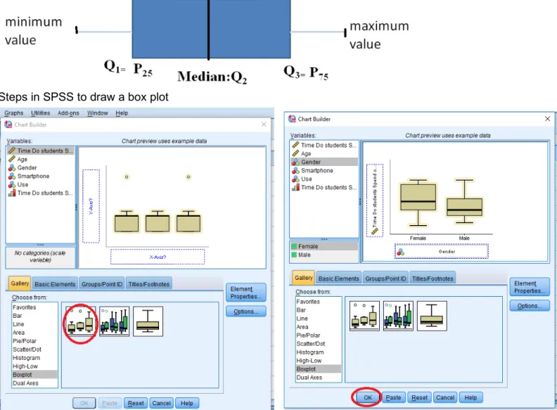
In the Variable View, make sure that the appropriate scale is selected for each variable. The dependent variable should be a scale variable, and the grouping variable should be ordinal or nominal.
This chart divides the data into four areas of equal frequency. The central box (where the middle 50% of the data) has a vertical (or horizontal) inside the box indicates the median (if this line is at the center in the center of the box there is symmetry). From the center of each side vertical (or horizontal) of the box are drawn whiskers. The mustache on the left (or lower) has its extreme value closer to Q1 - 1.5 * IQR, while the right whisker (or higher) has its extreme value closer to Q3 + 1.5 * IQR, and are considered the most extreme outliers in Q3 + 3 * IQR or less than Q1 - 3 * IQR (in SPSS are represented by “o” or “x”, respectively). So from top to bottom, here’s what’s in the boxplot:
Top whisker: Q3 + 1.5 * IQR,
Top of box: 3rd quartile
Line in the middle: median
Bottom of box: 1st quartile
Bottom whisker: Q1 - 1.5 * IQR Steps
Select the Boxplot option under the gallery. Select the type of boxplot you want to create, and drag it to the main window.
Then, drag the dependent variable to the box next to the Y-axis, and the independent variable to the box under the X-axis. Note: you will get an error message if you only created scale variables. Setting the appropriate measurement scale is very important.
Steps in SPSS to draw a box plot
Output
Interpretation: We observe that there are no outliers, so women also spend more time on their mobile phone.
In the above figure, the time that students spend on their mobile phone by gender are skewed right. The part of the box to the left of the median (representing not many hours of cell phone use in both groups) is shorter than the part to the right of the median (representing the many hours of cell phone use). That means that students who use a few hours their cell phones are closer together than those who use long hours.
About variability: the box diagram for women and men shows a slight asymmetric distribution (skewed to the right), that is, the data tend to be concentrated towards the bottom of the distribution and extend to the right. In the context (hours), most hours are concentrated in a short time of telephone and those that uses more time are more dispersed.
The long upper whisker in the example means that the hours of student telephone usage vary among the most positive quartile group.
The same median, different distribution - See diagrams of women and men. The medians (which will generally be close to the average) are at the same level. However, the box diagrams in these examples show different views distributions.
Note:
If one side of the box is longer than the other, it does not mean that side contains more data. In fact, you can’t tell the sample size by looking at a boxplot; it’s based on percentages of the sample size, not the sample size itself. Each section of the boxplot (the minimum to Q1, Q1 to the median, the median to Q3, and Q3 to the maximum) contains 25% of the data no matter what. If one of the sections is longer than another, it indicates a wider range in the values of data in that section (meaning the data are more spread out). A smaller section of the boxplot indicates the data are more condensed (closer together).
Graphs: Stem and leaf
Stem-and-leaf plots are a method for showing the frequency with which certain classes of values occur. (a stem-and-leaf plot is another way to visually organize numerical data)
Use the actual numerical values of each data point.
• Divide each measurement into two parts: the stem and the leaf.
• List the stems in a column, with a vertical line to their right.
For instance, suppose you have the following list of values about the prices ($) of 11 brands of walking shoes:
12 13 21 27 33 34 35 37 40 40 41
Figure 4. Price ($) of walking shoes
Frequency Stem & Leaf 2.00 1 . 23 2.00 2 . 17 4.00 3 . 3457 3.00 4 . 001 Stem width: 10.00 Each leaf: 1 case(s)
Interpretation: The stem and leaf plot of walking shoes prices showed that shoes prices are a little more concentrated between 30 and 40 $.
How many of the estimates are between 30 and 40 dollars (inclusive)? Seven of the eleven estimates are between 30 and 40 $.
Steps to draw Stem and leaf
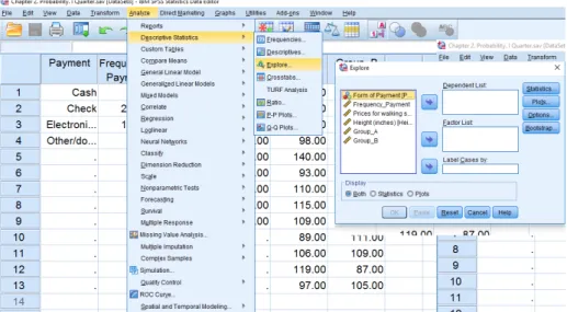
Step 1. Analyze > Descriptive Statistics >Explore
Select the desired variable and click the arrow to move them to the right side (as shown in the figure below)
Suppose you have the following list of values about the prices ($) of 11 brands of walking shoes: 12, 13, 21, 27, 33, 34, 35, 37, 40, 40, 41
Construct a Boxplot for this data Statistics
Minimum 12
Maximum 41
Percentiles
25 21 50 34 75 40
Interpretation: We see that half the prices of walking shoes are between 21 and 40 dollars. If the data set includes one or more outliers they are plotted separately as points on the chart. 25% of prices fall below $ 21, and 25% of the highest price of shoes was over $ 40. The box plot above does not present outliers. And finally, Box plots often provide information about the shape of a data set. The example below shows
some common patterns.
2 4 6 8 10 12 14 16
2 4 6 8 10 12 14 16 2 4 6 8 10 12 14 16
Skewed right Symmetric Skewed left
Interpreting Graphs: Shapes
Measures of Central Tendency (describing the center)
They are computed to give a “center” around which the measurements in the data are distributed; i.e. the central indicate that the data seem to cluster: Mean, median and mode
Mean. The arithmetic average of the data (Most commonly called the “average”)
Population Mean Sample Mean
Suppose you have the following list of values about the prices ($) of 11 brands of walking shoes: 12, 13, 21, 27, 33, 34, 35, 37, 40, 40, 41
The average price of walking shoes is 30.27 dollars
Median
Middlemost or most central item in the set of ordered numbers; it separates the distribution into two equal halves
If odd n, middle value of sequence (n = 9) if X = [1, 2, 4, 6, 8, 10,12,14,17] then 8 is the median
If even n, average of 2 middle values if X = [1, 2, 4, 6, 8,10,11,12,14,17] then 9 is the median; i.e., (8+10)/2 Median is not affected by extreme values
Mode
The mode is the most frequently occurring number in a distribution if X = [1, 2, 4, 7,7,7,7,10,12,14,17]
then 7 is the mode
Easy to see in a simple frequency distribution
Possible to have no modes or more than one mode Bimodal and multimodal
Properties of mean and median
For symmetric distributions, mean = median
For skewed distributions, mean is drawn in direction of longer tail, relative to median
Mean valid for interval scales, median for interval or ordinal scales
Mean sensitive to “outliers” (median often preferred for highly skewed distributions). Means can be badly affected by outliers (data points with extreme values unlike the rest)
Outliers can make the mean a bad measure of central tendency or common experience
When distribution symmetric or mildly skewed or discrete with few values, mean preferred because uses numerical values of observations
Measures of Dispersion (Variability)
Indices that allow the researcher to indicate how spreads out a group of data.
1. Range: The spread, or the distance, between the lowest and highest values of a variable. To get the range for a variable, you subtract its lowest value from its highest value.
2. Interquartile Range: Is the distance or range between the 25th percentile and the 75th percentile.
(IQR= Q3- Q1)
Interpretation: A large amount of variability among the middle 50 percent of the relevant observations, and a small IQR indicates a small amount of variability among of the relevant observations.
3. Standard Deviation: A small standard deviation means that the group has small variability or relatively homogeneous.
Standard Deviation Population Standard Deviation Sample
The standard deviation ‘s’ is the square root of the variance Example:
Suppose you have the following list of values about the prices ($) of 11 brands of walking shoes: 12, 13, 21, 27, 33, 34, 35, 37, 40, 40, 41
Standard Deviation is:
Interpretation: The variability around the mean price of walking shoes is $10.59
Properties of the standard deviation:
• s³ 0, and only equals 0 if all observations are equal
• s increases with the amount of variation around the mean
• s depends on the units of the data (e.g. measure euro vs $)
• Like mean, affected by outliers
Empirical rule: If distribution is approx. bell-shaped,
• about 68% of data within 1 standard deviation of mean
• about 95% of data within 2 standard deviation of mean
• all or nearly all data within 3 standard deviation of mean
you convert in minutes the value is 120, and a high 7200, if you use seconds. But in any event, the Sd has not changed!
A way to overcome the difficulty in interpreting the Sd is to include the value of the mean of the dataset and
use de COEFFICIENT OF VARIATION. The coefficient of variation is a relative measure of the Sd of a distribution and the mean. The coefficient of variation can be either expressed as a proportion or a percentage of the mean.
4. Coefficient of Variation: The coefficient of variation (CV) is defined as the ratio of the standard deviation ‘σ’ to the mean‘µ’. Let’s compare variability between samples where units are different.
For the previous example about the prices ($) of 11 brands of walking shoes 35% of variability with respect to the mean therefore is heterogeneous data.
Note: Smaller the coefficient of variation, higher is the consistency, homogeneity, stability, uniformity, and etc.
(Less than 12% considered very homogeneous data, more than 50% considered very heterogeneous data)
Application example: Risk of a Single Asset
The owners of Photo Shop in Kigali, are considering two investment alternatives, asset A and asset B. They are not sure which of these two single assets is better, and they ask Butera Aaron, a financial planner, for some assistance.
Rates of Return
Year Asset A Asset B
5 years ago 11.30% 9.40%
4 years ago 12.5 17.1
3 years ago 13 13.3
2 years ago 12 10
1 year ago 12.2 11.2
Total 61 61
Average rate
of return 12.20% 12.20%
Standard
deviation 0.63 3.12
Solution: Aaron knows that the standard deviation is the most common single indicator of the risk of the variability of a single asset. In financial situations the fluctuation around a stock’s actual rate of returns and is expected rate of return is called the risk of the stock. The standard deviation measures the variation of returns around an asset’s mean. Aaron obtains the rates of return of each asset. The results are show in the following table. Notice that each asset has the same average return of 12.2%. However, once Aaron obtains the standard deviation, it becomes apparent that asset B is a riskier investment.
Measures of position
pthpercentile:percent of observations below it, (100 - p)% above it.
Quartiles
– first quartile (designated Q1) = lower quartile
cuts off lowest 25% of data (25th percentile) – second quartile (designated Q2) = median
cuts data set in half (50th percentile) – third quartile (designated Q3) = upper quartile
cuts off highest 25% of data, or lowest 75% (75th percentile)
Example
Statistics
Height (inches) N Valid 9
Missing 4
Percentiles 25 50.0000
50 62.0000
75 67.5000
Interpretation: Q1: 25% of the height of people is 50 inches or less and that the other 75% are 50 inches or
more.
Q3: 75% of the height of people is 67.5 inches or less and 25% are greater than or equal to the third
quartile.
IQR: The middle 50% of the data have a spread of only 17.5 inches (between 50 to 67.5)
Measures of Distributions: skewdness and kurtosis
Skewness Shape. The skewness of a sample is a measure of how central the average is in relation to the overall spread of values
.
skewness is a measure of the asymmetry of the probability distribution of a random variable about its mean. In other words, skewness tells you the amount and direction of skew (departure from horizontal symmetry). The skewness value can be positive or negative, or even undefined. If skewness is 0, the data are perfectly symmetrical, although it is quite unlikely for real-world data.Symmetry: The right and left tails of the histogram appear to be mirror images of each other If: Skewed 0 the distribution is symmetric
Skew > 0 the distribution is positive (right skewed asymmetry) • Fewer scores right of the peak
• Can be caused by a floor effect
Skew <0 the distribution is negative (left skewed asymmetry) • Fewer scores left of the peak
• Can be caused by a ceiling effect As a general rule of thumb: If skewness is:
If skewness is between -0.5 and 0.5, the distribution is approximately symmetric.
Mean and Median in Skewed Distributions
In a normal distribution, the mean and the median are the same number while the mean and median in a skewed distribution become different numbers:
Kurtosis
The kurtosis of a sample is a measure of how pointed the distribution is. It is also a way to think about how clustered the values are around the middle.
If k ≈ 0.263, we say that the curve corresponding to the frequency distribution is mesokurtic (has just pointing to the normal or Gaussian)
If k> 0.263, we say that the curve corresponding to the frequency distribution is leptokurtic if k <0.263, we say that the curve corresponding to the frequency distribution is platykurtic
Exploratory Data Analysis
Box-and-whisker plots and stem-and-leaf displays are examples of what are known as exploratory data analysis techniques. Allow the investigator to examine data in ways that reveal trends and relationships identify unique features of data sets, and facilitate their description and summarization.
SPSS output using the data given on page 3, about the ‘time students spend on their mobile phones in 2019 (Hours)’.
The box diagram shows that there is one outlier, The box diagram shows that there is no outlier found in row 1 of the database.
Interpretation: The box diagram shows that the data is skewed to the right, that is, it is an asymmetric distribution, where the median cuts the box into two unequal parts. If the longest part of the graph is to the right (or above) of the median, the data is said to be skewed to the right. If the longest part is to the left (or below) the median, the data is skewed to the left.
Descriptive statistics with outlier
Descriptive statistics without outlier (value = 8.70)
Statistic Std. Error Statistic Std. ErrorMean 3.4236 .27734 Mean 3.2949 .25174
95% Confidence Interval for Mean
Lower
Bound 2.8635 95% Confidence Interval for Mean Lower Bound 2.7861
Upper
Bound 3.9837 Upper Bound 3.8037
5% Trimmed Mean 3.3079 5% Trimmed Mean 3.2310
Median 3.2000 Median 3.2000
Variance 3.231 Variance 2.598
Std. Deviation 1.79738 Std. Deviation 1.61194
Minimum 1.10 Minimum 1.10
Maximum 8.70 Maximum 7.00
Range 7.60 Range 5.90
Interquartile Range 2.50 Interquartile Range 2.45
Skewness .769 .365 Skewness .425 .369
Kurtosis .344 .717 Kurtosis -.780 .724
Note: Interpret the statistics studied in this chapter shown in the previous table
Assignment 2 1. True and false…
a. ____the first step in data analysis is to describe, or summarize, the data using descriptive statistics b. ____the number resulting from the computation of a measure of central tendency represents the
typical score attained by a group of participants
c. ____the mean is the most precise, stable index of typical performance that is especially useful in situations in which there are extreme scores
d. ____plus and/or minus two standard deviations includes more the 99% of the scores e. ____the median of a set of scores corresponds to the 50% percentile
f. ____if the extreme scores are at the upper, or higher, end of the distribution, it is said to be positively skewed.
2. Fill in the blank
a. …the values calculated for an entire population __________________
b. …the index of central tendency appropriate for nominal data _____________ c. …the index of central tendency appropriate for ordinal data _____________
d. …the index of central tendency appropriate for interval or ratio data _____________ e. …the measure of variability used for interval and ratio data _____________
f. …+/- 1.00 standard deviations constitutes ____ % of the sample
3. Consider the boxplot below.
2 4 6 8 10 12 14 16 18
Which of the following statements are true? I. The distribution is skewed right II. The interquartile range is about 8 III. The median is about 10
a. I only b. II only c. III only d. I and III e. II and III
4. In the following list, post a ‘D’ for the situations in which statistical techniques are used for the purpose of description and an ‘I’ for those in which the techniques are used for the purpose of inference. _____ (a) Several manufacturing firms in a particular industry are surveyed for the purpose of estimating industry wide investment in capital equipment.
_____ (b) The price movements of 50 issues of stock are analyzed to determine whether stocks in general have gone up or down during a certain period of time.
_____ (c) A statistical table is constructed for the purpose of presenting the passenger-miles flown by various commercial airlines in the United States.
_____ (d) The average of a group of test scores is computed so that each score in the group can be classified as being either above or below average.
5. We want to measure the IQ in two groups of classes of IT students,
a. Compute and interpret all statistics, such as: measures of central tendency (mean and median); variability (standard deviation, coefficient of variation, range); position (quartiles) and distribution (skewness and kurtosis). Which group is more intelligent and more consistences?
b. Draw a boxplot for the data and compare and also check for any outliers. c. Draw Stem and Leaf Plot of IQ for Two Classes
Group A: 102 128 131 98 140 93 110 115 109 89 106 119 97
Group B: 127 131 96 80 93 120 109 162 103 111 109 87 105
Statistics
IQ_groupA IQ_groupB
N Valid 13 13
Missing 29 29
Mean 110.5385 110.2308
Median 109.0000 109.0000
Std. Deviation 15.52211 21.45598
Skewness .516 1.044
Std. Error of Skewness .616 .616
Kurtosis -.600 1.743
Std. Error of Kurtosis 1.191 1.191
Range 51.00 82.00
Minimum 89.00 80.00
Maximum 140.00 162.00
Percentiles
25 97.5000 94.5000
50 109.0000 109.0000
75 123.5000 123.5000
6. Using a bar graph representing the information in the table below, corresponding to the cost of a basket of AUCA student. Data taken in a survey in May 2017
Amount spent in Rwf according to the cost of a basket of AUCA students, 2017
Basket
Quantity in Rwf
Food 50
Transport 10
Tools 20
Entertaiment 25
Place to live 30
Laundry and Other 05
Total 140
7. A random sample of 11 vouchers is taken from a corporate expense account. The Voucher amounts are as follows:
276.72 194.17 259.83 249.45 201.43 237.66 199.28 211.49 240.16 261.1 226.21 Compute and interpret:
a. the mean and median
b. the range, standard deviation and coefficient of variation c. quartile first and third
d. the interquartile range e. Skewness and Kurtosis
f. Construct histogram and box plot g. construct a table with 3 intervals
8. In a survey of 20 year olds in China, Germany and America, people were asked the number of foreign Countries they had visited in their lifetime. The following box plots display the results.
a. In complete sentences, describe what the shape of each box plot implies about the distribution of the data collected.
b. Compare the three box plots. What do they imply about the foreign travel of twenty year old residents of the three countries when compared to each other?
c. Have more Americans or more Germans surveyed been to over eight foreign countries? Solution:
a. Seventy-five percent of Chinese participants have never visited a foreign country. The only variability occurs in the top 25%, so this data is skewed to the right. The lower 50% of data for Germans is more spread out than the top 50%, so the German box plot is skewed to the left. The data for U.S. participants is skewed to the right.
b. According to the box plots, 20-year-olds in China rarely travel outside their home country. Germans travel a great deal. The greatest variability is seen in the U.S. where 25% of participants have never traveled outside the country, yet 25% have traveled to at least 5 foreign countries.
c. At least 50% of Germans surveyed have been to eight or more foreign countries. Fewer than 25% of U.S. participants have been to eight or more foreign countries. A greater proportion of Germans have traveled to eight or more foreign countries. This is reasonable because Germany is in close proximity to many more foreign countries than the United States.
9. Given the following box plot
a. Which quarter has the smallest spread of data? What is that spread? b. Which quarter has the largest spread of data? What is that spread? c. Find the inter quartile range (IQR)
10. Refer to the following histograms and box plot. Determine which of the following are true and which are false. Explain your solution to each part in complete sentence
a. The medians for all three are the same.
b. We cannot determine if any of the means for the three graphs is different. c. The standard deviation for (b) is larger than the standard deviation for (a).
11. Age of students at party
6 7 8 9 10 11 12 13 14 15 16
Determine which of the following are true and which are false a. All of the students are less than 17 years old
b. At least 75% of the students are 10 years old or older c. There is only 7 year old students at the party
d. There is only 16 year old students at the party
12. Calculate and interpret the descriptive statistics taught in this chapter. Use the data that you will find on the website course. https://sites.google.com/a/upeu.edu.pe/rosa-padilla/ named ‘Chapter 2, 2019’ Steps with SPSS
Go to analyze> Frequency and follow the steps in the figure
Statistics
Time do students spend on their Mobile Phones in 2019
Age
N Valid 42 42
Missing 0 0
Mean 3.4236 23.1667
Median 3.2000 22.5000
Std. Deviation 1.79738 2.66794
Skewness .769 1.010
Std. Error of Skewness .365 .365
Kurtosis .344 .745
Std. Error of Kurtosis .717 .717
Range 7.60 11.00
Minimum 1.10 20.00
Maximum 8.70 31.00
Percentiles
25 2.0500 21.0000
50 3.2000 22.5000
70 4.4000 24.1000
75 4.5500 25.0000