AIC 2010, Color and Food
From the Farm to the Table
Interim Meeting of the
International Color Association
Mar del Plata, Argentina
October 12-15, 2010
Proceedings
edited by
José Luis Caivano and Mabel Amanda López
(with CD-ROM enclosed)
Published by
Grupo Argentino del Color and Nobuko
This publication includes lectures, papers and posters presented in AIC 2010 Color and Food: From the Farm to the Table
Interim Meeting of the International Color Association held in Hotel Provincial, Mar del Plata, 12-15 October 2010 organized by the Argentine Color Group
web of the congress: www.aic2010.org
Decimal Universal Classification
535.6:663/664 535.6:547.9 535.6:392.8 535.6:641/642 535.6:725.71 535.6:73/77
Caivano, José Luis
AIC 2010 color and food : from the farm to the table : Interim Meeting of the International Color Association, Proceedings / José Luis Caivano and Mabel Amanda López. – 1st ed. - Buenos Aires : Grupo Argentino del Color; Grupo Argentino del Color, 2010.
628 pp. + CD-ROM : il. ; 30 × 21 cm.
ISBN 978-987-24707-2-2
1. Tecnología de los Alimentos / Food Technology. I. López, Mabel Amanda II. Título
CDD 664.028
Graphic design: Lucía Maillo Puente Assistant in edition: Ayelén Mazzuca
copyright 2010
© Grupo Argentino del Color
Secretaría de Investigaciones FADU-UBA Ciudad Universitaria Pab. 3 piso 4
C1428BFA Buenos Aires, Argentina Tel. (54-11) 4789-6289
Web: www.fadu.uba.ar/sitios/sicyt/color/gac.htm
Made the deposit established by Argentine Law No. 11.723 Printed in Argentina / Impreso en Argentina
This book was printed on demand, with digital technology in bibliográfika, Voros SA, Bucarelli 1160, Buenos Aires, Argentina [email protected] / www.bibliografika.com
October 2010
AIC 2010 “Color and Food: From the Farm to the Table” is organized by the Argentine Color Group (GAC, Grupo Argentino del Color)
and the National University of Mar del Plata (FAUD-UNMdP), on behalf of the International Color Association (AIC, Association Internationale de la Couleur) Hotel Provincial, Mar del Plata, Argentina, 12-15 October 2010
Scientific Committee
José Luis Caivano, chair (Argentina) María del Pilar Buera (Argentina) R. Daniel Lozano (Argentina) John B. Hutchings (UK) Angel I. Negueruela (Spain) Berit Bergström (Sweden) Javier Romero (Spain) Nick Harkness (Australia) Lindsay MacDonald (UK) Shoji Tominaga (Japan) Verena M. Schindler (Switzerland) María Luisa Musso (Argentina) Osvaldo Da Pos (Italy) Katsunori Okajima (Japan) Manuel Melgosa (Spain) Robert Hirschler (Hungary) Jin-Sook Lee (Korea) Paul Green-Armytage (Australia) Paula J. Alessi (USA) Lucia R. Ronchi (Italy) Francisco J. Heredia (Spain)Organizing Committee
Omar E. Burgos (GAC president)María Paula Giglio (National Univ. of Mar del Plata) José Luis Caivano (Univ. of Buenos Aires) Claudio Salvador (Leather Chemists Association) Laura A. Quaintenne (Pampa Center)
María del Pilar Buera (Univ. of Buenos Aires) R. Daniel Lozano (Buenos Aires) María Luisa Musso (Univ. of Buenos Aires) Lucía Maillo Puente (Univ. of Buenos Aires) María F. de Mattiello (Nat. Research Council) Susana G. Geat (National Univ. of North-East) Cristina Manganiello (National Univ. of La Plata) Emilia Rabuini (Pampa Center)
Silvia Barrios (Buenos Aires) Marcela Rojas (Gutenberg Foundation) Alejandra Jaimerena (Nat. Univ. of Mar del Plata) Carlos Prause (National Univ. of Litoral) Anahí López (National Technological Univ.) Alicia M. Gaisch (Nat. Univ. Center Bs.As. Prov.) Teresita Kessler (Nat. Univ. Center Bs.As. Prov.)
AIC Executive Committee
President: Berit Bergström (Sweden) Vice-President: Javier Romero (Spain) Secretary/Treasurer: Nick Harkness (Australia) Ordinary Members: Lindsay MacDonald (UK)
Verena M. Schindler (Switzerland) Shoji Tominaga (Japan) María Luisa Musso (Argentina) Auditors: John B. Hutchings (UK)
AIC regular members
Argentina Grupo Argentino del Color Australia Colour Society of Australia Brazil Associaçao Pro-Cor do Brasil Bulgaria Colour Group - Bulgaria Chile Asociacion Chilena del Color China Color Association of China Finland Suomen Väriyhdistys Svy Ry France Centre Français de la Couleur Germany Deutscher Verband Farbe Great Britain The Colour Group
Hungary Hungarian National Colour Committee Italy Associazione Ottica Italiana
Japan Color Science Association of Japan Korea Korean Society of Color Studies
Mexico Asociación Mexicana de Investigadores del Color Netherlands Nederlandse Vereniging voor Kleurenstudie Poland Glóny Urzad Miar
Portugal Associaçao Portugesa da Cor Slovenia Drustvo Koloristov Slovenije South Africa Colour Group of South Africa Spain Comité Español del Color Sweden Stiftelsen Svenskt Färgcentrum Switzerland Pro Colore
Taiwan Color Association of Taiwan Thailand The Color Group of Thailand USA Inter-Society Color Council
AIC associate member: International Association of Color Consultants/Designers
Sponsors of AIC 2010
Main: Agencia Nacional de Promoción Científica y Tecnológica Gold: Natural Color System
Consejo Nacional de Investigaciones Científicas y Técnicas Silver: Osram
Bronze: X-Rite / Abastecedora Gráfica / Pantone / Macbeth Fundación Gutenberg
Verivide / DigiEye D’Amico Sistemas
Sanico Instrumental / Lovibond Basic: Brapack
International Association of Color Manufacturers
Media partners of AIC 2010
journals: Color Research and ApplicationColour: Design & Creativity
publisher: CRC Press - Taylor & Francis Group
Preface
Dear friends,
On behalf of the International Color Association (AIC) and the Argentine Color Group (GAC), we are delighted to welcome you at the AIC Interim Meeting 2010, in Mar del Plata city, Argentina, from October 12 to 15, on the theme “Color and Food: From the Farm to the Table”.
The meeting includes keynote lectures by specialists, oral papers and posters on different aspects of color related to food, as well as a commercial market and an artistic exhibition. The theme of the meeting is approached from different perspectives, including not only food technology and colorimetry, color chemistry and physics, but also commercial architecture and design, lighting, packaging, advertising and color communication, color psychology related to some aspects of food, consumer expectations, color preferences, the representation of color and food in the arts, and various other aspects of the interdisciplinary net that these two essential aspects of life interweave. We cannot live without food, and certainly life would be extremely ominous and difficult without color.
This is the second time that an AIC meeting or congress is held in Argentina. Various participants may still have fresh memories of the 6th AIC quadrennial Congress held in Buenos Aires in 1989.
You will experience the friendly and open character of the Argentine people, who will warmly receive you in a country with plenty of natural beauties and appealing cultural features.
Welcome to AIC 2010!
José Luis Caivano Chairman, AIC 2010
Roberto Daniel Lozano Committee member
Program outline
47 oral papers (20 minutes); 4 keynote lectures (40 minutes)
99 posters exhibited all 3 days: October 13-15
Commercial exhibition open all 3 days: October 13-15
Optional tours or excursions after the meeting: Saturday, October 16 in the afternoon
pre-congress seminars / cursos pre-congreso:
Index of Contents
Preface ... 5 Index of contents ... 7
Oral Papers and Invited Lectures
Oral session: Food Color and Appearance
J. Hutchings (invited lecture): Food, expectations, colour and appearance ... 17 O. da Pos, C. Rao: Colours seen through transparent objects ... 23 I. Jung, P. Jokela, P. Brandt, O. Victor: What is the colour of a glass of wine? ... 27
Oral session: Psychological Aspects of Food Color
P. F. M. Conceição: The control of animal stress and welfare with measurements of skin color variation: A new field of applications of colorimetry in aplied
psychology ... 31 G. Ortiz Hernández: Colors, flavors and emotions ... 37 R. G. Frontera, M. A. Camerlo, D. P. Frontera: The psychology of color:
A relevant instrument in marketing and design ... 41 P. Cox, M. R. Domper: Use of color in the promotion of consumption of fruits
and vegetables: The experience in the program “5 a day Chile” ... 45 M. Kuo, H. L. Chang, Y. C. Tseng: A study of the relationship between color and
the Chinese five elements –exemplified by the color schemes of health food
in Taiwan ... 49
Oral session: Color in Food Packaging
J. A. Castillo Cabezas, P. Becerra: Color strategies for food packaging: Systematic compilation and analysis of chromatic palettes of olive oil’s
package ... 53 M. L. Musso: Colour as a code in food packaging: an Argentine case ... 57 P. Csillag: Food package chromatic design: An analysis from the point of view
of visual perception ... 61 C. Prause, S. Cariola: Compatible colour palettes for natural food packaging ... 65 M. Rojas, J. Fossati: Study and analysis of the consistency of the color from the
piece of food to the virtual representation in the screen and in the packaging ... 69
Oral session: Color in Food-Related Architecture
F. Hidalgo, A. Torres, J. Serra, J. Llopis, A. García: The color of the tiles in the
architecture of Valencia’s Central Market (Spain) ... 73 A. Incatasciato, I. Girelli, M. M. Mariconde, A. V. Zucaria: Chromatic
expressions in commercial architecture: Córdoba, Argentina ... 77 D. Suárez, M. M. Avila, V. Domijan: Urban image and color in the food industry
Oral session: Food Chemistry and Colorimetry
M. J. Akhtar, M. Jacquot, E. Arab-Therany, M. Jamshidian, M. Imran,
S. Desobry: Role of color edible films against photo-oxidation of salmon
oil: Physico-chemical characterization of film ... 92 R. Hirschler: Whiteness, yellowness and browning in food colorimetry –
a critical review ... 96 N. Harkness, D. Leedham, M. Butterworth: Application of non-contact digital
imaging for “measuring the un-measurable” ... 100 S. Kim, M. Golding, R. Archer: Matching target colours in a food system using
the Allen colorimetric algorithm ... 104 M. Melgosa, J. Romero, R. Huertas, L. Gómez-Robledo, P. A. García, D.
Khaustova,S. Q. Bukhari, J. K. Bismillah, P. Wang, A. Tremeau:
Color-difference measurements using 9-steps gray scales ... 108
Oral session: Food Colorimetry
D. Ferraris, M. L. González-Miret, L. Libertino, F. J. Heredia, G. Hough: Relationship between sensory analysis and the instrumental colour and
visual texture assessment of deep-fried breaded veal ... 112 F. J. Rodríguez-Pulido, M. L. González-Miret, J. M. Zaldívar-Cruz, F. J. Heredia:
Application of image analysis to the colour-phenolic composition
relationships of grape seeds ... 116 M. Lucassen, J. Alferdinck, R. van Megen: Color classification of veal carcasses:
Past, present and future ... 120 A. I. Negueruela (invited lecture): Is the colour measured in food the colour
that we see? ... 124
Oral session: Color and Food in Arts and Culture
L. Echagüe: From Arcimboldo to Mondongo: Food and color in painting ... 130 O. Burgos: The Last supper of Leonardo da Vinci, analysis and interpretation ... 134 S. Gündes, D. Özden: Between mysterious and sin: Red in pomegranate and
apple ... 138 L. M. Silveira: Color communication: Pieces of culture from photographs of food ... 142 M. Tassara: It’s nice… can it be tasty? ... 146
Oral session: Color, Food Properties, and Preferences
R. Peacock-Smith: The colour of food and its relationship to appetite appeal ... 150 S. Sueeprasan, C. Traisiwaku: Colour evaluation of green tea drinks by Thai
observers ... 154 L. M. Agudelo Laverde, N. Acevedo, C. Schebor, M. P. Buera: Color
determination in dehydrated fruits: Image analysis and photocolorimetry ... 158 A. V. Gallo, M. P. Buera, C. Petriella: Color study at storage of lyophilized carrot
systems ... 162 J. D. Sandoval, S. R. Gor, J. Ramallo, A. Sfer, E. Colombo, M. Vilaseca, J. Pujol:
Oral session: Color Design in Food Environments (ECD Study Group)
M. M. Avila: Food, colors and urban places ... 170
E. Cordero, F. Poblete, M. Egert: The daily quotes that transforms the city into a festival of colours: River Market Valdivia ... 174
J. Serra, S. Gilabert, A. Torres, J. Llopis, A. García: The colour of food: Last layer in the palimpsest of St. Caterina market in Barcelona ... 178
T. R. Lee, V. Sun: Color preference for dining space and its imagery ... 182
Oral session: Color and Food in Culture and Language S. Barrios: Bicentenary: The colour in NOA’s (Argentinian north-western) aboriginal cultural pottery ... 188
S. Gündes, A. Yildiran: Female names associated with rose in food and color relationship ... 192
L. MacDonald, D. Mylonas: Edible colour names ... 196
A. Mollard-Desfour, S. Krylosova, V. M. Schindler (invited lecture): From red bordeaux to absinthe green, from hot chocolate to cappuccino: Beverages, their referential colour terms and reflections on cultural differences ... 200
Oral session: Food Lighting, Color Imaging and Appearance I. Villar: Enjoying food under a new light ... 206
S. Okuda, Y. Fukumoto, N. Hara, H. Iwade, W. Iwai: Effect of illuminance and correlated colour temperature on visibility of food colour in making meals ... 209
B. Funt, M. Mosny: Color calibration via natural food colors ... 213
J. L. Lin, M. C. Lo: Using image partition and process syncronization technologies to shine food via web-based color gamut mapping in cross-media ... 217
A. Farroni, M. P. Buera: Matrix influence on color perception: A study of cornflake processing stages ... 221
R. D. Lozano (invited lecture): Colour and visual appearance in foods ... 225
Posters
Posters: Color in Food Packaging and Identification E. Andrade, G. Incatasciato: Food and its packaging. Color, transparency and sense ... 233P. Becerra, J. A. Castillo Cabezas, L. Maillo Puente, M. Castellá Esplugas: Packaging design for food: Teaching color and cesia in designers’ education ... 239
R. Alvarez, E. Bermúdez, S. Pescio: Colour interaction between food and non-food products ... 243
M. L. F. de Mattiello, H. Salinas: Importance of label and labeling in food commercialization ... 247
D. Bardier: Legal value of color and form in the “small print” ... 251
M. Neiva: ColorAdd. Color identification system for colorblind people ... 256
R. Peacock-Smith, F. Wild: Breakfast cereal packaging in Australia ... 259
X. Liu, R. Zhao: The color research of food package in global market ... 262
Posters: Color in Food Design, Architecture and Built Environment
P. Zennaro, K. Gasparini: Exciting architecure for exciting food ... 270
V. Conte: Home sweet home: Is the gingerbread house in Palermo Viejo? ... 274
S. M. Estévez: Food’s domestic enviroment, its evolution and trends ... 278
R. Funk: From garden conscious to color conscious: The rise of the suburban food garden ... 282
R. F. Nill, S. G. Geat: The use of color in a fishermen’s village. Case study: “San Pedro Pescador” neighborhood, Antequeras, Chaco, Argentina ... 286
R. Rao, A. Carena: Food design: Perception of color and polysensoriality. Color and taste ... 290
T. Vorobyeva: French design color wine ... 294
Posters: Food Color and Lighting J. S. Lee, H. N. Kim, J. Y. Park, C. S. Kim: A study on the proper color temperature of LED lamp in space of dining table ... 298
P. Ixtaina, M. Presso, F. Bredice, P. A. Bazalar Vidal: Colour appearance in LED lighting ... 302
Y. Imai, Y. Kato, T. Horiuchi, S. Tominaga: Illuminant estimation under multiple light sources ... 306
M. Rossi, A. Rizzi: Color temperature variation for food lighting: A test on user preferences ... 310
Y. Yamadera, S. Okuda, W. Iwai, Y. Fukumoto: Preferable lighting conditions for the appearance of the dishes in the dining room ... 314
Posters: Food Color in the Arts, Culture and Communication M. C. Albrecht, I. S. Molinas: “In the green market…”: From the poetic evocation to the recovery of municipal markets in Latin America ... 318
C. Recio Dávila: Colors of the desert. The colors of the dishes in north Mexico ... 322
L. Elizalde: Culinary expressiveness in national holidays ... 324
C. Manganiello: The ever-changing color of apples ... 328
M. E. Beneito: Communicating through color and health ... 331
J. L. Caivano, M. A. López: Color and feeding, a compromise between necessity and desire: biological and cultural semiotic processes ... 334
M. Grosjean, O. Guillemin, S. Marest, M. Cler, F. Cler, V. M. Schindler, M. Yonge: Multi-sensory culinary colours: Shifting hues from green to blue ... 337
M. Cler, V. M. Schindler: Of imaginary and fantasies/phantasms: A critical view of the relationship between colour and food ... 341
J. C. Sanz, V. M. Schindler: Environmental colour design and synaesthesia in food-related contexts ... 345
M. C. Grassi, A. Tedeschi, N. E. Del Prete, L. Podestá: “Man does not live by bread alone…” Attractors in a platter. Art and production ... 349
Posters: Sensory Evaluation of Food Color, Psychological Aspects, Consumer Preferences and Expectations
R. Fernández-Vázquez, C. M. Stinco, A. J. Meléndez-Martínez, F. J. Heredia, I. M. Vicario: Orange juice colour: Visual evaluation and consumer
preference ... 357 L. Garitta, G. Hough: Optimization of sensory analytic methodologies applied to
heterogeneous vegetables ... 361 A. B. Picallo, M. E. Cossu, E. B. Coste, B. Montenegro, L. R. Basso: Assessment
on relationships between color and tenderness parameters in different steers
breeds ... 365 I. Okamoto, M. Kobayashi: On the color analysis of the presentation of Japanese
food: The relationship between color and taste ... 369 G. Olguin, L. M. Castellano, M. Abraham, M. P. Bourdichon, S. Giurdanella,
T. Hernández, M. Scocco, F. De la Fuente: The color of toys and its
relationship to child development. Aspects transferred to the appearance of
sweets ... 373 K. Sakata, H. Shimakura: Effect of taste and tone listening on achromatic colour
perception ... 378 J. L. Sandford: Food color memory and names: A linguistic vantage ... 382 K. Tomita, T. Aiba, J. Kang, M. Matsui, K. Ohtani: Psychological effects of the
tray-color on diners: Comparison between young persons and elderly
persons ... 386 M. C. Vadji: Food, color and health: Therapeutic and preventive approaches ... 390
Posters: Food Color and Appearance
M. O. Bello, R. J. Aguerre, M. P. Tolaba, C. Suárez: Kinetics effect of
hydrothermal conditions on translucence of milled rice ... 393 G. B. Cordon, S. Gismondi, A. V. Nievas, M. G. Lagorio: Non-destructive
assessment of water and pigments in leaves from the remission function
using the Kubelka-Munk theory ... 397 W. Ji, R. Luo, J. Hutchings: Measuring banana appearance aspects using
spectrophotometer and digital camera ... 401 S. Kawai, Y. Ohtani: Effects of stimulus chromaticity on transparency perception:
A study on perceptual “clarity” of spatially overlapping figures ... 405 G. Lado, M. L. F. de Mattiello, S. Pescio: Visual texture in foods ... 409 L. R. Ronchi, J. L. Sandford: On the prototypical transformation of food
appearance from the farm to the table ... 413 M. P. Giglio: Beverages and containers: An experiment for color appearance
teaching ... 417
Posters: Food Colorimetry
G. Alcuson, A. M. Ruiz de Castro, C. Urzola, R. Oria, A. I. Negueruela:
Cross-sectional colour evaluation in borage stems ... 421 G. B. Cordon, M. G. Lagorio: Sensing chlorophyll and anthocyanin
concentrations in leaves with spatial resolution from digital image ... 425 M. E. Cossu, M. L. Lamanna, A. B. Picallo, E. B. Coste, M. L. Cumini:
Rabbit meat hamburgers: Color differences due to industrial or organic
L. Gallez, A. Marconi, E. Tourn, M. L. González-Miret, F. J. Heredia: Colour of honeys from the south-western pampas region: Relationships between Pfund
colour scale and CIELAB tristimulus method ... 433 M. García-Marino, M. L. Escudero-Gilete, M. T. Escribano-Bailón, J.
Rivas-Gonzalo, F. J. Heredia: Colour-copigmentation study in wine blending ... 437 L. Gómez-Robledo, R. Huertas, M. Melgosa, F. J. Heredia, M. J. Moyano,
J. Romero: New color scale for virgin olive oils ... 441 S. R. Gor, J. D. Sandoval, A. Ramallo, M. Vilaseca, J. Pujol: Spectral reflectance
analysis of tobacco leaves and fungus infection detection ... 445 G. Green, M. C. Rodríguez, M. S. Sobrero, N. Marsili: Simple method for
simultaneous quantitation of dyes in hydrating beverages (Gatorade and
Powerade) ... 449 D. Hernanz, V. Gallo, M. L. González-Miret, F. J. Heredia: Discrimination of
five strawberry varieties by spectroradiometry and image analysis ... 453 P. Jutterström: To define colour and set up colour tolerances for natural fruit or
berry based yogurt and juices ... 457 A. Piagentini, L. Martín, C. Bernardi, D. Güemes, M. Pirovani: Color changes in
fresh-cut fruits as affected by cultivar, chemical treatment, and storage time
and temperature ... 461 A. Piagentini, E. Silva, R. Roa, R. Garrote: Determination of kinetic parameters
of color development in evaporated goat milk during heat treatment ... 465 A. Piagentini, Y. Merayo, A. Bonaldo, R. Torres, D. De Greef, R. González:
Evaluation of color changes of maize corn spaghetti made by
extrusion-cooking ... 469 C. M. Stinco, R. Fernández-Vázquez, A. J. Meléndez-Martínez, F. J. Heredia, E.
Bejines Mejías, I. M. Vicario: Influence of different backgrounds on the
instrumental colour specification of orange juices ... 473 M. Velazque, A. Sosa, M. Jiménez Veuthey, L. Caballero, M. R. Simonetti,
C. Alvarez: Colour determination in multilayer mini-cakes ... 477
Posters: Applications of Colorants in the Industry
G. Nirino, P. Damiano: Food colorants: Use in the dyeing of textiles ... 481 M. Kobayashi, I. Okamoto: Studies on dyeing by “Kikurage” mushroom
(Auricularia auricula (Hook.) Underw.) – Reserch for optimum extracting
condition ... 485 M. C. Grasselli, T. Kessler: Basics of electrode potentials and color for redox
indicators applied to food industry ... 489 O. D. Pavioni, A. M. Gaisch, T. Kessler: Mixture design applied to the
development of explicit comestible colorant pastes ... 493
Posters: Color Change as Quality Index of Food
M. V. Agüero, A. Bevilacqua, S. I. Roura: Temperature abuses during lettuce
postharvest: Impact on color and chlorophyll ... 497 C. Busso, R. Baeza, V. Sánchez, M. C. Zamora: Evaluation of color changes
(instrumental and sensorial) of commercial pasteurized juices of cranberry (Arandano), elderberry (Sauco) and blackcurrant (Cassis) – from El Bolsón,
L. Franceschinis, N. Sosa, C. Schebor, D. Salvatori: Changes in color and
anthocyanin content of different dried products based on sweet cherries ... 505 M. L. Gagliano, L. M. Agudelo Laverde, C. Schebor, M. P. Buera: Nonenzymatic
browning in dehydrated food liposomes ... 509 S. Guidi, A. M. Sancho, G. Polenta, G. Meier, D. Vázquez, C. González: Color
measurement of “Nova” mandarins submitted to heat and degreening
treatments during long storage ... 510 M. A. Loubes, C. Almada, M. P. Tolaba: Kinetics of melanosis in shrimp. Effect
of pretreatment using chemical additives ... 514 S. B. Maidana, M. B. Vullioud, D. M. Salvatori: Color of dried pears as affected
by prior blanching and sugar infusion ... 518 S. Matiacevich, P. Silva, C. Herrera, F. Osorio: Storage effects on blueberry color ... 522 L. Pilatti, A. M. Sancho, M. Irurueta, G. Grigioni: Color variation in nut kernels
during storage under different dry methods ... 526 A. M. Sancho, S. Guidi, A. Biolatto, A. Pazos, G. Grigioni: Effects of postharvest
treatments in ruby red grapefruit quality ... 530 A. Tomac, M. I. Yeannes: Color changes in vaccum-packed squid mantle rings
(Illex argentinus) induced by gamma radiation ... 534 F. Van de Velde, M. Pirovani, D. Güemes, A. Piagentini: Effect of
washing-disinfection conditions on total anthocyanins retention and color of fresh-cut
strawberries ... 540 B. N. Pirone, M. Del Castillo, A. De Michelis, D. Salvatori: Effects of maturity
stage and use of drying on sweet cherries (Napolitana var.) ... 544 B. N. Pirone, A. Kesseler, A. De Michelis, M. Ochoa: Temperature, air speed and
pre-treatments influence in dehydrated sour cherries color ... 548
Posters: Color as an Index of Food Composition and Properties
G. Balbarrey, A. Andrada, J. Echazarreta, D. Iaconis, L. Gallez: Relationship between mineral content and color in honeys from two ecological
regions in Argentina ... 552 Y. Fukumoto, S. Okuda, K. Okajima: Colour references for estimating actual
conditions of food material and cooked meat ... 556 B. Gordillo, M. L. González-Miret, F. J. Heredia: Importance of anthocyanic
copigmentation on the colour behaviour of red wine obtained by
prefermentative cold maceration ... 560 L. Langman, L. Rosetti, A. M. Sancho, E. Comeron, A. Descalzo, G. Grigioni:
Color characteristics of raw milk from silage and alfalfa-fed cows ... 564 G. Leiva, L. Guida, G. Naranjo, L. Malec: Color as an indicator for the Maillard
reaction at mild temperatures. The effect of reducing sugars ... 567 J. M. Zaldívar-Cruz, M. J. Jara-Palacios, F. J. Rodríguez-Pulido, D. Hernanz, M.
L. Escudero-Gilete, F. J. Heredia: Colour-composition relationships of seeds
from two red grape varieties ... 571 A. Marqués-Mateu, S. Ibáñez, H. Moreno, J. M. Gisbert, S. Balasch, M. Aguilar:
Statistical relationships between soil colour and some factors of soil
formation ... 575 M. P. Serratosa, A. Márquez, A. López-Toledano, M. Medina, J. Mérida: Color
Posters: Food Color Vision and Imaging
V. Gosti, J. L. Sandford: Food colouring and liquids – basic and natural colours ... 583 M. Inui, M. Kato, Y. Azuma, D. Saito, M. Sato: Evaluation of compressed
images displayed on LCD monitor (V): Introducing a coefficient for maximum color difference used in the formula of underestimating edge
color difference ... 587 S. Gorji Kandi: Applying machine vision for quality control of fruits in human
based color space ... 591 M. C. Lo, J. L. Lin, X. K. Ma: A multi-spectral approach of cross-media HDR
imaging technique for food store scenes under multi-illuminants using a
locally optimized automatic white balancing method ... 596 R. Saito, T. Horiuchi, S. Tominaga: Feature extraction of painter-specific color
distribution from real paintings ... 600 S. Sakamoto, Y. Manabe, S. Ikeda, K. Chihara: Color reproduction of 3D printer ... 604 K. Samu, A. Molnar, Z. Nemeth, B. V. Nagy: Color optimization of different
fruits and vegetables for computer displays ... 608 T. Sato, N. Ito: Contribution of chromatic information in depth perception
with rapiddly changing dynamic stereograms ... 612 H. Shimakura, K. Sakata: Colour opponency in chromatic after-effects ... 616 I. Tortajada, J. Montalvá, M. Aguilar: Effect of chromatic assimilation
(Bezold effect) in the vision of the content in a dinner plate ... 620
Food, expectations, colour and appearance
John HUTCHINGS
Department of Colour Science, The University of Leeds, UK
ABSTRACT
Expectations drive our decisions, lives and actions. Interpretation of the scene governs whether or not we eat the food front of us, or whether or not we patronize a particular store or restaurant. Throughout the food supply chain expectations (derived from the total appearance of the food) are at the heart of quality and price judgements. On entering a restaurant or pub we may subconsciously judge expectation qualities such as cleanliness, comfort, privacy and quality. Such judgements are direct responses to the visual properties of the space. A holistic approach is taken because total appearance images and expectations are critical in separate and interlinking ways to all aspects of food research, development, production, marketing, sales and preparation, as well as consumption. Above all, they are critical to each individual producer or customer whether they are in the field, kitchen, store, restaurant or pub. They are also critical to those contributing to the visual stimulus experienced by the customer. These include architects, store designers, and food producers, whether they are chef or manufacturer, as well as those in advertising and packaging or those responsible for training customer contact staff.
1. INTRODUCTION
The early history of life on earth involved co-evolution of insect and animal visual characteristics with vegetation and fruit to produce food appearance based on sensitivity to wavelength and angle, on surface texture, on ultraviolet signals and on polarisation. Specific food properties evolving were related to the particular visual sensitivities of the creature. Human beings see that world using a restricted wavelength sensitivity, zero detection of the ultraviolet and zero detection of polarisation. Cones in the retina of the human eye gave us the ability to detect the yellows, oranges and reds of fruit and reddish coloured succulent edible leaves from their respective green and brown backgrounds.
Our early evolutionary link with fruit and vegetable colour is so profound that we need to eat generous portions of pigment containing fruit and vegetables to live a healthy life today. Colour is not the whole story of our visual link with food because we have evolved to respond to appearance. This comprises visual structure, each element of which possesses colour, translucency, gloss, surface texture (roughness) properties. Each of these attributes behaves characteristically with time and processing, all contributing to our overall expectations of the food in front of us.
Study of the appearance of food is totally different from the study of other mass marketed materials such as paints and plastics. There is considerable interaction of appearance properties of foods in the formation of expectations, whereas it is normally easy to treat appearance attributes of other materials as independent variables.
2. FOOD COLOUR AND APPEARANCE
One of the ways that study of how foods look differs from that of all other mass marketed materials is that foods have a natural variation in appearance properties. Normally, solid foods are non uniform in colour, they are translucent and vary, often irregularly, in surface texture (i.e. roughness) and gloss. It is the complete package of these properties that leads to identification and preference for a particular food.
Many products, for example meats, have a visual structure revealing different elements within the total product. We immediately receive information as to the number of muscles present, the degree of lean and fat contents.
Translucency, caused by occurrence of both light transmission and reflection, is visually perceived as a colour contrast. Ancient Egyptians clarified drinks by filtration and today a reduction in clarity leads to rejection of alcoholic drinks. Turbidity in fruit juices, such as apple, can be a positive or a negative attribute depending on the expectation of the consumer. Processing affects colour as well as translucency. Fish and red meats depend for their perceived quality on the balance between colour and translucency.
Gloss, also perceived as a colour contrast, is of concern to the food industry. Specific gloss characteristics are associated with different fruits and vegetables. High-quality chocolate normally has a high gloss and light scattered from the surface is near mirror-like specular reflection. When chocolate blooms it loses gloss, the specular reflection changes to diffuse scatter and the surface becomes dull. In the store glossiness of moist surfaces such as fish reinforce perceptions of freshness, but only if there is sufficient directional light. Glossy surfaces look attractive and are perceived as clean. Hence, for the store apples may be coated with wax designed to reduce gas exchange, weight loss, and fungal growth but are also designed to be glossy. Gloss or glaze is achieved in the kitchen by finishing vegetables glacé or coating products with a jam or fruit puree, or with a sweet or savoury aspic glaze.
Surface texture is also a characteristic of foods. Meat cut along the grain reveals its fibrous structure, breakfast cereals have differing degrees and types of roughness, some varieties of apple are rough skinned some smooth. We perceive this roughness as colour contrast but a study of colour alone will not reveal the story behind the product.
In summary, there is a number of attributes of appearance that affect the look of the product. Hence, when we study effects of processing, cooking and consumer preference it is essential to consider appearance as a whole. This consists of visual structure, variations of colour, translucency, gloss and surface texture, and temporal properties, this is, how these individual attributes change with time or processing. All these attributes combine to result in what we expect of the food in front of us.
3. EXPECTATIONS
There are two main types of expectations that condition our subsequent responses and experiences. The first are those generated by what we believe, perhaps from a religious knowledge. The second are the five general categories of expectations generated from our perceptions of a scene. This applies to everything we view, whether that is a landscape, store front, the waiter, a plate of food or its packaging (Hutchings 2003).
Visually assessed safety involves safety of body and safety of mind. Perhaps the cutlery appears dirty, or that this television programme will corrupt the mind of my child.
Visually assessed usefulness, for example, will the waiter know how the meal is prepared, is this food what I need at this time, will it contain the vitamins I need?
Visually assessed pleasantness, this is a comfortable looking restaurant, will this waiter be friendly, how tasty will this plate of food be?
Visually assessed satisfaction, for example, when I have finished eating a meal in this restaurant, will I have enjoyed it; will it have been value for money?
Expectations are fundamental to food marketing and when a food pack, advertisement, dining room, or a particular food dish is being designed it is helpful to consider the five types. An important consequence of expectations are the halo effects they generate, these have profound implications for the sensory testing of foods. Expectations can also be commercially exploited, sometimes to an unethical extent.
3.1 Halo effects
Colour and appearance are powerful indicators of object quality. Human beings have different sensitivities to flavour and it is relatively easy to confuse tasters by giving them inappropriately coloured foods. Raspberry flavoured drinks may be identified as orange juice, sweets presented in differently coloured wraps taste differently. Food folklore has it that diners eating in the dark can be made physiologically sick by switching on the lights, revealing that they are eating inappropriately coloured food. Divisions occur within populations; in the UK there are different preferences for tomato soup colour. Dark, deep red is the preferred colour for those used to tomato puree/powder based soup but orange red is preferred by those raised on tins of Heinz cream of tomato soup (Hutchings 1999).
3.2 Implications for sensory testing
Halo effects have severe implications for the food sensory panel. Panel in-mouth scores can be influenced by sample appearance, the environment, panel organisation and panel organiser attitude. During optimisation of product flavour or texture, low illumination levels or coloured lighting is used in the tasting area. However, although the actual colour of the product may be completely lost, conclusions may still be drawn about the sample from the light reflected. For example, the extent of baking of bread products can be detected even under low illumination levels. The halo effect is so powerful that variations in appearance should be entirely eliminated while judgments of flavour and texture are made. There are however two groups of subjects, field-independent, who attend to their taste and smell perceptions even in the presence of an inconsistent visual stimulus, and the field-dependent, who make more mistakes when trying to identify flavours in the absence of visual cues as to their origin. The traditional R and D function of the manufacturer may concentrate too much on the product. The marketing end of the business may focus too much on concepts, and the lifestyle and attitudes of potential customers. Often little account is taken of the extreme influence of the brand.
Halo effects can be positive or negative. The colour of an orange tells us that it contains a natural mix of healthy antioxidants which are good for us. But the colour uniformity may tell us that it is sprayed with fungicide and herbicide, and the gloss reveals that it has been waxed. We may therefore conclude that oranges are poisonous and are bad for us.
3.3 Commercial exploitation
Although colour might be basic to judgements of identification and quality it is by total appearance that we come to understand the product. High expectations about the healthiness of oranges may lead us to have similar beliefs about orange juice. This is itself an example of the halo effect. A commercial exploitation of this is the extension to some commercially produced ‘orange’ drinks. Not only is this orange liquid in a white translucent plastic bottle having an orange label, it is marketed in exactly the same way as real orange juice in a chill cabinet. But when it was launched this product contained a mere 5% orange juice with lots of sugar, water and colorant. The success was great, the parent thinking that it is healthy for the child but the child liking it because it contains lots of sugar. The marketing was brilliant, unethical, but brilliant.
Lighting is a factor in environmental design and no single lighting regime is optimal for all foods. Red biased light is used to conceal the brown specks in fresh beef that indicate pigment oxidation. The customer normally regards such meat containing metmyoglobin, although probably edible, as undesirable. Some regard this use of store lighting as bordering on fraud, but is it unethical to display foods to their best possible advantage?
4. ETHICAL CONSIDERATIONS
We expect natural foods that we eat to have a colour and appearance appropriate to the dish. Similarly we feel better if a synthetic dish, such as ice cream, also has a colour appropriate to the flavour. For 4,000 years colorants have been added, perhaps to restore damage caused by processing, or to make products more uniform or attractive, or later to protect flavour- and light-sensitive vitamins during storage. Colour helps us identify flavour and estimate its strength and quality. How far is it ethical to colour foods?
In the USA non-natural colours are being used to tempt children to overeat foods that contribute to obesity when eaten to excess. Examples include: high fat margarine products that are purple and bubblegum flavoured, or hot pink, or bright blue; high fat, high sugar ketchups that include bubblegum flavoured blue mayonnaise and ‘Blastin’ Green’ and ‘Funky Purple’ versions of the normal yellow ketchup; high fat, high salt snacks that include some that are neon orange; and high sugar drinks that are marketed in colourful branded cans. Is manufacture of these products and such presentations ethical?
coloured cartoon covered bottles. Bright high contrast colours are used to market to all ages and younger buyers are attracted by products specifically meant for adults (Hutchings 2006).
5. MEASUREMENTS
Visual appearance is comprised of those properties we perceive as visual structure, the value, uniformity and pattern of surface texture (i.e. unevenness of surface), colour, translucency and gloss, plus changes of these properties with time or with response to, say, pressure or temperature. All these attributes we can scale visually with precision and accuracy and instrumentally specify using digital camera technology (Hutchings et al. 2002). The term total appearance, meaning a combination of assessable and measurable product attributes as well as our feelings about them, was first used 30 years ago with reference mainly to foods. Since then the approach has been extended and refined (Hutchings 1999). The CIE has a Technical Committee TC 1.65 coordinating progress in this area (Pointer 2006).
When we think of objects as having derived attributes, such as acceptability of appearance of foods, the ripeness of tomatoes, the appearance warmth of a room, the elegance of a building, then we are thinking in terms of appearance and impact. Such attributes are related specifically to our recognition and psychological sensory, emotional and intellectual images and estimates of quality. As such they are scalable and understandable in terms of visual appearance attributes and their interactions.
Understanding of any food product (e.g. a plate of food), internal space (e.g. dining room or store) or external space (e.g. a store façade or landscape) can be achieved using the following six elements. The details obviously change with situation, but there are six elements to the understanding of a space and its effect on the viewer. The approach can be applied to the analysis and possibly to the prediction of the effects of the space on the human being. These six elements of a scene fall into three groups, they are:
1. The physical environment consisting of the static environment itself (e.g. the furniture in the room or food on the plate, and additions to the static environment, for example, the temperature, illumination and human beings within the space or the temperature of the food.
2. The psychophysical impressions, that is, the impact properties in terms of warm/cool, hard/soft and clear/greyed (suggested for colours by Kobayashi 1998), i.e. design elements (e.g. curves and angles, irregularity, furniture style, small/large spaces), materials of construction, illumination (colour, artificial/daylight, rendering intensity, uniformity), colours (also in terms of Green-Armytage 2002); the primary expectations, that is, safety, identification, pleasantness, utility, satisfaction (see above); and secondary expectations, that is specific psychophysical experiences of the appearance of the space, in terms of, for example, homeliness, intimacy, elegance, and privacy (Hutchings 2003).
3. The psychological effects of the environment, such as the sadness, fear, vulnerability, motivation, calmness, self esteem, or tranquillity generated by the space or the product.
REFERENCES
Green-Armytage, P. 2002. Colour zones, explanatory diagram, colour names, and modifying adjectives, Proc Ninth AIC Congress, 2001 Rochester, Robert Chung, Allan Rodrigues editors, Washington, SPIE The International Society for Optical Engineering, 976-979.
Hutchings, J. B. 1999. Food colour and appearance, 2nd edition. Gaithersburg, MD: Aspen.
——. 2003. Expectations and the food industry - the impact of color and appearance. New York: Kluwer/Plenum Publishers.
——. 2006. Talking about color?... and ethics, Color Research and Application 31: 87-89.
Hutchings, J. B., M. R. Luo, and W. Ji. 2002. Calibrated colour imaging analysis of food. In Colour in food, improving quality, ed D. B. MacDougall. Cambridge: Woodhead Publishing, 352-366. Hutchings, J. B., M. R. Luo, and L-Ch. Ou (forthcoming). Quantification of scene appearance - a valid
design tool? Color Research and Application.
Kobayashi, S. 1998. Colorist, a practical handbook for personal and professional use, translated by Keiichi Ogata, Leza Lowitz. Tokyo: Kodansha International.
Pointer, M. 2006. A framework for the measurement of visual appearance, CIE TC1-65 report.
Colours seen through transparent objects
Osvaldo DA POS, Cristina RAO Facoltà di Psicologia, Università di Padova
ABSTRACT
Perceiving transparency involves the perception of a transparent object, may it be real like a drink or simulated like in virtual reality, distinct and in front of an organized background visible behind and through it. Here we study how the colours in the background are modified by a coloured filter which completely covers them. Four observers had to reproduce in a uncovered part of the background the nine colours of a simulated mondrian stereoscopically observed through a coloured veil. The filters could have one of the four unique hues, at two levels of chromaticness (NCS), and at two levels of transmittance. A control mondrian without filters had also to be matched. The obtained matching colours show rather relevant deviations as respect to the ‘real’ colours of the covered mondrian, that is little colour constancy occurred. No constancy difference has been found as a function of the chromaticness and of the transmittance of the filters, while colour constancy seems to depend on both the colours of the filter and of the background.
1. INTRODUCTION
Both foods and drinks can be transparent or translucent (from now on we do not differentiate the two terms), but not always they appear as such. The reason is that the definition of transparency is almost always framed in physical terms (transmittance or density). We need a psychological/perceptual definition which describes the visual appearance, for instance: “transparency is the property of an object through which we can see more or less distinctly what is behind”. The degree of distinctness of the shape, colour, texture, glossiness and other features of the objects perceived in the background through a transparent object determines different kinds of transparency. Research about transparency in the field of foods and drinks can be concentrated on two main characteristics, either on the transparent object or on the background seen behind and through it. Therefore we distinguish two main aspects: first the determination of the chromatic characteristics of the colour of the object (its colour and its visual density), and secondly how the colours of things seen through it are modified by the transparent object. The present research deals with this latter aspect, and our hypothesis can be formulated in term of colour constancy: “how much a surface colour appears constant despite the modifications introduced by a coloured filter in front of it” (Foster and Nascimento 1994, Ripamonti et al. 2004). We expect that, contrary to what found by D’Zmura et al. (2000), and on the basis of previous works (Masin 1998) colour constancy of surfaces completely covered by transparent objects is quite low.
2. THE EXPERIMENT
2.1 Material
viewing distance, and protruding from it over a white background (120 cd/m2). The veil was perceived at a certain distance in front of the mondrian (about 6 cm) by means of a simulated stereoscopic vision (two prismatic lenses were placed at 30 cm from the screen). The mondrian consisted of nine nearly square regions of chromatic (B, G, Y, O, R, P) and achromatic colours (W, S, and A-grey), always presented in random order (Table 1, Figure 1, left). It appeared behind and covered by the filter as a result of the stratification in depth; the reduction colours (Katz 1935) were computed according to one of the most widely accepted models of phenomenal transparency (partitive mixtures: Metelli 1974, Da Pos 1989, D’Zmura et al. 2000). The filter could have one of the four unique hues (Y, R, B, G), at high or low saturation (20 and 60 NCS chromaticness), and at high or low density (0.10 and 0.5 achromatic transmittance) (Table 1, Figure 1, right).
Table 1. CIELAB specifications of the colours of the mondrian at left, and of the filters at right. In brackets colour labels at left and the approximate NCS chromaticness at right.
SF L* a* b*
Red (R) 53.40 84.59 63.86 Yellow (Y) 94.00 -10.27 90.98 Blue (B) 46.85 -13.72 -37.46 Purple (P) 37.32 41.83 -43.39 Green (G) 56.00 -51.69 25.64 Orange (O) 63.06 61.40 69.62 White (W) 100.00 0.00 0.00 Gray (A) 53.98 0.00 0.00 Black (S) 0.00 0.00 0.00
F L* a* b*
Y (60) 86.49 -1 66.86
R (60) 64.03 44.28 16.44
B (60) 63.68 -17.38 -34.67 G (60) 68.85 -48.69 16.65 Y (20) 92.29 -3.8 28.34 R (20) 85.43 15.35 7.04 B (20) 87.07 -8.29 -9.6 G (20) 90.18 -16.31 7.63
Figure 1. The colours of the mondrian at left, and of the filter at right.
2.2 Method
both at the filtered and at the reproduced mondrian to verify their global colour correspondence, and to adjust again the matches if necessary. There was no time limit to perform the task and it could be interrupted as many times as the observers liked. To check the ability of the observers in matching colours a number of further sessions were performed in which both mondrians were uncovered while all other factors remained unchanged.
2.3 Results
All colours were transformed in the CAM02-UCS appearance colour space to better deal with measures of colour constancy (inconstancy index: Luo et al. 2006, Kim and Park 2010). First of all the performance of the four observers showed rather interesting differences. The observer 2 resulted significantly, and also largely different from the other three (her median deviation ∆E’ = 31.99 compared with 16.68, 21.42, 13.14 of the other three observers, two tails Wilcoxon Z test = ∼ 8.2 for the three comparisons, p = 0.0000) in that it reproduced with admirable care the ‘reduction’ instead of the mondrian colours (see an example in Figure 2).
Figure 2. At left the results plotted in a CAM02-UCS diagram of three observers when the filter was blue, little chromatic and highly transparent. In green the chromatic colours, derived by calculations according to Metelli model (1974), and presented in the screen; in blue are the colours of the mondrian if seen in plain air. In yelloware the colours reproduced
by the three observers (1, 3, 4). At right the results of observer 2 in the same conditions. Perfect constancy is obtained if the reproduced colours are the same of the uncovered mondrian. While rather good constancy is achieved by the three subjects at left, observer 2
carefully reproduces the reduction colours, failing to see the colours of the mondrian.
This difference seems to depend either on the very poor stereoscopic vision of observer 2, not emerged in the initial training, or on her very strong selective attention which prevents spatial interactions between colours (Masin and Quarta 1984) and consequently the appearance of complex phenomena like transparency, in which two colours are perceived at the same time in the same area, one in front and one on the back, along the same line of sight. All further statistical analysis have been therefore made on the data provided by three observers only.
On the basis of previous experiences we expected that highly transparent filters would affect colour constancy less than the more opaque ones. On the contrary we found no significant difference between conditions in which transmittance was high (50%) and low (10%). Moreover we also expected that more chromatic filters would distort more the back colours than little chromatic filters: results on the contrary indicate that slightly less deviations are derived when more chromatic filters are covering the mondrians (median =
-60 -40 -20 0 20 40 60 80 100
-60 -40 -20 0 20 40 60 80 100 a'
b'
-60 -40 -20 0 20 40 60 80 100
-60 -40 -20 0 20 40 60 80 100 a'
14.76 vs 15.16). Although the difference is very small, it is significant (two tails Wilcoxon Z test = -8.07, p = 6.85E-16). Interesting results were obtained relative to the filter colours: increasing deviations from colour constancy are produced by Red, Green, Blue and Yellow filters in the order (median-R = 17.9, median-G = 18.7, median-B = 20, median-Y = 21.4; yellow is more deviating than the others, two tails Wilcoxon Z test = -2.8, p = 0.005 in comparison with the blue filter; Z test = -2.9, p = 0.003 in comparison with the green filter; Z test = -2.6, p = 0.008 in comparison with the red filter). Also the colours of the background are more or less susceptible of being modified by the filter. Warm colours (Y, O, R) seem to be more constant than cold ones (B, G, P), irrespective of the kind of filters which cover them (median-Y = 21.9, median-O = 27.3, median-R = 32.3, median-B = 40.0, median-G = 40.1, median-P =49.7). In the control trials deviations were rather small: red, yellow, and blue colours are reproduced with small deviations (CAM02_UCS ∆E’ = 3.1, ∆E’ = 3.5, ∆E’ = 3.8 respectively) while slightly higher deviations are found in the case of orange, purple, and green (CAM02_UCS ∆E’=7.1, ∆E’ = 8.1, ∆E’ = 10.3 respectively). Lastly lightness matching has been always very accurate.
3. CONCLUSIONS
The perception of transparent objects can be studied as a case of colour constancy: the variable which interfere with colour constancy are many, and on the one side we found that constancy of the background colours depends on the colour of the filters, while on the other side warm colours in the background are more constant than cold colours.
ACKNOWLEDGMENTS
We want to thank S. C. Masin for the precious advices. Research performed with the MURST grant PRIN 2007.
REFERENCES
Da Pos, O. 1989. Trasparenze – Transparency. Milano: Icone.
D’Zmura, M., O. Rinner, and K. R. Gegenfurtner. 2000. The colors seen behind transparent filters.
Perception 29: 911-92.
Foster, D. H., and S.M.C. Nascimento. 1994. Relational colour constancy from invariant cone-excitation ratios. Proceedings of the Royal Society, London, B, 257, 1: 15-121.
Katz, D. 1935. The world of colour. London: Routledge.
Kim, Y. J., and S. Park. 2010. CIECAM02-UCS based evaluation of colorimetric characterization modeling for a liquid crystal display using a digital still camera. Optical Review 17 (3): 152-158. Luo, M. R., G. Cui, and C. Li. 2006. Uniform colour spaces based on CIECAM02 colour appearance
model. Color Research and Application 31 (4): 320-330.
Masin, S. C. 1998. The luminance conditions of Fuchs’s transparency in two-dimensional patterns.
Perception 27: 851-859.
Masin, S. C., and A. Quarta. 1984. Experimental demonstration that observers produce unbiased estimates of reduction lightness in transparent surfaces. Bulletin of the Psychonomic Society 22: 529-530. Metelli, F. 1974. The perception of transparency. Scientific American 230 (4): 91-98.
Ripamonti, C., S. Westland, and O. da Pos. 2004. Conditions for perceptual transparency. Journal of
Electronic Imaging 13 (1): 29-35.
What is the color of a glass of wine?
Ivar JUNG,1 Päivi JOKELA,2 Patrik BRANDT,2 Ole VICTOR1 1 School of Design, Linnaeus University
2 School of Computer Science, Physics and Mathematics, Linnaeus University
ABSTRACT
In this multidisciplinary pilot study, the overall research question is how the color of transparent materials is perceived and if it can be matched with opaque samples in visual color system. The focus is on the Natural Color System (NCS) and its potential to represent color in glass artifacts. The perceived color of seven glass objects was determined using NCS notation, i.e. hue (Φ) and nuance (s, c, w). A total of 420 color observations were conducted by 20 trained observers, using three different techniques. Two of them utilized the NCS atlas and the third one used virtual screen images of the NCS colors. The differences in hue and nuance were calculated for the three techniques. The main conclusion is that it seems to be possible to use NCS representation also for transparent materials but the standard viewing conditions must be modified to take account of the light that is transmitted through the object. It is also indicated that the virtual images match the nuance values of reference method quite well, but further studies are needed to enhance the color appearance of virtual hue values.
1. INTRODUCTION
The area of color research is characterized by its multidisciplinary approach, including phenomenological, psychological and physiological aspects of color perception (Billger 2000, Fridell Anter 2000, Hård and Sivik 2001), physical measurements of light spectra and, most recently, also the color appearance in virtual reality (Stahre 2009). The main focus in perceptual color research has been on the surface colors and the existing colour systems, such as Natural Color System (NCS) and Munsell, are established using opaque colors (Hård et al 1996a, 1996b, Kuehni 2000, Nayatani 2004). When it comes to transparent materials e.g. glass, plastics and liquids, there is no available color system based on perception (Gladushko and Chesnokov 2007). Pantone has a set of transparent three-step plastic samples with progressively increasing thickness and specified color codes designated to these samples, but they are not organized systematically in a color-space like NCS.
2. RESEARCH PROBLEMS ADDRESSED
The overall research question is as follows: Is it possible to use the same perceptual representations (especially NCS) for transparent materials that are used for surface colors and if this is possible, in which way should the existing color space be modified or extended to be able to incorporate transparent colors. Another research perspective is to study how the color appearance of transparent objects can be modeled in the virtual reality and how virtual models can be used to facilitate the communication in industrial color generation processes.
In the current study, the perceived color of glass objects is determined by trained observers in a standardized setting. The perceived color is expressed using NCS notation: hue (Φ) and nuance, i.e. the relationship between blackness (s), chromaticness (c) and whiteness (w). Similar method has been used by Fridell Anter (2000) in order to study the perceived color of painted house facades in different viewing situations. However, it is important to keep in mind that it is impossible to visually determine the “true” color of a transparent sample as the human color perception is always subjective. What is more, the perception also depends on external viewing conditions such as the type and position of the light source, viewing distance and angle, the thickness and shape of the sample as well as surrounding colors.
3. PILOT STUDY
In the pilot study, a total of 420 color observations were conducted by 20 different observers. The observers were 18 students and lecturers from the School of Design (Linnaeus University, Sweden) and two glass experts from Glafo. All the observers had prior experience of color matching using NCS atlas. The studied samples were seven glass sheets with the same dimensions (5*10*4 mm) and different colors, these samples will be referred to as sample A to G. The glass samples were matched with the NCS colors in three different ways:
• The sample was placed on a metal frame 5 cm above the white paper and the color was matched with the color samples in the NCS atlas.
• The sample was placed directly on the computer screen and the color was matched with screen images of the NCS colors.
• The sample was placed on a white paper and the color was matched with the color samples in the NCS atlas.
During all the observations, the light source, viewing distance and angle as well as other significant conditions were according to Swedish Standard, SS 019104, color specifications with NCS.
4. RESULTS AND DISCUSSION
The differences in nuance and hue between the mean values of the reference color and the two other perception methods are summarized in Table 1 and 2. In these tables, 1 denotes the values when the sample is observed 5 cm above the white paper, 2 is the value when the sample is placed directly on the computer screen and 3 is the value when the sample is placed directly on the white paper. The differences in nuance are calculated as follows: ∆s2 = s2 – s1 and ∆s3 = s3 – s1; ∆c2 = c2 – c1 and ∆c3 = c3 – c1; ∆w2 = w2 – w1 and ∆w3 = w3 – w1.
Table 1. Summary of differences in nuance between the three observations techniques.
∆s2 ∆s3 ∆c2 ∆c3 ∆w2 ∆w3 A -9.10 17.9 -3.50 4.55 12.6 -22.5 B 14.6 4.90 -14.0 3.80 -0,90 -8.75 C -5.05 5.70 -0.95 4.50 5.65 -10.4 D 2.00 0.40 -5.95 11.2 4.20 -11.5 E -2.95 -0.15 -1.15 4.30 3.90 -4.35 F 0.45 0.05 -2.20 26.6 1.75 -26.6 G -0.70 0.70 -1.10 8.60 2.00 -9.15
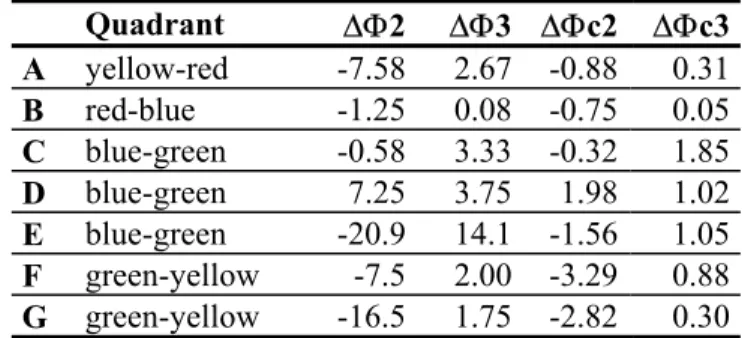
The differences in hue are calculated in the same manner: ∆Φ2 = Φ2 – Φ1 and ∆Φ3 = Φ3 – Φ1. The other way to estimate the difference in hue values also includes the chromaticness (the reference value) as follows: ∆Φc2 = (Φ2 – Φ1)*c1/100 and ∆Φc3 = (Φ3 – Φ1)* c1/100. The differences and the position of samples in the NCS circle are shown in Table 2:
Table 2. Summary of differences in hue between the three observations techniques.
Quadrant ∆Φ2 ∆Φ3 ∆Φc2 ∆Φc3 A yellow-red -7.58 2.67 -0.88 0.31 B red-blue -1.25 0.08 -0.75 0.05 C blue-green -0.58 3.33 -0.32 1.85 D blue-green 7.25 3.75 1.98 1.02 E blue-green -20.9 14.1 -1.56 1.05 F green-yellow -7.5 2.00 -3.29 0.88 G green-yellow -16.5 1.75 -2.82 0.30
For all the samples A to G, the variation in nuance follows a similar pattern: samples observed 5 cm above the paper and on the computer screen are relatively similar and they both show lower chromaticness as well as higher whiteness compared to the observation made directly on a white paper. Sample A and F have the largest overall variations, whereas E has the smallest variation. Comparing the observations made when sample was placed directly on a white paper with the reference technique, following pattern can be used to describe variation in nuance:
• Samples D, F and G, which all have low blackness values, show greater whiteness and lower chromaticness for the reference method. E, which has the highest whiteness value, varies only slightly but could be classified in this pattern.
Generally, the difference in hue values is greater when virtual images are matched with glass samples than when the NCS atlas is used. However, there are no obvious similarities with the variation in hues and nuances. It is interesting to note that when ∆Φ-values are weighed against chromaticness, the obtained values show much less variation as the colors with the lower chromaticness are allowed to vary more in hue values.
The main conclusion from the pilot study is that it seems to be possible to use NCS representation also for transparent materials. However, the standard viewing conditions must be adapted to take account of the light that is transmitted through the object, which is illustrated by the difference in whiteness between the reference color and the color observed when the sample lies directly on a white paper. What is more, for transparent materials the lightness value depends on the thickness of the sample. It is also indicated that the virtual images match the nuance values of reference method quite well, but further studies are needed to enhance the color appearance of virtual hue values.
REFERENCES
Bamford, D. R. 1997. Colour generation and control in glass. Amsterdam: Elsevier.
Billger, M. 2000. Evaluation of a colour reference box as an aid for identification of colour appearance in rooms. Color Research and Application 25 (3): 214-225.
Fridell Anter, K. 2000. What colour is the red house? Perceived colour of painted facades. Stockholm: Royal Institute of Technology, Thesis.
Gladushko, O. A., and A. G. Chesnokov. 2007. Analysis of the color of glass products. Glass and Ceramics 64 (11/12): 24-27.
Hård, A., L. Sivik, and G. Tonnquist. 1996a. NCS, Natural Color System – from concept to research and applications, Part I. Color Research and Application 21 (3): 180-205.
——. 1996b. NCS, Natural Color System – from concept to research and applications, Part II. Color Research and Application 21 (3): 206-220.
Hård, A., and L. Sivik. 2001. A theory of colors in combination – a descriptive model related to the NCS color-order system. Color Research and Application 26 (1): 5-28.
Kuehni, R. G. 2000. A comparison of five color order systems. Color Research and Application 25 (2): 123-131.
Nayatani, Y. 2004. Why two kinds of color order systems are necessary? Color Research and Application 30 (4): 295-303.
Stahre, B. 2009. Defining reality in virtual reality. Exploring visual appearance and spatial experience focusing on colour. Gothenburg, Sweden: Chalmers University of Technology, Thesis.
The control of animal stress and welfare with
measurements of skin color variation: A new field of
applications of colorimetry in applied psychology
Paulo Felix Marcelino CONCEIÇÃO Associação Pró-Cor do Brasil
ABSTRACT
The main objective of the present study is to bring new perspectives on the application of reflectance spectrophotometry to control stress through the analysis of skin color changes in threatening situations, which has common implications in human and animal health. The control of animals stress is challenging, as the biochemical diagnosis and control involve the determination of stress biomarkers levels, e.g. hydrocortisone, and it is even more problematic outside the laboratory setting. The management of skin color oscillations due to stress and environmental conditions is presented through a new chromatic approach to the control of animal welfare, and to the quality of animal food products –from the farm to the table. Stress has adverse consequences on the quality of meat, affecting its color, pH and tenderness. The influences of stress on the oscillations of skin color in humans and animals are the consequences of reciprocal regulatory mechanisms between sensory perception, psychological reaction, neurohumoral mechanisms and physiological responses, which are determiners of the vasoconstriction of blood flow in responses to stress symptoms such as fear and fright. The harmful effects of stress in animals could be minimized by the control of skin color alterations during handling and transportation.
1. INTRODUCTION – STRESS AND ANIMAL EMOTIONS: FROM THE FARM TO THE TABLE
The color of the skin may change and become yellowish; a condition generated by psychological reactions, neurohumoral mechanisms and physiological responses to symptoms of stress such as fear and fright – these mechanisms have common aspects in humans and animals, Conceição (2008). Fear responses in animals are difficult to predict because they depend on how the animal perceives the handling and transport experience. Fear is a universal emotion in the animal kingdom that motivates animals to avoid predators, Grandin (1997).1
Grandin explains that both genetic factors and experience are determiners of how an animal will behave in a fear-provoking situation, animals with high-strung temperament are more fearful and form stronger fear memories than those with placid temperament. Two types of animals may have different physiological and behavioral reactions to the same procedure: the one with calm temperament may adapt more easily and become less stressed with repeated handling. The way an animal is handled early in life will have effects on its physiological response to stressors later – memories of stress can’t be easily erased, Grandin (1997), Sacks (2006).
1 Grandin is a designer of livestock handling facilities and a Professor of Animal Science at Colorado