Working Paper N.3/05
This version: June, 2006
Monitoring the Socio-Economic
Conditions in Paraguay
María Victoria Fazio and Leopoldo Tornarolli *
CEDLAS
Universidad Nacional de La Plata
Abstract
This report documents the socio-economic situation in Paraguay. The document is mainly based on a wide range of distributional, labor and social statistics computed from microdata collected since 1995 by household surveys with national coverage: the Household – Workforce Survey (EH-MO) (1995), the Integrated Household Survey (EIH) (1997-1998 and 2000-2001) and the Permanent Household Survey (EPH) (1999, 2002, 2003 and 2004). Paraguay is one of the poorest and most unequal countries in the region. The combination of sustained income inequality, stagnation and high population growth led to increasing poverty throughout the second half of the 1990s and the early 2000s. Poverty has significantly decreased since 2002 due to the economic recovery and a reduction in income inequality.
Keywords: poverty, inequality, education, labor, wages, employment, Paraguay
*
1.
Introduction
Paraguay stands out as one of the poorest Latin American countries, with high inequality in incomes, access to education, health and basic infrastructure services. In addition, there are large disparities in human development between rural and urban areas. Over the last decades, social and labor protection has been weak.1 Several assessments suggest that it is unlikely that Paraguay will be able to meet most of the Millennium Development Goals by the year 2015. One of the main constraints is that a large fraction of the work force is functionally illiterate due to low investment in education over decades.
Paraguay is emerging from a prolonged period of political and economic instability. In 1989, Paraguayans recovered democracy after 35 years of dictatorship. However, the following years were characterized by political instability, including the assassination of the Vice President in 1999, the resignation of the then President, and a four-year interim presidency. In such political setting, Paraguay’s economy was also characterized by volatility. While in the 1970s Paraguay had the second per capita growth rate in the region, in the 1980s per capita levels decreased at an annual rate of 0.1%. During the early 1990s, with the new democratic administration there were new attempts to implement structural, macroeconomic and market-oriented reforms. However, in the first half of the decade per capita GDP growth remained at the level it had in the 1980s. Moreover, since 1995 a combination of factors - both domestic and external - has led to economic recession and rising poverty. In 1995, Paraguay experienced a severe banking crisis, which lasted until 1998. From 1999 on, difficulties were exacerbated by external shocks from two Mercosur neighbors. First, Brazil’s devaluations in 1999 and 2001 and then, Argentina’s crisis in 2002 have further weakened Paraguay’s economy, undermining prospects for growth and competitiveness, which were already vulnerable in a context of depression, fiscal deficits and structural fragilities. The political situation stabilized during 2003 with the election of a new president. Increased domestic confidence and more favorable external conditions gave economy a boost - GDP grew 3.8% and 4.1% during 2003 and 2004, respectively.2
This document shows evidence on the socio-economic performance of Paraguay in the last decade. The report, mostly focused on the 1995-2004 period, presents evidence mainly drawn from microdata of the national household surveys collected over the period - the Household - Workforce Survey (EH-MO, 1995), the Integrated Household Survey (EIH, 1997-1998 and 2000-2001) and the Permanent Household Survey (EPH, 1999, 2002, 2003 and 2004). Unfortunately, fully comparable time series are not available to assess the evolution of poverty and inequality before 1995 in Paraguay, since household surveys were conducted mainly in the Asunción Metropolitan Area (AMA hereafter).
1
See for instance, World Bank (2003a), World Bank (2003b), and ILO (2003). 2
All statistics presented in this report and computed by our team can be downloaded from www.depeco.econo.unlp.edu.ar/cedlas/monitoreo.htm. All indicators are updated as new information is released.
The rest of the document is organized as follows. Section 2 presents the main sources of information used in this report. The following 8 sections show and analyze information on incomes, poverty, inequality, aggregate welfare, the labor market, education, housing and social services, and demographics. Section 11 presents a poverty profile, and section 12 closes with an assessment of the main findings.
2.
The data
The Household - Workforce Survey (EH-MO), the Integrated Household Survey (EIH) and the Permanent Household Survey (EPH) are household surveys with national coverage that allow us to trace the distributional, labor and social situation in Paraguay since 1995. From 1983 to 1994, the EH-MO was conducted annually only in the AMA. In 1995, with the technical assistance of the World Bank, there was a significant reform in the EH-MO. Its geographic coverage was extended to rural and additional urban areas and its thematic scope added more information on living standard conditions (education, housing, migration, demographics). In 1996, under the technical and financial support of the MECOVI program, the survey changed substantially in conceptual and methodological aspects. However, on that year the survey was carried out only in the AMA and the remaining urban areas. Since then, the EIH (1997-1998 and 2000-2001) and EPH (1999, 2002, 2003 and 2004) are the most relevant sources for the analysis of the living standards of the Paraguayan population.
The EIH is carried out since 1997. The first EIH was conducted from August 1997 to July 1998 and the last one available covers the period from September 2000 to August 2001. The EPH is carried out from August to December by the General Directorate of Statistics and Census (DGEEC). The first four national EPH surveys were performed in 1999, 2002, 2003 and 2004.3
Although the EPH 1996 did not cover rural areas, it was the first household survey that extended the thematic coverage to household expenditures. In the EIH 1997-1998 there were further improvements in the estimation of expenditures, which allowed the construction of basic consumption baskets and poverty lines for different geographic regions. In this first round of the EIH there were also new sections on incomes and expenditures of independent workers. This survey also included a section on health for children under 5 years of age. The DGEEC also implemented a new methodology to aggregate total household income. This methodology mainly includes (i) estimating
3
misreported incomes with other reported information and (ii) considering implicit rent from self-owned housing as part of total household income. With the exception of the EIH 1997-1998, which includes the departments of Boquerón and Alto Paraguay, all surveys considered in this study include the same 15 departments.
In the 2000-2001 round, new sections were included on civil participation, other transactions of the household, adverse situations, security and extra-family violence, perceptions on basic services and child labor. Moreover, concerning sample size, the 2000-2001 round of the EIH almost doubles the first one.
The EPH 1999 has the same thematic coverage as the first EIH, and only includes a new section on tourism. The EPH 2002 has been modified in terms of the sampling selection based on the preceding census information gathered by the National Census on Population and Housing (CNPV, 2002). It also includes new sections on social capital, such as social nets, civil participation, charity, empowerment, political participation, access to information and social cohesion, which were financially supported by the World Bank. Unfortunately, since social protection has been weak for many years and a national strategy has only recently emerged, the surveys do not include information on specific social programs.4 The results of the EPH 2002 are not readily comparable with those of the previous surveys. The survey is based on a new frame, and it is known to have sampling problems, particularly in rural areas. Additionally, the EPH suffered a large reduction in the number of observations in 2002 compared to the previous surveys. The sampling selection for EPH 2003 and EPH 2004 is also based on the CNPV 2002, but the sample size of these surveys doubles the one of 2002. The EPH 2004 includes new sections on child labor.
Summarizing, the EH-MO (1995), the EIH (1997-1998 and 2000-2001) and the EPH (1999, 2002, 2003 and 2004) are not strictly comparable due to their variability in methodologies, reference periods, sampling and thematic coverage. Nonetheless, they are the most suitable data sources to monitor distributional, labor and social conditions in Paraguay.
3.
Incomes
Since real incomes are the arguments of poverty, inequality, polarization and welfare measures, before computing indicators of these distributional dimensions, in this section we present some basic statistics on real incomes. All nominal incomes have been deflated by the consumer price index of the month when incomes reported on the survey were earned.
4
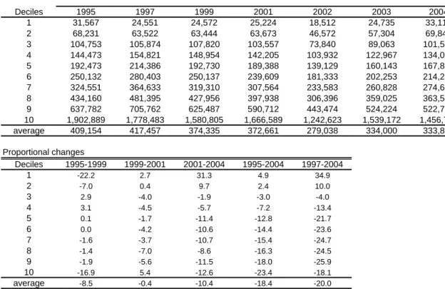
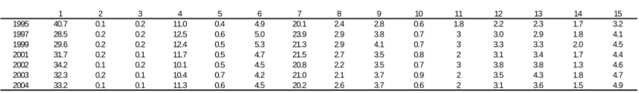
Table 3.1 shows real incomes5 by deciles between 1995 and 2004. On average, real income went down 8.5% between 1995 and 1999, fell 0.4% between 1999 and 2001, and 10.4% in the following three-year period. Overall, real income reported in the household surveys fell 18.4% (20%) between 1995 (1997) and 2004. In the same period, per capita GDP declined 9.4% (8.4%).6 Discrepancies with National Accounts could arise from changes caused by under-reporting on the household surveys, or overestimation in the GDP. They could also be the consequence of an increase in the share of sources such as capital income, benefits, and rents, which were not well-captured by household surveys.
The second panel of Table 3.1 suggests that over the 1995 – 2004 period income changes were not uniform across deciles. Only the 2 poorest deciles have experienced a small increase in their incomes. The growth incidence curves of Figure 3.1 present a more detailed picture of income change patterns. Each curve shows the proportional income change of each percentile in a given time period. They are used to study the extent to which different segments of the population participate in the growth process (or suffer from a recession). It is interesting to notice that each curve shows a decrease in real incomes for almost all percentiles. The curve for 1995 - 2004 is decreasing, implying equalizing income changes. That growth-incidence curve is located below the horizontal axis for percentiles 20 to 100, showing that the country has suffered a deep crisis that translated into large income falls. The Pen’s parade curves in figure 3.2 present another view on the same facts. Each curve shows real income by percentiles. To make the figure clearer, the curves for different percentile groups are shown in panels A to D. The order of the curves indicates falling real incomes between 1995 and 2002 for the whole distribution. The 2004 curve lies well below the 1995 curve, except for percentiles 1 to 20. However, the curve for the last year of the period is always located above the curve for 2002. The order of 1995 and 1999 depends on the specific income strata.
The income changes shown in the figures in this section suggest an increasing pattern for poverty. The non-uniform fall in income over the 1995 – 2004 period surely implied a decrease in inequality. All the evidence suggests that 2002 was the worst year in the period. The next three sections provide more evidence on these issues.
4.
Poverty
In this section, poverty is computed with the most widely used poverty lines and indicators to identify and aggregate the poor. The USD 1 a day and USD 2 a day at PPP prices are international poverty lines extensively used by the World Bank (see World Bank
5
In guaraníes of 2000. Previous versions of this report present real incomes in guaraníes of 1990. Other differences with former versions are explained by two facts: firstly, more detailed analysis of inconsistent answers; secondly, in previous versions we made a few minor mistakes in the construction of income variables in 1999 and 2002.
6
Indicators, 2004).7 Most Latin American countries, including Paraguay, compute official moderate and extreme poverty lines using the cost of a basic food basket and the Engel/Orshansky ratio of food expenditures.8 Table 4.1 shows the value of these monthly poverty lines in local currency units for the period 1995-2004 and for five different regions in the case of official poverty. Finally, another line considered is set at 50% of the median of the household per capita income distribution, which captures a relative rather than an absolute concept of poverty. For each poverty line, three poverty indicators are computed - the headcount ratio, the poverty gap, and the FGT (2).9 We also calculate the number of poor people by expanding the survey to the population covered by it. Tables 4.2 to 4.6 present these poverty measures with alternative poverty lines.
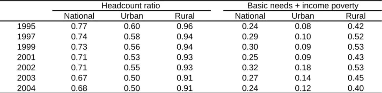
Tables 4.2 and 4.3 and Figure 4.1 show poverty estimates using poverty lines set at USD1 and USD2 a day for the whole country, and urban and rural areas separately. All three poverty measures for USD1 line (headcount ratio, FGT (1) and FGT (2)) show a small decrease in national poverty between 1995 and 2004. The trend was not uniform in the period. The headcount ratio went up from 11% to 20% between 1995 and 1999. After a temporary reduction in 2001, poverty increased again in 2002, reaching a level of 17.2%. The last available value (2004 with data from the EPH) show an important reduction in poverty, which nonetheless remains at a very high level (10.2%). Notice that there are large disparities in poverty between rural and urban areas.10 The headcount ratio for the USD1 a day line was always lower than 8% in urban areas, while it was always larger than 18% in rural areas. However, the gap in poverty between areas for USD1 line has narrowed from 17 points in 1995 to 14.4 points in 2004. The patterns for the other indicators (poverty gap and FGT (2)) are similar.
When using the USD-2 line the results are slightly different: national poverty has increased between 1995 and 2004. The headcount ratio rose from 24.6% in 1995 to 30.4% in 1999. After a decreased of 4.7 points between 1999 and 2001, poverty increased substantially in 2002, reaching the record level of 34.7%, which means that the estimated number of poor increased in around 550,000. During 2004 poverty fell to 26%. Between 1995 and 2004 around 420,000 Paraguayans (out a population of 6 millions) crossed the USD2-a-day poverty line. Again, the difference between the poverty levels in urban and rural areas is very large but it is narrowing in the last years.
Tables 4.4 and 4.5 and Figure 4.2 show official poverty estimates. Although we could compute our own poverty estimates using the official methodology, it was not possible to apply this procedure to the income data available for 1995.11 Table 4.4 shows changes in
7
See the methodological document for details. 8
See the methodological document, DGEEC (2003) and Robles (1999). 9
See Foster, Greer and Thorbecke (1984) for references. 10
The large gaps between urban and rural poverty were also found in previous studies by Miranda (1982) and Sauma (1993). The authors analyze rural poverty in the 1980s and early 1990s using unique data since national household surveys with rural coverage were not available until 1995.
11
extreme poverty recorded over the period. The incidence of extreme poverty in Paraguay grew from 15.5% in 1999 to 21.7% in 2002. These changes imply that nearly 325,000 more individuals12 fell into extreme poverty between 1999 and 2002. In 2004 the incidence of extreme poverty experienced a slightly fall to 17.1%.
As it has been already noticed, there is considerable heterogeneity in poverty between the urban and the rural population. Over the period 1995 - 2003, extreme poverty was more than 15 points higher in rural regions. This is so despite the fact that official poverty lines in urban areas more than duplicate rural official poverty lines, according to regional basic food basket estimates. In fact, Morley (2001) and the ENREPD (2002) argue that in Paraguay, poverty, and particularly extreme poverty, is predominantly a rural problem, since 3 out of 4 indigent people lived in rural areas by 2001. In 2004, as extreme poverty increased relatively more in urban areas, this ratio declined to 3 out of 5 people in extreme poverty. According to ILO (2003), urban poverty is mostly due to rural poverty, since a large share of the poor population in urban areas are rural migrants searching for better opportunities. Figure 4.3 shows that extreme poverty is concentrated on rural areas, while moderate poverty is mostly represented by urban people. Over the total number of poor people, 25.1% are rural extreme poor, while 18.5% are urban extreme poor. The ENREPD (2002) also points out that rural extreme poverty is concentrated mainly on six departments in the Central and North regions of the country, far from Asunción. However, over the period 1997 – 2004 the gap in extreme poverty significantly narrowed from 21.6 points to 10 points. Between 1997 and 2002, extreme poverty in rural areas grew from 28.7% to 31.1%. In that period the incidence of extreme poverty also increased in urban areas from 7.1% to 14.6%. From 2002 to 2004, Paraguay experienced a fall in extreme poverty to 22.8% in rural areas and 12.8% in urban ones.13 By 2005, there is preliminary evidence that extreme poverty declined around 1.2 and 2 points in urban and rural areas, respectively.
The headcount ratio for the moderate poverty line also went up over the last half of the 1990s and the early 2000s, both in rural and urban areas (see Table 4.5 and Figure 4.2). National poverty incidence rose from 32.3% to 33.8% over the 1997-2001 period, while by 2002 the headcount ratio jumped to 46.4%.14 This means around 2.6 million
sources. For instance, although the EIH (1997-1998 and 2000-2001) and the EPH (1999, 2002, 2003 and 2004) allow estimating the corrected measure of disposable income used to compute official poverty, the EH-MO (1995) does not include certain income sources which are later included in other surveys. For this reason the DGEEC adjusts the 1995 incomes to make this year comparable to the rest. Unfortunately, in this report we can not make that adjustment. We compute official poverty in that year using incomes without adjustments.
12
There are some differences in the number of poor people with previous versions because in this version we decide to expand surveys just to the population covered by it; following the methodology used by the DGEEC. In previous versions the surveys were expanded to all the population.
13
Between 2002 and 2003, this change may not be significant if the mentioned sampling variability problems of the EPH (2002) are considered.
14
Paraguayans living in income poverty conditions. The number of poor people rose by around a quarter of million between 1997 and 2001 and by an even larger figure between 2001 and 2002. During 2003 and 2004, a period of slight recovery in economic conditions, poverty decreased around 7.2 points. In the countryside, the incidence of poverty fell from 42.8% to 41.2% between 1997 and 2001 and grew to 50.5% in 2002. In urban areas poverty increased from 23.2% in 1997 to 27.6% in 2001, and reached 43.2% by 2002, which implies a relatively higher increase than in rural regions. The results for 2003 indicate a decline in rural and urban poverty of 7 and 3.5 points, respectively. The evidence for 2004 shows a decline in rural and urban moderate poverty to 40.1% and 38.4%, respectively. Prospects for 2005 suggest an interesting change: there is a reversal in the gap between rural and urban poverty driven by both a fall in rural poverty to 36.6% and an increase in urban poverty to 39.4%.
According to the existing literature, the increase in total poverty between 1995 and 2001 was mainly driven by the economic recession.15 One of the explanations of the particularly huge increase in urban poverty experienced by 2002 is due to the fact that in this area poverty is more sensitive to current income changes than rural poverty (DGEEC, 2003). In this sense, Robles (1999) argues that, keeping income distribution constant, if per capita GDP declined 5%, then the percentage of urban poor would rise in 6.7 points, while the percentage of rural poverty would rise in 4.7 points. Another feasible reason for this relative poverty jump in urban areas could also be the migration phenomenon of population moving from rural to urban regions searching for better opportunities.16
Figure 4.4, which is drawn from official estimates, shows the poverty headcount ratio in the AMA from 1983 to 2002.17 Poverty substantially declined during the 1980s and in the first half of the 1990s. It started to climb in 1998, and in 2002 it reached similar levels to those recorded in the early 1990s. From 2002 to 2004 poverty in AMA experienced a small decrease. The last 10 years have been a “lost decade” in terms of poverty reduction in Paraguay.
There is a wide dispersion of poverty estimates for Paraguay in the literature. ECLAC (2002) reports a headcount ratio of 61% around 2002. Using a methodology proposed by Londoño and Székely (2000) that sets a USD 2 a day poverty line and compares it with income measures adjusted by private consumption, Székely (2001) finds a headcount ratio of 52.1% in 1995 and 61% in 1999. Even when poverty is computed following the official methodology, differences with official estimates could arise from the way the DGEEC and
15
Some examples are the World Bank (2002), DGEEC (2003), ILO (2003), Robles (2000), and Morley (2001).
16
According to the World Bank (2002), between 1995 and 2001, around 140,000 people migrated from rural areas to urban areas, representing 6% of the urban population.
17
different authors treat individuals with misreported information, and some income items.18 For instance, the DGEEC adds the implicit rent from self-owned housing to total household income, while some authors do not. These methodological issues are especially relevant for Paraguay, where national household surveys are far from being fully comparable. For instance, Lee, Mejía and Vos (1997) show that different conclusions on poverty trends in Paraguay can be reached depending on the information source used.
ECLAC (2002) shows that in Paraguay, the percentage of households below the extreme poverty line almost doubles the average for 18 Latin American countries. Figure 4.5, which is based on data from ECLAC (2003) for around 1990, shows Paraguay as one of the five countries with the highest poverty rates in the region. Poverty in Paraguay has been considerably larger than in its Mercosur neighbors. Figure 4.6 presents evidence from Székely (2001). Using data for 1998, the author also ranks Paraguay as one of the six countries with the highest poverty rates along with Colombia, Bolivia, El Salvador, Nicaragua and Honduras.
Some countries (e.g. those in the European Union) use a relative rather than an absolute measure of poverty. According to this view, since social perceptions of poverty change as the country develops and living standards go up, the poverty line should increase along with economic growth. Probably the most popular relative poverty line is 50% of median income. The relevant scenario to justify this kind of poverty measure does not apply to Paraguay, since the economy has been stagnant in the period under analysis. In contrast to official estimates, all poverty measures computed with the 50% median income line shown on Table 4.5 indicate that poverty did not increase between 1997 and 2003. Figure 4.7 also documents this fact.
Poverty implies difficulties beyond insufficient income to afford a basic basket of goods.19 This is particularly relevant in Paraguay, where many poor households lack access to basic health, education and infrastructure services. Given the availability of information for the countries in the region, we constructed a poverty indicator according to the characteristics of the dwelling, access to water, sanitation, education (of the household head and children) and dependency rates.20 Table 4.7 and Figure 4.8 suggest that poverty in basic needs slightly declined over the period, which is consistent with similar indicators available in the literature. Indicators of endowments or basic needs usually fall, driven by urbanization
18
This fact is stressed by Lustig and Deutsch (1998), who argue that depending on the author’s approach, the poverty and inequality estimates that correct under-reporting can have results that are several orders of magnitude different from and sometimes even opposite to uncorrected estimates, even if the same survey and poverty line are used.
19
Bourguignon (2003) discusses the need and the problem of going from income poverty to a multidimensional approach of endowments. Attanasio and Székely (eds.) (2001) show evidence of poverty as lack of certain assets for Latin American countries.
20
(which has a positive impact on both monetary and non-monetary indicators), households´ efforts to improve their dwellings over time and governments investments in water, sanitation and education, even in stagnant economies.
5.
Inequality and polarization
Most comparative studies for Latin America coincide in characterizing Paraguay as one of the most unequal countries in the region (IADB, 1999, Székely, 2000, Masi, 2000, Morley and Vos, 1997, Gasparini, 2003). The evolution of the Gini coefficient over the distribution of household per capita income is depicted in Figure 5.1 for the Greater Asunción area, due to lack of national evidence until 1995. After a considerable fall in the late 1980s, inequality in Asunción increased in the early 1990s, reaching its highest historical level in 1994. After a drop from 1994 to 1997, inequality increased again and in 2001 it reached levels just slightly lower than those recorded for 1994. Morley and Vos (1997) find that the evolution of the Gini coefficient reaches a maximum level in 1995.21 Our estimates from national household survey data reveal a fall in the Gini coefficient from 1995 to 1999, followed by a sharp increase until 2003, and a dramatic drop in 2004. The high variability of the estimates casts some doubts on the robustness of the results. It is likely that, as our estimates suggest, inequality increased during the crisis and it is decreasing in the current economic recovery. However, as the high variability of the estimates suggest, the magnitudes of these changes may be distorted by noise in the surveys.
In Table 5.1 we present our own estimates of the most tangible measures of inequality - the shares of each decile and some income ratios. These measures are computed over the distribution of household per capita income. The differences in shares between the bottom decile and the upper decile are considerably large compared to other countries in the region. For instance, in 2003, while the poorest 40% of the population received 8.8% of the total income, the richest 10% received 46.1%. Between 1995 and 2002, the income share of the poorest decile declined from 0.77% to 0.66%, and the income share of the richest decile also declined from 46.5% to 44.4%. But the share of deciles 3 to 9 increased over the period. In 2004, the poorest and middle-income deciles gained participation against the richest decile.
Table 5.2 presents some inequality indices – the Gini coefficient, the Theil index, the coefficient of variation, the Atkinson index, and the generalized entropy index with different parameters. The Gini coefficient decreased from 0.584 in 1995 to 0.555 in 1999 and went back to 0.581 in 2003. But in 2004 it reached the lowest level in the period: 0.552. According to the Gini, today inequality would be similar to that of 1999. However,
21
the inequality rank between 1995, 1999 and 2004 depends on the specific index used to compare, for example the coefficient of variation and the generalized entropy index with parameter 2 rank 2004 as a worst year than 1999.
Tables 5.3 and 5.4 report an extension of the analysis to the distribution of equivalized household income. Equivalized income takes into account the fact that food needs are different across age groups – leading to adjustments for adult equivalent scales – and that there are household economies of scale.22 The introduction of these adjustments does not imply significant changes in the assessments of the inequality results. Again, the Gini does not change between 1995 and 2003, while inequality measured by any other indicator goes up. And in 2004 there is a very significant improvement in the distributional situation driven by both an increase in the income share of the 8 poorest deciles and a decrease in the participation of the 2 richest deciles.
On Tables 5.5 and 5.6, the distribution of a more restricted income variable is considered – the equivalized household labor monetary income. By focusing on labor income, capital income and transfers are ignored. Changes seem small without a clear pattern over time.
Tables 5.7 and 5.8 assess the robustness of results by presenting the Gini coefficient over the distribution of several income variables. Each column considers different adult equivalent scales, restrict income to labor sources, consider total household income without adjusting for family size, and restrict the analysis to people in the same age bracket to control life-cycle factors. All the main results drawn from previous tables hold on Table 5.7 when these adjustments are made.
Table 5.8 shows that inequality, measured by the Gini coefficient for the distribution of household per capita income, fell in urban areas but remained very high in rural ones between 1995 and 1999. Similarly to the national statistics, the Gini also went up in both areas between 1999 and 2003.23 In both areas the Gini decreased in 2004. Inequality in rural areas is always higher than in urban areas. This fact is probably related to the concentration of land among rural inhabitants. Land is a key determinant of per capita farm income in rural areas (López and Thomas, 2000), and, according to the assessment of the World Bank (2002), Paraguay has one of the most unequal land distributions in Latin America. For instance, while two thirds of the farmers have less than 5% of the land, the top 1% of the farmers has two thirds of the land. This gap in land ownership has led to the organization of a peasant political force (campesinos) that demands access to land, among other claims.
Table 5.9 suggests significant income gaps between urban and rural areas. Indart (2000) and Gonzalez (2000) argue that regional inequality is a distinctive phenomenon in
22
See Deaton and Zaidi (2003). 23
Paraguay. According to Indart (2000), in 1999 rural families represented 73% of the total number of families in the two poorest deciles and only 13% in the richest decile. However, the table shows a downward trend in the income gap, from 2.5 in 1995 to 1.7 in 2004.
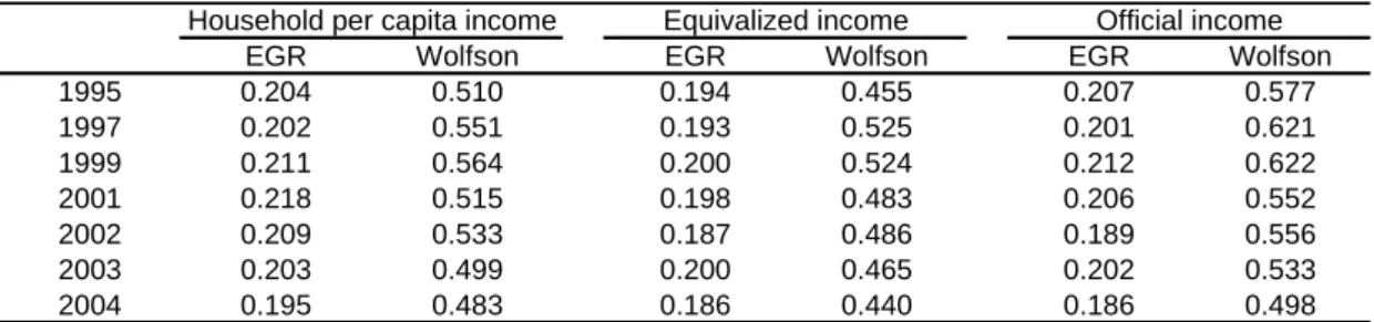
Polarization is a dimension of equity that has recently received attention in the literature. It refers to homogeneous clusters that antagonize each other. Table 5.10 shows the Wolfson (1994) and Esteban, Gradín and Ray (1999) indices of bipolarization. Polarization and inequality can go in different directions, as it was the case in Paraguay. Although the Gini coefficient decreased during the 1995-1999 period, polarization rose according to both indices. Conversely, all polarization indices fell between 1999 and 2003, while inequality increased at the national level. In 2004 polarization and inequality indices go in the same direction showing a significant decrease.
6.
Aggregate welfare
Rather than just maximizing mean income, or minimizing poverty or inequality, in principle societies seek the maximization of aggregate welfare. Welfare is usually analyzed with the help of growth incidence curves, generalized Lorenz curves, Pen’s parade curves and aggregate welfare functions. In section 3 we presented growth incidence curves and Pen’s parade curves that suggest unambiguous welfare changes over the last half of the decade. The same conclusion arises from the generalized Lorenz curves in Figure 6.1. The curve for 2002 lies well below the corresponding curves for 1997 and 2004. Therefore, any social welfare function would rank 2002 worse than 1997 and 2004. Comparing 1997 and 2004, the result is ambiguous –while the curve for 1997 seems to dominate along the entire distribution, the curve for 2004 dominates if the analysis is restricted to the lower tail of the income distribution. Therefore, the rank between these two years depends on the welfare function used.
A welfare analysis was also performed in terms of abbreviated welfare functions (See Figure 6.2). Four functions were considered. The first one is represented by the average income of the population, and according to this value judgment inequality is irrelevant. The other functions do take inequality into account. These are the ones proposed by Sen (equal to the mean times 1 minus the Gini coefficient) and Atkinson (CES functions with two alternative parameters of inequality aversion).24 For this exercise, we take real per capita GDP from the National Accounts as the average income measure, and combine it with the inequality indices shown above.25 Given that most assessments of the performance of an economy are made by looking at per capita GDP, we use this variable and complement it with inequality indices from our study to obtain rough estimates of the value of aggregate welfare according to different value judgments.26
24
See Lambert (1993) for technical details. 25
The source for GDP figures is “Sistema de Cuentas Nacionales del Paraguay, Serie 1991-2004”, Banco Central del Paraguay.
26
Between 1995 and 2004, GDP per capita went down 9.4 %. Table 6.1 and Figure 6.2 show that aggregate welfare according to the Sen function also fell but only 2.5%, while according to an Atkinson function with parameter 1 welfare fell even less (1.6%). According to the Atkinson (2) function, which captures a more Rawlsian value judgment, welfare increased 4.8% over the period under analysis driven by the decrease in inequality experienced in 2004.
7.
The labor market
This section summarizes the structure and changes of the labor market during Paraguay’s economic downturn in the last half of the 1990s and early 2000s.27 Table 7.1 reports hourly wages, work hours and labor income for the working population. Real hourly wages (deflated by the CPI) decreased over the period. Between 1997 and 2004 the mean real wage declined 25.6%, while work hours remained roughly unchanged. Labor income evolution was mainly explained by wage behavior –in 2004, mean labor income was just 72% of the value observed in 1997.
Tables 7.2 to 7.4 present real hourly wages, work hours and real labor incomes by gender, age and education. An average male worker earns more than an average woman. In addition, men work more hours, which implies higher labor incomes. In 1997, men earned 11.4% more per hour than women, and worked 11.3% more hours per week. The wage gap remained constant until 2001, but widened in 2002 reaching a record level of 1.24. In 2004, the wage gap narrowed to 7% but the hour gap grew to 18%.
.
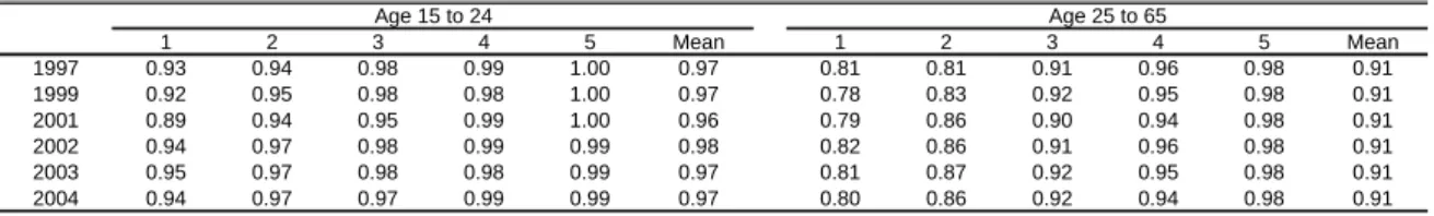
Table 7.3 shows that people between 25 and 64 years old earn higher hourly wages than those aged 15 to 24, and more than 65 years old. However, the wage gap between age groups declined from 1997 to 2003. While hourly wages for people aged 25 to 64 was 80% higher than hourly wages for people aged 15 to 24 in 1997 that difference narrowed to 57% in 2004. Changes in work hours were similar across age groups. Again, prime-age people work more hours than elderly and young people.
Formal education has been shown to be very important as an income determinant. Although this fact is also true for Paraguay, returns to education do not appear to be as large as in other countries in the region, for example, in Argentina. Table 7.4 shows labor variables by educational groups. People are classified into low, middle and high education categories, according to their years of formal education.28 The gains from education decreased between 1997 and 2004. Skilled workers earned 4.8 times more per hour than those with incomplete high school or less in 1997. The gap narrowed to 2.7 by 2004. In turn, the hourly wage gap between the skilled and the semi-skilled declined from 2.5 to 2 over the same period. The changes in hours of work were slightly unequalizing: hours
27
The information about labor characteristics collected in the EH-MO (1995) is not comparable with the information gathered for the rest of the years.
28
worked by low-educated persons fell from 46 to 45.5 between 1997 and 2004, while in the same period high-educated workers has experienced a rose in hours worked from 45.6 to 45.9
Table 7.5 shows that real hourly wages and labor income decreased for all types of workers, although the fall was more dramatic for the self-employed and for wage earners. In the period 1997 – 2003 the gap between salaried and self-employed workers widened in terms of both hourly wages and hours worked. While in 1997 the average real wage of a typical self-employed worker was 91% of the hourly wage of a typical salaried worker, by 2002 it was only 68%. By 2004, the wage of self-employed workers reached a 93% of a wage of salaried workers. The real hourly wage gap between wage earners and entrepreneurs increased from 2.7 to 3.3 times over the 1997-2004 period. Table 7.6 shows a more detailed assessment of the evolution of labor variables by labor groups. The decrease in real hourly wages has been widespread.
Table 7.7 shows labor variables across economic sectors. Falls in real hourly wages have been proportionally larger for skilled services, utilities and transportation and education and health sectors. The only sector where labor income significantly increased was primary activities, while in high tech industries labor income suffered a small decrease between 1999 and 2004. Work hours remained roughly unchanged over the period for almost all sectors; the only exceptions were skilled services and construction: in these sectors there was an increase of around 10%.
Table 7.8 shows that in rural areas, where there is a predominance of employment in primary activities, real hourly wages, hours of work and labor income stayed unchanged over the period. On contrary, in urban areas the mean wage and labor income suffered a large drop and hours of work remained almost without changes.
Table 7.9 divides total labor income into earnings of salaried workers, self-employed workers and employers. The share of the earnings of salaried workers has always been greater than 47%. The shares of these three labor income categories change across surveys, probably as a consequence of sample variability and changes in the questionnaires.
Since labor income is the main income source in the economy, and it is easier to capture in household surveys, inequality in labor outcomes is the main source of inequality in household income. Table 7.10 records the Gini coefficient computed over the distribution of hourly wages. Wage inequality substantially increased until 2003, decreasing by a little in 2004. When the analysis is restricted to gender or educational groups, results are very unstable.
hourly wages. Results suggest that correlations are negative and significant for all years. After 1999, the correlation has fallen –in absolute values– meaning that there has been an unequalizing effect on the earnings distribution. The conclusion would be the opposite if the analysis was restricted to urban salaried workers.
On Table 7.12 we compute wage gaps among three educational groups for prime age men. On Table 7.4 a slightly decreasing wage premium for skilled workers was observed within the group of all workers. On Table 7.12 the wage gaps in favor of the skilled also seem to have decreased between 1997 and 2004. In 1997 a skilled prime-age male worker earned per hour in his primary job on average 5 times more than a similar unskilled worker. That value decreased to 3.25 by 2004. Similarly, it seems that the wage gap between semi-skilled and unsemi-skilled workers has narrowed in the last years.
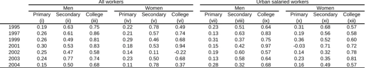
To further assess the relationship between education and hourly wages, we run regressions of the logarithm of the hourly wage in the primary job on educational dummies and other control variables (age, age squared, regional dummies, and an urban/rural dummy) for men and women separately.29 Table 7.13 shows the results of these Mincer equations. For instance, in 2004 a male worker aged between 25 and 55 with a primary education degree on average earned 15% more than a similar worker without that degree. Having secondary school complete implied a wage increase of 50% over the earnings of a worker with only primary school –the marginal return of completing secondary school versus completing primary and not having started secondary school is 50%. The wage premium for a college education was another 68%. The returns to primary school did not significantly change over the period 1997 - 2003, while the returns to secondary education increased, and the returns to college education went down. However, over time the large fluctuations recorded on Table 7.13 suggest that the returns are not estimated with precision.
The Mincer equation is also informative on two interesting factors –the role of unobservable variables and the gender wage gap. The error term in the Mincer regression is usually interpreted as capturing the effect of factors that are unobservable in household surveys, like natural ability and contacts on hourly wages. An increase in the dispersion of this error term may reflect an increase in the returns to these unobservable factors in terms of hourly wages (Juhn etal. (1993)). Table 7.14 shows the standard deviation of the error term in each Mincer equation. The returns to unobservable factors have significantly risen in Paraguay since 1997. Again, the results are different is the analysis is restricted to urban salaried workers.
The coefficients in the Mincer regressions are different for men and women, indicating that they are paid differently even when having the same observable characteristics (education, age, location). To further investigate this point we simulate the counterfactual wage that men would earn if they were paid like women. The last column in Table 7.14
29
reports the ratio between the average of this simulated wage and the actual average wage for men. In all cases this ratio is less than one, reflecting the fact that women earn less than men even when controlling for observable characteristics. This result has two main alternative interpretations: it can be either the consequence of gender discrimination against women, or the result of men having more valuable unobservable factors than women (e.g. be more attached to work). It seems that the gender wage gap has increased during the last decade.
Table 7.15 shows basic statistics on labor force shares by gender, age, education and geographical area. Over the considered period, labor participation has been larger for males, for the group aged 25 to 64, and for the most skilled. According to available data, labor force participation rose between 1997 and 2004. This fact is the result of the increasing participation of women, prime age people, unskilled workers and workers in rural areas and decreasing participation of young people and skilled workers. While in 1997 around 55.4% (95.9%) of prime age women (men) were in the labor market, in 2004 that proportion rose (fell) to 67.5% (95%).
The employment rate in Paraguay rose around 4 points between 1997 and 2004 (Table 7.16). Again, this change is the result of changes in the participation of different groups. Employment grew for women, prime age and elderly people, unskilled workers and workers in rural areas; while men, people aged 15 to 24 and semi-skilled and skilled workers living in urban areas have experienced a decrease in employment. The fall in employment by 2002 and 2003 has been mainly explained by the economic recession. The significant economic recovery is the main explanation for the high employment rate in observed in 2004.
As Table 7.17 shows, the share of unemployed adults increased 2.3 points between 1997 and 2001, and another 3.1 points by 2002, but it decreased 3.3 points by 2004. The proportion of unemployed people is greater in the groups of youngsters (15-24), semi-skilled workers, and workers in urban areas.30 The latter group was particularly more affected in terms of unemployment in 2002. The factors explaining these results seem to be different. Employment increased for women, but not enough to absorb all women who entered the labor market. In contrast, some youngsters and semi-skilled workers left the labor market, but the employment for these groups fell at a higher rate, thus increasing unemployment.
The analysis of unemployment spells gives more information on the well-being of the unemployed. The duration of unemployment, as reported at the moment when the surveys were collected, fell around 1 month between 1997 and 2001 and increased 2.3 months by
30
2004 (Table 7.18). This implies that, despite persistent unemployment has not been very significant on average, recession has exacerbated the spells, especially for the unskilled. According to Robles (2002), unemployment in Paraguay is mainly a short run situation since 70% of the unemployed reported a spell duration of about 3 months or less in the EIH (2000-2001). The author also argues this can be explained by the fact that the prevailing employment in the labor market is mainly generated by many occasional new micro firms that offer low quality jobs. Table 7.18 shows that the duration is higher for the most educated group. This can be explained by the fact that the less skilled tend to accept lower quality jobs. Moreover, as this kind of jobs generally lacks unemployment insurance, unprotected workers have more incentives to find a new job sooner.
Tables 7.19 to 7.24 show the structure of employment in Paraguay. Although there are significantly more male than female workers employed, the gender gap in shares has been narrowing down. While in 1997 35% of the working population were women, in 2004 that share grew to 39%. Throughout the 1997-2004 period, the group of workers aged 41 to 64 gained participation in the labor market, while the share of the group aged between 25 and 40 decreased. Finally, the last three columns on Table 7.19 show the change in the educational structure of the working population in favor of the most skilled. According to the results on Table 7.20, the share of rural areas in total employment has increased by 2.2 points. AMA has lost participation in employment, particularly after 1999, while the Resto Rural has consolidated its position as the region with the largest share in total employment. Table 7.21 reports changes in the structure of employment by type of work. The workers with zero income and the self-employed have increased their participation. Employment in small firms and the public sector also grew, but employment in large firms diminished.
Sizeable levels of informality have shaped Paraguay’s economy. According to the assessment by ILO (2003), the labor market is characterized by a low compliance with laws and regulations. The study also argues that informality is mainly the outcome of several factors such as inadequate or rigid laws for the development of firms and an ineffective system of incentives. In addition, informality has been exacerbated in the last half of the 1990s, since the economic downturn led workers to accept lower quality jobs. Table 7.22 presents the formal-informal structure of the labor market. Unfortunately, there is not a single definition of informality. Following Gasparini (2003), two definitions are implemented with the information available in the EH-MO, EIH and EPH. According to the first one, entrepreneurs, salaried workers in large firms and in the public sector, and self-employed professionals are considered formal workers. Considering the second definition, formal workers are those who have the right to receive pensions when they retire. According to both definitions, informality in the labor market has remained roughly unchanged and at very high levels.
1.3 point increase in the participation of Education and Health. On the contrary, commerce and industry has lost participation in total employment.
Child labor is a social issue of particular concern in Paraguay. Table 7.25 shows the proportion of working children between 10 and 14 years of age. In 2004, 25.3% of the children in the first equivalized household income quintile reported that they worked. The proportion of working children significantly declined in the richest quintile. UNICEF and ILO (2003) document that working children aged 10 to 17 amount to 241,945. Among them, 40% work in primary sector activities and 30% in unskilled jobs. According to the same study, child labor implies worse prospects for intergenerational poverty since 40% of the children aged between 10 and 17 are not enrolled in school.
The last two tables in this section are aimed at assessing different dimensions of the quality of employment. Table 7.26 shows that the access to social security remained roughly unchanged. However, the behavior was very different between groups: the access decreased for workers with low and medium education, and increased for skilled workers. Instead, the access to labor health insurance dropped for all the skills groups (see Table 7.27).
8.
Education
In this section we assess the changes in the educational structure of the population. Although Paraguay has made progress in education, it still lags behind in terms of literacy, years of education and enrollment compared to other countries in the region. The rate of illiteracy has been reduced by half, and years of education among the population aged over 9 have doubled over the last two decades. From recent national household surveys we can trace the evolution of educational indicators in Paraguay.31 The proportion of high-educated people increased during the last half of the 1990s and the early 2000s (Table 8.1).32 While in 1995, 7.6% of adults aged 25 to 65 had more than 13 years of education, that share rose to 11.2% in 2004. The rise was higher for women (around 4 points) than for men (around 1 point). Despite this increasing trend, it is worth noting that the proportion of skilled people is relatively low compared to the other countries in the region.
Table 8.2 records average years of education by age and gender. Notice that years of education increased for all groups between 1995 and 2004. The gender gap in years of education in favor of men has remained quite stable for the working-age population (25 to 65). A remarkable fact is the gap reversion in years of education between men and women. While men older than 30 have more years of education than women of the same age, the difference for people in their 20s has recently turned.
31
The EIH (2000-2001) is the first survey that includes the outcomes of an education reform that extended the number of years of primary education from 6 to 9.
32
Information on Table 8.3 suggests that the gap in years of education between the rich and the poor has been stable. It is worth noting that national household surveys do not allow us to capture years of education in graduate programs, so the variable is truncated at 18 years. Presumably, if years of graduate education had been reported, the gap between the rich and the poor would have been higher than on Table 8.3.
Table 8.4 shows people divided by age and household income quintiles. The widest gap in years of education between top and bottom quintiles corresponds to adults aged 31-50. The gap is somewhat narrower for younger and older people. For instance, in 2004 while the educational gap between poor and rich was 6.2 years for people aged 31 to 50, for people in their 20s it was 5.6, and 5.2 for individuals older than 60.
Table 8.5 presents the gap in years of education between the rural and the urban population. The first column shows that the difference has remained quite stable and in 2004 there is still a gap of 2.4 years of education between the urban and the rural population. This gap becomes larger when only adults aged between 25 to 65 are considered. Again, the difference remained stable around 3.5 years.
There have been recent efforts to gather educational information from most countries in the world and to compute measures of inequality in access to education and education outcomes.33 Paraguay stands out as one of the most unequal countries in the region in terms of years of education. According to Table 8.6, educational Ginis have fallen during the last decade, mainly from 2001 to 2004.
Tables 8.7 and 8.8 show a rough measure of education - the self-reported literacy rate. Paraguay fares poorly compared to Argentina, Chile and Uruguay. There has not been much progress between 1997 and 2004. The greatest increase in literacy occurred in quintile 2. In only 7 years literacy rates climbed from 94% to 97%, for people aged 15 to 24 and from 81% to 86% for the working-age population. Literacy rates are near 99% for quintiles 4 and 5, the same as 7 years ago.
Table 8.9 depicts literacy rates by area of residence and age groups. The gap between the rural and the urban population is around 10 points in favor of urban adults aged between 25 and 65, and 24 points for the elderly. However, this gap has been narrowing and it is just 2 points for people in their 20s.
Guaranteeing equality of access to formal education is one of the goals of most societies. Tables 8.10 and 8.11 show school enrollment rates by equivalized income quintiles. Attendance rates have sharply increased for children in primary-school age. While in 1995 89% of these children attended a school, in 2004 96% of them did. Despite the economic
33
downturn, which left more people impoverished, schooling was not affected by its negative consequences. By 2004, attendance decreased from 96% in the group aged 6 to 12 to 77% in the group aged 13 to 17. This is directly related to the fact that poor children who have to work tend to leave school early. In fact, half of the children between 12 and 15 years of age report that they are not attending school because of lack of resources. Another reason is early pregnancies. The lack of proximity of schools in rural areas is also cited as a reason for dropping out (World Bank, 2002). Nonetheless, school attendance increased over the crisis period. In terms of gender, girls are more prone to attend high school than boys. The increase in attendance of young people aged 18 to 23 has also been noticeable, although it has had a somewhat lower pace. Again, enrollment considerably decreases with age compared to other countries in the region.
Attendance rates increased in the whole distribution for children aged 3 to 5. The enrollment rates of children aged between 6 and 12 increased for all income quintiles and are more equal among quintiles than the attendance of other age groups. The rises in enrollment rates for youth aged between 13 and 17 were larger in poor and middle-income quintiles. The gap in attendance rates between the rich and the poor has slightly narrowed for youths aged 18 to 23. In summary, it seems that educational disparities in terms of school attendance have decreased in primary and high school but have remained stable for college.
Table 8.12 presents enrollment rates by rural or urban location and by age groups. Attendance has increased for all age groups and areas. The increase was especially higher for youth between 13 and 17 years in rural areas. While in 1995 only 49% of rural youth in that age group attended school, by 2004 the rate rose to 66%. Although this rate also increased for urban children of the same age, the gap between rural and urban substantially decreased from 25 points to 20 points. The regional gap in enrollment also decreased for children in primary school age. In fact, by 2004, while 94% of the children aged between 6 and 12 in rural areas were enrolled, in urban areas the enrollment rate was 97%. For older groups, regional disparities are still important. For youth in college attendance age, the enrollment rate in urban areas (37%) almost doubles the enrollment rate in the countryside (22%).
Educational Mobility
Educational Mobility Index (EMI) is defined as 1 minus the proportion of the variance of the school gap that is explained by family background. In an economy with low mobility, family background would be important and thus the index would be small.34 Table 8.13 shows the EMI for teenagers (aged 13 to 19) and young adults (aged 20 to 25). It seems that there has been a significant increase in educational mobility, especially in 2002 and 2003 for teenagers aged 13 to 19 and in 2003 and 2004 for young people between 20 and 25 years of age.
9.
Housing and social services
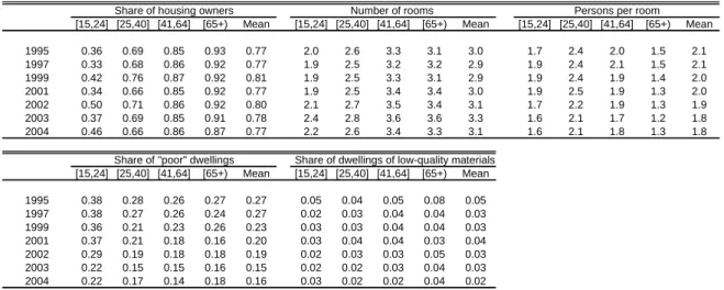
Housing is probably the main asset that most people own. Table 9.1 shows the share of families owning a house (the building and the lot) for each income quintile. Housing ownership is widespread along the income distribution. Actually, the share of poor people who reports that they own a dwelling is higher than the corresponding share for the rich. The gap decreased over the period. In fact, while the difference between bottom and upper income quintiles was 16 points in 1995, it reached 9 points in 2004. We will analyze the characteristics of the houses later in this section. Table 9.1 suggests that housing ownership remained quite stable between 1995 and 2004.
The number of rooms in the house is smaller for poor families than for richer households. Since poor families are also larger in size, the number of people per room is considerably larger. The gap is about 2 more people per room in the poorest household, compared to the richest. The number of people per room has decreased for all quintiles.
We have constructed an indicator of poor dwelling. This variable takes a value of 1 if the family lives in a shantytown, inquilinato, pensión, or other space not meant to be used as a house. By 2004 around 16% of the population lived in poor dwellings. This proportion is 11 points lower than in 1995. Between 1999 and 2004, the share of people living in poor dwellings in the first quintile experienced a significant decrease from 64% to 34%. In any case, the level is significantly higher than the indicator for other countries in the region. The share of people living in houses of “low-quality” materials, i.e. houses whose walls are made of waste materials, is small. In 2004 these houses were approximately 2% of total dwellings.
Table 9.2 shows housing statistics by age groups. Housing ownership has remained rather constant for all age groups. Ownership and the number of rooms in the house increase with age. In contrast, the indicators of poor dwellings and people per room decrease with age. Between 1995 and 2004 the share of low-quality dwellings declined for all ages.
34
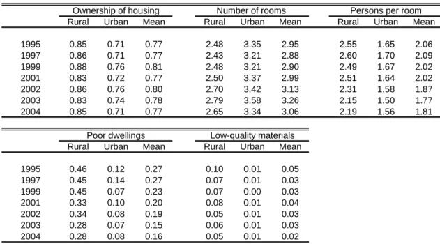
It is interesting to notice the regional disparities among rural and urban households on Table 9.3. While the share of house ownership is greater for rural families, quality indicators (number of people per room and poor dwelling) reflect that urban families live in better quality houses. Over the period considered, house ownership was stable and quality indicators improved in both areas.
Table 9.4 shows housing statistics by education group. Housing ownership has remained stable for all education groups. But, while ownership decreases with education, quality indicators show that households with mid-educated and high-educated heads live in houses of better quality.
Table 9.5 shows statistics on the access to some basic services – water, hygienic restrooms, sewerage, and electricity – by income strata.35 Gaps are large between upper and bottom income quintiles, which have very low coverage of basic services. Public sewerage and telephone are the services with less incidence for all quintiles, especially the poorer. Increases in use were more widespread across quintiles for electricity.36 Instead, the improvement in telephone coverage was mainly restricted to the richest quintiles.
Table 9.6 shows that although the increase in coverage has been widespread for the rural and the urban population, regional gaps still remain high. In rural areas, the coverage pattern almost mimics the pattern for the first income quintiles. While sewerage and telephone coverage is low in urban areas, in rural areas it is almost null.
10.
Demographics
Resources available to each person depend on the number of people among whom total household resources are shared. The size and composition of the household are key determinants of an individual’s economic well-being. Table 10.1 shows household size by residence area, by income quintiles and by education of the household head. Rural households tend to be larger than urban ones. Family size is also larger for poorer and less educated families. A similar phenomenon is observed on Table 10.2, which reports the number of children by quintile of parental income. Rural households have larger shares of children under 12 years of age. On the other hand, the number of children under 12 decreases with income and education. There were no considerable changes in family size
35
Water refers to the availability of a source of water in the house or lot. The variable restroom is equal to 1 when the household has a restroom with a toilet connected to the sewerage system or to a septic tank. The variable sewerage is 1 when the house is connected to a public sewerage system. The variable electricity includes all sources of electricity.
36
but there was a downward trend in the number of children across all quintiles between 1995 and 2004.
Dependency rates have stayed quite stable during the period. Again, dependency rates are larger in rural areas, for poor people and less educated families. Table 10.3 shows this result by presenting the ratio between the number of income earners and the household size, by residence area, by income quintiles and by education of the household head.
Paraguay has a high proportion of young population. In comparison to other Southern Cone countries, Paraguay’s population has not suffered a significant aging process. By 2004, the mean age of the population was 25.8 years, 40% was under 15, and 3.5% were over 64. Mean age is almost two years higher in urban areas. On average, it increased 1.5 years over the last half of the 1990s (see Table 10.4). However, it is interesting to see heterogeneous changes across areas and quintiles again. While the mean age of the rural population increased 2 years, the mean age of the urban population increased 1 year. Between 1995 and 2004 the average age rose in all quintiles.
Inequality is reinforced if marriages take place between people of similar income potential. Table 10.5 presents some simple linear correlations that suggest the existence of assortative mating in Paraguay.37 Men with more years of formal education tend to marry women with a similar educational background (column (i)). This is one of the factors that contribute to a positive correlation of hourly wages within couples shown on column (ii). According to these simple statistics, there are no signs of changes in the degree of assortative mating between 1995 and 2004. Finally, columns (iii) and (iv) show positive - though small - correlations in work hours, both considering and excluding people who do not work.
11.
A poverty profile
This section presents a poverty profile based on information from the latest available EPH conducted in 2004. A poverty profile gives a characterization of the poor population, often compared to the non-poor population. The poor population was identified using the 2USD a day and the official moderate poverty lines criteria. To make reading more fluent, in general we discuss the results for the USD2-a-day poverty line (columns (i) and (ii) on each table), except when a significant difference justifies discussing the alternative poverty definitions.
Table 11.1 shows some basic demographic characterization of the poor and non-poor populations. According to the USD2 poverty line, 26% of the total population is poor. The incidence of poverty is higher among the group of children under 15 (33.8%). The share of poor population decreases monotonically with age. Furthermore, almost half of the poor
37
population (47.7%) consists of children aged under 15, while only 4.3% are people over 65. On average, age is higher in the non-poor group. It is 27.1 for the non-poor and falls to 22.4 for the poor.
These patterns illustrate the relevance of the correlation of demographic factors with poverty. Poor households tend to be larger compared to the poor. While a typical non-poor household has 4.1 members, a typical non-poor household has 5.4. That gap is largely explained by the difference in children under 12. On average, there is 1.6 children in each non-poor family where the head is aged 25 to 45, while in poor households led by a prime age head there are 3 children Dependency rates (number of income earners per person) are also dramatically different - 0.34 in poor households and 0.56 in non-poor households.
It is interesting to notice that the share of female-headed households is the same for the poor and the non-poor regardless of the poverty line used to define them.
As it was already mentioned, there are important regional disparities in social conditions. While the incidence of poverty in rural areas is 40.6%, in urban areas it drops to 14.8%. Table 11.2 shows that there is a difference in the regional distribution of the poor depending on the line used. According to the USD2 line, 67.8% of the poor are rural inhabitants, while using the official line, the proportion is reduced to 44.2%. As it was mentioned before, this is explained by the fact that the USD2 line is higher than the official poverty line defined for rural areas and lower than the poverty line for urban regions.
More specifically, poverty is particularly high in the Resto rural region (43.5%, compared to a country average of 26%). While in Asunción the incidence amounts to 7.2% according to the USD2 line. In fact, only 2.4% of the poor live in Asunción and 64.4% are located in the Resto rural region.
The poor have fewer years of formal education than the rest of the population for any age group. The educational gap is slightly wider for the [21, 50] age group.38 These differences are shown in the second panel of Table 11.4. While 59.9% of non-poor adults are unskilled, that share rises to 90% for the poor. Skills are not very widespread among the non-poor. Only 13.9% of non-poor adults are skilled, while 1% of the poor are.
The literacy rate is 7 points lower for the poor - 86% of those who are older than 10 report that they are able to read and write. That share rises to 93% for the non-poor. The last panel on Table 11.4 indicates that school attendance is more widespread for those children aged 6 to 12 (97% for the non-poor and 93% for the poor). The gap in attendance rates significantly increases in the secondary and tertiary levels. While the rate of attendance is 68% for the poor aged 13 to 17 and 19% for the 18-23 age group, it is 82% for the non-poor between 13 to 17 and 33% for those aged 18 to 23.
The poor participate in the labor market in smaller rates than the non-poor. The gap is particularly large for women - while the rate for poor women is 58%, for the non-poor it is 72%. Moreover, the gap is also considerable between people aged 25 to 55. Employment is significantly higher for the non-poor, while unemployment is substantially larger for the poor. The unemployment rate of the poor is more than double the rate of the non-poor. That gap is wider for the elderly, while unemployment rates are similar for the poor and non-poor between 16 and 24 years of age. Again, the unemployment spell of the poor is on average roughly higher than for the non-poor. Finally, Table 11.5 reports that child labor is high in Paraguay, especially among the poor. Around 5 out of 20 poor children aged 10 to 14 worked at least one hour in 2004.
From Table 11.6 it can be inferred that the poor not only have more difficulties in finding a job, but even when they have one, they work fewer hours and get lower hourly wages. On average a non-poor employed person works 6.8 hours a week more than a poor person. That gap is smaller for prime age men (4.3 hours) and larger for prime age women (10.5 hours). The hourly wage of a non-poor person is on average 3.5 times that of a poor worker. The gap is larger for the elderly and for male workers aged 25 to 55.
Table 11.7 presents a characterization of the employment structure. Compared to the non-poor, the working poor are more prone to be self-employed unskilled workers, who were mostly affected by economic downturn. Compared to the poor, the non-poor are relatively much more concentrated on salaried jobs. According to a definition of informality based on labor groups, almost 95% of the poor are informal workers, while 67% of the non-poor are in that category. Proportions are similar when informality is defined on the basis of access to social security.
38
There is also evidence of some disparities in the sector structure of employment between the poor and the rest. Compared to the non-poor, the poor are relatively much more concentrated on primary labor activities, while non-poor are more prone to work in construction, commerce, industry, skilled services, public administration and education and health. The rest of the sectors have quite similar shares of poor and non-poor.
Table 11.7 also shows substantial differences in the access to stable jobs with social security rights. The share of jobs with rights to pensions is 27 points higher for the non-poor. For instance, while 29% of the working non-poor report that they will have access to pensions when they retire, only 2% of the poor are entitled to that right. The results are similar regarding the access to labor health insurance.
Table 11.8 summarizes mean income, and the income structure of the poor and the rest of the population. It also shows that inequality, as measured by the Gini coefficient for the distribution of household per capita income, is much lower with the poor than within the non-poor (0.25 and 0.48 respectively). Also, the difference is not so large when the poor and the non-poor defined by the official line are compared. Finally, the table shows that, compared to the non-poor, the poor rely relatively more on income from self-employment and transfers.
Table 11.9 shows the results of performing a simple simulation to characterize the difference in per capita income between a typical poor person and the rest. Panel B of the table indicates the per capita income of a typical poor if a particular variable (e.g. household size) takes the mean value for the non-poor. The actual per capita income of a typical poor person is G 83,372 a month. If household size for the poor were the same as for the non-poor and other variables were kept constant, per capita income would grow to G 102,304. Of course, this exercise is helpful just as a preliminary characterization of the differences between the poor and the non-poor. The poor have less per capita income than the rest because of several reasons. For instance, they have fewer income earners in the household, lower non-labor income, and larger household size, but especially because they earn substantially less in the labor market.
Table 11.10 shows that according to our indicator of household endowments, while 55% of the non-poor have deficiencies in at least one variable (water, education, housing, etc.), that share amounts to 91% in the case of the poor.
12.
Final remarks
vulnerable. The outcome has been increasing poverty and sustained inequality. Stagnation in per capita income combined with inequality led to a fall in aggregate welfare. In contrast to this poor performance, the economy has been recovering in the last few years. Poverty has significantly decreased since 2002, due to the economic recovery and a reduction in income inequality.