Visualization and machine learning techniques to support web traffic analysis
110
0
0
Texto completo
(2) Instituto Tecnológico y de Estudios Superiores de Monterrey Campus Estado de México. The committee members, hereby, certify that have read the thesis presented by Fernando Gómez Herrera and that it is fully adequate in scope and quality as a partial requirement for the degree of Master of Science in Computer Sciences.. Raúl Monroy Borja Tecnológico de Monterrey Principal Advisor. Eduardo Morales Manzanares Instituto Nacional de Astrofı́sica, Óptica y Electrónica Committee Member. Luis Angel Trejo Rodrı́guez Tecnológico de Monterrey Committee Member. Raúl Monroy Borja Associate Dean of Graduate Studies Escuela de Ingenierı́a y Ciencias. Atizapán de Zaragoza, Estado de México, Dec, 2018 i.
(3) Declaration of Authorship I, Fernando Gómez Herrera, declare that this thesis titled, Visualization and Machine Learning Techniques to Support Web Traffic Analysis and the work presented in it are my own. I confirm that: • This work was done wholly or mainly while in candidature for a research degree at this University. • Where any part of this thesis has previously been submitted for a degree or any other qualification at this University or any other institution, this has been clearly stated. • Where I have consulted the published work of others, this is always clearly attributed. • Where I have quoted from the work of others, the source is always given. With the exception of such quotations, this thesis is entirely my own work. • I have acknowledged all main sources of help. • Where the thesis is based on work done by myself jointly with others, I have made clear exactly what was done by others and what I have contributed myself.. Fernando Gómez Herrera Atizapán, Estado de México, Dec, 2018 ©2018 by Fernando Gómez Herrera All Rights Reserved ii.
(4) Dedication Este trabajo es fruto de mucho esfuerzo y apoyo, tanto moral como económico, de la persona que me ayudó a llegar a donde estoy: mi mamá. Estoy, y siempre estaré, agradecido por lo que me has brindado; te admiro mucho mamá, me gustarı́a poder ser igual de trabajador y lograr lo mismo que tú.. iii.
(5) Acknowledgements Agradezco infinitamente a mi pareja Aliosha por todo el apoyo incondicional en estos difı́ciles años de maestrı́a. Eres una gran inspiración para mı́ y si pude llegar aquı́ en estas condiciones, fue en gran medida debido a ti. No podrı́a haber encontrado mejor compañera en la vida; soy muy afortunado de tenerte a mi lado. Gracias, en verdad, por todo; siempre estuviste ahı́. Mamá, no encuentro cómo pudiste tú terminar tus múltiples maestrı́as teniendo que estar cuidando a tus hijos tú sola. Estoy seguro que mi estrés, preocupaciones y dificultades no se comparan nada a lo que tuviste que superar. Estoy más que impresionado y eres a quien más admiro en la vida. Gracias por todo tu apoyo. Te quiero mucho. Estoy muy orgulloso de que seas mi mamá. También agradezco a todas las personas que estuvieron ahı́ para mı́; compañeros, profesores, familia y amigos. Con grata mención especial a mi compañero de lucha, Rodolfo; con quien pasé muchas risas en estos dos años y de quien también aprendı́ mucho. Y por supuesto no podrı́a dejar de mencionar directamente al gran amigo que a pesar de ya no coincidir, me sigue dichando con su amistad, Luis. Por último, pero no menos importante, doy el debido reconocimiento al Tecnológico de Monterrey, mi alma máter, por haberme otorgado la oportunidad (con beca del 100%) de cursar este posgrado. Agradezco enormemente a CONACyT por el apoyo económico sin el cual, obviamente, no podrı́a estar aquı́. A los profesores del posgrado que son una inspiración para mı́; Edgar Emanuel Vallejo, Miguel Medina y mención especial para Salvador Venegas. A mi asesor de tesis Raúl Monroy, por recibirme en el proyecto como su asesorado, por el apoyo en la investigación y todo el tiempo invertido en las múltiples revisiones de la tesis, además de haberme brindado una experiencia internacional. Claramente, ligado a lo anterior, agradezco a José Emanuel Ramı́rez Márquez por haberme recibido en Stevens y por toda la atención que me brindó en su momento. Gracias a todas las personas que compartieron conmigo su conocimiento, tiempo y afecto en estos dos años; compañeros de clase y amigos.. iv.
(6) Visualization and Machine Learning Techniques to Support Web Traffic Analysis by Fernando Gómez Herrera Abstract Web Analytics (WA) services are one of the main tools that marketing experts use to measure the success of an online business. Thus, it is extremely important to have tools that support WA analysis. Nevertheless, we observed that there has not been much change in how services display traffic reports. Regarding the trustworthiness of the information, Web Analytics Services (WAS) are facing the problem that more than half of Internet traffic is Non-Human Traffic (NHT) [78]. Misleading online reports and marketing budget could be wasted because of that. Some research has been done [65, 3, 71, 40, 64], yet, most of the work involves intrusive methods and do not take advantage of information provided by current WAS. In the present work, we provide tools that can help the marketing expert to get better reports, to have useful visualizations, and to ensure the trustworthiness of the traffic. First, we propose a new Visualization Tool. It helps to show the website performance in terms of a preferred metric and enable us to identify potential online strategies upon that. Second, we use Machine Learning Binary Classification (BC) and One-Class Classification (OCC) to get more reliable information by identifying NHT and abnormal traffic. Then, marketing analysts could contrast NHT against their current reports. Third, we show how Pattern Extraction algorithms (like PBC4cip’s miner [46]) could help to conduct traffic analysis (once visitor segmentation is done), and to propose new strategies that may improve the online business. Later on, the patterns can be used in the Visualization Tool to analyze the traffic in detail. We confirmed the usefulness of the Visualization Tool by using it to analyze bot traffic we generated. NHT traffic shared a very similar linear navigation path, contrasted with the more complex human path. Furthermore, BC and OCC (BaggingTPMiner [50]) worked successfully in the detection of well-known bots and abnormal traffic. We achieved a ROC AUC of 0.844 and 0.982 for each approach, respectively.. v.
(7) List of Figures 1.1. 2.1. 2.2. 2.3. 2.4. 2.5. Website page views. It shows the Google Analytics report for the Google Online Store. The table on the right-hand side, is the common way to report the number of views for the website pages. On the top-side, it displays overall results for the whole website. . . . . . . . . . . . . . . . . . . . . . . . . . . . . .. 2. Server architecture and client interaction. Three websites mounted on the single server, plus Matomo’s server where traffic logs were sent. . . . . . . . . . . . . . . . . . . . . . . . . . . . . 6 Heatmap Matrix of the variable correlation using Pearson’s method. A value close to 1.0 means a positive correlation, whereas a value close to −1.0 is a negative correlation; values close to 0.0 indicates no correlation. . . . . . . . . . . . . . . 12 Fraction of Missing Values. On the histogram of the left-hand side, the x-axis represents the fraction of missing values; the y-axis counts how many features fall into that bucket. On the right-hand side, the table shows how many values are missing for each attribute as a percentage. . . . . . . . . . . . . . . . 14 Visit Duration Information. Left-hand side: Colored World Heatmap by class, with ranks depending on the visit duration. Right-hand side: Histograms of the visit duration by class. . . 15 Histograms of clicks by continent and class. The left-hand side shows information for bots and the right-hand side for humans. Each row represents the continent code, and for each continent there is a histogram by class. X-axis represents the amount of clicks made by a visit. Y-axis shows the percentage of instances that fall into a specific bucket. . . . . . . . . . . 16. vi.
(8) 2.6. 3.1. 3.2. 3.3. 3.4. 3.5. 3.6 3.7 3.8 3.9 4.1. Operating System and Web Browser Usage. Bar charts on the right-hand side show the distribution of web browsers separated by class to see which are the most common for humans and bots. On the upper-left side we see information about the browser and the operating system it was used. On the bottomleft corner we see the percentage of OS usage by class. . . . . Goal reports by Google Analytics (left) and Matomo (right). These are a common kind of report to display the performance of user pre-defined goals such as number of sign ups, purchases, etc. through time. . . . . . . . . . . . . . . . . . . . Google Analytics’ (left) and Piwik’s (right) Click Path view . Both are tables of the sequence in which a single visitor was browsing the site. . . . . . . . . . . . . . . . . . . . . . . . . Visits View. Blue nodes represent web pages; green stars are objective pages; nodes with country flags are visits of users from that country. Page views was used as metric and inverse visit duration for the edge width. Thin connections represent longer visit duration; thicker otherwise. . . . . . . . . . . . . Click Path. Navigation graph of a visit. The number at the edge’s center indicates the view step, and the one with a clock icon shows how long the previous page was viewed. . . . . . . Multi-site View. We are analyzing three sites: each color represents a different domain. Grey nodes are external referrers (e.g. Google, Facebook, another website, etc.). Red connections are visits from bots we identified. The right sidebar shows information of the selected page. . . . . . . . . . . . . Objective performance visualization through a concentric layout. . . . . . . . . . . . . . . . . . . . . . . . . . . . . . . . Visits View. Selection of a visit. . . . . . . . . . . . . . . . . Query functionality implementing ML Patterns. . . . . . . . . Navigation Patterns. Left side: human traffic; Right side: bot traffic. . . . . . . . . . . . . . . . . . . . . . . . . . . . . . . Dataset modifications for testing performance. The first one does not have any attribute modifications at all; the second one has removed date and time attributes; the third one has both date, time and location attributes; the final dataset includes the removal of the six attributes mentioned in Section 2.3. . . vii. 18. 23. 24. 30. 32. 36 38 38 39 40. 49.
(9) 4.2. 4.3. 4.4. Datasets and their J48 Decision Trees. Each tree represents a variation on the dataset. The No Datetime-Location’s tree resulted in the same as the final’s. The note (* any other country) represents a series of nodes, each one being a country (e.g. USA, Germany, Russia...) and all of them ended into a bot leaf. Such nodes were removed and resumed in this general node in order to reduce the tree size. . . . . . . . . . . . . . . Similarity Distribution. Boxplot on the top for each class, global box-plot on the bottom-side. Instances were classified as human if T hreshold > 0.60699, bot otherwise. . . . . . . . Information about the 276 bot instances. 67 are bots indeed, the rest may also be, there is not enough information to ensure that. . . . . . . . . . . . . . . . . . . . . . . . . . . . . . . .. viii. 51. 61. 62.
(10) List of Tables 2.1. 2.2 4.1. 4.2. 4.3. 4.4. 4.5. Traffic generation dates. First, we generated bot traffic June 6 to June 14, 2017; then, we asked the participation of people to generate human traffic from June 16 to July 6, 2017. Start and End date columns indicate the date and time in which traffic started to be generated. . . . . . . . . . . . . . . . . . . . . . Dataset information. Description of each attribute. . . . . . . . J48 5-fold Classification results for the four different dataset versions. Decision of which one to keep was done by taking into account the ROC Area metric. D.Time = No Datetime; D.Time-Loc. = Datetime-Location; Prec. = Precision; Rec. = Recall; F-M. = F-Measure . . . . . . . . . . . . . . . . . . One-Class Classification: Weka’s One Class Classifier experiments and results. F-M (F-Measure) could not be computed because of the complete misclassification of the bot class. . . . Weka’s OCC Confusion Matrix. All the instances are being classified as human. 76,771 human instances were classified correctly, but all the 5,601 bot instances were classified incorrectly. . . . . . . . . . . . . . . . . . . . . . . . . . . . . . . One-Class Classification: Cost Sensitive Classifier experiments and results. Base learner is Weka’s OCC and we just changed its classifier hyper-parameter as in Section 4.4.2. . . . . . . . . One-Class Classification: Isolation Forest experiments and results. Each row represents a different model configuration. Parameters column follows the syntax: (numTrees, subSampleSize), which are hyper-parameters of the classifier. Default = (100, 256). . . . . . . . . . . . . . . . . . . . . . . . . . .. ix. 8 11. 50. 56. 56. 57. 58.
(11) 4.6. 4.7. 5.1. 5.2. 5.3. 5.4. 5.5 5.6. 5.7. 5.8. One-Class Classification: Bagging TPMiner and Random Bagging Miner experiments and results. The parameters column has the following syntax: (number of classifiers, distance function). . . . . . . . . . . . . . . . . . . . . . . . . . . . . . . . Best results for one class classification. CSC = Cost-Sensitive Classification (Section 4.4.2); OCC: One-Class Classification (Section 4.4.2). Classifiers were evaluated by ROC Area. . . . Example of a series of patterns for the human class. It has a support of 0.38, meaning that 38% of the human instances share that common pattern, whereas zero percent of the opposite class (bot) is covered for that pattern. This pattern indicates that 38% of the human visitors were browsing the website for at least 175.50 seconds (∼ 2.9 mins.), and their clicks median is greater than 0. . . . . . . . . . . . . . . . . . . . . Dataset example before labeling it into two classes. Duration: visit duration in seconds. Type: returning if the user has already visited the website; new if it is a new visit. . . . . . . . Dataset labeled into two classes: high and low. high represents visits with a duration ≥ 40, and low visits with duration < 40. . . . . . . . . . . . . . . . . . . . . . . . . . . . . . . Referrer labeling example. The referrer column was transformed into two-classes: direct, and social that groups google and twitter together. . . . . . . . . . . . . . . . . . . . . . . Country comparison labeling. Mexican (mx) visitors against Russians (ru). The remaining instances (Visit 4) were deleted. Patterns for the human class. The first column is a counter to reference a pattern within this table. The second column indicates the support for the human class. Third column describes the pattern in DNF. . . . . . . . . . . . . . . . . . . . . . . . Patterns for the bots class. The first column is a counter to reference a pattern within this table. The second column indicates the support for the bots class. Third column describes the pattern in DNF. . . . . . . . . . . . . . . . . . . . . . . . Patterns for the completed class. The first column is a counter to reference a pattern within this table. The second column indicates the support for the completed class. Third column describes the pattern in DNF. . . . . . . . . . . . . . . . . . . x. 58. 59. 68. 69. 69. 69 69. 71. 72. 74.
(12) 5.9. Patterns for the non-completed class. The first column is a counter to reference a pattern within this table. The second column indicates the support for the class. Third column describes the pattern in DNF. . . . . . . . . . . . . . . . . . . . 5.10 Patterns for the mx (Mexico) and ru (Russia) classes. The first column is a counter to reference a pattern within this table. The second column indicates the support for the class. Third column describes the pattern in DNF. . . . . . . . . . . . . . . 5.11 Patterns for the new class. The first column is a counter to reference a pattern within this table. The second column indicates the support for the class. Third column describes the pattern in DNF. . . . . . . . . . . . . . . . . . . . . . . . . . 5.12 Patterns for the returning class. The first column is a counter to reference a pattern within this table. The second column indicates the support for the class. Third column describes the pattern in DNF. . . . . . . . . . . . . . . . . . . . . . . . . .. xi. 75. 77. 79. 81.
(13) Contents Abstract. v. List of Figures. viii. List of Tables. xi. 1. Introduction 1.1 The Need For Visualization and Analytics Tools . . . . . . . . 1.2 A problem with Internet Bot Traffic . . . . . . . . . . . . . . 1.3 Working towards a better visualization tool and SIVT detection. 1 1 3 4. 2. Data Collection and Exploration 2.1 Experimentation . . . . . . . . . . . . . . . . 2.1.1 Server and websites . . . . . . . . . . 2.1.2 Tracking scripts . . . . . . . . . . . . 2.1.3 Traffic generation . . . . . . . . . . . 2.2 Exploratory Data Analysis . . . . . . . . . . 2.2.1 Dataset General Information . . . . . 2.2.2 Redundant Attributes . . . . . . . . . 2.2.3 Variable correlation . . . . . . . . . . 2.2.4 Missing Values . . . . . . . . . . . . 2.2.5 Individual Attribute Inspection . . . . 2.2.6 Visit Duration . . . . . . . . . . . . . 2.2.7 Visitors Clicks . . . . . . . . . . . . 2.2.8 Operating System and Browser Usage 2.3 Conclusions . . . . . . . . . . . . . . . . . . 2.4 Acknowledgements . . . . . . . . . . . . . .. xii. . . . . . . . . . . . . . . .. . . . . . . . . . . . . . . .. . . . . . . . . . . . . . . .. . . . . . . . . . . . . . . .. . . . . . . . . . . . . . . .. . . . . . . . . . . . . . . .. . . . . . . . . . . . . . . .. . . . . . . . . . . . . . . .. . . . . . . . . . . . . . . .. 5 5 5 6 7 8 8 11 11 13 14 15 16 17 19 20.
(14) 3. Visualization Model 3.1 Problem description . . . . . . . . . 3.2 Related work . . . . . . . . . . . . 3.2.1 Enterprise solutions . . . . . 3.2.2 Open Source tools . . . . . 3.2.3 Research and others . . . . 3.3 Description of the Visualization Tool 3.3.1 Query format . . . . . . . . 3.4 Analysis of web traffic using the tool 3.5 Conclusions . . . . . . . . . . . . .. . . . . . . . . .. . . . . . . . . .. . . . . . . . . .. . . . . . . . . .. . . . . . . . . .. . . . . . . . . .. . . . . . . . . .. . . . . . . . . .. . . . . . . . . .. . . . . . . . . .. . . . . . . . . .. . . . . . . . . .. . . . . . . . . .. . . . . . . . . .. 21 23 25 26 27 27 28 34 37 41. 4. A Machine Learning Approach to detect Non-Human Traffic 4.1 Related work . . . . . . . . . . . . . . . . . . . . . . . . . . 4.2 Motivation . . . . . . . . . . . . . . . . . . . . . . . . . . . . 4.3 A first approach to a Two-Class Classification for Bot Detection 4.3.1 Dataset variations and Decision Trees . . . . . . . . . 4.3.2 Conclusions . . . . . . . . . . . . . . . . . . . . . . . 4.4 Building a One-Class Classifier for anomaly detection . . . . . 4.4.1 Experimentation details . . . . . . . . . . . . . . . . 4.4.2 Results . . . . . . . . . . . . . . . . . . . . . . . . . 4.5 A further exploration of data using the OCC . . . . . . . . . . 4.6 Conclusions . . . . . . . . . . . . . . . . . . . . . . . . . . .. 43 44 47 47 49 52 53 54 55 60 63. 5. Mining Patterns To Support Web Traffic Analysis 5.1 Description of a pattern . . . . . . . . . . . . . . . . 5.2 Dataset preparation . . . . . . . . . . . . . . . . . . 5.3 Use Cases . . . . . . . . . . . . . . . . . . . . . . . 5.3.1 Case 1: Humans vs Bots . . . . . . . . . . . 5.3.2 Case 2: Business KPI (conversion achieved) . 5.3.3 Case 3: User segmentation by country . . . . 5.3.4 Case 4: Recurrent visitors . . . . . . . . . . 5.4 Conclusions . . . . . . . . . . . . . . . . . . . . . .. . . . . . . . .. 66 67 68 70 70 73 77 79 81. . . . . .. 83 86 86 86 87 88. 6. . . . . . . . .. . . . . . . . .. . . . . . . . .. . . . . . . . .. Conclusions and Future Work 6.1 Future Work . . . . . . . . . . . . . . . . . . . . . . . . . . 6.1.1 Graph mining from visits to web pages . . . . . . . 6.1.2 Aggregated traffic information . . . . . . . . . . . . 6.1.3 Improve Pattern Extraction and Visitor Segmentation 6.1.4 Visualization Tool Improvements . . . . . . . . . . xiii.
(15) 6.1.5. Iterative OCC Improvement . . . . . . . . . . . . . .. Bibliography. 88 95. xiv.
(16) Chapter 1. Introduction Web Analytics services are one of the principal tools that marketing analysts use to measure the success of online businesses. Therefore, it is extremely important to have powerful tools; tools that allow to analyze and visualize the traffic in a better way, and also tools that can provide reliable information that depicts the real situation of the online business. With powerful tools, business owners may be able to make better decisions faster and distribute better the budget on online marketing resources. We believe that the current state of products and techniques for Web Analytics analysis could be improved with the help of Machine Learning (ML) algorithms and new visualization techniques. This research presents some of the current problems in the Web Analytics industry where inherently marketing experts get affected. In order to support the marketing expert with those problems, we introduce a new visualization tool, a way to ensure the reliability of traffic reports by identifying Non-Human Traffic (NHT), and a method of traffic analysis by using ML Pattern Extraction Algorithms.. 1.1. The Need For Visualization and Analytics Tools. Data analysis is a very important task for any business analyst or marketing expert in order to get useful insights that could lead to decision making. Visualization tools come very handy for such tasks and therefore is very important to count with some of them in the everyday toolbox. In the context of Web Analytics, we observed that there has not been much change in how services display traffic reports.. 1.
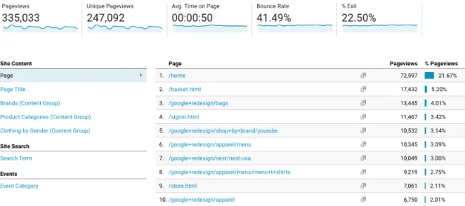
(17) CHAPTER 1. INTRODUCTION. 2. Figure 1.1: Website page views. It shows the Google Analytics report for the Google Online Store. The table on the right-hand side, is the common way to report the number of views for the website pages. On the top-side, it displays overall results for the whole website. Figure 1.1 is an example of the standard report for visit metrics. Such data do not provide, for example, how visits interact with the website pages individually; more often, results are aggregated metrics spread in multiple reports. In the case of visitor’s navigation, the common report is a table of sequential actions (very similar to Figure 1.1). However, there is the case where marketers would need to explore individual traces of navigation from their users; such option is not available in some of the current platforms or if exists, the way to represent such information is through simple text reports. To improve current tools, we introduce a new visualization tool that could help analysts to get insights from data. We propose a graph-based visualization that allows combining multiple metric reports (i.e. page views, visits, bounce rate. . . ) into a single one. It also displays how visits interact with website pages, and displays a metric associated for each one. In order to validate the visualization tool, we consulted a Mexican ecommerce business which gave us positive feedback indicating the tool has good potential, most of all, in the analysis of individual visit navigation path..
(18) CHAPTER 1. INTRODUCTION. 1.2. 3. A problem with Internet Bot Traffic. The Internet is no longer dominated in web browsing by human people, instead, bots are taking control of many interactions within websites. Around 52% of web traffic reported in latest Incapsula paper is coming from bots [78]. Such visits to websites by bots are denominated Non-Human Traffic (NHT). NHT is then categorized in two: General Invalid Traffic (GIVT) and Sophisticated Invalid Traffic (SIVT). Although a great percentage of GIVT has the purpose to provide a service (for example web indexers —GoogleBot, or feed fetchers), SIVT becomes a problem when the intention of such bots are malicious. One specific problem related to SIVT arises in the field of Web Analytics. It would be very easy for a malicious attacker to launch a series of bots targeting a specific online marketing campaign. Then, the marketing expert, not being aware of that, may think that a certain product or campaign is having a marvelous success. In such case, time and money of the business could be wasted. Taking as an example the field of online advertising, which is measured by Web Analytics tools, nowadays, it is a must for companies to invest in advertising campaigns with the purpose of increasing sells, get more customers, and expand their presence in the market. Usually, companies that provide such ad services charge a specific amount for every click made in an ad (named CPC, Cost per Click) or for every thousand of impressions (CPM) —ads displayed and viewed by a user. So, what happens when there are bots, not humans, that are clicking or viewing (actually, not even viewing!) such ads? Companies lose money. comScore reports a lose between $650 million and $4.7 billion in the U.S. [13], in addition, WhiteOps/ANA (Association of National Advertisers) report estimated losses of more than $7 billions of dollars [7]. NHT is responsible for such waste of money, more specifically SIVT, because 80% of NHT is sophisticated [48]. The Media Rating Council (MRC) is the organization that dictates standards for digital metrics and providers must complain to those standards. Since NHT is a current problem, MRC recently updated their Invalid Traffic (IVT) detection guidelines addressing NHT [52] but not many of the big providers like Google, Youtube nor Facebook are up to such guidelines. Because of that, organizations like Havas group (O2, Royal Mail, BBC. . . ) and many others [49, 74] are stopping giving money to those providers until they provide reliable measures..
(19) CHAPTER 1. INTRODUCTION. 4. Given the previously stated situation, marketing experts need more reliability in the reports given by Web Analytics tools. There are some ways to fight against that problem and this work provides a way to support in there.. 1.3. Working towards a better visualization tool and SIVT detection. We started and continued this research project under the hypothesis that if we use Machine Learning and better visualization tools, then we could support better decision making for the marketing experts or business analysts. In order to do so, we defined three main objectives. First, the development of a new Visualization Tool which could be able to help by showing the website performance in terms of a preferred metric and enable the identification of potential online strategies upon that. Second, use Machine Learning Classification and identify Non-Human Traffic (or at least abnormal traffic) to provide more reliable traffic reports. By doing so, we attempt to ensure the trustworthiness of the information and obtain cleaner traffic reports. Third, support the task of visitor segmentation analysis by using Pattern Extraction algorithms to identify common patterns in such segments. Consequently, insights from those patterns could lead to propose new strategies that may improve the online business. This written thesis attempts to accomplish the previously described objectives and it is structured as follows. First, we are going to explain how we collected web traffic (Chapter 2) and use it as a base for experimentation. Second, in Chapter 3, we introduce the new visualization tool to explore web traffic in more detail, providing new tools that could improve the way marketing experts perform traffic analysis. Third, in Chapter 4, a bot traffic detection system is created with two different Machine Learning approaches; two-class classification, and one-class classification. Fourth, Chapter 5 presets how pattern mining from the dataset can be used to analyze the website traffic, leading us to potential online strategies that could improve the conversion rate. Finally, we conclude in Chapter 6 with some of the key insights of this research and propose future work that could be worth to explore..
(20) Chapter 2. Data Collection and Exploration Data collection usually is the first step in the whole Machine Learning pipeline and our case was not the exception. Since we are going to analyze and visualize web analytics, gathering such data from scratch would have been very challenging and it may have taken too much time; luckily, there are tools that provide the basic functionality for doing so and we took advantage from them. In this chapter, we are going to explain how we collected website traffic data by mounting sites on servers and using tracking scripts (Section 2.1); then, we are going to look into such data by performing an Exploratory Data Analysis (EDA) (Section 2.2), describe the attributes and some of their distributions, and decide which ones will be useful for further analysis. We will relate the information found with human and bot behavior and show visualizations of how the visits are distributed around the world. Finally, we will draw some conclusions (Section 2.3) from the data and decide how it is going to be used for the Machine Learning process.. 2.1. Experimentation. 2.1.1. Server and websites. Three websites were mounted on a single server which we owned at the moment. The server was located at Mexico City, Mexico, and all incoming traffic to it were collected. In the following section, Section 2.1.2, we will explain 5.
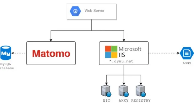
(21) CHAPTER 2. DATA COLLECTION AND EXPLORATION. 6. how it was done.. Figure 2.1: Server architecture and client interaction. Three websites mounted on the single server, plus Matomo’s server where traffic logs were sent. Figure 2.1 shows the architecture of how the websites were mounted on the server. By using a free DNS server named DynDNS, we mapped each website to unique Unified Resource Locations (URLs), which were the entry point for the users browsing the site.. 2.1.2. Tracking scripts. It is quite common in websites to include several scripts which serve to specific purposes. Web analytics tools often provide an easy way to install their services by incorporating such scripts into website pages. Google Analytics and Matomo are examples of that. We took advantage of these existing platforms to collect the visitor’s information and thus get the data we desired. Listing 1 shows an example of how the scripts look like; every web page had inserted the Matomo’s script..
(22) CHAPTER 2. DATA COLLECTION AND EXPLORATION. 7. <!-- Matomo --> <script type="text/javascript"> var _paq = _paq || []; _paq.push(['trackPageView']); _paq.push(['enableLinkTracking']); (function() { var u="//{$PIWIK_URL}/"; _paq.push(['setTrackerUrl', u+'piwik.php']); _paq.push(['setSiteId', {$IDSITE}]); var d=document, g=d.createElement('script'); var s=d.getElementsByTagName('script')[0]; g.type='text/javascript'; g.async=true; g.defer=true; g.src=u+'piwik.js'; s.parentNode.insertBefore(g,s); })(); </script> <!-- End Matomo Code -->. Listing 1: Matomo’s JavaScript tracking code. It must be included in every single page wanted for collecting traffic. Usually it gets inserted at the end of the body tag or inside the head. We chose Matomo as the platform in charge to collect the data because it is open-source, but most of all, because it gives 100% data ownership, whereas other platforms do not allow that (e.g. Google Analytics); meaning that we were able to setup the platform in our own server (as seen in Figure 2.1 and having complete control over it. If we used Google Analytics, we would be constrained by the fact they do not allow you to download all the visits’ /raw/ information. Once the scripts were installed, every time a user visited the website, Matomo collected information from the browser, device information, IP address, country of origin, language and many other information. In Section 2.2.1 we look further into what information is collected.. 2.1.3. Traffic generation. Because one of our objectives was to detect Non-Human Traffic (NHT) we decided to run certain bot programs to generate fake traffic. We shall clarify that by saying fake traffic does not means that there was no real traffic at all, the websites indeed received requests but automated programs were the ones visiting, clicking and browsing through the pages. Three main bot traffic generators were used: Traffic Spirit, Jingling Traffic Bot and w3af ; and for the human traffic we requested the participation of people from Mexico City.
(23) CHAPTER 2. DATA COLLECTION AND EXPLORATION. 8. (Mexico) and New Jersey (USA). Table 2.1 shows how we conducted the experiments. The first week we ran the bot traffic generators, and the rest of the weeks people visited the website; bot traffic were stopped at such moment. Traffic Type. Start Date time. End Date time. Jingling Traffic Bot Traffic Spirit Traffic Spirit Traffic Spirit w3af Jingling Traffic Bot Human Traffic. June 06, 2017 04:16:39 CDT June 06, 2017 05:11:12 CDT June 07, 2017 05:21:50 EDT June 12, 2017 05:10:22 EDT June 13, 2017 05:30:43 EDT June 14, 2017 05:05:16 EDT June 16, 2017. June 06, 2017 05:10:22 CDT June 06, 2017 05:57:07 CDT June 07, 2017 09:33:11 EDT June 12, 2017 13:20:02 EDT June 13, 2017 09:48:54 EDT June 14, 2017 10:04:31 EDT July 06, 2017. Table 2.1: Traffic generation dates. First, we generated bot traffic June 6 to June 14, 2017; then, we asked the participation of people to generate human traffic from June 16 to July 6, 2017. Start and End date columns indicate the date and time in which traffic started to be generated. We are going to analyze the results of this experiment in the following section.. 2.2. Exploratory Data Analysis. 2.2.1. Dataset General Information. The constructed dataset has a total of 1,809 observations and 68 attributes; 35 are numerical attributes and 33 categorical. Each observation represents a visit to a website and has information like the browser the user used to visit the site, geographical location information in most of the cases (user’s continent, country, city, etc.), in some cases the user’s device information (device brand e.g. Apple, Samsung, etc.) and also aggregated information of the visit like how many pages the user viewed (pageviews) and even custom information we gathered like the amount of clicks and keypresses the used did during the visit. Bot traffic dates from June 6, 2017 to June 14, 2017, whereas human traffic dates from June 16, 2017 to July 3, 2017. 96% of the data belongs to bot traffic and the remaining to human traffic (4%); we can see that we are against a class-imbalance problem..
(24) CHAPTER 2. DATA COLLECTION AND EXPLORATION. 9. Detailed information of the dataset is described in Table 2.2. Attributes with a ? indicate that new statistical attributes were generated from them, specifically the mean, median and a total sum. Attribute. Description. actions. Number of actions in the visit. It contains both events and pageviews Coded version of browserName. Examples: CH, FF, IE (for Chrome, Firefox and Internet Explorer, respectively) Rendering engine. Example: Trident, Gecko, Blink Name of the visitor web browser e.g. Chrome, Firefox, Internet Explorer, etc. Web browser application’s version. e.g. 10, 8 Name of the identified visitor’s city. e.g. Sydney, Sao Paolo, Rome # of clicks made during the whole visit Visitor’s continent. e.g. eur, asi, amc, afr Example: de, us, fr # of CPU Cores of the visitor’s device. This value cannot always be obtained. e.g. 2, 4, 8 Days past since the first time the user visited the site. browserCode browserFamily browserName browserVersion city clicks ? continentCode countryCode cpu cores daysSince FirstVisit daysSince LastVisit deviceBrand deviceModel deviceType. events fingerprint. Days past since the last time the user visited the site Visitor’s device brand. e.g. 3Q, Acer, Airness, Alcatel, Altech UEC, Arnova, Amazon, Apple, Archos, Asus, Avvio Model of the visitor’s device Type of visitor’s device. e.g. desktop, smartphone, tablet, feature phone, console, tv, car browser, smart display, camera, portable media player, phablet Number of events triggered in the visit A 32-bit integer representing the browser’s fingerprint (more details at [67]). A fingerprint is information collected about a remote computing device for the purpose of identification. Fingerprints can fully or partially identify individual users or devices even when cookies are turned off. e.g. 1167364286.
(25) CHAPTER 2. DATA COLLECTION AND EXPLORATION. firstAction Timestamp generationTime?. keys? languageCode lastAction Timestamp latitude longitude operatingSystem Code operatingSystem Version pageviews plugin cookie plugin director plugin flash plugin java plugin list plugin pdf plugin silverlight plugins referrerName referrerSearch EngineUrl referrerType referrerUrl regionCode resolution. 10. Timestamp of the first action in a user’s visit Time the page took to render in seconds (Matomo uses seconds, but IIS uses milliseconds). Because this value is per pageview, we compute summarized data for it. # of keys pressed during the whole visit Language of the visitor’s browser. e.g. de, fr, en-gb, es Timestamp of the last action in a user’s visit Geo coordinate Geo coordinate Coded version of the visitor’s device operating system. e.g. WIN, MAC, LIN (Windows, macOS, Linux, respectively) Operating system version. e.g. XP, 7, 2.3, 5.1, ... # of page views i.e. how many pages the visitor viewed Boolean attribute that indicates if the browser has enabled cookies Boolean attribute that indicates if the browser has enabled the Director plugin Boolean attribute that indicates if the browser has enabled the Flash Player plugin Boolean attribute that indicates if the browser has enabled the Java plugin Idem Idem Idem # of the previous plugin attributes enabled Name of the Website where the visitor comes from URL of the search engine provider that the user used to reach the website Referrer type (where the visit comes from) Example: direct, search, website, campaign URL of the website where the user comes from Example: 01, P8, 02 Screen resolution of the user. Example: 1280x1024, 800x600.
(26) CHAPTER 2. DATA COLLECTION AND EXPLORATION. screen info. serverTimestamp timeSpent? visitCount visitDuration visitIp visitLocalHour visitLocalTime visitServerHour visitorId visitorType class. 11. An electronic visual display for computers. The screen monitor comprises the display device, circuitry and an enclosure. Timestamp of the visit (unix epoch in seconds, not ms) Amount of time the user spent in the page in seconds Count of visits for this visitor Visit duration in seconds Visitor’s public IP Local hour related to the visitor’s country Local time of the visitor. This field is more descriptive than the serverDate Server local hour (where the website is mounted on) ID for identifying unique visitors, i.e. the same ID can have multiple page views Describes if the user has previously visited the website. Can take the values new or returning. Class label, either bot or human.. Table 2.2: Dataset information. Description of each attribute.. 2.2.2. Redundant Attributes. The original dataset contained several attributes that were redundant, most of them were in the form of attrCode, attrName; for example, browserCode and browserName. Both attributes represent the same; *Name attributes just contain detailed info. For example, to represent the Google Chrome’s browser, the attributes have the following values: browserCode = CH, browserName = Google Chrome. We removed the attributes that ended in Name and left only the coded ones (e.g. browserCode). That decision was taken because the *Code version use less memory space.. 2.2.3. Variable correlation. Before going deeper into some of the attributes we have, we performed a correlation analysis of the numerical variables. We have 35 numerical attributes, however, some of them are statistical attributes derived from others (the ones.
(27) CHAPTER 2. DATA COLLECTION AND EXPLORATION. 12. with a ?), so we are going to use only those we consider are the most meaningful. Variable correlation is useful because it can let us better understand the relationships between two variables. It is performed as a statistical method and it is represented as a numerical value between −1.0 to 1.0. The correlation is positive if the value is greater than 0, and negative otherwise. If the correlation is positive, it means that both of the variables change in the same direction, and if it is negative, their values change in opposite ways. For example, if we are predicting house prices, it would be very probable that the price will be positively correlated to the size of the house, i.e. the price increases as the size increases. Figure 2.2 shows the variable correlation analysis for the dataset. It is a matrix that intersects an attribute in a row to another in a column. Each intersection indicates the correlation coefficient, which belongs to [−1.0, 1.0]. It is said that a variable is highly correlated to another if its correlation coefficient is close to 1.0; and conversely, a pair of variables is negatively correlated if the value gets close to −1.0; we can say that there is no correlation if the value gets close to 0.0.. Figure 2.2: Heatmap Matrix of the variable correlation using Pearson’s method. A value close to 1.0 means a positive correlation, whereas a value close to −1.0 is a negative correlation; values close to 0.0 indicates no correlation..
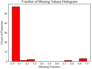
(28) CHAPTER 2. DATA COLLECTION AND EXPLORATION. 13. As we expected, there are some highly positive correlated variables but there are other correlations we did not expect. We expected to see a high correlation between clicks, keys, pageviews and actions/events because the first ones are derived attributes from the latter, and so it happens. However, we not expected a lower correlation coefficient between clicks and pageviews, and they have a value of 0.51. Also, we expected to see a higher value for the visit duration and the pageviews, however, it only has a correlation coefficient of 0.54. In this case it may indicate that users possibly spent more time reading or viewing the pages, rather than browsing a lot. Because of the high correlation between the variables of actions/events with clicks/pageviews/keys, we decided not to use them for the Machine Learning process, i.e. we are going to use only the derived attributes of clicks, pageviews and keys, instead of actions and events. Such variables we are keeping provide an improved contextual representation of the visit; pageviews, keys and clicks gives us a better understanding of what the user was doing, e.g. it is more convenient to have the following values: pageviews = 10, clicks = 4, keys = 2 rather than actions = 10 and events = 16 because then we know that there were 10 page views during the visit, and also the user made 4 clicks and pressed a total of 2 keyboard keys.. 2.2.4. Missing Values. With the purpose of cleaning the dataset and leaving only those attributes that provide enough information, we analyzed the fraction of missing values for each attribute. The results are shown in Figure 2.3. We can see that only few attributes have a high percentage of missing values. We dropped out those with a f raction ≥ 0.75. Such attributes are: deviceModel, referrerName, referrerSearchEngineUrl and referrerUrl. We decided to use such threshold because it was the recommended value by the toolset we used to pre-process the data. Moreover, even if we had to choose a more strict value (> 0.3), we would end up with the same attributes removed..
(29) CHAPTER 2. DATA COLLECTION AND EXPLORATION. Attribute RSE URL deviceModel referrerName referrerUrl OS Version city. (a) Histogram of missing fraction. 14. MF 0.993919 0.993367 0.988944 0.788834 0.254837 0.200663. (b) Attributes and their missing fraction (MF) value (second column). RSE: Referrer Search Engine. OS: Operating System.. Figure 2.3: Fraction of Missing Values. On the histogram of the left-hand side, the x-axis represents the fraction of missing values; the y-axis counts how many features fall into that bucket. On the right-hand side, the table shows how many values are missing for each attribute as a percentage. Surprisingly, the meaning that the referrerUrl presents a high percentage of missing values indicates that many of the visits were direct visits. For the human traffic we predicted that, because it was given a direct URL to the participants in the experiments. But, for the bot traffic we did not know exactly what would be the behavior, even when we launched directly the bots. It seems that the bots we used, visited directly the website without any intermediary. Is this good? It depends. From the point of view of advertising, it is very good because it means that bots are not reaching the website through search engines and so, they are not wasting the spend on ads. However, from the point of view of detecting sources of invalid traffic it is a bad, because we can not build a blacklist of referrers.. 2.2.5. Individual Attribute Inspection. In the following subsections, we present a more detailed exploration of some individual attributes. We explore only the most common attributes presented by Web Analytics services, such as the visitor’s duration, the number of page views, the visit’s geographical location and the web browser’s usage. We included two more attributes that are not commonly reported by Web Analytics platforms: the number of clicks and keys the visitor pressed during the visit, with the hope that they provided useful information to further analysis..
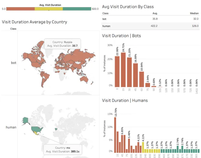
(30) CHAPTER 2. DATA COLLECTION AND EXPLORATION. 2.2.6. 15. Visit Duration. Figure 2.4: Visit Duration Information. Left-hand side: Colored World Heatmap by class, with ranks depending on the visit duration. Right-hand side: Histograms of the visit duration by class. In Figure 2.4 we can see a summary of the visit duration attribute. It shows two World maps, that contain information about the bot and human classes, respectively. The countries are colored as a heatmap, where the country with lowest visit duration is colored as red, the ones with a high value are colored as green and yellow as an intermediate value. As an example, we show the average visit duration of Mexican visitors: 389.1 seconds, and the same value for a bot visitor country (Russia): 38.7 seconds. On the right hand side we can also see two histograms, each one depicting the visit duration attribute by class. The x-axis represents the different buckets of the histogram (in steps of 15 seconds) and the y-axis represents the percentage of instances that fills that bucket..
(31) CHAPTER 2. DATA COLLECTION AND EXPLORATION. 16. Figure 2.4 shows information we expected: almost every country from the bot class is colored in red and for human visitors, the countries are colored in yellow-green. This means that if we split the visitors in three main buckets, let say Low-Middle-High, many of the bots visitors would be placed in the Low bucket and the humans in the Middle-High buckets, which would mean that the bots we used can be characterized to spend low time visiting the website, where as humans are the opposite. Regarding to the histograms, we can see that many of the humans fall into the first interval 0 − 15 but its distribution is more sparse than the bots histogram. Moreover, bots are browsing the website at most 75-90 seconds; bins further than such values contain very few instances (0.66%).. 2.2.7. Visitors Clicks. Figure 2.5: Histograms of clicks by continent and class. The left-hand side shows information for bots and the right-hand side for humans. Each row represents the continent code, and for each continent there is a histogram by class. X-axis represents the amount of clicks made by a visit. Y-axis shows the percentage of instances that fall into a specific bucket..
(32) CHAPTER 2. DATA COLLECTION AND EXPLORATION. 17. Figure 2.5 shows a distribution of the clicks variable. It displays a histogram for each continent and for each class, i.e. we analyze the visitors from America and generate two histograms: each one belonging to a different class (human and bot). We repeat such visualization for each of the continents. This process is because in marketing analysis it is common to analyze customer segments and not as a hole. One example of segmentation is by demographics. We can find some similarity in the behavior of the bots. By looking at Figure 2.5 we can see that the click distribution is very similar for each continent: 60-70% of the time they click 1-2 times, around 20% of the time clicks 3-4 times and finally around 10% click zero times. The distribution seems to be equal for every continent. In contrast, the human click distribution seems to be more sparse.. 2.2.8. Operating System and Browser Usage. We are interested in some characteristics of the visitors like the Operating System they are using, for example to know which are the most vulnerable to be infected by bots; the same applies to web browsers. Fortunately, we have this related information. Figure 2.6 shows the Operating System and Web Browser that the visitors were using during their visit to the websites..
(33) CHAPTER 2. DATA COLLECTION AND EXPLORATION. 18. Figure 2.6: Operating System and Web Browser Usage. Bar charts on the right-hand side show the distribution of web browsers separated by class to see which are the most common for humans and bots. On the upper-left side we see information about the browser and the operating system it was used. On the bottom-left corner we see the percentage of OS usage by class. It is easy to spot that Google Chrome is the most used Web Browser and Windows the most used Operating System, both for the two classes. However, we can see other useful information. For example, all the visits registered for mobile browsers belong to the human class. Could this mean that mobile devices are less probable to be infected by web bots? By analyzing the information of the Browser by Operating System chart we can get more insight in how important the OS is for the browser and the class it belongs. For example, in most of the cases, for the browser when the visit is classified as bot, Windows was the operating system the user was using. Regarding to the popularity of the browser, no human traffic belongs to an unpopular browser (Chrome, Firefox, Safari, Opera). This could lead us to.
(34) CHAPTER 2. DATA COLLECTION AND EXPLORATION. 19. implement a business rule to keep an eye on uncommon web browsers.. 2.3. Conclusions. We can extract a few ideas from the previous analysis, some of them as a hypothesis and others as facts. We shall remember that all of this information is related to this specific scenario and may not represent the whole universe, nevertheless, it is a good starting point and still provides useful insights to marketing people. Let us enumerate some conclusions from the previous sections: 1. We are not going to use the attributes of events and actions for the Machine Learning process because they are highly correlated to the derived attributes of clicks,keys and pageviews. Such three attributes provide us a better contextual explanation and therefore are better to use. 2. We are going to drop the attributes deviceModel, referrerName, referrerSearchEngineUrl and referrerUrl, because they have a fraction of missing values ≥ 0.75. 3. The analysis of missing values gave us information related to the referrers. It seems that most of the traffic were direct visits, i.e. they did not reach the website through an intermediary (search engine, social media). This behavior was expected for human traffic and unknown for bot traffic. This is good for advertising, because the spend on ads is not wasted in search engines by invalid traffic and also good for human traffic because it indicates a kind of loyalty to the brand by remembering the site URL or at least entering directly to it. 4. Visit duration and pageviews were not highly correlated as we expected. It might indicate that users possibly spent more time reading or viewing the pages, rather than browsing a lot. 5. Bots tend to spend less time than humans. The median value of visit duration for bots was 32 seconds versus 126 seconds of humans. 6. Bots click behavior seems to be shared among their visits; the distribution of its clicks among the different visits from the global continents look very similar. In contrast, human click distribution seems to be more sparse..
(35) CHAPTER 2. DATA COLLECTION AND EXPLORATION. 20. 7. Google Chrome and Windows were the most used by the users for visiting the websites. 8. Browsers running under Windows tends to be more present in the bot class. We have collected the information and explored it, now, we are going to use it for: 1. Create a visualization tool for exploring and query visit information. 2. Take different approaches for building Machine Learning classifiers and detect Non-Human Traffic (NHT). 3. Get insights from the data by using Machine Learning Pattern Extraction algorithms and use patterns to query existing traffic or create custom visitor segments.. 2.4. Acknowledgements. Later on during this research, NIC México, the Mexican company which supported part of this project, shared with us a new dataset which contributed to this research. We thank the company for giving us access to their information. Such data did not contain any confidential information about their clients and some attributes were encrypted or omitted in order to protect the privacy of both NIC and its clients..
(36) Chapter 3. Visualization Model Getting insights from data is a very important skill for any business analyst, marketer or any decision maker. However, it is almost impossible to get knowledge looking directly at raw data, so it must be presented in a way that is easy to understand and analyze. There are many options to visualize data; specifically, for web analytics, companies have developed platforms for doing such tasks, and by the use of geographic maps, pivot tables, heatmaps and other visualization techniques, finding valuable information becomes easier. Nevertheless, the trend of creating new ways to display web analytics has not been changing much in the past few years; goal reports, conversions and site performance usually are still displayed as tables, big score counters or line plots. Such data do not provide, for example, how visits interact with the website pages individually; most often, results are summarized and spread in multiple reports. In the case of visitor’s navigation, the common report is a table of sequential actions or as aggregated traffic flow (funnels). However, there is the case where marketers would need to explore individual traces of navigation from their users; such option is not available in some of the current platforms or if it exists, the way to represent such information is through simple text reports. We believe this could be improved; our proposal addresses the problem by using a visual representation inspired in network diagrams. Most of the work done in this area has been developed by private companies and offered as a paid service; CrazyEgg, Kiss Metrics, Mixpanel, Imperva or comScore’s software are just a few examples of them, and of course, the public Google Analytics. As the Internet is a global network, with traffic coming from any part of the world, it is very common to see new visualizations inspired in world maps or network graphs. [5, 39, 44, 17, 29, 77, 54, 11] are some examples. 21.
(37) CHAPTER 3. VISUALIZATION MODEL. 22. Although the previous work was used to analyze network traffic, many of them uses either an intrusive client-approach or a low-level packet capturing method, in order to create a visualization. We aimed for a strategy closer to Web Analytics that is the use of server logs and browsing information, generated directly from a client’s request. In this way we do not have to install software in each client’s computer, we just need a single HTTP server to gather multiple client’s information. The latter was a motivation for us to propose a new visualization tool that could help analysts to get insights from data and to support other reporting tools. We propose a graph-based visualization that allows to combine multiple metric reports (i.e. page views, visits, bounce rate. . . ) into a single one, it also displays how visits interact with the pages of a website and a metric associated to each one. Regarding to visit details, we believe to have a better visual representation of a navigation path which enabled us to find visual patterns of human and bot traffic, whereas using table reports we would not be able to find them that easily. This was also possible thanks to a query system embedded into the tool, where Machine Learning Patterns can be introduced to segment website visits. Furthermore, we implemented the previous ideas to multiple sites at once, providing a visualization that shows how internal traffic flows and also where external traffic is coming from. This is a new feature that, as far as we know, no one has implemented in their tools. The contributions we aimed, enable marketing people to explore in more detail web site visits, it allows them to combine multiple reports into a single visualization, and also it can be used to assess an ad-campaign performance or to audit reports provided by advertisers and compare how reliable the information is, contrasted with the one reported by our tool. We had very positive feedback from the marketing team we consulted for validation and they see this work as a powerful resource..
(38) CHAPTER 3. VISUALIZATION MODEL. 3.1. 23. Problem description. (a) Google Analytics. Example of a Day view report for some defined goals on the Google Online Store.. (b) Matomo. Example of a Year view report for some defined goals on an example website provided by the Matomo Platform.. Figure 3.1: Goal reports by Google Analytics (left) and Matomo (right). These are a common kind of report to display the performance of user pre-defined goals such as number of sign ups, purchases, etc. through time. As described before, some of the web analytics reports have not changed in the past few years. For example, Figure 3.1 shows a common report to display goal performance and conversion counters. Although these kinds of reports provide a quick way to compare time series, there could be ways to improve them. For example, such report does not provide information about how visitors interact with the website pages; the information is usually just presented as summarized results spread in multiple reports..
(39) CHAPTER 3. VISUALIZATION MODEL. (a) Google Analytics: user’s browsing history. 24. (b) Piwik: user’s browsing history. Figure 3.2: Google Analytics’ (left) and Piwik’s (right) Click Path view . Both are tables of the sequence in which a single visitor was browsing the site. On the other hand, for reporting visitor’s navigation, the common report is represented as tables of sequential actions (as shown in Figure 3.2) or as aggregated traffic flow by the use of funnels. However, there is the case where marketers would need to explore individual traces of navigation from their users; such option is not available in some of the current platforms or if it is, the way of representing such information is through simple text reports as we can see on Figure 3.2. Regarding customer segmentation, few platforms have implemented features for doing it automatically. The common way to do it is by an expert manually creating filters based on arbitrary parameters such as the visitor’s country, user type, visitor’s language, etc.. Although this does not represent any problem, there is a huge chance to mislead the segment; we believe that Machine Learning could improve this process by suggesting such filtering parameters through the use of Pattern Mining [23, 26, 30]. Such patterns represent true segments found from the data itself. Having described the previous situation, this research proposes new ways to display website traffic by using an interactive tool that provides several ways to arrange visits, conversions, user behavior, click path, page views and.
(40) CHAPTER 3. VISUALIZATION MODEL. 25. filtering options, which combined with Machine Learning Pattern Recognition [23] (specifically, with the pattern extractor of PBC4Cip [46]) could help to find clusters for new market niches, discover unknown visitor segments or improve segment analysis by the use of the patterns that can be found on the data. A pattern contains a series of conditions that are true for a certain amount of data instances. ”country = Mexico ∧ pageviews > 10” is an example of a pattern. We have interest in patterns that cover as much data as possible, because web traffic can be segmented by them. A complete chapter of patterns and its application is discussed in Chapter 5. We integrated into the visualization tool a way to introduce a pattern and using it as a query to filter the visits. This allows the expert to create segments automatically (after introducing the pattern) or at least give some insight on which group of visitors shares common properties or behavior. As an example, we use the tool to visualize Non-Human Traffic (NHT) present in the data. In the case of click path navigation, we believe current visualizations can be improved. We will describe our proposal in Section 3.3, it addresses the problem by introducing a new visual representation of click path navigation inspired in network diagrams [51]. The motivation of developing this visualization tool is to help analysts to get insights from both the site traffic and the performance of the online marketing goals. Then, better business decisions like improve page content or move ads to certain pages can be taken with the support of the tool.. 3.2. Related work. There are many tools available for measuring digital content and because this is such an important topic in the marketing industry, some companies have created their own tracking tools and build a business around it. We will briefly analyze such tools dividing them into three categories: enterprise solutions, open source tools, and research proposals. Many of the enterprise solutions (with the exception of Google products) are paid services, whereas the open source tools are free to use; we did not find implementations as a product of any of the research proposals we looked into. Furthermore, we see the problem discussed in the previous section, of non-evolving text reports without explicit visitor-page interaction, (Section 3.1) present in every one of the mentioned tools..
(41) CHAPTER 3. VISUALIZATION MODEL. 3.2.1. 26. Enterprise solutions. Google Services. As the biggest company in the Internet, Google has three main products focused on web advertising (Google AdWords [27] and DoubleClick 1 ) and web analytics (Google Analytics). Combining those products, you can have powerful insights of the users that are visiting your website. DoubleClick is a paid service, but AdWords and Analytics are not. Google Analytics (GA) is the main product for getting reports and analyze the traffic to a website. It can be configured to import and track ad campaigns from Ad Words and Double Click. It allows to segment the traffic from many sources and apply several kinds of filters to build them. Also, it has the advantage of being widely known by marketing experts and people from other domain areas, so it has become a standard in a certain way. comScore [19]. It is an American company founded in Virginia which now has a big presence not only on the Internet but also providing services to other kinds of media companies like the TV industry, newspapers, health care and others as well. Nevertheless, we could not get a further analysis of their tools because they are paid services and usually oriented to big sized companies with a large amount of data. Despite this fact, comScore has been very open with their current research and has been publishing some reports in a periodic way [20, 13]. Kiss Metrics [41]. It is also a paid service but the company behind it provides a more tailored experience, focusing on consulting and teaching their customers on how to implement the tool and interpret the results. Popular stories about the use of Kiss Metrics are the one of Lucid Chart 2 , a tool for creating digital diagrams, which after upgrading their product, needed to measure the performance of the new design and by using Kiss Metrics, they got an increase of 30% in conversions. Another case is the one of the e-commerce site Manillo, an Amazon-like service from Denmark, which increased their Return on Investment (ROI) by 50% by understanding better their audience 3 . The disadvantage of the previous tools is that they can only be used as a hosted service. For some companies that could be problematic if they need to obey certain law regulations about storing customer’s data, or for companies that need an on-premise solution. Another big concern about these kinds of services is that, usually, the user does not own the data, instead, the only way to access the information is through a third-party. To avoid the mentioned issues, 1. https://www.doubleclickbygoogle.com/ https://www.kissmetrics.com/lucidchart/ 3 https://www.kissmetrics.com/manillo/ 2.
(42) CHAPTER 3. VISUALIZATION MODEL. 27. the tool we present can be installed on any computer, either a web server or the business analyst’s desktop.. 3.2.2. Open Source tools. Matomo [1]. Formerly named Piwik, it is one of the most popular and robust tools that could be either self-hosted or as Software as a Service (SaaS) in the cloud. Matomo is a company (named the same as their main product) that focuses on giving their users a complete control of everything, meaning that the user gets full reports (no data sampling, in contrast with GA) and also is the owner of the 100% of the data; it is also completely open source, which means that can be customized as needed. Matomo is developed in PHP and also provides an HTTP API for consulting several kinds of reports such as the visitor’s information, goals, and pages performance, user segments, live visits information, etc. For the sake of this work, in addition to raw server logs, we used this tool to gather and manage web traffic data in our experiments. This decision was taken because it would be very time-consuming (and out of the scope of this research) implementing from scratch the scripts for the visitor data collection. Thus, we used the on-premise version of Matomo and installed it on a custom web server. Then, we activated the tracking script the tool provides to start collecting the visitors’ information. Open Web Analytics (OWA) [60]. Although the OWA project has not published any new version since 2014, it is still popular in legacy websites. It was integrated into former versions of Content Management Systems (CMS) like Wordpress or Media Wiki. It can be tested only by installing it on a personal server. One of the greatest features included out-of-the-box is the click heatmap that shows the hottest sections of a website page; then, it can be used to optimize the placement of page information.. 3.2.3. Research and others. As the Internet is a global network with traffic coming from any part of the world, it is very common to see new visualizations inspired in world maps or network graphs. For example, Akamai [5] provides an interactive map of web attacks in real time. Kaspersky offers a similar tool but using a 3D perspective and has a little bit more features integrated [39]. Logstalgia [44] is another.
(43) CHAPTER 3. VISUALIZATION MODEL. 28. interesting tool to visualize HTTP server logs, it is inspired by Atari’s pong game and when you get requests, it renders a swarm of pong balls. In the field of credit fraud, a new method is being employed: the use of graph-based databases. Neo4j4 and IBM Graph5 are examples of tools for such purposes. The motivation is to find cycles inside graphs, which commonly represents a kind of fraud [47, 55]. Neural Networks can also be used as visualization tools; Self Organized Maps (SOM) has been employed to find web traffic attacks [8]. [17] surveys a couple of visualization tools developed at the User Interface Research Group at Xerox PARC. The mentioned work used such tools to improve web usability, find and predict browsing patterns and to show web structure and its evolution. Like us, such work also implemented a graph inspired visualization. Another graph inspired visualization is Hviz [29], which was used successfully to explore and summarize HTTP requests in order to find common malware like Zeus [34] and also as a tool for forensic analysis [21]. Hviz deserves a mention for its versatile use cases and also for creating a heuristic to aggregate HTTP requests by using Frequent Item Mining. Hviz is related to ReSurf [77], using it as a benchmark to improve browsing reconstruction. Another work in this field is ClickMiner [54], which also reconstructs browsing paths and provides a tool to visualize it; this is analogous to the Click Path feature we propose, but the context is different: they analyze traffic from a single machine, client by client, whereas ours is server-based and we don’t need access to each individual computer. NetGrok [11] uses a combination of graphs and Treemaps to display bandwidth usage from IP hosts in real-time. Although they used the tool successfully to detect anomalies, the scope of their analysis does not match with ours; they use low-level packet capturing, whereas we use server logs, more close to the Web Analytics resources available.. 3.3. Description of the Visualization Tool. Inspired on the motivation described before, we created a visualization tool to analyze web traffic. It is intended for helping analysts to get insights from both the site traffic and the performance of the online marketing goals. Then, 4 5. https://neo4j.com/ https://www.ibm.com/us-en/marketplace/graph.
(44) CHAPTER 3. VISUALIZATION MODEL. 29. as we will see, certain marketing strategies can be proposed to improve page content, take advantage of the most visited pages like moving ads to them or adding appealing elements. The tool itself has the intention to provide the following useful features: S.1 Explore the pages, visits and goals of a website, plus their metrics (e.g. page views, bounce rate, etc.). S.2 Explore the relationship of user visits and the pages they visit by a metric (e.g. visit duration, page views, etc.). S.3 Combine S.1 and S.2 in a single report. S.4 Explore individual visits and the navigation path taken by a user to a objective page. S.5 Combine Machine Learning Pattern Extraction techniques to highlight visit patterns and find traffic segments, which could belong, for example, to bot traffic or new market niches. S.6 By using S.5, help audit reports provided by advertisers and compare how reliable is the information. Let us describe each specification... S.3. Combine S.1 and S.2 in a single report. Items S.1 and S.2 are common features found in any web analytics platform, more often, those reports are provided as tables or line plots (as shown in Figure 3.1). However, by using a different visualization we can combine a couple of those into a single one (S.3). A contribution of this work is the new visualization model, which we explain below..
(45) CHAPTER 3. VISUALIZATION MODEL. 30. Figure 3.3: Visits View. Blue nodes represent web pages; green stars are objective pages; nodes with country flags are visits of users from that country. Page views was used as metric and inverse visit duration for the edge width. Thin connections represent longer visit duration; thicker otherwise. Figure 3.3 shows the visualization model; it is based on several concentric circles and reports a specific period of time. Visit nodes. Outermost concentric semi-circle; the ones containing country flags. Each node represents a visit to the website. The flag indicates from which country the visit is coming. A connection between a visit and a page node, indicates that such page was visited. The width of the connection represents a metric, in this case, the inverse of the visit duration; meaning that the width is thicker if the visit has a low visit duration, and a thinner width otherwise. On top of the node, the metric used for the connection width is displayed; e.g. it indicates how many seconds the visit lasted. Page nodes. Several concentric semi-circles of blue nodes. Each node represents a unique web page of the website. For each inner semi-circle, nodes are ordered in ascendant from left to right by the metric used, in this case, page views; i.e. pages with fewer page views are positioned at the leftmost side and.
(46) CHAPTER 3. VISUALIZATION MODEL. 31. increasingly positioned to the right. In the center of the node, the metric is displayed; e.g. it indicates how many page views the page has. Node distribution. Each concentric semi-circle is ordered into k-levels, in this case 3 levels. Each level is ordered from the center to the outermost level in ascending order by the metric used (page views); i.e. pages on the 1th level (closest radius) are going to have the fewer page views, whereas pages on the k st level have the higher page views. The selection of the k-levels can reflect a certain Key Performance Indicator (KPI), for example, the business could decide to use k = 5 levels and the goal KPI could be that at least, all the objective pages should be at the fourth level; a different situation could indicate a bad performance of the business goals. Once the parameter k is established, the elements are distributed into are selected, the k levels in the following way. k-segments of size max(metric) k starting from min(metric). Then, we put all the pages depending on their specific metric into the respective level. The index page is excluded from all computations because its position is fixed into the center of the view. For example, in the pictures we show, we established k = 3 and metric as page views. Therefore max(pageviews) = 45, min(pageviews) = 10, SegmentSize = 45/3 = 15. Thus, we end-up with three segments (starting at 10): [min(pageviews), 25], (25, 41], (41, max(pageviews)]. The strategy of distribution can, of course, be changed. We used it as a simple example. An alternative could be dividing into quartiles. Objective nodes. Green stars. Web pages that are considered goals of the business, e.g. sign-up pages, landing pages, checkout pages, etc. The same positioning rules as the page nodes are applied. The contribution of the visualization in Figure 3.3 shows how, by using a single report, we can observe how many views is getting each page, including the performance of goal pages, plus the visit duration and from which country the visit comes from. For the sake of this research, the use case we have given to the tool was to visualize Non-Human Traffic (NHT) and how it impacts the overall metrics of a website. As mentioned before, this is important for many consumers of analytic tools because bot traffic makes companies waste their investments in advertising. For example, comScore reports a lose between $650 million and $4.7 billion in the U.S. [13], in addition, WhiteOps/ANA (Association of National Advertisers) reports estimated losses of more than $7 billion of dollars.
(47) CHAPTER 3. VISUALIZATION MODEL. 32. [7]. NHT is responsible for such waste of money, more specifically Sophisticated Invalid Traffic (SIVT), because 80% of NHT is sophisticated [48]. S.4. Explore individual visits and the navigation path taken by a user to a objective page. Regarding the user’s navigation path, in many platforms it is commonly represented as tables of sequential actions or as aggregated traffic flow (Figure 3.2). We believe this could be improved and we propose using a visual representation inspired in network diagrams.. Figure 3.4: Click Path. Navigation graph of a visit. The number at the edge’s center indicates the view step, and the one with a clock icon shows how long the previous page was viewed..
Figure

+7


Documento similar