Denne artikel er publiceret i det elektroniske tidsskrift Artikler fra Trafikdage på Aalborg Universitet (Proceedings from the Annual Transport Conference at Aalborg University)
ISSN 1603-9696
www.trafikdage.dk/artikelarkiv
9f trafikdage
ny viden og netvserk
Post-harmonised European National Travel
Surveys
Linda Christensen,
LCH@Transport.dtu.dk
DTU Transport, Technical University of Denmark
Natalia Sobrino Vázquez ,
NSobrino@Caminos.Upm.es
Transyt, Universidad Politéchnica de Madrid
Abstrakt
Look-up tables are collected and analysed for 12 European National Travel Surveys (NTS) in a harmonized way covering the age group 13-84 year. Travel behaviour measured as kilometres, time use and trips per traveller is compared. Trips per traveller are very similar over the countries whereas kilometres differ most, from minus 28% for Spain to plus 19% and 14% for Sweden and Finland. It is shown that two main factors for differences are GDP per capita and density in the urban areas. The latter is the main reason for the low level in Spain. Mode share is except for Spain with a very high level of walking trips rather similar with a higher level of cycling in the Netherlands, more public transport in Switzerland, and more air traffic in Sweden. Normally kilometres per respondent / inhabitant is used for national planning purpose and this is very affected by the share of mobile travellers. The immobile share is varying between 8 and 28% with 6 NTS at a 15-17% level. These differences are analysed and discussed and it is concluded that the immobile share should be a little less than 15-17% because it is assessed that some short trips might have been forgotten in these 6 countries. The share has a downward tendency with higher density. The resulting immobile share is very dependent on data collection methodology, sampling method, quality of interviewer felt-work etc. The paper shows other possibilities to improve local surveys based on comparison with other countries.
Background
In the Cost Action TU 0804, Survey HArmonisation with New Technologies Improvement (SHANTI) it was decided to collect some look-up tables covering data from as many European National Travel Surveys (NTS) as possible to show that it is possible at least to a certain extent to post-harmonise the NTS data.
Furthermore, the purpose was to show how similar or different the travel behaviour is across Europe. The results are presented in the report from the group (Armoogum et al, 2013) as chapter 4 and Appendix E. The purpose of this paper is to outline how the post-harmonisation was carried through and to present some main results of the comparison between the countries and how these can be used to analyse
purpose is to show an example on how the joint data can be used to improve a survey with some short-comings.
16 European countries have carried out a national travel survey. The look-up tables are collected for 11 of these, Belgium, Switzerland, Germany, Great Britain, Denmark, Spain, Finland, France, Netherlands, Norway, and Sweden. Germany has two complimenting surveys, the normal NTS, the MiD, and a panel survey, the MOP, which have both provided tables. See Table 1 for an overview of the surveys. Cyprus and Ireland are not member of the Cost action. For Latvia the member university was not allowed to get the data from Latvia’s Ministry of Transport, and in Italy the NTS is secret to everybody. Finally the latest survey in Austria is from 1997 which was considered too old. For 11 surveys the look-up tables are generated from the micro-database which makes it possible to post-harmonise several of the differences between the surveys. For Spain however, the original micro-dataset has disappeared so data-construction could only be based on already constructed look-up tables.
Post-harmonising method
The purpose of post-harmonising is to remove differences between the countries which are due to
differences in data definitions and the scope of the data so that differences between the countries should only represent differences in travel behaviour. By post-harmonising data should be similar across countries according to for instance age groups, weekdays, time of the year, included types of trips, etc.
Data collection period
Travel activities are changing from year to year, over the year, and over the days in the week. It is therefore necessary to consider such changes in the post-harmonising process.
Most of the countries are conducting periodic surveys covering one year with several years in between, so it is not possible to post-harmonise to cover one common year. As the increase in traffic seems to have slowed down the latest years and eventually even decreased the effect of a need to group several years is minor. Except for Finland who finished the latest survey in 2011 all participating countries have concluded a survey in the period 2006-2010. 8 of the surveys are one year surveys whereas 4 are continuous. The continuous surveys are delivered for an aggregate period. Due to a changed methodology in 2010 data from the Netherlands include 2006-2009. Great Britain has chosen to take out data for the 3 years, 2008-10, while Demark and the German MOP with smaller samples have chosen to deliver aggregate data for the five year period 2006-10.
Except for the German MOP all surveys cover a full year. The German MOP has chosen a typical period in the autumn without bank holidays or other school holidays for the survey. This means that the travel activity is more workday-like than the rest of the NTS because the vacation period is left out. The difference due to leaving out holidays might be smaller than expected because all NTS that makes diaries for one or a few days are covering holiday periods rather rudimentary because the response rate for those at holiday is very low.
Socio economic groups
The most important known difference between the NTS’s is difference in age groups. Norway has the highest start age, 13 year, and Denmark and Sweden as the only countries have an upper age limit at 84 year. This resulted in an age limit for all look-up tables to 13-84 year.
The four Nordic countries, Belgium, and the Netherlands sample individual respondents independent on which kind of household they live in. The rest of the countries sample families or households for which either some of the household members or all the members are or ought to be interviewed. The look-up tables are based on the individuals who are interviewed. This is resulting in differences in the included respondents, which are no more representative for the population according to age, gender and household size. The countries might have taken care of this in a weighting process.
Several other socio-economic differences have not been taken care of mostly because they are difficult or impossible to post-harmonise. Differences might stem from to which extend non-national respondents, residents in institutions and other multifamily households are included in the sampling. The response rate might also be affected by the way language problems are handled and to what extent it is possible to get response from the more marginalised low income groups and from the most busy typical high income groups. These differences are normally not properly handed in the weighting process.
Included travels
Finally a very important question for the post-harmonisation is which travels are included. Some countries include all trips at public networks. Others only include trips longer than for instance 300 meter. Spain is not including short trips by walking less than 5 minutes. In practice the shortest trips are more often forgotten. Because the short trips are not influencing the overall kilometres more than marginally no restrictions were made on the lower end of the travel distance for post-harmonisation.
Several of the countries distinguish between the shorter daily trips and long distance trips when they produce NTS tables. However, all the countries collect data for long distance too. It was therefore decided to include all trips in the tables. It has shown up after the tables were generated that this was a mistake because even though all surveys include long distance trips the definition of long distance is different which influences the overall kilometres in an unclear way.
5 surveys include all long distance trips including cross-border trips: Sweden, Norway, the Netherlands, Belgium, and France. 2 Surveys include international travels too, Denmark and Finland but the travel distance and time use is restricted to the place where the border is crossed, for instance the airport. Great Britain, Spain, and Germany only include national travels. Furthermore, Germany only includes travels up to 1000 km. The restriction for Switzerland is unknown.
Differences in travels abroad are resulting in important differences in the distribution of distances and for the overall kilometres. The size of the country is furthermore of importance for the share of long travels. At the other hand long distance travels often include a long an overnight stay so that the outbound trip is not included in surveys covering only one day. This means that they influence the results less than what should be expected.
Structure of the look-up tables
It was discussed whether one big table with many variable crossings from which it is possible afterwards to extract the travel behaviour variables in the combination that the user prefer or only more simple
predefined crossings should be collected. The last solution was decided because the risk for something to get wrong in case of a too complicated data structure.
travel distance, and mean time use. Furthermore both the absolute and the weighted number of respondents and trips in each group are included.
An important discussion was if the travel indicators should be calculated per respondent for which respondents without trips are included in the divider or per traveller for which only respondents with trips are included. It is known from Christensen, L., 2006 that the share of respondents without a trip is extremely sensitive to the data collection methodology, the way to contact the respondents, interviewer effect etc. It was expected that the kilometre per traveller would give a more correct picture of the travel behaviour than kilometres per respondent. Kilometres, time use, and number of trips are therefore
calculated per traveller and not per respondent. With knowledge of the share of immobile respondents it is possible to calculate the kilometres per respondent too and compare the two indicators.
To understand travel behaviour it was decided that transport mode was the most important travel characteristic and should therefore be included in all tables. Furthermore a table with travel purposes should be collected and to improve the results the purpose should be crossed with weekdays or weekend. Another important travel characteristic is the distribution over travel distances so a table with distance bands and a table with time use bands were chosen. A table by age and a table by car-ownership in combination with family type were added.
Results from comparison of 1 2 NTS
An overview of the surveys
The 12 surveys the look-up tables are based on are of very different size (see Table 1) from the Dutch survey with 177,000 respondents followed by the British with 80,000 and the Danish with 75,000 to the Finish survey with 11,300 and the Belgian with 14,100 respondents. The German MOP with only 8,000 respondents is the smallest; however, each respondent are asked for all travels during a week leading to 194,000 included trips which is at level with several other much bigger surveys.
The response rate is varying as well between the surveys. It is highest with 72% for the French survey (participation is mandatory), followed by Sweden with 68%, and several surveys with a response rate around 60%, down to the two German surveys with a response rate at 20-21%.
Survey BE 2010 CH 2010 DE MiD08 DE MOP06-10 DK 06-10 ES 2006 FI 10-11 FR 07-08 GB 08-10 NL 06-09 NO 2009 SE 05-06 Mean Country Belgium Switzerland Germany, MiD Germany, MOP Denmark Spain Finland France Great Britain Netherlands Norway Sweden
Survey period Response
rate
Respon-dents Travellers Trips
Share of Immobile Km per traveller Min per traveller
45.7 82.0
Trips per traveller 2010 2010 2008 2006-10 2006-10 2006 2010-11 2007-08 2008-10 2006-09 2009 2005-06 21% (~20%) 72% 60% 68% 14,083 57,038 53,587 8,006 75,020 55,352 11,320 17,163 79,789 177,319 26,105 25,002 10,145 50,455 48,016 7,327 62,640 49,027 9,331 14,093 62,131 146,433 22,739 20,710 34,301 197,020 164,493 193,669 224,525 204,257 32,600 97,029 202,315 441,963 94,823 69,105 28% 10% 10% 9% 16% 11% 17% 15% 22% 17% 13% 17% 32.8 44.5 43.4 42.7 44.6 47.9 52.3 45.0 42.5 49.0 49.6 54.3 74.6 74.4 96.0 90.8 89.5 68.9 80.5 78.4 85.5 79.0 87.8 78.9 3.24 3.35 3.89 3.68 3.72 3.61 3.49 3.64 3.56 3.62 3.83 3.34 3.58
Table 1 furthermore shows the resulting trip indicators for the 12 surveys. Kilometres per traveller are varying most between the countries, and trips per traveller are varying the least.
Spain has the lowest level of mobility with only 33 km/traveller, 28% under the mean of all surveys. The Spanish survey is not including a question about travel distances so the number is estimated (explained in a later section). At the other end we find Sweden and Finland with the highest number of kilometres per traveller, more than 50 km and 19% respective 14% over the mean level. These are followed by Norway, the Netherlands and Denmark around 10% over the mean. The rest of the countries are travelling close to the mean with Great Britain and Switzerland in the low end. Interesting is how close the results for the two German surveys are, the difference between the distance per traveller is 1.9 km, 1.3 min and 0.04 trips per traveller.
The time use per traveller is not following the same order as the kilometres per traveller. In the lowest end we find Denmark 16% under the mean, whereas the Spaniards only use 9% less than the mean, the same level as the Belgians. The most time consuming travellers are the Swiss and the Germans 17% respectively 9-11% above the mean. For both Sweden and Finland the time use is under the mean. The number of trips are only varying between 9% above the mean for Switzerland to 9% under for Spain.
Mode share
Figure 1 shows kilometres, minutes and number of trips per traveller distributed on travel modes.
Countries with many kilometres per traveller all have more car kilometres as driver. Spain at the other end has few kilometres by car in all for both drivers and passengers. Switzerland has much more kilometres by public transport than the rest of the countries. The 3 countries Sweden, Norway and the Netherlands, which includes international travels, have many kilometres by ‘others’, which is primarily by air. At the other hand France and Belgium, which also includes travels abroad, do not have a high share of ‘others’. Again the two German surveys are unusually close to each other. The only difference is that public transport has a low share in the MiD.
What is interesting too to observe from Figure 1 are the walking and bike trips. For several countries the sum of the number of walking and bike trips is close to each other. Denmark has more bike trips and kilometres but less walking; in Norway, Switzerland, Germany, Sweden, and Finland they walk more and bike less. In Belgium, Great Britain, and France the vulnerable trips are less, especial the bike trips for the two latter. Two countries are clearly different, Spain with many walking trips and kilometres (walking and bike cannot be separated) and the Netherlands with many bike kilometres.
The countries with long travel distances use less time on travelling because a higher share of kilometres is done by the fast modes, car and ‘others’. Because of many walking trips Spain use relatively more time on travelling than the distances travelled. The same is partly the case for Switzerland because of many public transport trips.
Travel distance bands
Figures with distribution on trip distance bands can be found in Appendix E in Armoogum et al (2013). For trips up to 50 km the kilometres per traveller is rather similar. There is a tendency to a little fewer
kilometres at these shorter trips for the countries with many kilometres, especially Norway, Sweden, and the Netherlands. The opposite is the case for Belgium and France, and partly Denmark. The 4 countries with most kilometres have many kilometres at trips over 1000 km. Except for Finland it is also the countries with international travels. France and Belgium have less long travels; kilometres are more in accordance with the rest of the countries.
60
50
40
30
20
10
0
-No information
Others
Public transport
Car or Moto
Car passenger
Car driver
Bike
• Walking
<S?
c^ b* J' J"
<o+ „•{•. #
jS>j ? ( #
j * 1? j f JP
J*<, # j # .•? &
<s*# / P
,<$>*
<*"4?
<*" <J>* * # * - * *
90
-80
70
60
50
40
-30
20
10
-I
1
1
1
No information
Others
Public transport
Car or Moto
Car passenger
Car driver
• Moped+MC
Bike
Walking
C^ C^ £
%J> ,$ <& J> «& J> J*
«# J?
3,5
3,0
2,5
2,0
1,5
1,0
0,5
-No information
Others
Public transport
Car or Moto
Car passenger Car driver
Moped+MC
Bike
& & <£* J?
<F & <<
s« & 4* *° *
Car-ownership
The indicators for travel activity has also been compared dependent on car-ownership (no car, one car and two or more cars). For countries for which it has been possible family type has been included too (singles and couples with and without children). Figures with the comparison can be found in Appendix E in Armoogum et al (2013).
Families without a car are as expected driving very little by car as driver, a little more as car passengers and most kilometres by public transport and by bike. Especially in Switzerland car is very little used and public transport kilometres is very high. The opposite is the case in Denmark where many families borrow/rent a car or are brought as passengers by others.
Singles with one car travel more kilometres by car than other family types with one car including singles with children. For couples and families with one car car-passenger is an important mode.
For couples and families with two or more cars car-driving is of course the most common transport mode. However, they still drive much as passengers, the level is close to the same as for families with one car. In Denmark and Finland and partly Norway respondents with two cars are travelling more kilometres than in other countries. In these countries a car is more expensive than for the rest of the countries. In Denmark it is known that families who afford to have two cars really need the second car which means that the two cars each are driving as much as the only car in a one-car household.
For all three car-owning groups respondents in the Netherlands are travelling more kilometres on bike and respondents in Switzerland are travelling more kilometres by public transport than people from other countries - even families with 2 cars – but only those with children.
Travel purpose and weekday
Travel purpose at weekdays and in weekends is shown in Figure 2. Commuting and work-related travels and education is of course most common on weekdays. Belgium and the Netherlands travel longer than other countries at weekdays and Belgium furthermore more in weekends. Great Britain has less commuting kilometres than other countries which is also found in a commuting statistic for the country (Nielsen et al., 2007).
The Netherlands have less shopping kilometres than other countries at both workdays and in weekends. Great Britain has longer shopping trips in the weekends.
For all countries except Belgium respondents are travelling longer in weekends than at workdays. The biggest differences are found in Finland and Sweden. Finland and partly the Netherlands have longer leisure trips in the weekends than the rest. Leisure trips at workdays are in the high end too for Finland. Unfortunately Sweden has a big group with the purpose ‘others’ especially in the weekends. If this is leisure trips Sweden has still longer leisure trips in the weekend than Finland and is at the same high level at weekdays. Opposite to Finland, Sweden has many of these leisure kilometres by other modes which is primarily by air. For Norway there is a group of travels with ‘no information’ about the purpose; if this is leisure trips too we can see the same pattern as for the two other Nordic countries but with a little less kilometres. They are at level with the Netherlands.
FIGURE 2 Kilometres per traveller dependent on day, purpose and mode
45
40
35
30
25
20
15
10
I No information I Others I Public transport I Car passenger I Car driver I Moped+MC Bike I Walking
Kilometres per traveller
h
-I
UuJ
111111111
Ihh
iiIIIiiiin 11
iiiiiiiiiiiiiiiiiiiiiii i
Workplace, Education, Shopping and personal Business business
Escorting Weekday
Others, No information
Workplace, Education, Shopping and personal Business business
Escorting Others, No information
5
0
Leisure Leisure
Discussion
Level of the travel activity
The difference in the resulting kilometres per traveller for the 11 countries might be caused by several differences between the countries according to for instance income level, urban structure, and traditions for leisure activities.
60
40
30
20
10
O
10.000 20.000 30.000 40.000 50.000 60.000 GDP per capita in US$ - 2008 national level
70.000 80.000
A No 2009 A C H 2010
• DK 06-10
• NL 06-09
A SE 05-06
• Fi 10-11
• BE 2010
• Fr 07-08
• DE MOP06-10
A DE Mid08
OGB 08-10
A ES approx
60
50
40
30
20
10
•
"
f
2.000 4.000 6.000 8.000 10.000 Density - population per sq-km
12.000 14.000
• DK 06-10
NL 06-09
SE 05-06
• Fi 10-11
BE 2010
• Fr 07-08 ADE Mid08
DE MOP06-10
GB 08-10
AES approx
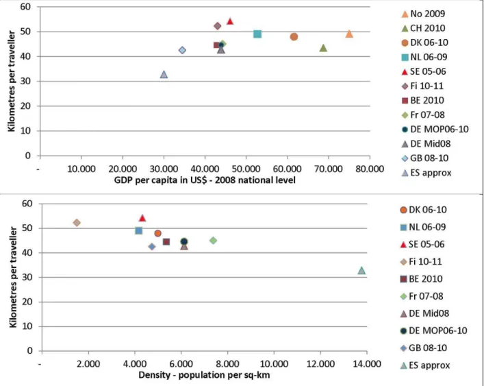
Figure 3 Kilometres per traveller dependent on GDP per capita and population density
Figure 3 confirms that the kilometres increase by income level with saturation for countries with the
highest income (UN, 2012, Weo 2012). However, Sweden and Finland seems to be too high, and Spain and partly Switzerland too low.
Figure 3 furthermore shows kilometres per traveller dependent on the population density (calculated by 100 m x 100 m grid and weighted by the number of residents in each grid, Corine, 2000). The figure shows a decrease in kilometres by increasing density with Finland as an outlier. The urban structure in Spain is rather different from the rest of Europe. 53% of the population live in metropolitan areas (OSE, 2007) and the weighted density is around twice the density of Germany and France. A high share of respondents living in metropolitan areas is reducing the aggregate travelled distances per traveller because of shorter
distances to workplaces, friends and relatives, and service activities like shops. (Ewing and Cervero, 2010, and Næss, 2005). This might very well explain the few kilometres per traveller in Spain and the very high share of walking trips.
0
The Density of Switzerland and Norway is unfortunately not included in the database. A guess might be that Switzerland is rather dense because of concentration of the cities in the valleys. This could explain a lower level of kilometres related to the income. The higher use of public transport might also be due to a concentration of the urban structure along public transport in the valleys.
Less kilometres to shopping activities in the Netherlands might be related to an urban structure with a possibility to cycling trips to more local shops. The opposite is the case for Great Britain for which many kilometres per traveller by car in the weekend might be related to a shopping structure with more decentralised big shopping centres than in the rest of Europe. These suggestions should be investigated more in future research.
Finland is an outlier in both figures, too many kilometres related to the income and too few related to the very low density. The latter might eventually be explained by a lower limit for the influence of density. For Sweden, Finland and Norway one of the explanations for many kilometres might be visits at summer cottages in weekends. A higher level at weekdays might add to this explanation because most families leave for the cottage already at Friday. Denmark has many summer cottages too but they are often located closer to the home, typically 5-50 km away. Leisure trips in Denmark are therefore more at level with the rest of the countries in which people travels to the open nature and for instance stays at campsites or hotels.
An explanation for more kilometres can be caused by included international trips for 5 countries. A high share of kilometres by air for Sweden at both work / business and leisure trips might be explained by international trips. But also a rather decentralised localisation of both public and private business in a big country might result in much air traffic for both business travels and for long distance commuting in the weekends (perhaps another explanation for the purpose ‘others’?). For Belgium and France no extra leisure traffic which could be international traffic is observed. However, the data collection methodology prevents inclusion of long distance travels for France because the questionnaire with the diary is delivered by a first visit and picked up again in the following week. For Belgium and the Netherland more kilometres for workplaces and business by car and public transport is observed than for other countries, which might be cross border commuting to Luxemburg and the German cities along the Rheine.
Share of immobile
As mentioned it was decided to calculate the indicators kilometres, time use and trips per traveller instead of per respondent, which is normal practise when using data from the NTS for up-weighting to the full level of transport or traffic for the country. With a too high level of immobile the overall kilometres will be too low. For Belgium for instance kilometres per traveller is very close to the mean for the 12 surveys (1% over). But the kilometres per respondent is the lowest of all the countries, 14% under the mean level. At the opposite end for the German MOP the level of kilometres per respondent is 9% over the mean level although kilometre per traveller is close to the mean level (1% over).
Christensen, 2006 shows based on the Danish NTS for 1998-2001 that the immobile level is very sensitive to the data collection methodology. Over the 4 years the share increased from 15% to 25%. The change was first of all explained by decreasing interviewer performance, but the analyses also showed that the share of immobile was dependent on several other questions related to the collection method as for instance which time of the day and week respondents were called and how many times respondents were recalled if they only made an appointment for a later call back. Christensen, 2012 at the other hand shows that the share of immobile could be kept constant and possibly more or less correct by a close follow up on the
Madre et. al., 2007 conclude that the immobile level should be between 8 and 12% for a weekday in a one day survey based on analyses of the immobile share from many different regional and national surveys and by using several different methodologies. For only 4 of the NTS in our study the share is at this level, Switzerland and the German MiD with 8%, Norway with 11%, and Spain assessed to be 8% (only known for the whole week). 5 Countries are with a 14-15% share a little over their suggested correct level. Belgium is with 26% much over. The German MOP and the British Survey which are multi-day surveys are at 6% and 19% respectively.
The question is therefore which levels of the immobile share should be trusted?
For Denmark the overall kilometres by car resulting from the NTS is compared with the results from odometer reading of the car fleet for the years 2007-2011. This shows a 1-8% lower level of the kilometres with 4 of the 5 years in the upper end. The NTS result has to be lower than the odometer reading because 1) Driving by elderly people over 85 year, 2) cross-border travels, and 3) the outbound trips are missing in the NTS for trips with an overnight stay. An underestimation up to 8% is therefore not unrealistic. This is however, not a proof for a correct level of the share of immobile because short walking and bike trips might still be left out resulting in an increased share of immobile.
The German MiD, Switzerland, and Spain which have an immobile share at weekdays around 8% have the highest number of walking trips of the surveys. This might indicate that these surveys have been better in collecting short trips than the 5 countries with an immobile level at 14-15% for weekdays. However, this cannot explain a so much lower level, the Norwegian 11% seems more correct.
Great Britain has a very high share of immobile compared to the rest. In the British NTS is asked for travels for seven days of which the delivered tables are for day 7. In Dickinson and Melbourne (2013) is analysed the level of immobile. They compare the level in the NTS with a survey for the Greater London area carried out by London Transport. This survey is a one-day survey similar to most of the European surveys. This survey shows an immobile share at 14% at weekdays and 22% in weekends for the survey in 2005-06, which is at the level with five of the European NTS’s. Furthermore, they show that the level of immobile is increasing during the 7 days. If the immobile level is based on day 1 instead of day 7 the share of immobile would be 17%, and 15% in weekdays which is in line with both the London survey and 5 European NTS’s. This indicates some fatigue of the respondents during the reporting period.
France belonging to the middle group at weekdays has a higher share of immobile in the weekend than the rest of the countries in the group. A fatigue like the one observed for GB might be the case with the weekend interviews for France. People could also have a lower remembrance of the weekend travels if they are asked several days back in time. However, Madre et. al., 2007 show that a delay of data collection is not an explanation for a high share of immobile.
Madre et. al., 2007 show that people in dense cities are more out for a trip than people living at the countryside with few shops and other attractions. This might explain the rather low level of the immobile share for Spain, and eventually for Switzerland too.
The low level of the share of immobile in the German MiD could be explained by a two-stage contact to the respondents. First the respondents are asked if they want to participate and socio-economic data are collected. If they accept to participate they are later contacted for collecting the diary. It is well known from other surveys that respondents without trips find themselves irrelevant for a survey about travelling which might result in an overrepresentation of immobile excluded from step two. A very high level of the none-response rate indicates a risk for a bias in the population for the diary too.
Finally the very high share of immobile in Belgium indicates that the quality of the data collection is too low. However, researchers at the University of Namur have compared the results for the Flanders part of the Belgium survey with a survey for Flanders. This shows a difference in the share of immobile but the travel behaviour in the two surveys seems similar. However, according to our comparison, a low level of short trips indicates that many short trips are forgotten and therefore is some of the explanation for the high level of immobility.
Estimation of kilometres per traveller for Spain
Spain has not asked for trip length in the questionnaire. However, with information about travel distances from all other countries it has been possible to estimate a good approximation to the travel distance per traveller distributed at modes and at time use bands.
For each time use band the mean travel distance for each transport mode is known for all countries and a mean distance has been calculated. For all time use bands and all modes this mean distance is multiplied by the trip frequency calculated from the table for Spain for the respective time use band and mode.
However, Spain has not the same modes in the survey as the rest of the countries. Walking and bike are together and car drivers and passengers are together and include moped and motorcycle. The mean distances for these groups had to be estimated too based on an assumption of the distribution on modes from other countries. For the distribution of trip frequency on bike and walking France is used resulting in an assumption of 95% walking at trips less than 5 minutes, decreasing to 80% for trips longer than 1½ hour. 3% of the trips by car and moped are used for moped or motorcycle at all distances, it is similar for most countries and Barcelona. Based on frequencies from several countries 95% of the car trips are chosen as driver trips for the shortest distances falling to 70% for the longest.
The result is 32.7 km per traveller per day. The exact distribution of kilometres on modes only has very marginal effect on the overall kilometres per traveller. Sensitivity analyses show that the overall kilometres is between 32.9 km and 32.1 km per traveller.
Real time control of data collection
The collected look-up tables can also be used to learn about possibilities to improve the data collection methodology. An example is Danish survey. By doing real time control of the stated distances and destination addresses in the data collection process the resulting distances can be corrected. Analyses show that people underestimate kilometres at shorter distances. The same is observed in Norway (Vågane, 2013). The comparison shows that Denmark has more kilometres in all time use bands by all modes up to 50 minutes than the rest of the countries.
Conclusion
post-harmonising can be carried further through than done in this actual work done by voluntary data users from European universities.
First of all handling of long distance travels should be post-harmonised too so that only travels inside the country is included. If the post-harmonisation is placed in the data-collecting organisation for all countries it would be possible to make more tables and especially more complex tables from which simpler tables can be deduced based on the user’s needs. More post-harmonising work on data definitions could also be done resulting in more detailed tables, for instance by going deeper into included transport modes, purposes, family types, and day of week. The cost action gave up finding possible common definitions for
urbanisation. However, this is an area which needs more work because the results from the actual work show that differences between the countries seem to be based on differences in urban structure and city densities.
Harmonising definitions of data values might be a natural next step without changing continuity of the data series each country collects. First of all ‘others’ and ‘no information’ should be reduced to a minimum. This would help comparison as well as better understanding of travel activities in each country. Harmonisation of included long distance travels in future data-collection would also improve the results further because these are of importance for the overall kilometres.
The actual work with comparison of post-harmonised data shows that meaningful knowledge about similarity and differences between the countries can be learned from comparing travel activity. It can for instance be concluded that a more thorough work with urban structure and with mode choice at different distances and travel purposes can show ways for future improvement in policy. Long-distance national travels is another area with need for more research to understand what makes the most important increase in overall kilometres.
The comparison and analyses of the immobility seems to show that both a very high and a very low immobile level might be outliers influenced by the quality or the methodology of the data collection or sampling process. It seems as if most NTS underrepresent the shortest walking trips but grasps the level of motorised trips correct. If differences can be reduced to the short walking and bike trips it is not important for the overall kilometres and for the motorised kilometres. However, if longer travels and motorised travels are over-exposed in the data collection process improvement in data collection and/or the weighting processes is necessary to get more valid results.
Furthermore, collection of post-harmonised data can as the example with Spanish travel-distance shows be used to help some countries to improve their own data, and as the Danish example shows to learn about possibilities to improve the data collection methodology.
ACKNOWLEDGMENT
Thanks to everybody for having contributed with all the look-up tables. It has been a hard work to do them over and over again
Eric CORNELIS, Laurie Hollaert, Fundp, Belgium Ilka Ehreke, Ethz, Switzerland
Angelika Schulz, Katja Köhler, DLR, Germany Martin Kagerbauer, Christine Weiss, IFV, KIT Jean-Paul Hubert, Ifsttar, France
Tuuli Järvi, VTT, Finland
Lyndsey Melbourne, Samuel Dickinson, DFT, Great Britain Dujuan Yang, Tue, Netherland
Jon-Martin Destali, Liva Vågane, TØI, Norway
Armoogum et al (2013): COST Action TU 0804. Survey HArmonisation with New Technologies Improvement
(SHANTI). http://shanti.inreFigure 1ts.fr/. In Progress
Christensen, L., 2006: Possible Explanations for an Increasing Share of No-Trip Respondents. In : Stopher, P. And Stecher, C : Travel Survey Methods. Quality and Future Directions, 2006, Elsevier Science, Amsterdam p 303-316
UN, 2012: GDP per capita in current prices and population: http://data.un.org/Search.aspx?q=gdp. WEO, 2012: http://www.imf.org/external/pubs/ft/weo/2012/01/weodata/download.aspx
Population density disaggregated with Corine land cover 2000. http://www.eea.europa.eu/data-and-maps/data/population-density-disaggregated-with-corine-land-cover-2000-2
Christensen, L., 2012: The Role of Web Interviews as part of a National travel Survey. in: Zmud, J., Lee-Gosselin, M., Munizaga, M and Carrasco, J.A. (eds) Transport Survey Methods: Best Practice for Decision
Making, Emerald, Bingley (UK), pp. 115-153.
Clond, B., Wirtz, M., Zumkeller, D, 2012: Data Quality and Completeness issues in Multiday or Panel Surveys. in: Zmud, J., Lee-Gosselin, M., Munizaga, M and Carrasco, J.A. (eds) Transport Survey Methods: Best Practice for Decision Making, Emerald, Bingley (UK), pp. 373-391.
Dickinson, S., Melbourne, L., 2013: Immobile proportion in the National Travel Survey, Great Britain.
Unpublished
Ewing, R., Cervero, R. 2010. Travel and the Built Environment. A Meta-Analysis. Journal of the American Planning Association 76, 265-294
Kuhnimhof, T., Clond, B., and Zumkeller, D. 2006. Nonresponse, selectivity, and data quality in travel
surveys: Experiences from analyzing recruitment for the German mobility panel.Transportation Research
Record: Journal of the Transportation Research Board. Volume 1972 pp 29-37. 2006
Madre, J.-L., Axhausen, K. W. and Brög, W., 2007 Immobility in travel diary surveys. Transportation 34: pp. 107-128.
Nielsen, T.S., Hovgesen, H.H., and Lassen, C., 2005: Explanatory mapping of commuterflow in England and
Wales, Paper presented at the RGS-IBG Annual international conference 2005, London
Næss, P. 2005. Residential location affects travel behavior—but how and why? The case of Copenhagen
metropolitan area. Progress in Planning 63, 167-257
Observatorio de la Sostenibilidad –OSE- (2007). Informe de la Sostenibilidad en España.
http://www.sostenibilidades.org/sites/default/files/_Informes/anuales/2007/sostenibilidad_2007-esp.pdf