Perceptual color similarity measurement
79
0
0
Texto completo
(2) Acknowledgments 9 My mother, Dra. Svitlana Koshova for her continuous support and motivation. 9 Dr. Fernando Ramos Quintana for his assistance and comprehension during the development of this work. 9 M. Sc. Alejo Mosso Vázquez for numerous corrections and suggestions. 9 Dra. Patricia Rayón Villela for related information and patience when final corrections were made. 9 Dr. Jose Luis Liñan, whose motivation is the result of my studies in master degree. 9 Dra. Dalila Jimenez who taught me several courses from which the general interest to computing science was born.. Thank you!.
(3) Abstract. Color perception remains a difficult and little understood problem, where the perceived color is generally subjective to the viewer such as human eye or a digital camera. In the area of vision there are a number of applications where measuring the similarity between several colors is required. However, existing models for measuring the color similarity use complex mathematical expressions and thus are slow and difficult to compute, especially on embedded systems where available number of instructions and mathematical capabilities can be quite limited. In many cases, the mathematical complexity of existing color similarity models makes them inadequate for applications running in real-time.. In this work a new model for measuring the perceived similarity is proposed. It requires a minimal set of mathematical calculations and its formula can be computed easily on an embedded system, even when running in realtime. The proposed model is the result of theoretical and experimental studies that were made by the authors of this document with the purpose of finding a better alternative for measuring the color similarity on embedded systems. This work also presents a series of experiments comparing the existing perceptual color similarity models with the proposed model of this work, where the human eye can judge the result visually, that is, in perceptual terms.. Page 1 of 77.
(4) Table of contents CHAPTER 1: INTRODUCTION. 4. 1.1. CONTEXT. 4. 1.2. PROBLEM DEFINITION. 6. 1.3. OBJECTIVES. 8. 1.4. SOLUTION STATEMENT. 9. 1.5. THE SCOPE. 10. 1.6. CONTRIBUTIONS. 11. 1.7. METHODOLOGY. 12. CHAPTER 2: BACKGROUND. 14. 2.1. VISUAL COLOR PERCEPTION. 14. 2.1.1. PROPERTIES OF LIGHT. 14. 2.1.2. LIGHT RECEPTION IN HUMAN EYE. 19. 2.2. COLOR SPECIFICATION. 21. 2.2.1. FORMAL DEFINITION. 21. 2.2.2. COLOR MATCHING. 22. 2.2.3. STANDARD SPECIFICATION. 24. 2.2.4. CIE XYZ COLOR MODEL. 25. 2.2.5. CIE CHROMATICITY DIAGRAM. 27. 2.3. COLOR SPACES. 33. 2.3.1. THE SPECIFICATION. 33. 2.3.2. ADDITIVE AND SUBTRACTIVE COLOR SYSTEMS. 33. 2.3.3. RGB COLOR MODEL. 35. 2.3.4. CIE 1976 L*, A*, B* (CIELAB) COLOR MODEL. 37. 2.3.5. YIQ NTSC TRANSMISSION COLOR SPACE. 38. Page 2 of 77.
(5) CHAPTER 3: RELATED WORKS. 40. 3.1. GENERAL OVERVIEW. 40. 3.2. COMMON COLOR DIFFERENCE MEASURES. 44. 3.3. AN ALTERNATIVE MEASURE. 52. CHAPTER 4: THE PROPOSED MODEL. 54. 4.1. INTRODUCTION TO THE NEW FORMULA. 54. 4.2. EXPERIMENTS. 59. 4.2.1. THE QUALITY COMPARISON. 59. 4.2.2. PERFORMANCE COMPARISON. 67. 4.3. ANALYSIS OF RESULTS. 70. CHAPTER 5: CONCLUSIONS AND FUTURE WORK. 72. CHAPTER 6: REFERENCES. 74. Page 3 of 77.
(6) Chapter 1: Introduction. 1.1. Context. Computers have become a powerful tool for scientific and commercial applications across the globe. The result of such widespread usage of computers was birth of computer vision, which is concerned with the theory and technology for building artificial systems that obtain information from images or multidimensional data.. In the context of computer vision, it is common to refer to concept of color, which according to [Lexico06] is “the quality of an object or substance with respect to light reflected by the object, usually determined visually by measurement of hue, saturation, and brightness of the reflected light; saturation or chroma; hue.”. Color derives from the spectrum of visible light (distribution of light energy versus wavelength) interacting in the eye with the spectral sensitivities of the light. Page 4 of 77.
(7) receptors. Color categories and physical specifications of color are also associated with objects, materials, light sources, etc., based on their physical properties such as light absorption, reflection, or emission spectra.. In the context of color, typically only components of light that can be detected by humans, that is, wavelengths from 400 nm to 700 nm are included. This objectively relates the psychological phenomenon of color to its physical specification.. Since the color perception is based on the variations of sensitivity of different types of cone cells in the retina to different parts of the visual spectrum, colors can be defined and measured by the degree to which these cone cells are stimulated [Hill01].. Page 5 of 77.
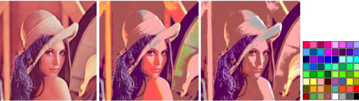
(8) 1.2. Problem Definition. Since color perception is difficult and a little understood problem and is really subjective to the viewer, measuring color similarity or difference is not only difficult for electronic equipment, but also for humans. In addition, the sensibility of human eye and digital camera to perceived colors varies depending on the illumination and other conditions.. The existing models for measuring color similarity or color difference use mathematical expressions which are rather complex and require a considerable time to compute. Although these models can achieve a good level of precision, they are difficult to implement and deploy on embedded systems, where the instruction set and mathematical capabilities can be reduced severely. In addition, the existing color similarity models are inadequate for applications, which need to compute the perceived color similarity for thousands of pixels in real-time.. For instance, an algorithm used in stereo vision to calculate the depth may require an indexed image to work with, which implies mapping a true-color image taken from digital camera to a palette with fixed number of colors. In this case, it is important that the color that was selected to represent original color is the least perceptually different from the existing palette, so the resulting image resembles the original as closely as possible. This is illustrated on a Figure 1.1, where truecolor image of Lena is mapped to a palette of 64 colors.. Page 6 of 77.
(9) Figure 1.1. True-color image of Lena on the left converted to indexed palette specified on the right using two different color similarity functions.. Another example would be textile industry where a color of the produced texture is compared to the color specified in original template (in quality control, for instance). Techniques used in stereo vision, on the other hand, commonly use the scanline comparison of two separate images for detecting a color match. These algorithms are essential aid in medicine, when stereo vision is used to assist the patient’s surgery. In other industries, color similarity comparison is used to detect shapes (where it is necessary to check whether two neighboring pixels are similar) and composition of objects captured on the video camera.. Page 7 of 77.
(10) 1.3. Objectives. The purpose of this work is to provide an alternative model for measuring color similarity in perceived terms, with the mathematical expression having more compact form and an ability of being computed faster than existing formulas, especially on hardware with limited mathematical capabilities.. The proposed model should be easier to implement and deploy on embedded systems and be applicable in real-time applications.. In addition, the goal of this work is to test and demonstrate that the proposed alternative not only gives similar results to existing mathematical models, but is more feasible and can perform better in image-processing applications that work in real-time.. Page 8 of 77.
(11) 1.4. Solution statement. The proposed solution described in this work is a new mathematical model for measuring perceived color similarity that was derived on the base of theoretical and experimental studies. The proposed model can measure the similarity of given color pairs with a similar visual result to existing mathematical models made for such purpose, but it is more robust and is easier to compute.. The color similarity formula of the proposed model does not use complex mathematical transforms like those used to calculate the formula CIEDE2000 [Luo01], which was accepted as CIE standard or few others [Cui01] [Guth97] [Ima01].. The color similarity formula of the model proposed in this work uses few mathematical expressions to compute the perceived similarity and gives results comparable in quality to the previously mentioned formulas visual-wise and performs better in terms of performance, which makes it suitable for real-time processing algorithms.. Page 9 of 77.
(12) 1.5. The scope. The scope of the theoretical studies accomplished in this work lies within the investigation in existing bibliography of the related topics, which are selected by the authors depending on their relevance to the subject.. The results of the studies are presented in this work to a certain point of detail, covering all important aspects of the theory that is required to form and define the proposed solution.. This work tries to cover completely the new proposed mathematical model and explains in detail how and where it could be used, although an assumption is taken that such mathematical model could still be improved. The details about any future work based on the mentioned model are provided at the end.. Some of the experiments that compare the newly proposed model with the existing works are presented at the end. The number of such experiments is limited and chosen by convenience of the author to demonstrate a variety of cases and scenarios to test the proposed formula and show where it can be applied. It is possible that not every possible case scenario is presented in the experiments, so the feasibility of the proposed model lies within the area covered by existing experiments.. The decisions and conclusions presented in this document are based on theoretical studies, numerical data and technical experience of the authors in the area, and do not cover all possible applications that can be concluded out of the proposed solution.. Page 10 of 77.
(13) 1.6. Contributions. This work proposes a new way of measuring the perceptual color similarity to the existing state of the art. In this model a new formula for calculating color similarity is described, which gives a comparable quality of results to existing color difference formulae, but is more compact and easier to compute. It is suggested to test this formula in future experiments, engineering and scientific works.. Page 11 of 77.
(14) 1.7. Methodology. In order to accomplish goals described in previous part, it is important to highlight the methodology applied in this work. It can be described as a series of steps or sections that are described below:. 1. The theoretical study of light’s nature and properties in order to understand how the light works so it can be perceived by human eye.. 2. The second theoretical study of how the light mentioned above is received and how different colors are seen by human eye to better understand the reception of the light and how colors are really perceived and interpreted.. 3. After it is clear how colors are perceived, it is necessary to formalize the definition of these colors and how they are represented digitally. This study is required to understand how colors are specified mathematically in digital equipment and their possible representations.. 4. Since. the. formal. definition. of. colors. and. their. representations, the next logical step is to compare the group of colors and measure such comparisons. This study implies investigation of previously developed models and their respective formulas. It is required to comprehend how colors can be compared and such comparison measured. In addition, this study also serves as a base for the next step.. Page 12 of 77.
(15) 5. With the existing color comparison methods explored, a new model is proposed which in some way can outperform the existing representations while giving similar or better results.. 6. The new mathematical model for measuring color similarity is used in a series of experiments to test how well it performs compared to other popular existing models.. 7. Based on the previous experiments and the analysis of their results, some recommendations are proposed for further analysis in future work.. As can be seen in the above list, this work includes several theoretical studies to fundament its proposed (possible) solutions to the previously defined problems. At the end of this work, the results are presented with their respective analysis. The generalized version of the methodology is presented in the following Figure 1.2.. Light properties. Color perception. Formal definition. Specification of color values Testing Results. Color Models. Similarity Measurement. New Measurement Model. Figure 1.2. The methodology used in this work.. Page 13 of 77.
(16) Chapter 2: Background. 2.1. Visual color perception. 2.1.1. Properties of light. The perceived light in [Hearn97] is defined as a narrow frequency band within the entire electromagnetic spectrum, in which some other frequency bands are defined such as radio waves, microwaves, infrared waves and X-rays. According to [Hill01], light is an electromagnetic phenomenon itself; that is, the waves that lie in a narrow band of wavelengths in the visible spectrum. The wavelength is defined as the distance light travels during its vibration period. Therefore, the wavelength λ and the frequency f are related in the following way:. λ = c f (1), where c is the speed of light in a given specific medium. In vacuum, v = 300,000 km/sec; in glass the speed of light is approximately 65 percent faster [Hill01].. Page 14 of 77.
(17) Figure 2.1 shows the electromagnetic spectrum with the visible spectrum (for humans) within, along with the spectra of some other common phenomena. The frequency of vibration f , increases to the right, whereas the wavelength λ increases to the left. The eye has sensitivity to wavelengths between approximately 400 and 700 nanometers (nm).. Figure 2.1. Electromagnetic spectrum (image by Louis E. Keiner – Coastal Carolina University).. A single light source such as the sun or a light bulb emits all frequencies within the visible range to produce white light. When this light is incident upon an object, some frequencies are reflected, while some are absorbed by the object’s surface. The spectrum of frequencies present in the reflected light determines the perceived color of the object. If low frequencies are the majority in the reflected light, the object is seen as red. In this case, it is said that the perceived light has a dominant frequency (or a dominant wavelength) at the red end of the spectrum. The dominant wavelength determines the hue, or simply the color of the light.. Page 15 of 77.
(18) Other properties besides the wavelength are needed to describe the various characteristics of light. In the perception of source light, the human eyes respond to the color (or dominant wavelength) and two other basic sensations. One of these sensations is brightness, which is the perceived intensity of the light. Intensity is the radiant energy, emitted per unit time, per unit solid angle, and per unit projected area of the source. It is related to the luminance of the source. The luminance is discussed later in this chapter. The second basic sensation is the purity, or saturation, of the light. Purity describes how pure or washed out the color of the light appears. Pastels and pale colors are usually seen as less pure. These described characteristics, dominant wavelength, brightness, and purity, are commonly used to describe the different properties perceived in a source of light. The term chromaticity is used to refer collectively to the two properties describing color characteristics: purity and dominant wavelength.. Energy. Wavelength Violet. Red. Figure 2.2. Energy distribution of a white-light source.. The energy emitted by a white light source has a distribution over the visible frequencies as shown in Fig. 2.2. Each individual slice of wavelength within the range from violet to red contributes more or less equally to the total. Page 16 of 77.
(19) energy, and the color of the source is seen as white. When a dominant wavelength is present, the energy distribution for the source takes a form such as that in Figure 2.3.. The light is described as having the color corresponding to the dominant wavelength. The energy density of the dominant light component is labeled as E D in the Figure 2.3 and the contributions from the other wavelengths produce. white light of energy density EW . The brightness of the source can be calculated as the area under the curve, which gives the total energy density emitted by the source. Purity depends on the difference between E D and EW : the larger the energy E D of the dominant wavelength compared to the white-light component. EW , the more pure the light is. The purity of 100 percent exists when EW = 0 and a purity of 0 percent is when E D = EW [Hearn97].. Energy. ED. EW Wavelength Violet. Red Dominant Frequency. Figure 2.3. Energy distribution of a light source with a dominant frequency near the red end of the frequency range.. Page 17 of 77.
(20) The total power in the light, that is its luminance, is given by the area under the entire spectrum. The saturation (or purity) of the light is defined as the percentage of luminance that resides in the dominant component.. The notions of saturation, luminance, and dominant wavelength are useful for describing colors, but when one is presented with a sample color, it is not clear how to retrieve or quantify these attributes.. When a light that has been formed by a combination of two or more sources is viewed, a resultant light with the characteristics determined by the original sources can be seen. Two different-color light sources with suitably chosen intensities can be used to produce a certain range of other colors. If the two color sources combined together produce white light, they are referred to as complementary colors. Some examples of complementary color pairs are red and cyan, green and magenta, and blue and yellow.. Typically, color models that are used to describe combinations of light in terms of dominant wavelength (hue) use three colors to obtain a reasonably wide range of colors, called the color gamut for that model. These two or three colors used to produce other colors are therefore referred to as primary colors.. No finite set of real primary colors can be combined to produce all possible colors in visible spectrum. Nevertheless, three primaries are sufficient for most purposes, and colors not in the color gamut for a specified set of primaries can still be described by some other methods. If a certain color cannot be produced by combining the three primaries, it is possible to mix one or two of the primaries with that color to obtain a match with the combination of remaining primaries. In this case, a set of primary colors can be considered to describe all colors [Hill01].. Page 18 of 77.
(21) 2.1.2. Light reception in human eye. The retina of the eye is a membrane sensitive to incoming light. It lines on the posterior portion of the eye’s wall and contains two kinds of receptor cells: cones and rods. The cones are the color-sensitive cells, each of which responds to a particular color: red, green, or blue.. The color seen by the eye is the result of the cones’ relative responses to red, green, and blue light. The human eye can distinguish about 200 intensities each of red, green, and blue. When two colors differ only in hue, the eye can distinguish about 128 different hues. When two colors differ only in saturation, the eye can distinguish about 20 different saturations, depending on hue [Hill01].. Each eye has approximately from 6 to 7 million cones, mainly concentrated in a small portion of the retina called the fovea. Each cone has its own nerve cell, thereby allowing the eye to discern tiny details. To see an object in detail, the eye looks directly at it in order to bring the image onto the fovea.. On the other hand, the rods can neither distinguish colors nor see fine detail. There are about 75 million to 150 million rods concentrated on the retina surrounding the fovea, although many rods are attached to a single nerve cell, preventing them from discriminating fine detail. However, rods are very sensitive to low levels of light and can see things in dim light that the cones miss. At night, for instance, it is generally better to look slightly away from an object, so that the image falls outside the fovea. Detail and color are not perceived well, but at least the general form of the object is visible.. Page 19 of 77.
(22) Spectral density. Yellow Violet. 400. Blue. Green. 500. Orange. 600. Red. 700. λ in nm. Figure 2.4. Spectra for some pure colors.. Furthermore, there are some light sources, such as lasers, that emit light of essentially a single wavelength, or “pure spectral” light. Human eye perceives 400-nm light as violet and 620-nm light as red, with the other pure colors lying in between these extremes. Figure 2.4 shows some sample spectral densities S (λ ) (power per unit wavelength) for pure light and the common names given to their perceived colors [Hill01].. Page 20 of 77.
(23) 2.2. Color specification. 2.2.1. Formal definition. In the previous sections the properties of light and how it was perceived by the eye were discussed. Based on the above study, a formal definition of color can be made. In his work of “Frequently Asked Questions about Color”, Poynton describes color as “the perceptual result of light in the visible region of the spectrum, having wavelengths in the region of 400 nm to 700 nm, incident upon the retina. Physical power (or radiance) is expressed in a spectral power distribution, often in 31 components each representing a 10 nm band” [Poynton99]. According to Poynton, spectral power distributions exist in the physical world, while color exists only in the eye and the brain. In addition, Poynton references Berlin and Kay that although different languages encode in their vocabularies different numbers of basic color categories, a total universal inventory of exactly eleven basic color categories exists from which the eleven of fewer basic color terms of any given language are always drawn. The eleven basic color categories are white, black, red, green, yellow, blue, brown, purple, pink, orange and gray [Berlin69], [Poynton99].. In order to work with colors, it is necessary to properly define and differentiate the terms of brightness, intensity and luminance, all of which are often used while working with colors. In previous sections, the terms of intensity and brightness were already defined. In his ColorFAQ [Poynton99], Poynton defines intensity as a measure over some interval of the electromagnetic spectrum of the flow of power that is radiated from, or incident on, a surface.. Page 21 of 77.
(24) The term of luminance, according to Poynton, is defined by CIE as the attribute of a visual sensation according to which an area appears to emit more or less light. Because brightness perception is very complex, the CIE defined a more tractable quantity luminance which is radiant power weighted by a spectral sensitivity function that is characteristic of vision. The luminous efficiency of the Standard Observer is defined numerically, is everywhere positive, and peaks at about 555 nm. When a spectral power distribution is integrated using this curve as a weighting function, the result is CIE luminance, referred to as Y.. The magnitude of luminance is proportional to physical power. In that sense it is like intensity. But the spectral composition of luminance is related to the brightness sensitivity of human vision. Strictly speaking, luminance should be expressed in a unit such as candelas per meter squared, but in practice it is often normalized to 1 or 100 units with respect to the luminance of a specified or implied white reference [Poynton99]. The concept of white reference (or white point) is discussed in section 2.2.5.3.. 2.2.2. Color Matching. Colors are often described (or defined) by comparing them with a set of standard color samples and finding the closest match. Many such standard sets have been described and are widely used in the dyeing and printing industry [Hill01]. One can also try to produce a sample color by matching it to the proper combination of some test lights. The technique of doing so is described below. The sample color with spectral density S (λ ) is projected onto one part of a screen, and other part is bathed in the superposition of three test lights with spectral densities A(λ ) , B(λ ) , and C (λ ) . The observer needs to adjust the. Page 22 of 77.
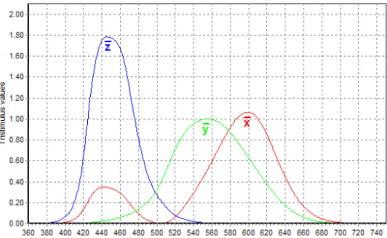
(25) intensities. (a,. b,. and. c). of. the. test. lights. until. the. test. color. T (λ ) = aA(λ ) + bB(λ ) + cC (λ ) is undistinguishable from the sample color, even. though the two spectra, S (λ ) and T (λ ) , may be quite different.. Experiments have been made to see how people match colors. Of particular interest is one experiment that combines three specific choices of red, green and blue in order to produce a so-called pure spectral color, that is, a totally saturated monochromatic color having its power concentrated at a single wavelength. In dominant-wavelength terms, this color is completely saturated and has dominant wavelength λ . Figure 2.5 shows the results of the mentioned experiment made with a large number of observers. The primary colors that were used were pure monochromatic red, green, and blue lights at wavelengths of 700 nm, 546 nm, and 436 nm, respectively.. Tristimulus values. r (λ ) b(λ ). g (λ ). 0.3 0.2 0.1. 500. 400. 600. 700. 436. -0.1. 700. 546. Wavelength λ (nm) Figure 2.5. Color-matching functions for RGB primaries.. On Figure 2.5, the functions r (λ ) , g (λ ) , and b(λ ) show how much of red, green, and blue lights are needed to match the pure spectral color at λ . From now. on,. this. will. be. referred. to. as. pure. spectral. color. mono (λ ) :. Page 23 of 77.
(26) mono(λ ) = r (λ )R + g (λ )G + b(λ )B . For instance, a pure orange color mono (600). looks (to the average observer) identical to the combination 0.37R + 0.08G. Although the spectrum of the orange light is not the same as the spectrum of this sum, the two lights still look the same visually.. It is useful to scale the color-matching functions so that they add to unity, so:. r (λ ) =. r (λ ) g (λ ) b(λ ) , g (λ ) = , b (λ ) = (2) r (λ ) + g (λ ) + b(λ ) r (λ ) + g (λ ) + b(λ ) r (λ ) + g (λ ) + b(λ ). and therefore. r (λ ) + g (λ ) + b (λ ) = 1 . These functions are also called as. chromaticity values for mono(λ ) . They give amounts of each of the primary colors that are required to match a unit of light’s brightness at λ . Excluding variations in brightness allows specifying colors with only two numbers like (r (λ ), g (λ )) , since it is possible to determine b (λ ) from the equation b (λ ) = 1 − r (λ ) − g (λ ) [Hill01].. 2.2.3. Standard specification. As mentioned previously, no finite set of color light sources can be used to produce all possible colors in color gamut, three standard primaries were defined in 1931 by the International Commission on Illumination, referred to as the CIE (commission Internationale de I'Eclairage). The three standard primaries are actually imaginary colors. They are defined mathematically with positive colormatching functions (Figure 2.6) that specify the amount of each primary needed to describe any spectral color. This provides an international standard definition. Page 24 of 77.
(27) for all colors, and the CIE primaries eliminate negative-value color matching and other problems associated with selecting a set of real primaries [Hearn97].. Figure 2.6. Color-matching CIE functions.. 2.2.4. CIE XYZ Color Model. The above set of CIE primaries is generally referred to as the XYZ color model (also known as CIE 1931), where X, Y, and Z represent vectors in a threedimensional color space. These vectors represent special “supersaturated” primary colors that do not correspond to real colors, but they have a property that all real colors can be represented as positive combinations of them. A monochromatic light at wavelength λ is matched by the specified linear combination of the special primary colors. The resulting equation is: mono(λ ) = x(λ )X + y (λ )Y + z (λ )Z . The color matching functions x(λ ) , y (λ ) , and z (λ ) are presented on Figure 2.6. Since all three functions are positive at every. λ , the function mono(λ ) is always a positive linear combination of the primary colors.. Page 25 of 77.
(28) For convenience,. y (λ ). was chosen to represent the luminance. numerically. That is, the amount of the Y primary color present in a light equals to the overall intensity of the light [Hill01].. The normalized chromaticity values that maintain unit brightness can be calculated as in similar way they were calculated for functions r (λ ) , g (λ ) , and b(λ ) :. x (λ ) =. x(λ ) y (λ ) z (λ ) , y (λ ) = , z (λ ) = (3) x(λ ) + y (λ ) + z (λ ) x(λ ) + y (λ ) + z (λ ) x(λ ) + y (λ ) + z (λ ). and they sum to unity: x (λ ) + y (λ ) + z (λ ) = 1 . Thus, any color can be represented with just the x and y amounts in this scheme.. Since the above functions were normalized against luminance, the values x and y are called the chromaticity values because they depend on hue and purity only. However, if the colors are only specified with x and y values, it is impossible to retreive amounts X, Y, and Z. Therefore, a complete description of a color is typically given with three values x, y, and Y. The remaining CIE amounts are then calculated in the following manner:. X=. where. x z Y , Z = Y (4) y y. z = 1 − x − y . Using chromaticity coordinates ( x, y ) , it is possible to. represent all colors on a two-dimensional diagram [Hearn97]. This diagram is called CIE chromaticity diagram and is discussed in the following section.. Page 26 of 77.
(29) 2.2.5. CIE Chromaticity Diagram. In previous section it was concluded that using chromaticity coordinates. (x, y ). it is possible to draw all colors on two-dimensional diagram. The result of. this is a tongue-shaped curve shown on Figure 2.7. This curve is called CIE chromaticity diagram.. Any points lying along the curve is the pure spectral color in the visible part of electromagnetic spectrum. These points are labeled according to wavelength in nanometers from the red end to the violet end of the spectrum on Figure 2.7. The line joining the red and violet spectral points, called the purple line, is not part of the spectrum. Interior points represent all possible visible color combinations.. Figure 2.7. CIE chromaticity diagram. Spectral color positions along the curve (blue text) are labeled in wavelength units (nm).. Since x and y values depend on hue and purity, the luminance is not shown on the diagram. However, colors with different luminance but the same chromaticity values map to the same point on the diagram [Hearn97].. Page 27 of 77.
(30) Also, it is important to note that equal distances between points in the chart do not correspond to equal differences in perceived color. In addition, there are specially defined color positions, referred to as white point – a term that is discussed in section 2.2.5.3. The CIE chromaticity diagram can be useful in many ways. Several of them originate from the ease with which straight lines on the chart can be interpreted, as suggested on Figure 2.8. Considering a line l, between the two colors a and b. All points on l are a linear interpolation from a to b, that is: c = αa + (1 − αb ) , where 0 ≤ α ≤ 1 . Each point is a legitimate color, so it can be. asserted that any colors on the straight line (and only those colors) can be generated by combining various amounts of colors a and b together. In the case when two colors are added and their sum turns out to represent white color, it is said that the colors are complementary (with respect to the choice of white).. Figure 2.8. Uses for the CIE chromaticity diagram (image owned by [Hill01]).. Page 28 of 77.
(31) The CIE chromaticity diagram can also be used to measure the dominant wavelength and purity of a given color, such as g in Figure 2.8. Accordingly, g must be the linear combination of some pure spectral color (found on the edge of the tongue shape) and a standard representation of white w. To find which spectral color is involved, it is only necessary to draw a line from w through g (and on to h here), and measure the wavelength at h, in this case, 564 nm - a yellowish green. Similarly, the saturation, or purity, is just the ratio of distances gw hw .. The color at j has no dominant wavelength, because extending line wj hits k on the so-called purple line, which as it was mentioned previously is not part of the visible spectrum (Colors along this line are combinations of red and violet.) In such a case, the dominant wavelength is specified by finding the complement of j at m and using its wavelength with a c suffix – that is, 498c [Hill01].. 2.2.5.1. Color Gamuts. The CIE diagram is especially useful in defining color gamuts, the range of colors that can be produced using a combination of three primaries on a specific device. For instance, a CRT monitor has three phosphor types that correspond to red, green, and blue primary colors. Figure 2.9 shows the positions of these colors on the CIE chromacity diagram.. Primary x y red 0.6280 0.3300 green 0.2580 0.5900 blue 0.1507 0.6000 Figure 2.9. CIE coordinates for typical CRT monitor primaries.. Page 29 of 77.
(32) The three points define the triangular region within the chromacity diagram. The combination of these primaries forms the gamut of colors that can be displayed on the monitor.1 Colors outside this triangle are not in the gamut of the display and thus cannot be displayed. Notice that white is inside the gamut, reflecting the well-known fact that appropriate amounts of red, green, and blue yield white.. It can be seen that for any choice of three primaries, even the pure spectral colors on the edge of the tongue-shaped curve, a triangular gamut can never encompass all visible colors, because the chromacity diagram “bulges” outside any triangle whose vertices are within it. Red, green, and blue are natural choices for primary colors, as they lie far apart in the CIE diagram and therefore produce a gamut that covers a wide area on the diagram [Hill01].. 2.2.5.2. Color temperature. According to Poynton in his ColorFAQ [Poynton99], Planck determined that the light’s spectral distribution radiated from a hot object is a function of the temperature to which the object is heated. Many sources of illumination have, at their core, a heated object, so it is often useful to characterize an illuminant by specifying the temperature (in units of Kelvin, K) of a radiator that appears to have the same hue.. 1. The National Television Standards Committee (NTSC) describes standard primary colors in CIE coordinates as following: red = (0.67,0.33) , green = (0.21,0.71) , blue = (0.14,0.08) [Hill01].. Page 30 of 77.
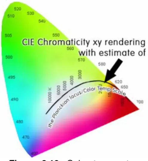
(33) Figure 2.10. Color temperatures on CIE chromaticity diagram.. Although an illuminant can be specified informally by its color temperature, a more complete specification is provided by the chromaticity coordinates of the spectral distribution of the source light [Poynton99]. As can be seen on Figure 2.10, chromaticity coordinates land directly on the Planckian locus1.. Figure 2.11. Blackbody temperature (in kelvins) and its respective color.. A numerical representation of color temperatures is shown on Figure 2.11. Since the color gamut of output devices most likely does not cover the visual spectrum of color temperatures, the above diagram is not accurate in colorimetric terms.. 1. Planckian locus is generally the path that the color of a black body generator would take in particular color space as the black body temperature increases.. Page 31 of 77.
(34) 2.2.5.3. White point. In the conversions between color spaces (discussed in next section) in addition to primary color coordinates, a special reference point is defined for white. Depending on the application, different definitions of white are needed to give acceptable results. For example, photographs taken indoors may be lit by incandescent1 lights, which are relatively orange compared to daylight. Defining “white” as daylight will give unacceptable results when attempting to color-correct a photograph taken with incandescent lighting.. Previously it has been discussed that white is described by its spectral power distribution, that is, by giving the amount of power per unit wavelength at each wavelength of the visible spectrum. The white point is commonly defined by x and y coordinates on CIE chromaticity diagram. A list of common white points, their CIE chromaticity coordinates ( x, y ) and their correlated color temperatures (CCT) are shown on Figure 2.12.. Name x y CCT, °K 0.33333 0.33333 5400 E 0.34567 0.35850 5000 D50 0.33242 0.34743 5500 D55 0.31271 0.32902 6500 D65 0.29902 0.31485 7500 D75 0.44757 0.40745 2856 A 0.34842 0.35161 4874 B 0.31006 0.31616 6774 C 0.28480 0.29320 9300 9300 0.37207 0.37512 4200 F2 0.31285 0.32918 6500 F7 0.38054 0.37691 4000 F11 Figure 2.12. Commonly used white points.. 1. Incandescence is the release of electromagnetic radiation from a hot body due to its high temperature.. Page 32 of 77.
(35) 2.3. Color spaces. 2.3.1. The specification. Although CIE’s specification of color is precise and standard, it is not necessarily the most natural one. In computer vision particularly, it is most natural to think of combining red, green, and blue to form the colors that are desired. Other people, however, are more comfortable thinking in terms of hue, saturation, and brightness, and artists frequently refer to tints, shades, and tones to describe color.. These are all examples of color models, choices of three “descriptors” used to describe colors. If one can quantify the three descriptors, one can then describe a color by means of a triple of values, such as (tint, shade, tone) = (0.125, 1.68, 0.045). This establishes a 3D coordinate system in which to describe color. The different choices of coordinates then give rise to different color spaces, and it is necessary to being able to convert color descriptions from one color space to another [Hill01].. 2.3.2. Additive and subtractive color systems. In previous sections it was considered summing contributions of colored light to form new colors, which is an additive process. An additive color system expresses a color Da as the sum of certain amounts of primary colors, for example, red, green, and blue: Da = (r , g , b ) . An additive system can use any three primary colors, but because red, green, and blue are situated far apart in the CIE diagram, they provide a relatively large color gamut.. Page 33 of 77.
(36) Subtractive color systems are used when it is natural to think in terms of removing colors. When light is reflected (diffusely) from a surface or is transmitted through a partially transparent medium (as when photographic filters are used), certain colors are absorbed by the material and thus removed. This process is referred to as subtractive. A subtractive color system expresses a color Ds by means of an ordered triple, just as an additive system does, but each of the three values specifies how much of a certain color (the complement of the corresponding primary) to remove from white color in order to produce Ds .. In a printing process, for instance, cyan, magenta, and yellow pigments are suspended in a colorless paint (sometimes black pigment is used to reduce the usage of color pigments for printing black text). Each color subtracts a portion of the complementary component of its incident light. For example, if magenta particles are mixed onto a colorless paint, the particles will subtract the green portion of the white light and reflect only the red and blue components [Hill01].. a) additive. a) subtractive. Figure 2.13. Additive and subtractive color systems.. The above figure 2.13 shows the additive and subtractive primary colors and their interaction. In Part (a), red, green, and blue beams of light appear on a white surface. Where the two beams overlap, their lights combine to form a new color. For instance, red and green add to form yellow light. Where all three. Page 34 of 77.
(37) overlap, white light is formed. A different situation can be viewed in Part (b), where each circle is formed by laying down a color ink. When the yellow and cyan pigments are blended, one sees green, since both the blue and the red components have been removed. The center is black, because all the components have been removed [Hill01]. Notice that previously described CIE XYZ color model is additive.. 2.3.3. RGB Color Model The RGB color model or color space describes colors as positive combinations of three primary colors of red, green, and blue [Hill01]. Similar to XYZ color space, the RGB color space is an additive model, that is, intensities of the primary colors are added to produce other colors [Hearn97]. If the scalar values of R, G, and B are confined to values between 0 and 1, all definable colors will lie in the cube shown in Figure 2.14.. Figure 2.14. The RGB color cube.. Unlike the CIE chromacity coordinates, the RGB model does not normalize the intensity of the color: points close to (0, 0, 0) are dark, and those farther out are lighter. In this case, (1, 1, 1) corresponds to pure white. This color space is the most natural for computer vision, in which a color specification such as (0.3, 0.56, 0.9) can be directly translated into values stored in a color lookup. Page 35 of 77.
(38) table (LUT). Note that the corner marked magenta properly signifies that red light produces magenta light, and similarly for yellow and cyan. Colors at diagonally opposite corners on Figure 2.14 are complementary. According to [Hill01], when normalized to unit intensity, all of the colors that can be defined in this model will, of course, lie in the CIE chromaticity diagram once suitable positions of red, green, and blue have been identified. It is easy to convert a color that is specified in CIE coordinates (x, y, z ) into (r , g , b ) space, and vice versa. Because R, G, and B primaries are linear combinations of the X, Y, and Z CIE primaries, a linear transformation suffices. The mapping depends on the definition of the primaries R, G, and B and on the definition of white point. For instance, the conversion between CIE XYZ and sRGB1 color space with white point D65 uses the primaries specified on Figure 2.15. [BT709], [IEC61966]. R G B white 0.6400 0.3000 0.1500 0.3127 x 0.3300 0.6000 0.0600 0.3290 y 0.0300 0.1000 0.7900 0.3583 z Figure 2.15. CIE coordinates for sRGB primaries and white point D65 .. Thus, the conversion from XYZ to sRGB (with linear r ′ , g ′ , and b′ components) would be the following:. ⎡ r ′ ⎤ ⎡ 3.240479 − 1.537150 − 0.498535⎤ ⎡ X ⎤ ⎢ g ′⎥ = ⎢− 0.969256 1.875992 0.041556 ⎥⎥ • ⎢⎢ Y ⎥⎥ (5) ⎢ ⎥ ⎢ ⎢⎣ b′ ⎥⎦ ⎢⎣ 0.055648 − 0.204043 1.057311 ⎥⎦ ⎢⎣ Z ⎥⎦. 1. sRGB color space, or standard RGB, is an RGB color space created cooperatively by Hewlett-Packard and Microsoft Corporation.. Page 36 of 77.
(39) Since the above conversion matrix has some negative coefficients, XYZ colors that are out of gamut for a particular transform when r ′ , g ′ , or b′ is negative or greater than unity [Poynton99]. Naturally, the conversion from sRGB to XYZ uses the inverse of the above matrix and the expression is the following: ⎡ X ⎤ ⎡0.412453 0.357580 0.180423⎤ ⎡ r ′ ⎤ ⎢ Y ⎥ = ⎢ 0.212671 0.715160 0.072169⎥ • ⎢ g ′⎥ (6) ⎢ ⎥ ⎢ ⎥ ⎢ ⎥ ⎢⎣ Z ⎥⎦ ⎢⎣0.019334 0.119193 0.950227 ⎥⎦ ⎢⎣ b′ ⎥⎦. 2.3.4. CIE 1976 L*, a*, b* (CIELAB) Color Model. CIE L*a*b* (CIELAB) is the most complete color model used conventionally to describe all the colors visible to the human eye. This model is based directly on the CIE 1931 XYZ color space as an attempt to linearize the perceptibility of color differences, using the color difference metric described by the MacAdam ellipses1 [MacAdam42]. The non-linear relations for L*, a*, and b* are intended to mimic the logarithmic response of the eye. Coloring information is referred to the color of the white point of the system, subscript n.. The conversion from XYZ to L*a*b* space according to [William01] is the following: ⎧ ⎛ Y ⎞1 3 Y ⎪116⎜⎜ ⎟⎟ − 16, for > 0.08856 ⎪ ⎝ Yn ⎠ Yn (7) L* = ⎨ Y Y ⎪903.3 , for 0.0 ≤ ≤ 0.008856 ⎪⎩ Yn Yn. ⎡ ⎧X ⎫ a* = 500 ⎢ f ⎨ ⎬ − ⎣ ⎩Xn ⎭. ⎧ Y ⎫⎤ f ⎨ ⎬⎥ (8) ⎩Yn ⎭⎦. 1. MacAdam ellipse is the region on CIE chromacity diagram containing all colors which are indistinguishable, to the average human eye, from the color at the center of the ellipse.. Page 37 of 77.
(40) ⎡ ⎧X ⎫ b* = 200⎢ f ⎨ ⎬ − ⎣ ⎩Xn ⎭. ⎧ Z ⎫⎤ f ⎨ ⎬⎥ (9) ⎩ Z n ⎭⎦. ⎧ w1 3 , for w > 0.08856 where f (w) = ⎨ (10) 7 . 787 0 . 1379 , for 0 . 0 0 . 008856 + ≤ ≤ w w ⎩. The three parameters in the model represent the lightness of the color (L*, L*=0 yields black and L*=100 indicates white), its position between magenta and green (a*, negative values indicate green while positive values indicate magenta), and its position between yellow and blue (b*, negative values indicate blue and positive values indicate yellow). The illustration of this is shown on Figure 2.16.. Figure 2.16. Lab color at luminance 25%, 50% and 75% respectively from left to right.. 2.3.5. YIQ NTSC Transmission Color Space. In the development of the color television system in the United States, NTSC formulated a color coordinate system for transmission composed of three values Y, I, and Q. The Y value, called luma, is proportional to the gamma-. Page 38 of 77.
(41) corrected luminance of a color. The other two components, I and Q, called chroma, jointly describe the hue and saturation attributes of the color. The reasons for transmitting the YIQ components rather than the gammacorrected components directly were two fold: The Y signal alone could be used with existing monochrome receivers to display monochrome images; and it was found possible to limit the spatial bandwidth of the I and Q signals without noticeable image degradation. As a result of the latter property, an ingenious analog modulation scheme was developed so that the used bandwidth of a color television carrier could be restricted to the same bandwidth as a monochrome carrier [William01]. The values of Y, I, and Q are related to non-linear1 r, g, and b components in the following way: 0.11448223 ⎤ ⎡ r ⎤ ⎡Y ⎤ ⎡ 0.29889531 0.58662247 ⎢ I ⎥ = ⎢0.59597799 − 0.27417610 − 0.32180189⎥ • ⎢ g ⎥ (17) ⎢ ⎥ ⎢ ⎥ ⎢ ⎥ ⎢⎣Q ⎥⎦ ⎢⎣0.21147017 − 0.52261711 0.31114694 ⎥⎦ ⎢⎣ b ⎥⎦. 0.62088850 ⎤ ⎡Y ⎤ ⎡ r ⎤ ⎡1.00000000 0.95608445 ⎢ g ⎥ = ⎢1.00000000 − 0.27137664 − 0.64860590⎥ • ⎢ I ⎥ (18) ⎢ ⎥ ⎢ ⎥ ⎢ ⎥ ⎢⎣ b ⎥⎦ ⎢⎣1.00000000 − 1.10561724 1.70250126 ⎥⎦ ⎢⎣Q ⎥⎦. It is important to note that luma component Y although directly related to color brightness does not represent the luminance and should not be confused with L* in previously described color models.. 1. The conversion between linear rgb and non-linear r´g´b´ components is accomplished by gammacorrection – a simple mathematical transformation [Poynton99].. Page 39 of 77.
(42) Chapter 3: Related works. 3.1. General Overview. There are numerous works related to measurement of perceived color similarity. In fact, there is a science colorimetry, which is according to [Hirakawa05] is the science of measuring color. Most of its concepts are covered in [William01] in chapter “Photometry and colorimetry”. Also, some parts of colorimetry are covered in [Hill01] and [Hearn97] inside chapters related to color theory. The pieces of these works that are relevant to measuring color similarity were presented in previous chapter of this document.. In addition to measuring a single color, there are works related to the effect of grouping colors together, like in error diffusion algorithm (also called “Floyd-Steinberg algorithm” after it was first published by Robert W. Floyd and Louis Steinberg in 1976), which is discussed in [Ostromukhov99]. This algorithm uses error propagation (the error is calculated using color difference formula) when mapping true-color pixels to a limited palette. This algorithm helps to. Page 40 of 77.
(43) improve visual appearance of the image, since pseudo-randomly pixels placed together create an illusion of a solid color. This is illustrated on the Figure 3.1.. Figure 3.1. Original photo (left) with smooth color changes, a photo with reduced color depth to 16-color optimized palette (middle), and photo with reduced color depth using error diffusion algorithm, which improves overall visual appearance.. The color by itself is subjective and is affected by many things, such as chromatic adaptation - the changes in the photoreceptive sensitivity of the human visual. system. under. various. viewing. conditions,. such. as. illumination. [Hirakawa05]. This brings the white-balance problem for digital equipment when rendering scenes with complex illumination schemes or when taking photographs under different light conditions. The effect of white-balance is illustrated on the next Figure 3.2.. Figure 3.2. The photo of the same view taken under different white-balance configuration of the photo camera.. In addition, the color appearance depends on the illuminant used, either physical or a simulated one (when displaying computer graphics on a CRT. Page 41 of 77.
(44) monitor, for instance). There experiments related to this problem are documented in [Brainard92]. The effect of how different illuminant affects the colors is illustrated on the following Figure 3.3.. Figure 3.3. The processed photo using different simulated illuminant characteristics.. Color perception and retrieval are further complicated because color is affected by so-called mutual illumination, which according to [Brian93] occurs when light reflected from one surface affects the coloring on a second one. The resulting additional illumination incident on the second surface affects the viewed intensity and color. Because of this, the visible image of viewed surface is different from what it otherwise would have been if no mutual illumination was present.. Methods that rely on color hue or intensity such as shape-from-shading and do not take mutual illumination into account may obtain incorrect results [Brian93]. The effect of mutual illumination is shown on Figure 3.4, where red side of the paper projects red color on white side (similar effect happens with the cone that projects its color on the surface).. Page 42 of 77.
(45) Figure 1.6. Mutual illumination between red and white side of paper and cone with the surface.. In order to take all the above phenomena into account when trying to measure colors and their differences, the properties of light should be taken into account, which are described accurately by [Hearn97] and to a degree in [Hill01]. A rather complete description work has been made by [Poynton99] to describe any issues related to measuring colors and brightness. The precise color measurement and the phenomena related to the problem described in this work were covered in previous chapter.. Page 43 of 77.
(46) 3.2. Common color difference measures. Considerable work has been accomplished in terms of perceptual color difference measurement based on previously described color models [Cui01] [Imai01] [Luo01] [Michal04] [Sharma04].. If the color is represented in a three dimensional space, the difference between two colors (inversely related to color similarity) is c1 − c2 , where ∗ denotes Euclidean distance. For instance, having color represented by three components x, y, and z, the distance between two colors c1 and c2 is calculated in the following way:. c1 − c2 =. (x1 − x2 )2 + ( y1 − y2 )2 + (z1 − z 2 )2. (19). It is easy to apply the above formula for RGB color space to obtain the distance (or difference) between two colors. Although the formula (19) is relatively compact and easy to compute, as it was seen in previous sections, RGB color space does not model the way in which color is perceived by human eye; it merely represents three mixture functions for generating colors to be presented on displaying device. Since it was previously discussed that a special color space was developed in attempt to linearize perceptual color similarity, a good approach would be using the Euclidean color distance in that color space. A CIE L*a*b* would be a good candidate for this:. ΔE * =. (ΔL *)2 + (Δa *)2 + (Δb *)2. (20). Page 44 of 77.
(47) Although the above formula is still in many cases not adapted to human perception. According to [Michal04], the related works in the area of color difference were focused on collecting reliable data and developing equations that can model the perceived color difference in a better way. Several other equations have been developed to address the issue of non-linearity in evaluated perceived difference. The result of such work was CIEDE2000 [Luo01] color-difference equation on base of the CIELAB (CIELCH) color space with application weighting difference components. The complete development process of this formula is explained in [Luo01]. According to [Luo01], four reliable color discrimination datasets based upon object colors were accumulated and combined for the development of the CIEDE2000 formula and the equation was tested together with the other advanced equations and it outperformed some of them by quite a large margin. It has been adapted as a CIE color-difference equation. An additional work was made as assistance to color engineers and scientists in correctly implementing the mentioned formula in their applications [Sharma04]. In general form, the CIEDE2000 formula is the following:. ⎛ ΔL′ ΔE00 = ⎜⎜ ⎝ kL SL. 2. ⎞ ⎛ ΔC ′ ⎟⎟ + ⎜⎜ ⎠ ⎝ kC SC. 2. ⎞ ⎛ ΔH ′ ⎟⎟ + ⎜⎜ ⎠ ⎝ kH SH. 2. ⎛ ΔC ′ ⎞ ⎟⎟ + RT ⎜⎜ ⎠ ⎝ kC SC. ⎞⎛ ΔH ′ ⎟⎟⎜⎜ ⎠⎝ k H S H. ⎞ ⎟⎟ (21) ⎠. where L′ = L * , C ′ is the chroma difference and H ′ is the hue difference [Imai01], while the rest of variables are weighting data described in [Luo01]. The equation (21) according to [Sharma04] was developed by members of CIE itself (Technical Committee 1-47) and it provides an improved procedure for the computation of industrial color differences. Later on, a new set of paint samples was prepared and was assessed by a panel of observers from two. Page 45 of 77.
(48) companies and one university. The results were used to reveal the tendencies in the observers testing different color difference formulas [Luo04]. An alternative formula to measuring color differences was described in [Cui01] that is called “DIN99 Colour-Difference Formula”. According to [Cui01], DIN99 formula in comparison CIEDE2000 has an associated uniform color space and predicts experimental data better than many other published color difference formulae and only slightly worse than CIEDE2000 (which was optimized on the experimental data). The DIN99 color distance formula can be calculated using the following series of mathematical transformations:. ΔE99 =. 1 kE. L99 = 105.51ln (1 + 0.0158L *) (23). ( ). ( ). (24). ( ). ( )]. (25). e = a * cos 16o + b * sin 16o. [. f = 0.7 b * cos 16 o − a * sin 16 o. G= e + f 2. 2. 2 ΔL299 + Δa99 + Δb992 (22). C99 = ln (1 + 0.045G ) 0.045 (27) ⎛f ⎞ h99 = arctan⎜ ⎟ (28) ⎝e⎠ a99 = C99 cos(h99 ) (29). (26). b99 = C99 sin (h99 ) (30). In addition to the general DIN99 color distance formula, [Cui01] suggests several variations tuned up to the COM data sets, including DIN99a, DIN99b, DIN99c and DIN99d formulas. Of the particular interest is DIN99d formula, which is computed in the following manner:. ΔE99 d =. 1 kE. X ′ = 1.12 X − 0.12 Z. 2 2 ΔL299 d + Δa99 d + Δb99 d. (32). L99 d = 325.22 ln (1 + 0.0036 L *) (33). (31). e = a * cos(50 o ) + b * sin (50 o ) (34) f = 1.14[− a * sin (50o ) + b * cos(50o )] (35). Page 46 of 77.
(49) C99 d = 22.5 ln(1 + 0.065G ) (36) h99 d = arctan( f e ) + 50o (37). a99 d = C99 d cos(h99 d ) (38) b99 d = C99 d sin (h99 d ) (39). It is important to note that there is no definition of parameter k E in [Cui01], which is probably due to the assumption of the knowledge of such parameter in the paper. The work in which DIN99 was proposed suggested that the above formula to be considered as a candidate for new CIE standard. The work of [Cui01] demonstrated that it is possible to derive color difference formulas with an associated color space being almost as good as the best formulas derived without the mentioned restriction.. In a slightly different approach described in [Imai01], a perceptual color difference can be measured in complex images using a so-called “Mahalanobis distance”. This unusual approach gives the color difference formula the following form:. Δd =. [ΔL. ΔC. ⎡WLL WLC Δh] ⎢⎢WCL WCC ⎢⎣WhL WhL. WLh ⎤ ⎡ ΔL ⎤ WCh ⎥⎥ ⎢⎢ΔC ⎥⎥ Whh ⎥⎦ ⎢⎣ Δh ⎥⎦. (40). where W elements are variances in color lightness, chroma and hue angle, ΔL , ΔC , and Δh are respectively.. According to [Imai01], the color difference is not the only one aspect of many differences between an original image and processed image that can affect the quality of the reproduction. For example, the contrast of the images is one of the important aspects for evaluating the images.. Page 47 of 77.
(50) All previously mentioned works related to color difference use the CIE L*a*b* standard color space. Although in many sources that color space is considered more or less perceptually uniform, it may not be the case. According to [Michal04] these formulae have a disadvantage that they correct the differences and therefore violate the vector definition of a color difference in a color space. Also, all these equations use CIE L*a*b* color space, which according to [Granger94] instead of providing a uniform color space, has created doubts in the color tolerance evaluation. The CIE L*a*b* color space shows obvious errors where they should not exist and is not uniform in lightness or chroma. In his work, E.M. Granger suggests that CIE L*a*b* is rather a poor choice for desktop publishing and that Guth’s ADT space, based on opponent model of a human vision is a better choice.. The color difference calculation proposed by [Granger94] is using ADT Model described in [Guth97]. This model uses a series of transformations from xyz chromaticity coordinates to the final (compressed) responses A1 , T1 , and D1 , and finally A2 , T2 , and D2 . The transformation process can be described as a series of steps: 1) Transform xyz chromaticity coordinates to Judd’s x’y’z’ values in the following way:. 1.027 x − 0.00008 y − 0.0009 0.03845 x + 0.0149 y + 1. (41). 0.00376 x + 1.0072 y + 0.00764 0.03845 x + 0.0149 y + 1. (42). x′ =. y′ =. 2) Rescale the obtained values to X’Y’Z’ tristimus values by multiplying x’, y’, and z’ by Y y ′ . 3) Calculate the corresponding L, M, and S values:. L = [0.66(0.2435 X ′ + 0.8524Y ′ − 0.0516Z ′)]. 0.70. + 0.024. (43). Page 48 of 77.
(51) M = (− 0.3954 X ′ + 1.1642Y ′ + 0.0837 Z ′). 0.70. S = [0.43(0.044Y ′ + 0.6225Z ′)]. + 0.036 (44). 0.70. + 0.31 (45). 4) Transform L, M, and S to Lg , M g , and S g :. Lg = L[σ (σ + L )] (46) M g = M [σ (σ + M )] (47) S g = S [σ (σ + S )] (48) where σ = 300 .. 5) Calculate the initial responses A1i , T1i , and D1i , for the first stage:. A1i = 3.57 Lg + 2.64M g. (49). T1i = 7.18Lg − 6.21M g. (50). D1i = −0.70 Lg + 0.085M g + 1.0 S g. (51). 6) Calculate the initial responses A2i , T2i , and D2i , for the second stage:. A2i = 0.09 A1i. (52). T2i = 0.43T1i + 0.76 D1i. (53). D2i = D1i. (54). 7) Calculate the final responses for A1T1 D1 and for A2T2 D2 : A1 = A1i (200 + A1i. ). (55). A2 = A2i (200 + A2i. ). (58). T1 = T1i (200 + T1i. ). (56). T2 = T2i (200 + T2i. ). (59). D1 = D1i (200 + D1i. ). (57). D2 = D2i (200 + D2i. ). (60). Page 49 of 77.
(52) From the above coordinates, a so-called small color difference is calculated as. (. ΔE s = ΔA12 + ΔT12 + ΔD12. ). 0.50. (61). According to work [Guth97], limiting ΔE s to 0.002 will be appropriate to predicting MacAdam’s results described in [MacAdam42].. There is also a large color. difference described in Guth’s work, which is:. (. ΔE L = ΔA22 + ΔT22 + ΔD22. ). 0.50. (62). Few other equations for calculating apparent brightness, hue and saturation (or chroma) are also described in [Guth97] but are not relevant to this work. According to [Guth97], the ATD95 model should be seriously considered by the vision community as a replacement for all models that are currently used to make predictions (or to establish standards) that concern human color perception. The model makes superior predictions of not only the data that is reviewed in [Guth97], but also for many other visual responses.. There is an informal document written and published by Thiadmer Riemersma [Riemersma06] on Internet to use an RGB-based color distance, which can be calculated in the following manner:. r=. C1,R + C 2, R 2. (63). ΔR = C1, R − C 2, R (64) ΔG = C1,G − C2,G. (65). Page 50 of 77.
(53) ΔB = C1,B − C2,B. (66). r ⎞ 255 − r ⎞ ⎛ ⎛ 2 2 2 ΔC = ⎜ 2 + ⎟ × ΔB ⎟ × ΔR + 4 × ΔG + ⎜ 2 + 256 256 ⎝ ⎠ ⎝ ⎠. (67). In the equation (67), the two colors C1,i and C 2,i have their respective RGB components specified in range of 0 to 255. Also, Thiadmer Riemersma does not explicitly state whether the input RGB components are linear or nonlinear, although it can be safely assumed that linear components should be used in the Euclidean distance formula. Riemersma claims that this formula is used in their products such as EGI, AniSprite and PaletteMaker [Riemersma06].. Page 51 of 77.
(54) 3.3. An alternative measure. An interesting alternative to evaluating color differences was proposed in the recent work by M. Sarifuddin and R. Missaouithe in 2005 [Sarifuddin05]. In the work an alternative formula for evaluating color difference was proposed, based on a HCL color space invented in the work itself.. The color space used to calculate the color difference in [Sarifuddin05] was inspired by the well-known color spaces such as HSV/HSL1 and CIE L*a*b*. It is calculated directly from non-linear components of RGB color space. The values of L, C, and H are calculated in the following manner:. L=. Q × Max (R, G, B ) + (1 − Q )× Min (R, G, B ) (63) 2. where Q = eαγ , α =. Min (R, G, B ) 1 × , Y0 = 100 , and γ = 3 . Max (R, G, B ) Y0. C=. Q×(R −G + G − B + B − R ) 3. (64). ⎛G−B⎞ H = arctan⎜ ⎟ (65) ⎝ R−G ⎠. The proposed color difference formula has the following form: DHCL =. ( AL ΔL )2 + AH (C12 + C22 − 2C1C2 cos(ΔH )). (66). 1. HSV and HSL color spaces are used to model colors for the purpose of color selection by the user but have no connection with the physical properties of color and do not represent the way how color is perceived by human eye. An informal color space HSP was suggested by Darel Rex Finley in 2006, which is closer to measuring perceived colors. Due to low relevance of these color spaces to measuring color similarity, they are not covered in this work.. Page 52 of 77.
(55) where AL is a linearization coefficient for luminance and AH is a parameter used to reduce the distance between colors having a same hue as the hue in the target color [Sarifuddin05].. According to [Sarifuddin05], their newly presented color space HCL and the similarity measure DHCL lead to a solution very close to human perception of colors and hence to a potentially more effective content-based image/video retrieval. In their work, it is mentioned that they are currently studying the potential of their findings in three fields of image/video processing, namely: image-segmentation, object edge extraction, and content-based image (or subimage) retrieval.. Page 53 of 77.
(56) Chapter 4: The proposed model. 4.1. Introduction to the new formula. In the previous section several existing models for measuring color difference were explained. Most of the reviewed formulae use CIE L*a*b* color space except ATD95 model, which uses its own color space. It was also mentioned that CIE L*a*b* color space is not really perceptually uniform and even with rather extensive modifications and aggregations to the color difference equation, it still remains an approximation to a space that is thought to be somewhat perceptually uniform.. In order to compute the reviewed color difference equations, it is common to transform non-linear RGB values to linear R’G’B’, then to XYZ color space using some reference white point, and then to L*a*b* color space. It is obvious that this is an excessive computing process, which requires hardware supporting floating point numbers and capable of elevating numbers to fractional power, etc. The performance of this computation can be quite debatable, especially on. Page 54 of 77.
(57) embedded systems (assuming that the formula can be deployed there in the first place).. The proposals such as HCL color space and color metric informally proposed by T. Riemersma [Riemersma06] (see previous chapter) are relatively new and hardly conclusive. The experiments presented in the end of this chapter show that these metrics deviate quite a lot from the optimal results given by other color difference formulae.. In his article, Thiadmer Riemersma explains that video and television industry have done a considerable research into perceptually uniform color models to improve the compression quality when sending image transmissions over a limited bandwidth. As it was discussed in chapter 2, section 2.3.5, the NTSC television accepted YIQ color space as a standard for the video broadcasts. The particular interest in YIQ color space is that its components can easily be obtained directly from non-linear RGB color values. Thus, a logical approach would be an attempt to calculate the color similarity (which is the inverse of color difference) in that particular color space.. Since the suggested YIQ color space is a three-dimensional space, where the component I has values in range of [-0.5957, 0.5957], Q in range of [-0.52, 0.52] and Y in [0, 1]. Thus, in YIQ color space the color similarity can be modeled by using Euclidean distance formula:. EYIQ = ΔY 2 + ΔI 2 + ΔQ 2. (67). However, the resulting values of the above equation are given in a certain inconvenient range and the main interest is related to color similarity rather color difference, so the equation (67) can be reformulated as:. Page 55 of 77.
(58) S yiq = 1 − k i ΔY 2 + ΔI 2 + ΔQ 2. (68). where k i is a normalization coefficient and S yiq gives values in range of [0, 1]. The resulting values of function S yiq can easily be interpreted: for a given pair of colors c1 and c2 with their respective YIQ values, S yiq = 1 , when both colors are undistinguishable, and S yiq = 0 , when both colors are not similar in any way.. The normalization coefficient k i is calculated depending on possible values of Y, I, and Q, so that the result is within the range of [0, 1]. For instance, when Y, I, and Q have values between 0 and 1, the value of k i is. S yiq = 1 −. 1 3. 1+1+1 = 1−. 1 3. 1 , so that: 3. 3 = 0.. Also, it was previously stated that the range of values of YIQ components varies. In addition to that, the perceptual uniformity of individual components may not be the same. In this case, it is logical to add some weighting values to YIQ deltas with the purpose of reducing any distortions caused by the difference of uniformity and value range:. S yiq = 1 − k i θΔY 2 + γ i ΔI 2 + γ q ΔQ 2. (69). The parameters θ , γ i , and γ q in the above equation are called calibration parameters throughout this work. The approach proposed in this work for obtaining the calibration parameters and normalization coefficient is the following:. 1) In the first set of experiments, compare grayscale with color images starting with θ = 1 .. Page 56 of 77.
(59) 2) Using some sort of sliders, modify the value of θ until the desired visual result is obtained when using the formula (69) for mapping true-color gamut to a palette of fixed colors. 3) Since the value of θ has been obtained, use true-color images and additional slides to obtain the values of γ i and γ q .. 4) Apply some numerical or graphical method to obtain the approximate value of k i , so that the function S yiq has a range of values between 0 and 1.. The described approach was used by the authors of this work, giving configuration parameters θ = 1.200 , γ i = 0.500 , γ q = 1.700 , and normalization coefficient k i = 0.669 , giving the following particular form to the similarity function:. S ′yiq = 1 − 0.669 1.200ΔY 2 + 0.500ΔI 2 + 1.700ΔQ 2. (70). In the process of obtaining the calibration parameters the results of formula (69) were compared to those of DIN99b and ATD95. It is important to note that different configuration parameters lead to different (or even erroneous) perceived results, so they are configured for a specific task or a specific set of images. The values of these parameters proposed in this work were chosen specifically for the area of true color nature images (forest, clouds and water) and may not be optimal for other environments like textile industries.. The proposed color similarity formula (70) has several advantages over previously mentioned formulas. First, it works directly with YIQ color space, which can be calculated right from non-linear RGB space with a minimal number. Page 57 of 77.
(60) of mathematical instructions. Second, it has a robust form which allows the formula to be calibrated (experimentally) for a specific application. Third, the resulting values lay in [0, 1] range, a property that can be used to transform the function (even apply some sort of gamma correction to it!) The function is relatively compact and can be quickly computed, even on a highly limited hardware such as embedded systems.. An additional feature of the above formula is that it can be converted to use integer instructions by using fixed-point math [Oberstar05] [Yates01].. Page 58 of 77.
(61) 4.2. Experiments 4.2.1. The quality comparison. The suggested formula of the new mathematical model for measuring color similarity proposed in previous section was the result of experiments and adjustments to the configuration parameters of formula (69). The experiments consisted of a source image with a relatively wide (or on the contrary, rather short) number of colors and a destination palette with a fixed number of colors, that was either generated randomly (uniform distribution) or generated using linearly interpolated red, green and blue components (a common case for 16-bit pixel formats). The palette generation was a process observed and controlled by human with the purpose of making a challenge for the color similarity formulas and does not involve any palette selection techniques.. Each true color in source image was compared to every color in the palette using different color difference formulas and a closest match was selected to represent the original true color. This approach was selected as a good way of letting the human eye judge the results visually, without getting involved with advanced color reduction methods like those described in [Atsalakis02] or [Papamarkos99].. Note that the purpose of the experiments was to illustrate how different color similarity formulas perform when making decisions for color selection. They are in no way represent the actual application of the color similarity measurement (e.g. color quantization), which is beyond the scope of this work.. The following figure 3.1 shows the well-know Lena image with a 128-color randomly generated palette that is also shown on the diagram.. Page 59 of 77.
(62) Figure 4.1 (a). Original image.. Figure 4.1 (b). RGB formula.. Figure 4.1 (c). HCL formula.. Figure 4.1 (d). DIN99 formula.. Figure 4.1 (e). ATD formula.. Figure 4.1 (f). YIQ formula.. Figure 4.1 (g). 128-color palette used for mapping previous images.. In the previous set of images (Figure 4.1) it can be seen that some areas of the original image cannot be properly matched to the palette on Figure 4.1 (g). Comparing all six images we can see that all formulas except HCL give good results with orange colors, while pink and saturated colors (near the hat of Lena) vary. quite a lot. On Figure 3.1 (d) DIN99 formula gives less “color banding”. than the rest (except for HCL, which did not detect additional pink levels). In this case, the proposed YIQ formula gave result similar to ATD and RGB formulas, having an average quality between the two.. Page 60 of 77.
(63) In the next series of images, a rather foggy forest image is converted to another palette with randomly chosen set of 128 colors. It provides a real challenge to the color distance formulas because most colors on original image are highly saturated including the colors, which are very dark. The palette has also a limited gamut of colors, which requires a very sensitive selection while mapping colors.. Figure 4.2 (a). Original image.. Figure 4.2 (b). RGB formula.. Figure 4.2 (d). DIN99 formula.. Figure 4.2 (e). ATD formula.. Figure 4.2 (c). HCL formula.. Figure 4.2 (f). YIQ formula.. Figure 4.2 (g). 128-color palette used for mapping foggy forest images.. In the set of images presented on Figure 4.2 it can be seen that RGB formula performs rather poorly followed by HCL formula giving rather saturated violet colors in some areas. In addition, RGB formula gives too greenish shades on the bottom of the image, with a strong visible banding effect. It can be seen. Page 61 of 77.
Figure


+7


![Figure 2.8. Uses for the CIE chromaticity diagram (image owned by [Hill01]).](https://thumb-us.123doks.com/thumbv2/123dok_es/3218250.582547/30.918.173.786.533.1061/figure-uses-cie-chromaticity-diagram-image-owned-hill.webp)
Documento similar
41 Color and albedo are correlated for TNOs in general, and within some dynamical groups.. TNO Albedo-Color
By measuring the two-point correlation function of galaxy populations that differ in redshift, color, luminosity, star-formation history and bias, and using high-resolution
Understanding how different facial regions from different color spaces are com- bined on a very challenging scenario has some remarkable benefits, for example: i) allowing
In this work we study the effect of incorporating information on predicted solvent accessibility to three methods for predicting protein interactions based on similarity of
We propose to model the software system in a pragmatic way using as a design technique the well-known design patterns; from these models, the corresponding formal per- formance
without color information, with high spatial resolution (1 m pixel). The goal is to achieve a fused image containing both color information and high spatial resolution. This method
It serves a variety of purposes, making presentations powerful tools for convincing and teaching. IT hardware
In this work an alternative diffuse lighting and specular reflection approach was proposed that uses YIQ color space for illumination instead of RGB color space used by most of
