The educational benefits of infographics are explored with an emphasis on visual and mathematical skills. I provide an analysis of examples of infographics that highlight the value of visual and mathematical skills and the potential educational applications of infographics.
Introduction
Background of the Study
Therefore, the understanding of visual and mathematical literacy and the ways to build visual and mathematical literacy is a topic that needs to be explored.
Research Questions
Organization of this Literature Review
Each infographic is analyzed based on specific visual and mathematical skills needed to understand the story conveyed. Additionally, it suggests how each infographic can be used to teach visual and mathematical literacy competencies and critical thinking skills.
Visual Literacy: An Educational Perspective
What is Visual Literacy and How is it Important?
First, visual literacy involves the use of the right hemisphere of the brain, which is critical to human development. Finally, visual literacy enables people to understand and analyze their environment and reach independent conclusions (Beauchamp et al., 1994).
Visual Literacy Competencies
Therefore, attention can be paid to visual literacy in education and visual literacy competencies can be taught. According to the explanations of Avgerinou (2009), Avgerinou and Petterson (2010), and Vermeersch and Vandenbroucke (2015), the processes involved in visual literacy and visual learning are similar.
Visualization and Meaning Generation
Mathematical Literacy: An Educational Perspective
What is Mathematical Literacy and How is it Important?
These skills also overlap with the mathematical literacy skills explained by Ojose (2011), which are explained later in this section. Ojose (2011) explains mathematical literacy as the ability to identify mathematics in different contexts and the confidence to apply mathematical knowledge in everyday life.
Mathematical Literacy Competencies
Visualization, which involves developing diagrams to represent the situation explained in the problem, can be used at any stage of the mathematical problem solving process. In terms of solving mathematical problems, the use of diagrammatic representations in mathematics requires reasoning and visual reasoning skills (Celik, 2019).
Overlap between Visual and Mathematical Literacy Competencies
Knowledge of mathematical symbols and correct use of operations help build mathematical literacy, while knowledge of visual vocabulary and conventions helps develop visual literacy. Knowledge about the associations between different mathematical representations and identifying such associations is a mathematical literacy competency.
Mathematical Visualization: Benefits in Education
What is Visualization in Mathematics?
The following description explains how problem solving is applied to creating, examining, surveying, and visual editing. Exploring data from information given in a problem, developing a visual representation with algebraic symbols, and making connections between visual ideas generated by the visual representation and existing knowledge are processes in the visual creation method. The visual examination method involves analyzing and designing a strategy for solving problems based on visual notions.
Representing or repeating parts or all of a problem and simplifying it is part of the visual surveying method. Visual thinking and making associations between different elements of the visual and mathematical concepts are involved in visualization.
Benefits of Visualization
Readers' minds are committed to seeing specific ways that enable the creation of necessary mathematical knowledge when observing a visual image (Rivera et al., 2014). Similar explanations were put forward by Guzman (2002); each person's frame of mind will influence the way they conceive and develop mathematical thoughts. According to Presmeg (2002), since mathematics uses symbols and diagrams to represent abstract concepts, visualization is involved and pictures and spatial patterns are easier to remember (Presemeg, 2020).
According to Pachemska et al. 2016), visualization plays a prominent role in geometry, and visualization is the only way to simplify the problem and to get instructions from the image on how to solve the problem (Pachemska et al., 2016). Concepts are understood more thoroughly and permanently through the use of geometric educational software that aids in visualization (Pachemska et al., 2016).
Data Visualization…
In figure 5.7, the data on jobs in the oil and gas industry is visualized on the map of Canada. It draws attention to an overview of the benefits in the cognitive domain of using infographics in teaching and learning. The infographic in Figure 7.3 is a misleading representation and the following are some pedagogical strategies that can be used in teaching.
The teacher can ask students to look for visual cues (eg, the number of icons for each year), and students can be asked to compare data between different years and create an interpretation. For example, the infographic in Figure 7.3 shows a misleading representation, due to inconsistencies in the ratio of units for each year in the representation.
Mathematical Visualization: A Look at Infographics
What are Infographics?
Flowcharts, stories, images, or a combination of these elements can be used in infographics to convey messages (Naparin & Saad, 2017). Infographics can also include a combination of these variants, such as statistics-based, timeline-based, process-based, or geography-based. Statistically based infographics include charts, diagrams, graphs, tables, lists, or a combination of these elements to present facts and figures (Siricharoen, 2013).
For example, the National Health Service (NHS) waiting times infographic shown in Figure 5.1 is considered statistically based because it presents statistics and a graph showing the number of individuals (in millions) on English hospital waiting lists since 2007. In the infographic on Figure 5.4 shows a map of the United States of America with six states marked and a general description of the landmark.
Storytelling Feature of Infographics
This number is important for all industries specified in the infographic as it helps to make a meaningful judgment based on data from all industries. In the next section, I explore the educational applications of infographics in the classroom and how they can be used to help students develop critical thinking skills. In this case, thinking about the sudden increase in visualization and doing a comparative analysis with other years will help develop a deeper understanding of the picture.
Based on the answers, teachers can ask guiding questions to elicit thoughts, encourage students to think about the visual, and make connections between the numerical data and the picture in the infographic. Therefore, in the visual representation, some years present the data accurately, while other years present the data inaccurately, as shown in the infographic in Figure 7.3.
Analysing Infographic Stories
- Infographic 1: Canada's Population
- Infographic 2: Indigenous Employment Income
- Infographic 3: Jobs in the Oil and Gas Industry
Educational Benefits and Developing Infographics for Education
How Infographics aid in Learning
- Cognitive Benefits of Using Infographics
- Comprehension of Information
- Memorability
The study by Elaldı and Çifçi (2021) provides an overview of the cognitive contribution of infographics. Researchers suggest that infographics help readers remember the information presented, and this was mainly due to the power of visualization to teach and convey information. Based on the results of the study by Bateman et al. 2010), participants demonstrated the same accuracy in describing ornate graphs as the simple version of the graph.
Participants retained the theme and nuance of the decorated graphs and preferred the decorated graphs to the simple version of the graphs (Bateman et al., 2010). Based on the results of the study by Borkin et al. 2013), the following aspects explain why visualizations are memorable and the ability of visualization to retain information in the mind of the observer.
Developing Infographics for Educational Purposes
Students were asked to defend their choices and present their findings to the rest of the class. According to Davidson (2014), the features of infographics include presentation-style infographics, which include aesthetic elements such as contrasting colors with the background and maintaining a consistent font, colors and shapes. Based on Yildrim's (2016) study findings, the components that determine the instructional power of infographics are information-visual fit, information quality, visualization quality, visual quality, and design approach.
The quality of information, images, multimedia elements and layout are essential components that determine the quality of infographics (Yildrim, 2016). Yidrim (2016) used a case study approach to find features of infographics that are preferred for learning.
An Analysis of Three Infographics
Infographic 1: The Top Five Counties with the most COVID-19 Cases…
The infographics in Figures 7.1 and 7.2 represent the top five counties with the most COVID-19 cases. The US Georgia Department of Public Health published the infographic in Figure 7.1 which attempted to show the top five counties with the highest number of COVID-19 cases from April 25, 2020 to May 9, 2020. Critical Thinking: Exploring the critical thinking skills that required to interpret the information, figure 7.2 is used.
Unless the observer examines the footage to detect the inaccuracy in the date and country arrangement, Figure 7.1 implies that the peaks are getting shorter for each date, giving the impression that COVID-19 cases are decreasing. For example, if students use the information provided in Figure 7.1, the narrative conveyed is that COVID-19 cases are decreasing.
Infographic 2: NSW Health Hires More Nurses
The statistics in this infographic tell the story that the number of nurses employed in 2011/12 and 2012/March 2013 increased significantly since 2008. There is a sudden increase in the number of jobs generated for 2011/12 compared to previous years. Information such as year, number of jobs generated and number of icons ( ) are obtained from the infographic and the unit ratio is calculated and this is shown in Table 7.1.
The unit ratio refers to the number of jobs represented by an icon and is calculated using the following formula: Unit ratio = Number of jobs created for each year ÷ Number of icons representing jobs.
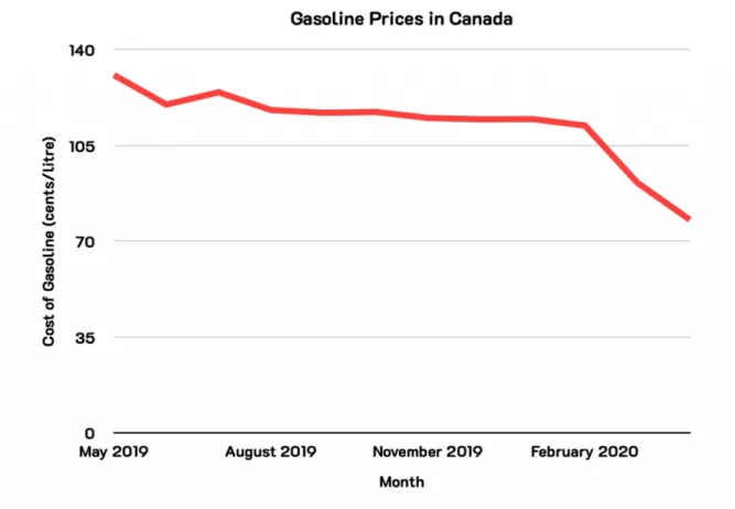
Infographic 3: Gasoline Prices in Canada
Teachers could use Figure 7.4 to learn how the values on the X-axis affect the line graph. The example in Figure 7.4 can be used as an example of a misleading representation and students can be asked to analyze the infographic and the teacher facilitates the discussion. Teachers can use the infographics in Figures 7.4 and 7.5 to learn how the selection of data values on the x-axis of the graph affected the line graph.
On the other hand, Figure 7.5 shows an increasing trend when using a longer time frame with more data. Using the infographic in Figure 7.4, teachers can draw attention to content and design decisions that promote a specific goal or convey an intended trend (in this case, gasoline prices are falling).
Limitations, Further Research and Conclusion…
Limitations
Further Research
Conclusion
Statistics Canada released the infographic in Figure 5.5 on the Canadian population in 2019 and the factors that led to the most significant annual population growth in history. Prism and the Canadian Association of Petroleum Producers (CAPP), (2020) published the following infographic in Figure 5.7, which shows the number of jobs supported by the oil and gas sector across Canada. An example of the specification sheet from the article is shown in Figure 6.5; students used the template in Figure 6.5 to build their infographic.
The following description explains how to use Figure 7.3 to guide students to identify that the presentation is misleading.