AIC 2004 Color and Paints
Interim Meeting of the
International Color Association
Porto Alegre, Brazil, November 3-5, 2004
Proceedings
edited by José Luis Caivano
AIC 2004 “Color and Paints” was organized by the
Brazilian Color Association
(ABCor, Associação Brasileira da Cor)
on behalf of the
International Color Association
(AIC, Association Internationale de la Couleur)
AIC 2004 Color and Paints, Proceedings of the Interim Meeting of the International Color Association, Porto Alegre, Brazil, 3-5 November 2004
The proceedings include: invited lectures, oral papers, posters.
Reference to papers in this book should be made as follows:
For the electronic version on the Internet:
Author(s). 2005. “Title of the paper”. In AIC 2004 Color and Paints, Proceedings of the Interim Meeting of the International Color Association, Porto Alegre, Brazil, 3-5
November 2004, ed. by José Luis Caivano. In www.fadu.uba.ar/sicyt/color/aic2004.htm, pp. X-X [first and last page of the article].
For the printed version:
Author(s). 2005. “Title of the paper”. In AIC 2004 Color and Paints, Proceedings of the Interim Meeting of the International Color Association, Porto Alegre, Brazil, 3-5
AIC 2004 Scientific Committee
Argentina: José Luis Caivano (chair) Roberto Daniel Lozano María L. F. de Mattiello Austria: Leonhard Oberascher Brazil: Nelson Bavaresco
Robert Hirschler Marcos Quindici Hanns-Peter Struck England: John Hutchings
Ming Ronnier Luo Lindsay MacDonald Michael Pointer Germany: Klaus Witt Italy: Osvaldo da Pos
Lucia Ronchi Japan: Munehira Akita
Hirohisa Yaguchi Spain: Joaquín Campos Acosta
Manuel Melgosa Javier Romero Sweden: Berit Bergström USA: Paula J. Alessi
Allan Rodrigues Thailand: Aran Hansuebsai
AIC 2004 Organizing Committee
President:
Hanns-Peter Struck General Secretary and Treasurer:
Maira Knop
General Chair:
Nelson Petzold Secretary of the Event:
Catia Brach Monser Exhibition Chair:
Roberto Ilhescas Event Chair:
Erni Clovis Gil
Publicity and Publications Chair: Norton Eduardo S. da Cunha Opinion Research Chair:
AIC Executive Committee
President: Paula J. Alessi (USA) Vice-president: José Luis Caivano (Argentina)* Secretary/Treasurer: Frank Rochow (Germany) Members: Joaquín Campos Acosta (Spain)
Paul Green-Armytage (Australia)† Aran Hansuebsai (Thailand) Hirohisa Yaguchi (Japan)
Contents
Program of the meeting ... viii Foreword ... xiii
Perception, Psychology, Psychophysics, Vision
Invited lecture
Osvaldo da Pos (Italy): When do colours become fluorent? ... 3
Oral papers
Jesús Zoido, Fernando Carreño, and Eusebio Bernabeu (Spain): A theory on
color perception ... 9 Shoji Sunaga and Yukio Yamashita (Japan): Evaluation of the color impression of
colored texture patterns by a color naming method ... 13 Helen H. Epps and Naz Kaya (USA): Color matching from memory ... 18 Haruyo Ohno (Japan): Color ratings for safety signs by young and elderly people ... 22 Beata Stahre, Maud Hårleman, and Monica Billger (Sweden): Colour emotions in
larger and smaller scale ... 27 Naz Kaya and Helen H. Epps (USA): Color-emotion associations: Past experience
and personal preference ... 31 Suchitra Sueeprasan, Pisut Srimork, Aran Hansuebsai, Tetsuya Sato, and
Pontawee Pungrassamee (Thailand and Japan): Quantitative analysis of
Thai sensation on colour combination ... 35
Posters
Javier Romero, Daniel Partal, Juan L. Nieves, and Javier Hernández-Andrés (Spain): Looking for an invariant under daylight changes with L, M, S-type
sensors ... 39 María L. F. de Mattiello and Hugo Salinas (Argentina): Metamerism in the visual
system ... 43 Silvia Pescio, María L. F. de Mattiello, and Ramiro Álvarez (Argentina):
Readability of chromatic documents ... 47 José M. Medina, José R. Jiménez, Enrique Hita, and Luis Jiménez del Barco
(Spain): Binocular stochastic models for suprathreshold chromatic changes
at isoluminance ... 52 Rafael Huertas, María José Rivas, Ana Yebra, María del Mar Pérez, Manuel
Melgosa, Manuel Sánchez-Marañón, and Enrique Hita (Spain):
Investigation of simulated texture effect on perceived color differences ... 56 Ralph W. Pridmore and Manuel Melgosa (Australia and Spain): Effect of
luminance on color discrimination ellipses: Analysis and prediction of data ... 60 Jesús Zoido and Fernando Carreño (Spain): Wavelength discrimination
thresholds and psychophysical monochromaticity. Definition of the
monochromaticity degree ... 64 Hirohisa Yaguchi, Naotaka Watanabe, and Satoshi Shioiri (Japan): Effects of
S-cone excitation on color discrimination threshold ... 69 Lucia Ronchi and Niccolò Rositani (Italy): Linking painting to visual science:
Creativity versus quantification in the laboratory ... 73 Djurdjica Parac-Osterman, Anica Hunjet, and Josip Burusic (Croatia):
Technology, Colorimetry, Order Systems
Invited lectures
Roberto Daniel Lozano (Argentina): Appearance in paints: Gloss, spatial filtering
and definition of image (DOI) ... 83 Ming Ronnier Luo, Carl Minchew, Phil Kenyon, and Guihua Cui (England):
Verification of CIEDE2000 using industrial data ... 97 Allan Rodrigues (USA): Color technology and paint ... 103
Oral papers
Kristina Holmberg and Anders Nilsson (Sweden): What has made the use of NCS
so widespread in the area of paint? ... 109 José Luis Caivano, Ingrid Menghi, and Nicolás Iadisernia (Argentina): Cesia and
paints: An atlas of cesia with painted samples ... 113 K. M. Raymond Ho, Guihua Cui, Ming Ronnier Luo, and B. Rigg (England):
Assessing colour differences with different magnitudes ... 117 Kiattisak Duangmal, Sekson Wongsiri, and Suchitra Sueeprasan (Thailand):
Colour appearance of fruit juice affected by vitamin C ... 121 Ana Marija Grancarić, Tanja Pušić, Anita Tarbuk, and Igor Jančijev (Croatia):
The fluorescence of sunprotected white cotton fabrics ... 125 Martina Viková (Czech Republic): Visual assessment of UV radiation by colour
changeable textile sensors ... 129 Jennifer Kathrin Gay, Cássia Cristina Melo, and Robert Hirschler (Brazil):
Instrumental whiteness evaluation: Practical results of inter-instrument
agreement tests ... 134 Michal Vik (Czech Republic): Industrial colour difference evaluation: LCAM
textile data ... 138
Posters
Jaume Pujol, Marta De Lasarte, Montserrat Arjona, Meritxell Vilaseca,
Francisco Martínez-Verdú, Dolores De Fez, and Valentín Viqueira (Spain): Performance analysis of different optoelectronic imaging sensors for
applications in color measurements ... 143 Meritxell Vilaseca, Jaume Pujol, Montserrat Arjona, Marta De Lasarte, and
Francisco Martínez-Verdú (Spain): Color visualization system for the
discrimination of indistinguishable samples in the visible spectrum ... 147 Manuel Sánchez-Marañón, Rafael Delgado, Encarnación Gámiz, Juan Manuel
Martín-García, Rafael Huertas, and Manuel Melgosa (Spain): Four soil
color charts compared in CIELAB color space ... 151 Kiattisak Duangmal, Busararat Saicheua, and Suchitra Sueeprasan (Thailand):
Roselle anthocyanins as a natural food colorant and improvement of its
colour stability ... 155 Marin Milkovic, Nina Knesaurek, Nikola Mrvac, and Stanislav Bolanca (Croatia):
Gamut characteristics of chromatic and identical desaturated achromatic
reproductions ... 159 Zdenka Bolanca, Marin Milkovic, and Ivana Bolanca (Croatia): The permanence
of conventional and digital offset prints ... 163 Maja Brozovic and Nina Knesaurek (Croatia): Colorimetric investigations as
Tomoko Mima and Masako Sato (Japan): Studies on ultraviolet-rays blocking by dyed fabrics: Comparison between direct dye/cellulose and disperse
dye/polyester ... 171 Boris Sluban and Olivera Šauperl (Slovenia): Target-position dependence of the
effect of the proportional concentration errors for dyeing polyacrylic with
basic dyes ... 175 Djurdjica Parac-Osterman, Ana Marija Grancarić, and Ana Sutlovic (Croatia):
Influence of chemical structure of dyes on decolouration effects ... 179
Architecture, Design, Arts, Aesthetics
Oral papers
Mari Ferring (Sweden): The colour-system of architectural structuralism: The
office complex Garnisonen, Stockholm, Sweden ... 185 María L. F. de Mattiello (Argentina): Colour and light in architecture ... 190 Gertrud Olsson (Sweden): Paul Scheerbart’s utopia of coloured glass ... 194 Verena M. Schindler (France): Prefabricated rolls of oil paint: Le Corbusier’s
1931 colour keyboards ... 198 Vojko Pogacar (Slovenia): Twelve-period seasonal colors-system ... 203 Michel Cler (France): Against colour globalisation. Colour trends and colour
collections: Their use as a vocabulary and effect upon colour culture ... 208 Richard Kjellström (Sweden): Local colouring and regional identity: Colours on
buildings exterior ... 211 Luciano Guimarães (Brazil): A model for application and analysis of the colors in
the media ... 215 Monica Billger (Sweden): The experience of the painted room: The significance
of light and colour combinations ... 219 Maud Hårleman (Sweden): Colour emotions in full-scale rooms ... 223 Karin Fridell Anter (Sweden): Painted walls: From pictures and imitations to
coloured space ... 227 Claudia Stern (Brazil): Food for thought: The use of color in sculpture ... 231 Nelson Bavaresco (Brazil): Harmonic compositions of complementary colors
according to their lightness degree ... 235 Helen Gurura, Lindsay W. MacDonald, and Hilary Dalke (England):
Background: An essential factor in colour harmony ... 239
Posters
Elisa Cordero (Chile): Colour proposal for two educational buildings in Valdivia,
Chile ... 243 Masashi Kobayashi and Ikuko Okamoto (Japan): Studies on the exterior color of
store: Effect on the motive of entrance to a clothing store ... 247 Gertrud Olsson (Sweden): Colour perspectives: On colour and paint ... 251 María Mercedes Ávila, Marta Polo, Adriana Incatasciato, Inés Girelli, María
Marta Mariconde, Darío Suárez, and Guillermo Olguin (Argentina): Colour
and the design of urban image ... 253 Silvia María Estévez (Argentina): Color and design of pre-Columbian ceramics
today ... 257 Paulina Becerra (Argentina): Chromatic strategies: Decisions around artificial
Fernanda García Gil, Ana García López, Gertrudis Román Jiménez, Sara Teva Almendros, and Teresa Vida Sánchez (Spain): Light as a genetic element of
the image ... 265 Belén Mazuecos (Spain): New materials for contemporary art: Experiences with
hair dyes on supports of different nature ... 270 María Reyes González-Vida (Spain): Projection of green fluorescent light upon
tulle and a female body: Practical experience ... 273
Culture, Communication, Education
Invited lecture
Robert Hirschler (Brazil): Light, colour, paints and pigments: A new concept in
teaching colour for designers, architects and artists ... 279
Oral papers
Garth Lewis (England): Colour, painting and computing ... 285 Lia Luzzatto and Renata Pompas (Italy): Teaching color plans ... 289 Berit Bergström (Sweden): Aspects of colour communication between different
paint materials ... 295
Posters
María Reyes González-Vida (Spain): Colour theory in infant education: Practical
experience ... 299 Mabel Amanda López (Argentina): How “to paint” with words: Talking about
color in learning situations in graphic design ... 303 Silvia Rizzo (Italy): Making color: Pictorial art training for environmental color
design ... 307 Berenice Santos Gonçalves and Alice Cybis Pereira (Brazil): Color learning based
on VLE-AD platform ... 311 Nelson Bavaresco (Brazil): A system of colors dedicated to educational aspects of
color ... 315 Mônica Araújo (Brazil): Imagination and color in the carioca scene ... 319 Masanori Iwase, Yutaka Nishida, Tetsuya Sato, and Ming Ronnier Luo (England
and Japan): Analysis of colour effect in Japan - South Korea World Cup
football game ... 323 Taeko Nakamura, O. Promsaka Na Sakolnakorn, Aran Hansuebsai, Pontawee
Pungrassamee, and Tetsuya Sato (Thailand and Japan): Emotion induced
from colour and its language expression ... 328
Closing session
Paula J. Alessi (USA): Closing ceremony speech from AIC President ... 335 Next AIC Congresses ... 338
Program of the meeting
Program outline
Detailed program
(The presenting authors of oral papers are underlined)
TUESDAY, November 2, 2004
10:00 – 17:00 AIC Executive Committee Meeting
WEDNESDAY, November 3, 2004
8:30 Registration. Posters hanging
9:00 Reception and opening ceremony. Words of welcome: Hanns-Peter Struck (president of the ABCor), Paula J. Alessi (president of the AIC). Brief history of the AIC meetings: José L. Caivano (vice-president of the AIC)
Presentation of the next AIC Congress, Granada, Spain, 2005: Javier Romero (chairman of the organizing committee)
10:00 – 10:40 Invited lecture:
Chair: Karin Fridell Anter Osvaldo DA POS (Italy): When do colours become fluorent?
11:10 – 12:30 Color Perception:
Chair: Roberto Daniel Lozano 11:10 Jesús ZOIDO, Fernando CARREÑO, and Eusebio BERNABEU (Spain): A theory on color
perception
11:30 Shoji SUNAGA and Yukio YAMASHITA (Japan): Evaluation of the color impression of colored texture patterns by a color naming method
11:50 Helen H. EPPS and Naz KAYA (USA): Color matching from memory
12:10 Haruyo OHNO (Japan): Color ratings for safety signs by young and elderly people 12:30 – 14:30 Lunch (2 hours)
14:30 – 15:50 Environmental Color Design, Architecture:
Chair: Maud Hårleman 14:30 Mari FERRING (Sweden): The colour-system of architectural structuralism: The office complex
Garnisonen, Stockholm, Sweden
14:50 María L. F. de MATTIELLO (Argentina): Colour and light in architecture 15:10 Gertrud OLSSON (Sweden): Paul Scheerbart’s utopia of coloured glass
15:30 Verena M. SCHINDLER (France): Prefabricated rolls of oil paint: Le Corbusier’s 1931 colour keyboards
15:50 – 16:20 Break (30 min.)
16:20 – 17:20 Architecture and Landscape:
Chair: Monica Billger 16:20 Vojko POGACAR (Slovenia): Twelve-period seasonal colors-system
16:40 Michel CLER (France): Against colour globalisation. Colour trends and colour collections: Their use as a vocabulary and effect upon colour culture (presented by Verena Schindler)
17:00 Richard KJELLSTRÖM (Sweden): Local colouring and regional identity: Colours on buildings exterior
17:20 – 17:30 Break (10 min.) 17:30 – 18:30 Color Emotion:
Chair: Ana Maria Goron Tasca 17:30 Beata STAHRE, Maud HÅRLEMAN, and Monica BILLGER (Sweden): Colour emotions in larger
and smaller scale
17:50 Naz KAYA and Helen H. EPPS (USA): Color-emotion associations: Past experience and personal preference
18:10 Suchitra SUEEPRASAN, Pisut SRIMORK, Aran HANSUEBSAI, Tetsuya SATO, and Pontawee PUNGRASSAMEE (Thailand and Japan): Quantitative analysis of Thai sensation on colour combination
18:30 – 19:30 Posters Session
18:30 – 19:30 Study Group Meetings:
Study Group on Color Education (Berit Bergström, chair)
THURSDAY, November 4, 2004
9:00 – 10:20 Colored Space and Design:
Chair: Hanns-Peter Struck 9:00 Luciano GUIMARÃES (Brazil): A model for application and analysis of the colors in the media 9:20 Monica BILLGER (Sweden): The experience of the painted room: The significance of light and
colour combinations
9:40 Maud HÅRLEMAN (Sweden): Colour emotions in full-scale rooms
10:00 Karin FRIDELL ANTER (Sweden): Painted walls: From pictures and imitations to coloured space 10:20 – 10:50 Break (30 min.)
10:50 – 11:50 Color Education:
Chair: Berit Bergström 10:50 Garth LEWIS (England): Colour, painting and computing
11:10 Lia LUZZATTO and Renata POMPAS (Italy): Teaching color plans 11:50 – 12.30 Invited lecture:
Chair: Berit Bergström Robert HIRSCHLER (Brazil): Light, colour, paints and pigments: A new concept in teaching colour
for designers, architects and artists (presented by Mônica Araújo)
12:30 – 14:30 Lunch (2 hours)
14:30 – 15:50 Aesthetics and Harmony:
Chair: Osvaldo da Pos 14:30 Claudia STERN (Brazil): Food for thought: The use of color in sculpture
14:50 Nelson BAVARESCO (Brazil): Harmonic compositions of complementary colors according to their lightness degree
15:10 Helen GURURA, Lindsay W. MACDONALD, and Hilary DALKE (England): Background: An essential factor in colour harmony
15:50 – 16.20 Break (30 min.)
16:20 – 17:20 Order Systems and Paint:
Chair: Nick Harkness 16:20 Kristina HOLMBERG and Anders NILSSON (Sweden): What has made the use of NCS so
widespread in the area of paint?
16:40 Berit BERGSTRÖM (Sweden): Aspects of colour communication between different paint materials 17:00 José Luis CAIVANO, Ingrid MENGHI, and Nicolás IADISERNIA (Argentina): Cesia and paints: An
atlas of cesia with painted samples 17:20 – 18:00 Invited Lecture:
Chair: Nick Harkness Roberto Daniel LOZANO (Argentina): Appearance in paints: Gloss, spatial filtering and definition of
image (DOI)
18:00 – 19:00 Posters Session
18:00 – 18:30 Study Group Meeting:
Study Group on Environmental Color Design (José Luis Caivano, chair)
FRIDAY, November 5, 2004
9:00 – 10:20 Posters Session
10:20 – 10:50 Break (30 min.)
10:50 – 11:50 Appearance and Color Differences:
Chair: Manuel Melgosa 10:50 K. M. Raymond HO, Guihua CUI, Ming Ronnier LUO, and B. RIGG (England): Assessing colour
differences with different magnitudes
11:20 Kiattisak DUANGMAL, Sekson WONGSIRI, and Suchitra SUEEPRASAN (Thailand): Colour appearance of fruit juice affected by vitamin C
11:50 – 12.30 Invited lecture:
Chair: Manuel Melgosa Ming Ronnier LUO (England): Verification of CIEDE2000 using industrial data (in collab. with C.
Minchew, P. Kenyon, G. Cui)
12:30 – 14:30 Lunch (2 hours)
14:30 – 15:50 Colorimetry and Textiles:
Chair: Frank Rochow 14:30 Ana Marija GRANCARIĆ, Tanja PUŠIĆ, Anita TARBUK, and Igor JANČIJEV (Croatia): The
fluorescence of sunprotected white cotton fabrics
14:50 Martina VIKOVÁ (Czech Republic): Visual assessment of UV radiation by colour changeable textile sensors
15:10 Jennifer Kathrin GAY, Cássia Cristina MELO, and Robert HIRSCHLER (Brazil): Instrumental whiteness evaluation: Practical results of inter-instrument agreement tests
15:30 Michal VIK (Czech Republic): Industrial colour difference evaluation: LCAM textile data 15:50 – 16.20 Break (30 min.)
16:20 – 17.00 Invited lecture:
Chair: Frank Rochow Allan RODRIGUES (USA): Color technology and paint
17.00 Closing session:
POSTERS EXHIBITED DURING THE WHOLE MEETING
1. Technology and Vision:
1.1. Jaume PUJOL, Marta DE LASARTE, Montserrat ARJONA, Meritxell VILASECA, Francisco MARTINEZ-VERDÚ, Dolores DE FEZ, and Valentin VIQUEIRA (Spain): Performance analysis of different optoelectronic imaging sensors for applications in color measurements
1.2. Meritxell VILASECA, Jaume PUJOL, Montserrat ARJONA, Marta DE LASARTE, and Francisco MARTÍNEZ-VERDÚ (Spain): Color visualization system for the discrimination of indistinguishable samples in the visible spectrum
1.3. Javier ROMERO, Daniel PARTAL, Juan L. NIEVES, and Javier HERNÁNDEZ-ANDRÉS (Spain): Looking for an invariant under daylight changes with L, M, S-type sensors
1.4. Manuel SÁNCHEZ-MARAÑÓN, Rafael DELGADO, Encarnación GÁMIZ, Juan-Manuel MARTÍN-GARCÍA, Rafael HUERTAS, and Manuel MELGOSA (Spain): Four soil color charts compared in CIELAB color space
1.5. Kiattisak DUANGMAL, Busararat SAICHEUA, and Suchitra SUEEPRASAN (Thailand): Roselle anthocyanins as a natural food colorant and improvement of its colour stability
1.6. Marin MILKOVIC, Nina KNESAUREK, Nikola MRVAC, and Stanislav BOLANCA (Croatia): Gamut characteristics of chromatic and identical desaturated achromatic reproductions
1.7. Zdenka BOLANCA, Marin MILKOVIC, and Ivana BOLANCA (Croatia): The permanence of conventional and digital offset prints
1.8. Maja BROZOVIC and Nina KNESAUREK (Croatia): Colorimetric investigations as quality criteria of the work of art reproductions
1.9. Tomoko MIMA and Masako SATO (Japan): Studies on ultraviolet-rays blocking by dyed fabrics: Comparison between direct dye/cellulose and disperse dye/polyester
1.10. Boris SLUBAN and Olivera ŠAUPERL (Slovenia): Target-position dependence of the effect of the proportional concentration errors for dyeing polyacrylic with basic dyes
1.11. Djurdjica PARAC-OSTERMAN, Ana Marija GRANCARIĆ, and Ana SUTLOVIC (Croatia): Influence of chemical structure of dyes on decolouration effects
1.12. Djurdjica PARAC-OSTERMAN, Anica HUNJET, and Josip BURUSIC (Croatia): Psychophysical study of colour
1.13. María L. F. de MATTIELLO and Hugo SALINAS (Argentina): Metamerism in the visual system 1.14. Silvia PESCIO, María L. F. de MATTIELLO, and Ramiro ÁLVAREZ (Argentina): Readability of
chromatic documents
1.15. José M. MEDINA, José R. JIMÉNEZ, Enrique HITA, and Luis JIMÉNEZ del BARCO (Spain): Binocular stochastic models for suprathreshold chromatic changes at isoluminance
1.16. Rafael HUERTAS, María José RIVAS, Ana YEBRA, María del Mar PÉREZ, Manuel MELGOSA, Manuel SÁNCHEZ-MARAÑÓN, and Enrique HITA (Spain): Investigation of simulated texture effect on perceived color differences
1.17. Ralph W. PRIDMORE and Manuel MELGOSA (Australia and Spain): Effect of luminance on color discrimination ellipses: Analysis and prediction of data
1.18. Jesús ZOIDO and Fernando CARREÑO (Spain): Wavelength discrimination thresholds and psychophysical monochromaticity. Definition of the monochromaticity degree
1.19. Hirohisa YAGUCHI, Naotaka WATANABE, and Satoshi SHIOIRI (Japan): Effects of S-cone excitation on color discrimination threshold
2. Architecture, Design, Arts:
2.1. Elisa CORDERO (Chile): Colour proposal for two educational buildings in Valdivia, Chile
2.2. Masashi KOBAYASHI and Ikuko OKAMOTO (Japan): Studies on the exterior color of store: Effect on the motive of entrance to a clothing store
2.3. Gertrud OLSSON (Sweden): Colour perspectives: On colour and paint
2.4. María Mercedes ÁVILA, Marta POLO, Adriana INCATASCIATO, Inés GIRELLI, María Marta MARICONDE, Darío SUÁREZ, and Guillermo OLGUIN (Argentina): Colour and the design of urban image
2.5. Silvia María ESTÉVEZ (Argentina): Color and design of pre-Columbian ceramics today
2.6. Paulina BECERRA (Argentina): Chromatic strategies: Decisions around artificial coloration of natural materials at product’s design process
2.7. Fernanda GARCÍA GIL, Ana GARCÍA LÓPEZ, Gertrudis ROMÁN JIMÉNEZ, Sara TEVA ALMENDROS, and Teresa VIDA SÁNCHEZ (Spain): Light as a genetic element of the image
2.8. Belén MAZUECOS (Spain): New materials for contemporary art: Experiences with hair dyes on supports of different nature
2.9. María Reyes GONZÁLEZ-VIDA (Spain): Projection of green fluorescent light upon tulle and a female body: Practical experience
3. Culture, Communication, Education:
3.1. María Reyes GONZÁLEZ-VIDA (Spain): Colour theory in infant education: Practical experience 3.2. Mabel Amanda LÓPEZ (Argentina): How “to paint” with words: Talking about color in learning
situations in graphic design
3.3. Silvia RIZZO (Italy): Making color: Pictorial art training for environmental color design
3.4. Berenice Santos GONÇALVES and Alice Cybis PEREIRA (Brazil): Color learning based on VLE-AD platform
3.5. Nelson BAVARESCO (Brazil): A system of colors dedicated to educational aspects of color 3.6. Mônica ARAÚJO (Brazil): Imagination and color in the carioca scene
3.7. Masanori IWASE, Yutaka NISHIDA, Tetsuya SATO, and Ming Ronnier LUO (England and Japan): Analysis of colour effect in Japan - South Korea World Cup football game
Foreword
These Proceedings contain the full version of papers and posters presented at the Interim Meeting of the International Color Association (AIC, Association Internationale de la Couleur), carried out from November 3 to 5, 2004, in Porto Alegre, Brazil, on the theme of “Color and Paints”. The congress was organized by the Brazilian Color Association (Associação Brasileira da Cor), and held at the Convention Center of the Pontificia Universidade Catolica de Rio Grande do Sul (PUCRS).
Initially, 104 abstracts were presented and accepted by the Scientific Committee: 6 invited lectures, 43 oral papers, and 56 posters. Finally, 74 papers were actually presented in the meeting: 5 invited lectures, 32 oral papers, and 37 posters. These are the ones published in this book, in addition to the closing speech delivered by the President of the AIC. The authors are representative of 16 countries: Argentina, Australia, Brazil, Chile, Croatia, Czech Republic, France, Italy, Japan, Slovenia, Spain, Sweden, Switzerland, Thailand, United Kingdom, and USA.
As it is usual at AIC interim and midterm meetings, the oral papers were organized in a single session, in order to avoid parallel speeches. The final program of the meeting is included in this book as a way of reflecting the arrangement of the presentations and some of the other main activities, such as meeting of the AIC Executive Committee, meetings of the AIC study groups, and social program (see pages vii-xii). Figure 1 shows a view of the room for the oral sessions, while Figure 2 shows some of the participants enjoying the delightful dinner barbecue accompanied with folkloric dances, which was sponsored by the NCS.
Figure 2. The dinner barbecue.
This Interim Meeting 2004 continues a long series of AIC congresses and meetings, which started in 1969, two years after the foundation of the AIC. Since 1977, the AIC has organized a congress or meeting every year, with the following structure: a full congress is held every four years, and three meetings (one midterm meeting and two interim meetings) are held in-between two successive congresses. The main difference among them is that full congresses are open to all topics and fields of color research, while interim and midterm meetings are concentrated upon more specific subjects. The chronology of congresses and meetings to date is as follows:
1969, June 9-13, 1st Congress, Stockholm, Sweden
1971, September 1-3, Special Symposium “Small Color Differences – Helmholtz Centenary”, Driebergen, The Netherlands
1973, July 2-6, 2nd Congress, York, England
1976, June 8-11, Interim Meeting “Colour Dynamics”, Budapest, Hungary 1977, July 10-15, 3rd Congress, Troy, New York, USA
1978, October 3-4, Interim Meeting “Color Measurement and its Application”, London, England
1979, August 16-17, Midterm Meeting “Color Appearance”, Tokyo, Japan
1980, February 3-6, Interim Meeting “Harry Helson Memorial Symposium on Chromatic Adaptation”, Williamsburg, Virginia, USA
1981, September 21-25, 4th Congress, Berlin, Germany
1982, June 8-10, Interim Meeting “Colour Dynamics”, Budapest, Hungary
1983, August 25-28, Midterm Meeting “Forsius Symposium Colour Order Systems”, Kungälv, Sweden
1984, June 18-20, Interim Meeting “Colour Education”, Salamanca, Spain 1985, June 16-22, 5th Congress, Monte Carlo, Monaco
1986, June 19-20, Interim Meeting “Color in Computer Generated Displays”, Toronto, Canada
1987, June 10-13, Midterm Meeting “Wyszecki-Stiles Memorial Symposium on Color Vision Models”, Florence, Italy
1989, March 12-17, 6th Congress, Buenos Aires, Argentina
1990, September 2-5, Interim Meeting “Instrumentation for Colour Measurement”, Berlin, Germany
1991, June 25-28, Midterm Meeting “Colour & Light”, Sydney, Australia
1992, June 21-24, Interim Meeting “Computer Color Formulation”, Princeton, New Jersey, USA
1993, June 13-18, 7th Congress, Budapest, Hungary
1994, April 10-12, Interim Meeting “Images in Colour”, Cambridge, England 1995, September 3-6, Midterm Meeting “Colorimetry”, Berlin, Germany
1996, June 15-18, Interim Meeting “Color & Psychology”, Gothenburg, Sweden 1997, May 25-30, 8th Congress, Kyoto, Japan
1998, not held
1999, June 22-23, Midterm Meeting “Applications of Colorimetry in Industry and Design”, Warsaw, Poland
2000, November 6-7, Interim Meeting “Color & Environment”, Seoul, Korea 2001, June 24-29, 9th Congress, Rochester, New York, USA
2002, August 29-31, Interim Meeting “Color and Textiles”, Maribor, Slovenia
2003, August 4-6, Midterm Meeting “Colour Communication and Management”, Bangkok, Thailand
2004, November 2-5, Interim Meeting “Color and Paints”, Porto Alegre, Brazil
Thus, this AIC 2004 meeting is Nr. 31 in the whole series.
I wish to express my gratitude to the members of the Scientific Committee, who helped in shaping the theme and sub-themes of the meeting and made a very good job in reviewing all the abstracts presented, and my sincere congratulations to the members of the Organizing Committee for the success of the meeting.
When do colours become fluorent?
Osvaldo DA POS
Department of General Psychology, University of Padua
ABSTRACT
Evans (1949) realised that physical fluorescence is neither sufficient nor necessary for producing the correspondent colour appearance, which can be generated by only increasing the luminance of a surface beyond a certain level. He called fluorence the perceptive phenomenon and fluorent the colours. Three experiments were performed to find the luminance threshold of the four unique hues to appear fluorent over either a uniform white background or a coloured Mondrian, by using the limits and staircase method. Results show that yellow has a threshold around the luminance of the surface white (sometimes higher), significantly higher than the threshold for the green, which is still significantly higher than that of the blue and red; moreover there is a significant inverse correlation between threshold and chromaticness. A fourth experiment shows that the threshold of reddish and greenish colours increases as a function of yellowness. Theoretical consequences dealing with the structure of colour systems are proposed.
1. INTRODUCTION
R. Evans (1949, 1959, 1974) was the first to perform a systematic study of fluorent colours. He realised that no physical fluorescence but simple luminance relationships between colours are the essential conditions to evoke the correspondent impressions. He called fluorence this effect to distinguish it from the physical process, and considered it of the greatest importance in developing a new approach to colour theory. Fluorence would be an intermediate step between surface and luminous colours along a continuum called brilliance. The lower branch of this continuum is characterised by a grey appearance, correlated with the visual impression of reflected light, which decreases from black to lighter colours until it completely disappears ad a point called zero greyness. Where greyness ends, fluorence starts. Greyness would be then a specific aspect of surface colours corresponding to the blackness of the Natural Colour System (Hering 1874; SIS 1989). Primarily concerned with the theory, Evans analysed relatively few colours, and until now, except few works (for instance by Bonato and Gilchrist 1994; Petrov et al. 1998), little research has been carried out in the field. This investigation presents a systematic study of the luminance threshold separating surface from fluorescent colours.
2. EXPERIMENT 1
2.1 Material and method
The apparatus used in all the four experiments of this research was devised to approximately replicate the viewing conditions of Evans work. The background against which the fluorent surface had to be seen was made of an A4 white cardboard (at a luminance of about 55 cd/m2), subtending 9.5° × 6.8° at a viewing distance of cm 177, vertically placed in a completely black and dark box, and uniformly lighted by a couple of D65 simulators at about 175 lux.
Figure 1. Position of the coloured target in the background: a) uniform white(experiment 1 and 4); b) coloured Mondrian (experiment 2, 3, and 4).
The target area (see Figure 1a) was a small rectangular hole of cm 4 × 6 (subtending 1.3° × 2°), through which an independently lit coloured paper placed 15 cm behind the background, at 45° as respect to its plane, could be seen. Twelve different coloured papers were used in experiment 1 (Table 1), taken from the four unique hues of the NCS collection (2nd edition) at the least possible degree of blackness. The independent illumination was provided by a D65 simulating lamp mounted on a rail perpendicular to the coloured paper and could be moved back and forth along the rail either by the observer or by the experimenter to vary with continuity the luminance of the target. The luminance of all colours was measured after each trial by an UDT150 Photometer placed at the same position of the observer’s eye.
Table 1. Coloured samples used in experiment 1 (*NCS 3rd edition). NCS notation
00 40 Y 00 40 R 10 40 B 10 40 G 00 60 Y 05 50 R* 10 50 B 10 50 G 05 80 Y* 05 65 R* 10 70 B 10 70 G
Twelve psychology students, with normal colour vision, volunteered as subjects. Before the beginning of the experiment each observer was shortly trained to distinguish the surface from the fluorent mode of colour appearance. He was instructed to move back and forth the sliding lamp (hidden behind a black wall) by means of two strings to change the luminance, and consequently the appearance, of the target area from a clearly surface to a clearly fluorent mode of appearance. The experimental task consisted in finding the threshold between the surface and fluorent mode for all the 12 colours (presented in random order) by the psychophysical method of limits. The different luminance steps were produced by the experimenter, who each time noted down whether the target appeared of a surface or fluorent mode to the observer. Four runs, with different starting points, were made for each colour.
2.2 Results and discussion
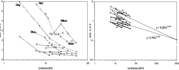
Results are shown in Figure 2. The luminance threshold dividing the surface from the fluorent appearance of the 12 tested colours differs as a function of the hue and of the NCS chromaticity, showing that a yellow target appears fluorent at a luminance closed to that of the surface white, while green, blue and red targets appear fluorent at lower and lower luminance. The luminance needed to appear fluorent is also lower for more chromatic colours.
1.2 1.3 1.4 1.5 1.6 1.7 1.8 1.9 2
30 40 50 60 70 80 90
NCS Chromaticity
Threshold (Log cd/m2) .
Figure 2. Luminance threshold of the four unique hues for appearing fluorent as a function of their chromaticity. Diamond: yellow; square: blue; triangle: green; circle: red. Dotted line:
luminance of the surface white.
In general the fluorence threshold is always at a lower luminance than that of the surface white, except for the yellow which appears fluorent at around the same luminance of the surface white, and significantly higher (F3 = 71.86, p < 0.00001) than that of the other three hues. Fluorence threshold decreases significantly (F2 = 40.06, p < 0.0001) when NCS chromaticity increases (except between the first two levels). The shape of the threshold curves as a function of the NCS chromaticity is strictly similar to that found by Evans as a function of Munsell chroma, and probably delineates the outer surface of the optimal colour solid.
3. EXPERIMENT 2 AND 3
The aim of these experiments was to check whether fluorence thresholds are influenced by figural and chromatic complexity of the background (a coloured Mondrian instead of a uniform white).
3.1 Material and method
The same apparatus as in experiment 1 was used. The background is a coloured Mondrian instead of a uniform white surface (Figure 1b). Around the hole, which is assuming different hues during the experiment, are placed different greys, while the rest of the background is covered with different nuances of the four unique hues, about 40 in all.
3.2 Results and discussion
Results are plotted in Figure 4a (experiment 2) and 4b (experiment 3), and look very similar to those of experiment 1, with the exception that thresholds are generally higher.
Figure 4. Threshold of the four unique hues for appearing fluorent as a function of their chromaticity when the background is a coloured Mondrian. Methods: limits (a), staircase (b).
Diamond: yellow; square: green; triangle: blue; circle: red. Dotted line: luminance of the surface white.
In experiment 2, the luminance necessary for making the yellow fluorent is much higher than that of the surface white. All hues show significantly different thresholds (F3 = 43.72, p < 0.0001), except between red and blue. Fluorence, which makes the colours to pop out from a set of surface colours, seems to require higher luminance when the background is more complex in shape and colour, as in the case of the coloured Mondrian as compared with a uniform white surface. Lastly, here too thresholds significantly decrease (F2 = 13.02, p < 0.0001) when NCS chromaticity increases. In experiment 3, still all hues show significantly different thresholds (F3 = 134.12, p < 0.00001) with the expected exception of red and blue; moreover thresholds significantly decrease as the NCS chromaticity increases (F2 = 322.45, p < 0.00001).
4. EXPERIMENT 4
The aim of this experiment was to check whether fluorence thresholds increase as a function of yellowness in reddish and greenish yellows. On the basis of the previous results higher thresholds were expected for greenish than for reddish colours.
4.1 Material and method
The same apparatus was used as in the previous experiment. The list of target colours for which the fluorence threshold was found is given in Table 2. The background was either a uniformly white surface, or the coloured Mondrian previously described. 10 psychology students with normal colour vision took part in the experiment; a simple staircase method was used.
Table 1. Coloured samples used in experiment 4.
NCS notation
00 60 Y20R 0060 Y40R 0070 Y60R 0060 G80Y 0060 G60Y 0060 G40Y 05 00 N 1.2
1.4 1.6 1.8 2.0
30 40 50 60 70 80 90 NCS chromaticity
Threshold (Log cd/m2) . 1.2
1.4 1.6 1.8 2
30 40 50 60 70 80 90
NCS Chromaticity
Threshold (Log cd/m2)
.
4.2 Results and discussion
Results are shown in Figure 6. As yellowness increases, also thresholds significantly increase, as expected (F2 = 27.92; p < 0.0001). Greenish colours have significantly higher thresholds than the reddish ones (F1 = 200.65, p < 0.0001). Thresholds do not differ as a function of the background.
1.4 1.5 1.6 1.7 1.8 1.9
30 40 50 60 70 80 90
NCS Yellowness
Threshold (Log cd/m2) .
Figure 6. Luminance threshold of three yellowish hues for appearing fluorent as a function of their yellowness. Diamond: greenish hue on a Mondrian; square: greenish hue on white; triangle: reddish hue on a Mondrian; circle: reddish hue on white. Dotted line: surface white.
Broken line: fluorence threshold of white on a Mondrian. Continuous line: fluorence threshold of white on uniform white.
The white target becomes fluorent at a relatively low luminance level; both thresholds significantly differ from the luminance of the surface white (t = 2.32, p = 0.045 on the white background; t = 4.16, p = 0.002 on the coloured Mondrian).
5. CONCLUSION
Results of all experiments show that yellow has a very high fluorence threshold, near to or higher than the luminance of the surface white, and is followed by green which still shows higher thresholds than red and blue; on the other hand the thresholds of these last hues are never different. We cannot but thinking that fluorence threshold is proportional to the natural lightness of hues (this can be revealed by looking at the highest chromatic nuance of a particular hue): while among all hues the natural lightness of yellow is the highest followed by that of green, those of red and blue are lower and almost of the same level, being higher only to that the purple. Moreover it is well known that a yellowish white appear darker than a bluish white of the same luminance, and this might account for the proximity, or even superiority, of the fluorence threshold of yellow to the luminance of the surface neutral white.
The decrease of fluorence thresholds as a function of chromaticness is a common feature of all our results and is theoretically relevant in the organisation of a colour system. On the one side it may reflect the Helmholtz-Kohlrausch-Boswell effect (da Pos and Zambianchi 1996) which makes high chromatic colours look brighter; on the other side it shows that lightness and greyness (or blackness) do not refer to the same colour variable, as their functions are different.
the Natural Colour System, although irregular) rather than cylindrical (as theoretically in the Munsell System). This poses the question of which visual attributes are more relevant in describing the surface colours as they appear to the observer. The acceptance of the brilliance dimension as a fundamental variable in colour perception, in addition to agree with the proposals by Hering expressed in the NCS, would make it possible to build a colour system that can be extended from surface to luminous colours passing through the fluorent ones.
Figure 7. Samples along any curve were judge to have the same grey content (from Evans, 1959). Red on white background.
ACKNOWLEDGMENTS
Research financed by the Italian MURST, Cofin 2002. We acknowledge the valuable contribution by Bruna Capelli in carrying out the experimental sessions.
REFERENCES
Bonato, F., and A. L. Gilchrist. 1994. The perception of luminosity on different backgrounds and in different illuminations. Perception 23 (9): 991-1006.
Da Pos, O., and E. Zambianchi. 1996. Visual illusions and effects - Illusioni ed effetti visivi. Milan: Guerini e Ass.
Evans, R. 1949. On some aspects of white, gray, and black. Journal of the Optical Society of America 39: 774-779.
——. 1959. Fluorescence and gray content of surface colors. Journal of the Optical Society of America 49: 1049-1059.
——. 1974. The perception of color. New York: John Wiley and Sons.
Hering, E. 1874. Zur Lehre vom Lichtsinne. English translation by L. M. Hurvich and D. Jameson, Outlines of a theory of the light sense. Cambridge, Mass.: Harvard University Press, 1964. Petrov, A. P., C-Y. Kim, I-S. Kweon and Y-S. Seo. 1998. Perceived illumination measured. Color
Research and Application 23 (3): 159-168.
SIS. 1989. Färgatlas. Stockholm: Skandinaviska Farginstitutet AB.
Address: Osvaldo da Pos, Department of General Psychology University of Padua, Via Venezia 8, 35131 Padova, Italy E-mail: [email protected] 1 2 3 4 5 6 7 8 9 10 11 …
9 8 7 6 5 4 3 Value
A theory on color perception
Jesús ZOIDO,* Fernando CARREÑO,† and Eusebio BERNABEU† * Escuela Universitaria de Óptica, Universidad Complutense de Madrid
† Facultad de Ciencias Físicas, Universidad Complutense de Madrid
ABSTRACT
In this contribution a theoretical model of the color perception process is proposed. It is assumed that any spectral power distribution belongs to the Hilbert space of continuous functions over the visible spectrum. In order to introduce a topology which allows us to generalize all the concepts of the Euclidean geometry, this space is endowed with the natural inner product. Orthogonality plays a major role in the proposed model. The concept of metamerism can be interpreted as a relation of equivalency. The detection process can be decomposed in two different steps. A matrix T, characterizing the colorimetric behavior of a given observer is defined. The property of invariance associated with the inverse matrix T-1 suggests the generalization of the trichromatic equation. We propose a redefinition of the concepts of radiant flux and luminous efficiency.
We have experimental evidence that any color stimulus Xr can be matched by the additive mixture in suitable amounts of three physical light stimuli uri(i=1, 2, 3), termed primaries. Thus, the following equation can be written to characterize a color matching experiment:
, 3
1
∑
= = i XiuiXr r (1)
where tristimulus values Xirepresent the amounts of the primaries required for a match. Any color stimulus can be represented by a vector of ℜ3, X (X ,X ,X )t
3 2 1
= r
, whose coordinates in the basis Bc ={ur1,ur2,ur3} are given by the tristimulus values. Expression (1) is usually known as trichromatic equation.
The spectral tristimulus values obtained when all the monochromatic stimuli with unit radiant power are matched in equation (1) are known as color-matching functions, eˆi(λ). Color-matching functions can be transformed into a new set of functions where the primaries are imaginary. There is a set for which each curve is proportional to the spectral sensitivity of one of the three kinds of retinal receptors. We will refer to eˆi(λ) function as the curve of spectral sensitivity associated with the i-th retinal receptor. When a spectral power distribution impinges on the visual system, the tristimulus values in expression (1) are given
by λ λ λ
χe n d
K
Xi =
∫
ˆi( ) ( ) , χ being the wavelength interval within the visible spectrum, and K is a constant depending on the set of primary stimuli in which the color-matching functions are expressed. In this way quantity Xi can be interpreted as the signal provided by the i-th receptor when it is excited by the distribution n(λ).measured in terms of the new set of primary stimuli, are related by transformation Xr'=CXr, with matrix C={cij}, and X (X ,X ,X )t
3 2 1′ ′ ′
= ′ r
being the coordinates of the color stimulus in the new basis Bc′ ={ur1′,ur2′,ur3′}. Color-matching functions e′ˆi(λ) referred to the new set of primary stimuli are given by er′=Cer, where e (eˆ( ),eˆ ( ),eˆ ( ))t
3 2
1 λ λ λ
= r and t e e e
er′=(ˆ1′(λ),ˆ′2(λ),ˆ′3(λ)) .
Let us consider a spectral power distribution n Lc χ λ)∈
( , where Lc
χ is the Hilbert space of continuous functions over the interval χ. We will assume that a certain distribution n(λ) belongs to a subspace Lχincluded in Lc
χ (n(λ)∈Lχ ⊂Lcχ). The dimension Q of this subspace is finite but large enough.
Space Lc
χ is endowed with the natural inner product defined as usually by . ) ( ) ( ) ( ),
( 2 1 2
1 λ n λ χn λ n λ dλ
n =
∫
(2)Thus, two functions n1(λ) and n2(λ) which belong to Lc
χ satisfy the orthogonality condition when n1(λ),n2(λ) =0. The norm of n(λ) is defined in the usual way as
2 / 1 ) ( ), ( )
(λ n λ n λ
n = . Thus, the distance between two distributions is given by
[
n1(λ),n2(λ)]
n1(λ) n2(λ)d = − .
It will be assumed that color-matching functions eˆi(λ) also belong to the subspace Lχ. From definition (2), it becomes obvious that these functions are linearly independent, in such a way that they generate de three-dimensional subspace D3 =lin{eˆ1(λ),eˆ2(λ),eˆ3(λ)}⊂Lχ, and )}Be ={eˆ1(λ),eˆ2(λ),eˆ3(λ is a basis of D3. We will refer to this subspace as detection space. When considering the set of primary stimuli uri′, the set Be′ ={eˆ1′(λ),eˆ2′(λ),eˆ3′(λ)} is also a basis of D3.
For a given distribution n(λ), the signal provided by the i-th detector can be rewritten as .
) ( ), ( ˆ λ n λ e
K
Xi = i (3)
The subset R={X (X ,X ,X )t 3 2 1
= r
, such that Xi =K eˆi(λ),n(λ) for all n(λ)∈Lχ}, included in ℜ3, which contains all the possible sets of tristimulus values perceived by the visual system, will be called representation system.
The color perception process can be mathematically described by the detection application R
L
D: χ → , such that D
[ ]
n(λ) =Xr.An important property of this application is the following one: condition n1(λ)≠n2(λ) does not imply condition D
[
n1(λ)] [
≠ Dn2(λ)]
, thusD is not an injection. This property points out how the metamerism can be formally described by a relation of equivalency: all the functions providing the same color sensation Xr are contained in the equivalence class CX={n(λ)∈Lχ, such that D[ ]
n(λ) = Xr }.Any arbitrary function n(λ)∈Lχ can be uniquely represented in the form )
( ) ( )
(λ =nD λ +nD⊥ λ
) (λ D
n being the orthogonal projection of n(λ) onto D3, and nD⊥(λ) is the corresponding projecting function, which belongs to the orthogonal complement, ⊥
3
D , of the detection space. Condition nD(λ),nD⊥(λ) =0 is satisfied. This fact allow us to rewrite signals (3) as
. ) ( ), (
ˆ λ D λ i
i K e n
X = (5)
Expression (5) points out how the orthogonal projection nD(λ) alone is the cause of the color sensation and the projecting function has no effect whatever on the evoked color sensation. In this way, the visual system only processes the function nD(λ), which contains all the useful information. This fact suggests us to refer to this function as processing information. Expression (5) allows us to simplify the formal description of the color perception process by considering function nD(λ), belonging to a three-dimensional space, instead of function n(λ), which belongs to a Q-dimensional space.
From this analysis, the color perception process can be decomposed in two different stages. In the first of them, the processing information is extracted from n(λ) and we will refer to it as discrimination process. This stage can be formally described by the discrimination operator, Pr :Lχ →D3, which is the orthogonal projection operator of subspace Lχonto the subspace D3, given by
[ ]
(λ) D(λ).r n n
P = Taking into account the properties of the norm defined from (2) and decomposition (5) we obtain the following relation:
[ ]
n(λ) n (λ) n(λ).P D
r = ≤ (6)
Inequality (6) guarantees the existence of an image for any n(λ)∈Lc.
The second stage in the color perception process is the processing step. In this stage the information contained in nD(λ) is processed providing the corresponding tristimulus values. This step is described by the processing application, P:D3 →R, such that P
nD(λ)
= Xr. Application P is a non-singular one, thus there exists an isomorphic relation between spaces3
D and ℜ3. This relation confirms how the discrimination operator optimizes the information processed in the last stage by the visual system. The detection application can be rewritten as the composition of the processing application and the discrimination operator as D=PoPr.
Let wi be the coordinates of nD(λ) in the basis e
B of D3. The processing information can be written in matrix form as
, ) ( ˆ )
( 31we e w
n t
i i i
D =
∑
= r r= λ
λ (7)
with w (w,w ,w )t 3 2 1 =
r . We replace tristimulus values (5) in expression (1) and, by using (7), the action of the processing application on the processing information is given in matrix form by
, w T
Xr = r (8)
with }T ={tij , and tij =K eˆi(λ),eˆj(λ) . Matrix T is a symmetric one and it represents to the processing application when bases Be in D3, and Bc in ℜ3 are considered. This matrix depends on the color-matching functions of the considered observer. For this, we will refer to it as characteristic matrix. If basis B′c is considered, the characteristics matrix T′ associated with the new set of primaries u′ri satisfies the following relation:
t CTC
Inverting expression (8) and replacing this result in equation (7), the processing information can be rewritten in terms of the tristimulus values in the form
X T e
nD(λ)= t −1 r . (10)
When the set of primary stimuli u′ri is considered, the processing information referred to the basis B′c will be given by nD(λ)'=(e′)t(T′)−1Xr′. By introducing in this expression the matrix C, which provides the change of tristimulus values (or color-matching functions), and equation (9), we obtain, when comparing with (10), nD(λ)'=nD(λ). This important result points out that processing information is independent on the set of primary stimuli, i.e., it is invariant under linear transformations of the representation system.
Let si(λ)∈D3 be the processing information associated with the i-th primary stimulus. It can be demonstrated that relation er=Tsr holds, with sr=(s1(λ),s2(λ),s3(λ)). From this expression, and equations (7) and (8) we have nD(λ)=srtXr , i.e.,
∑
== 31 ( ). )
( i i i
D X s
n λ λ (11)
This equation characterizes a color matching experiment in the detection space. Distribution )
(λ D
n is expressed in terms of the non variable functions si(λ). It should be noted that coordinates Xi in the trichromatic equation (1) have units of amount of light, while the same coordinates in (11) are non dimensional quantities. This fact together the property of invariance suggests that equation (11) can be used in order to characterize a color matching experiment in the detection space, instead of doing it in the color representation system by using the trichromatic equation (1).
The radiant flux of a certain distribution n(λ) is defined as Φ =
∫
( ) . χn λ dλl However
decomposition (4) does not guarantee that n(λ)>0 ∀ λ∈χ. Thus, we recur to the norm in
order to introduce the concept of generalized radiant flux as Φ = ( ) =
(
∫
2( ))
1/2.χ λ λ
λ n d
n rg
The previous definition is consistent with the units of the usual magnitude of radiant flux. It is easy to show that Φrg ≥ ΦrgD
= n(λ) . The last inequality indicates that the orthogonal projection nD(λ) is the element of the equivalence class CX with the minimum generalized radiant flux. In this sense nD(λ) is the most efficient element of CX.
In a similar way, the luminous flux is determined as Φ =
∫
2 1) ( ) ( λ
λn λ V λ dλ K
l , V(λ) being
the luminous efficiency of the visual system. Note that the usual notion of luminous efficiency is the quotient between the luminous flux to the radiant flux. Thus we propose a redefinition of the luminous efficiency as Efg =kef Φl /Φrg, kef being a constant used for normalization purposes.
ACKNOWLEDGMENTS
The authors acknowledge financial support from the Complutense University of Madrid (project PR3/04-12362).
Evaluation of the color impression of colored texture
patterns by a color naming method
Shoji SUNAGA and Yukio YAMASHITA Department of Visual Communication Design
Faculty of Design, Kyushu University, Japan
ABSTRACT
We investigated the Munsell-hue ranges in which a single color impression as a whole could be sensed in multi-colored textures, by using random-dot texture patterns made by two kinds of colored dots with different Munsell-hue and constant Munsell-value (V=5/) and -chroma (C= /6). Observers reported first whether a single color impression as a whole was perceived in them or not. In cases they perceived a single color impression, they also responded the received color name by a color naming method. The results showed that the single color impression could be perceived for color combinations within a hue difference ∆Hmin of 23 (for SS) or 14 (for MS), which was independent of those color combinations. The extent of color combination in which a single color impression was perceived exceeded the range of a categorical color. Many color combinations induced the perception of a single color impression, even when the two colors were included in different categorical colors. When the two colors were on an identical tritanopic confusion line, a single color impression was sometimes reported even when the two colors were complementary colors to each other. This suggests that the low visual resolution of textured colors might promote the production of single color impression as a whole.
1. INTRODUCTION
An additive color mixture by spatial arrays of tiny areas with different colors is a useful technique of color reproduction in the field of textile, art, and engineering, etc. When each colored element is sufficiently small to be indistinguishable, the chromaticity of the color perceived in the multi-colored texture pattern is almost equal to the colorimetric average of those colored elements. However, when the elements have a size large enough to be distinguished and have similar colors, a single color impression unlike the average as a whole is often sensed in them. In this case, it is not known how such a color impression is determined from the elements’ colors in the texture. Sunaga and Yamashita (2003) reported the single color impression of two-colored texture patterns made by elements with different saturations and an identical unique hue and equal brightness. They showed that the chromaticities of the single color impression were on the bent unique hue loci and shifted towards a more saturated color between two element colors. It was suggested that the color of the impression was not a colorimetric average and might be determined by a color mechanism for integrating color appearance of the elements’ colors. The mechanism determining a single color impression of a multi-colored texture pattern is not well known yet.
2. METHODS
2.1 Stimuli
Colors simulating the Munsell colors were generated on a CRT display controlled by a personal computer. We assumed a displayed white of D65 chromaticity and luminance of 70.0 cd/m2 as a standard white by a perfect reflected diffuser illuminated by D65 light. The stimulus was a random-dot texture pattern of 4
deg × 4 deg square made by two colored elements of 4 min × 4 min square as shown in Figure 1. It was surrounded by a uniform N6 gray square of 12 deg × 12 deg and a N9 white band of 30 min width. The element’s size was large enough to be distinguished. The ratio of the number of the two colors was 50% vs. 50%.
One of the two colors of the texture pattern was chosen from 10 colors of the major hue: 5R, 5YR, 5Y, 5GY, 5G, 5BG, 5B, 5PB, 5P, and 5RP. We called this color an anchor test color. The other color was chosen from 20 hues of every five-hue interval, i.e. 5 and 10 of each Munsell-hue. The Munsell-value and the Munsell-chroma of these colors were constant: V= 5/ and C= /6. We had 115 conditions of color combination.
2.2 Procedure
Before starting the measurement, observers adapted to the dark display for 5 minutes and then adapted to the gray surround with the white band for 2 minutes. The gray surround and the white band were always displayed during the experiment. The texture pattern of 115 color combinations was presented in random order on the center of the gray surround for 1 second.
Observers reported first whether a single color impression as a whole was perceived in the pattern or not. Then, if they perceived a whole color impression, they answered the name of the sensed color by a color naming method out of one of the following 13 colors: red, orange, yellow, yellow-green, green, blue-green, blue, purple, pink, brown, white, gray, and black. The observer performed 20 trials for the combinations of the 10 major hues and 10 trials for the combinations with other hues.
Two observers (MS, a female, and SS, a male) participated in the experiment. They had normal color vision and normal or corrected-to-normal acuity. SS was one of the authors and MS was naïve on the purpose of the experiment.
3. RESULTS
Figure 2 shows a part of the results for the two observers. Each panel indicates the results for the combination of different anchor test colors. The horizontal axis indicates the other hue combined with an anchor test color. The vertical axis represents the probability of perception of a single color impression as a whole and that of the color reported in the color naming
Figure 1. The random-dot texture pattern used as a stimulus.
4 deg 4 deg 4 deg
30 min
4 min N9
method. Thick solid lines show the probabilities of perception of a single color impression for various color combinations. Different symbols represent the probabilities of colors sensed as a single color impression. Arrows of the upper part of each panel indicate the horizontal positions of the anchor test colors.
The single color impression was obtained for the color combinations with neighboring colors of the anchor test color. The extent of color combinations in which a single color impression were obtained depended on the Munsell-hue of the anchor test color. Even in the complementary color combination, the single color impression as a whole was reported as the results for 5GY and 5P for SS. The cause of this can be attributed to the fact that those colors were on an identical tritanopic confusion line. There were some individual differences in some hue combinations, especially for the anchor test colors of 5Y, 5GY, 5PB, and 5P (the results of 5PB and 5P are not shown in Figure 2).
Munsell-Hue Combined with the Anchor Test Color
% Response of Color
Naming
SS
5R
5YR
5GY
5R 10R 5YR 10YR 5Y 10Y 5GY 10GY 5G 10G 5BG 10BG 5B 10B 5PB 10PB 5P 10P 5RP 10RP 100 80 60 40 20 0 100 80 60 40 20 0 100 80 60 40 20 0 100 80 60 40 20 0 5G 100 80 60 40 20 0 5Y
MS
5R 5YR 5GY 5G 5Y Red Orange Yellow Yellow Green Green Blue Green Blue Purple Pink Brown5R 10R 5YR 10YR 5Y 10Y 5GY 10GY 5G 10G 5BG 10BG 5B 10B 5PB 10PB 5P 10P 5RP 10RP
Figure 2. Probabilities of the perception of a single color impression and their colors. Dashed lines indicate 75%. Left panels are data for observer SS and right panels are
for observer MS. Arrows show the anchor test color.